
A complete issue · 60 pages · 1920
Life — April 1, 1920
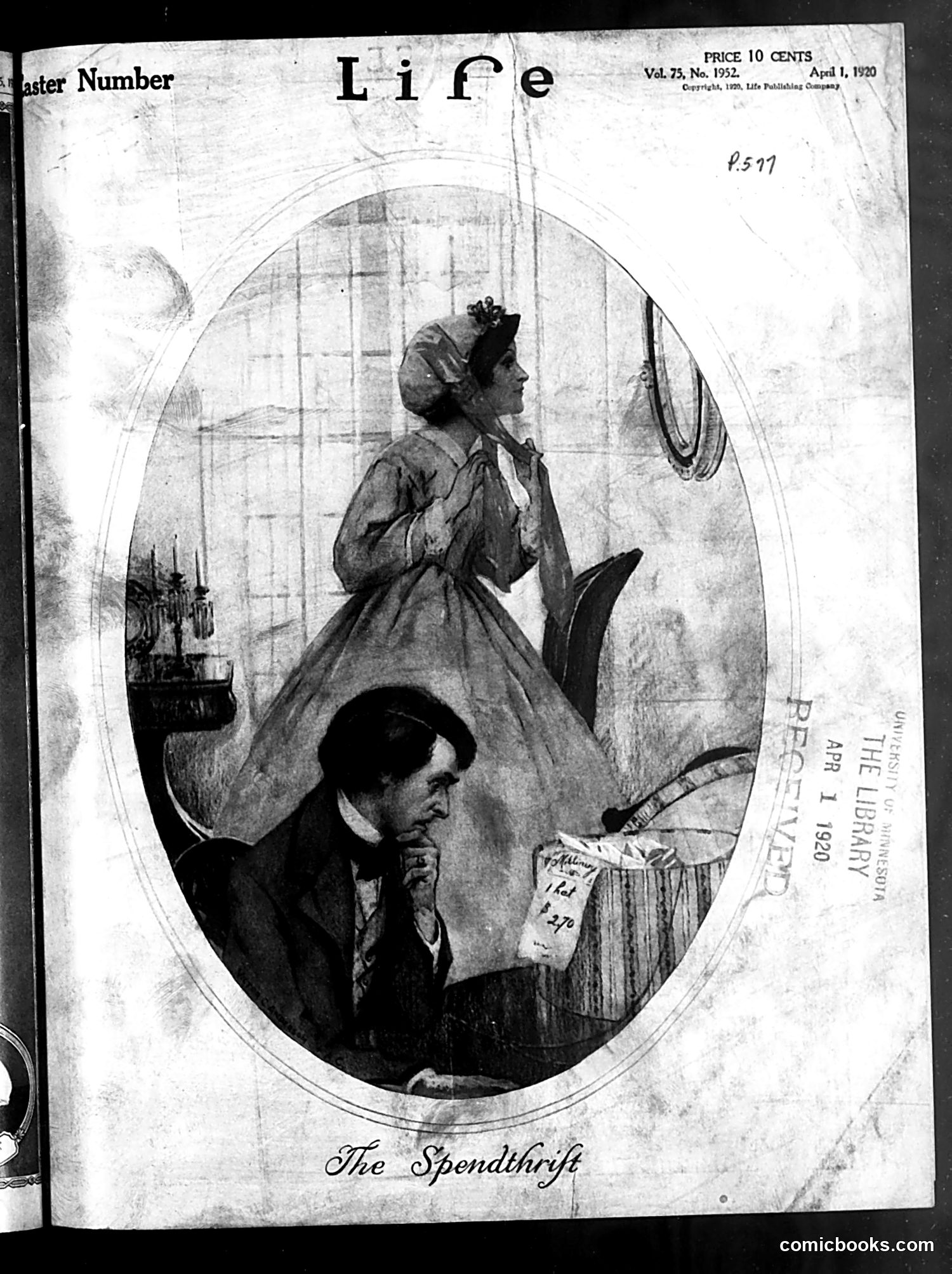
This Life magazine cover from April 1, 1920 satirizes wasteful spending, likely government expenditures following World War I. The title "The Spendthrift" labels the composition itself as social commentary. The image shows two figures in an oval frame: a woman standing (appearing affluent, dressed in fine clothing) and a man below her in darker garments, seemingly distressed or concerned. The woman's elevated position and elaborate dress suggest wealth or governmental authority, while the man's lower position and anxious expression suggest he bears the financial burden. The satire criticizes how those in power spend money recklessly while ordinary citizens suffer the consequences—a common post-war theme as Americans grappled with inflation and government debt following the armistice.
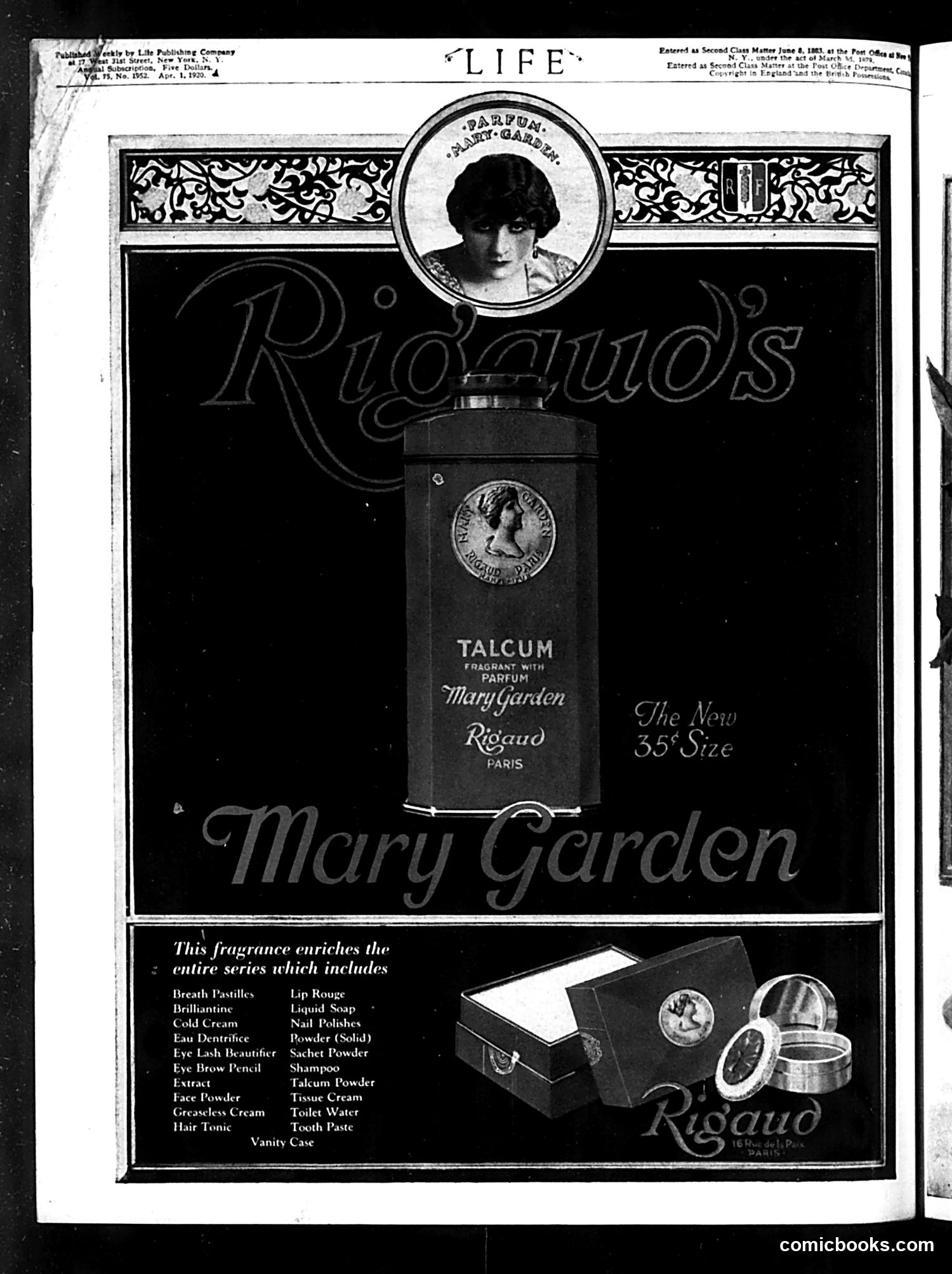
This is **not a political cartoon or satire page**—it's a **cosmetics advertisement** for Rigaud's "Mary Garden" talcum powder and fragrance line, published in *Life* magazine. The page features a portrait photograph of a woman at the top (likely the performer Mary Garden, for whom the product line was named) positioned above a talcum powder container. The advertisement emphasizes the product's new "35¢ Size" and lists an extensive product line including face powders, creams, rouge, and other beauty items typical of early 20th-century cosmetics marketing. This represents straightforward commercial advertising rather than editorial content or satire.
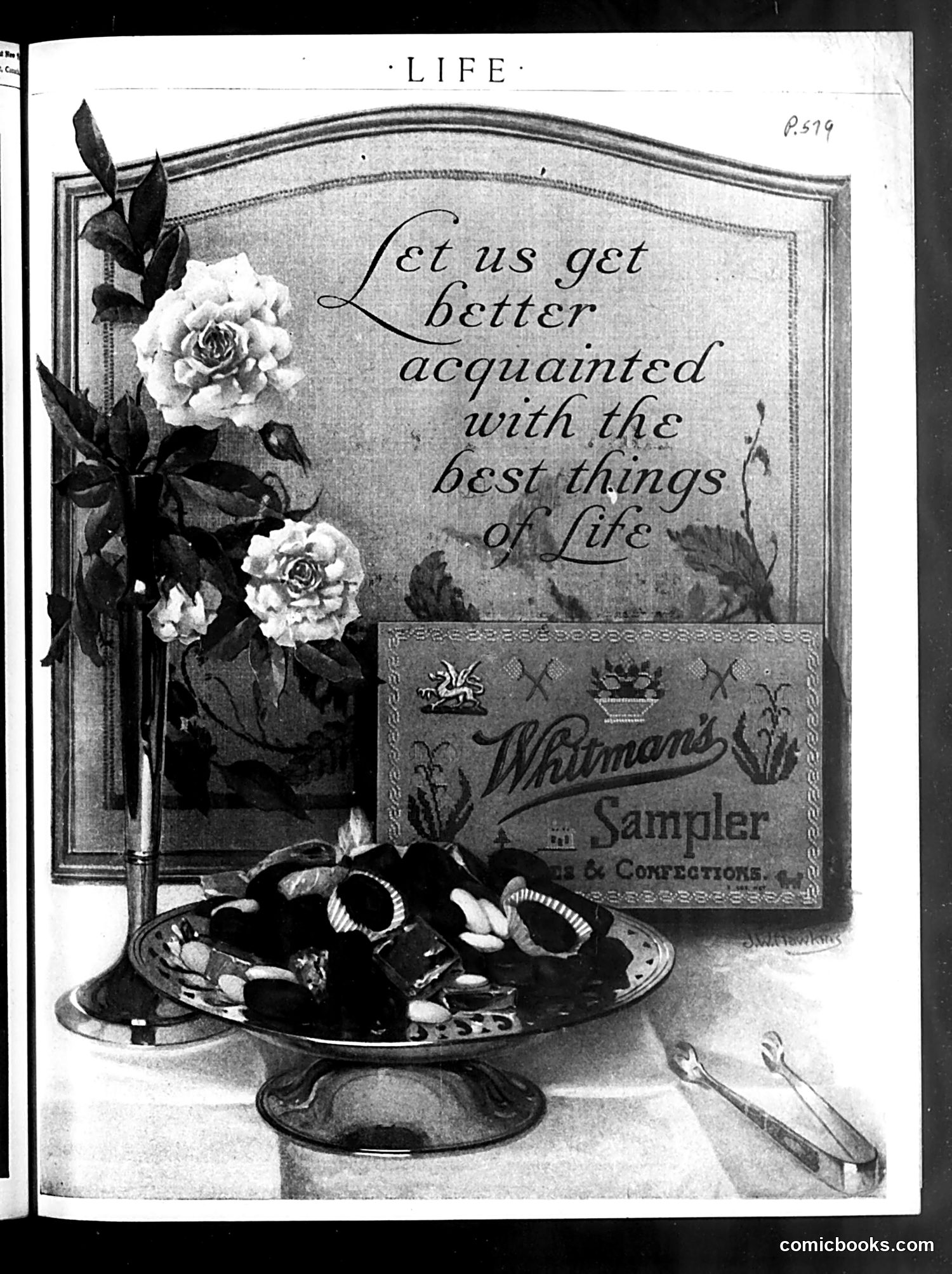
This is primarily a **Whitman's Sampler chocolate advertisement** rather than political satire or comics. The page shows: **Visual Elements:** - Decorative roses in a vase - A box of Whitman's Sampler confections - A pedestal dish filled with chocolates - Ornamental utensils **Text:** The quote "Let us get better acquainted with the best things of life" is a marketing slogan encouraging consumers to try Whitman's chocolates. **Context:** This represents early 20th-century advertising strategy—using refined aesthetic imagery (flowers, elegant presentation) to position candy as a luxury good associated with sophistication and leisure. There is no political commentary or satire present on this page. It's a straightforward commercial advertisement from *Life* magazine's paid content.
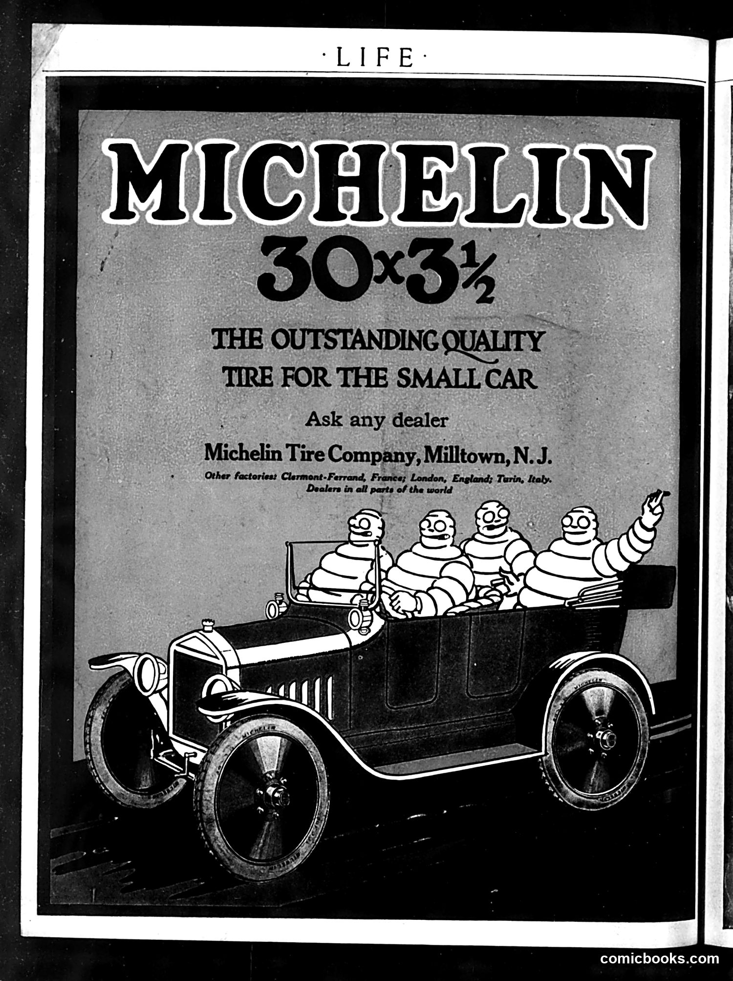
This is a **straightforward product advertisement**, not political satire. Michelin Tire Company advertises their 30x3½ tire size for small cars, positioning it as "the outstanding quality tire for the small car." The visual humor employs **Michelin's famous mascot, Bibendum** (the rotund "Michelin Man" made of tire rings), depicted here with companions in a early-model automobile. This playful imagery was designed to make tire advertisements more memorable and entertaining. The ad lists factories in Clermont-Ferrand (France), London (England), and Turin (Italy), emphasizing international manufacturing and distribution. This appears in *Life* magazine's early period, likely pre-WWI or 1920s-era, when such whimsical advertising mascots were novel and effective marketing tools.
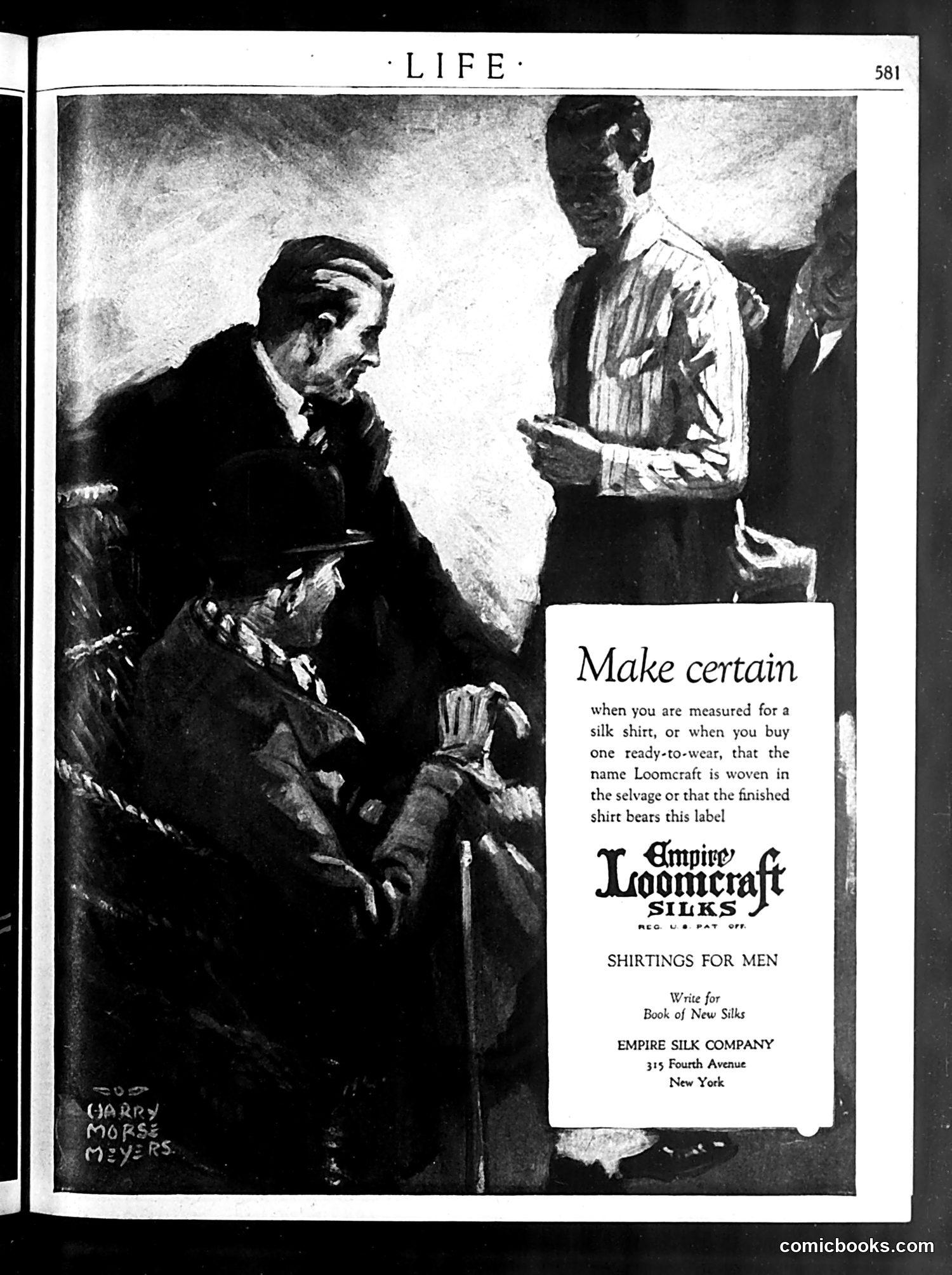
This page is primarily an **advertisement for Empire Loomcraft Silks**, not political satire. The illustration by Harry Morse Meyers depicts a tailoring scene: a seated man being measured for a silk shirt while a tailor takes notes. The ad's message is straightforward consumer advice: when purchasing silk shirts (either custom-measured or ready-made), buyers should verify that the garment bears the "Empire Loomcraft" label, ensuring the silk was properly woven and finished. This represents typical early 20th-century advertising strategy—using professional, dignified imagery to establish brand credibility and quality assurance for men's fashion products. The page contains no political commentary or satire.
This page is primarily **editorial/promotional content rather than a political cartoon**. The decorative border features Art Nouveau-style botanical illustrations (flowers, cherubs, landscapes), typical of Life magazine's design aesthetic. The text presents Life magazine's Easter greeting and subscription pitch. It describes Life as presenting "distinguished compliments and most cordial Easter greetings" to friends, and expresses optimism about "fairer days to come." The statement about the editor being "glad that he is an American" and having "over a million readers help him to support his Americanism" suggests this is wartime or patriotic-era content, though the specific date isn't visible. The page concludes with a subscription offer: one year for $3.00 (US), $3.52 (Canadian), or $6.04 (Foreign).
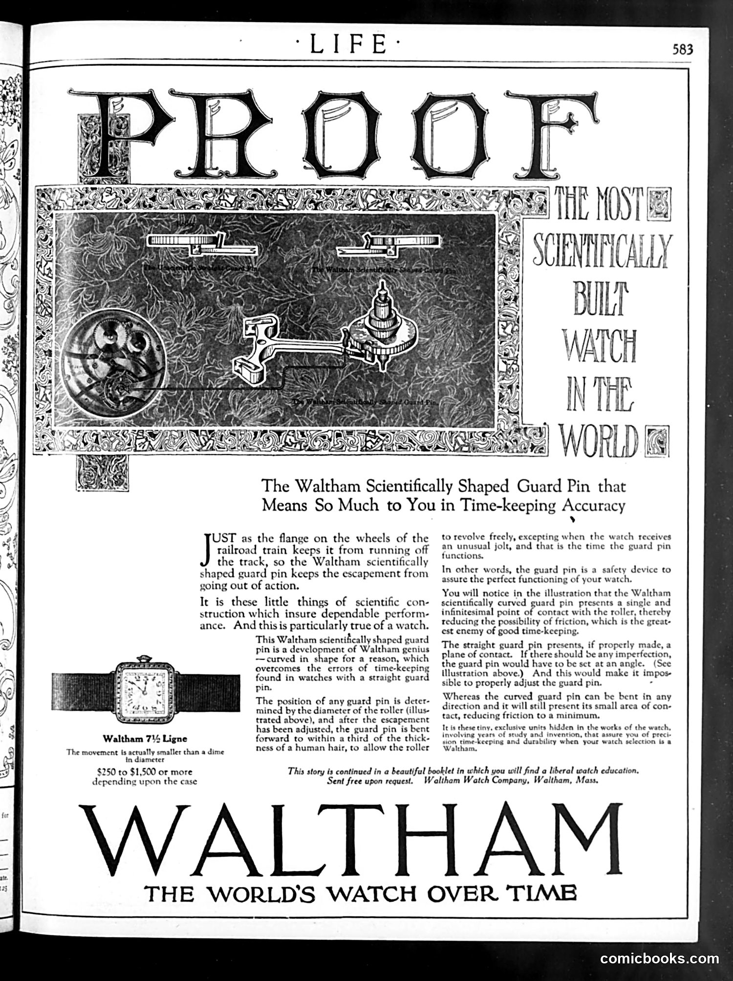
This is primarily **advertising content**, not satire or political commentary. It's a full-page Waltham Watch Company advertisement from *Life* magazine (page 583). The ad promotes Waltham's "scientifically shaped guard pin" — a small mechanical device that protects watch movements from damage. The decorative illustration shows watch components and mechanisms rather than political figures or caricatures. The text emphasizes technical precision and reliability, explaining how the guard pin prevents friction and maintains accurate timekeeping. The ad's headline claims Waltham produces "the most scientifically built watch in the world." This represents early-20th-century advertising's appeal to middle-class consumers through scientific authority and mechanical innovation — positioning watchmaking as precise engineering worthy of trust.
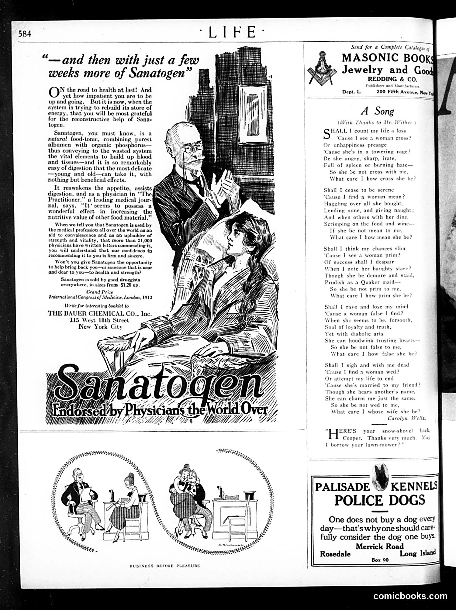
This page is primarily **advertising and poetry**, not political satire. The dominant content is a **Sanatogen advertisement** featuring a doctor and patient. The ad promotes Sanatogen as a tonic for rebuilding health and energy, claiming endorsement from physicians worldwide. This reflects early 20th-century patent medicine marketing, when such tonics were heavily advertised despite unproven efficacy. The right side contains **"A Song" by Carolyn Wells**—a romantic poem about romantic uncertainty and a woman's conflicted feelings. Below are small cartoons titled "Business Before Pleasure" showing domestic scenes, likely humorous commentary on prioritizing work over leisure. Additional ads include **Masonic books/jewelry** and **Palisade Kennels police dogs**. The page primarily represents commercial advertising typical of 1910s-era Life magazine.
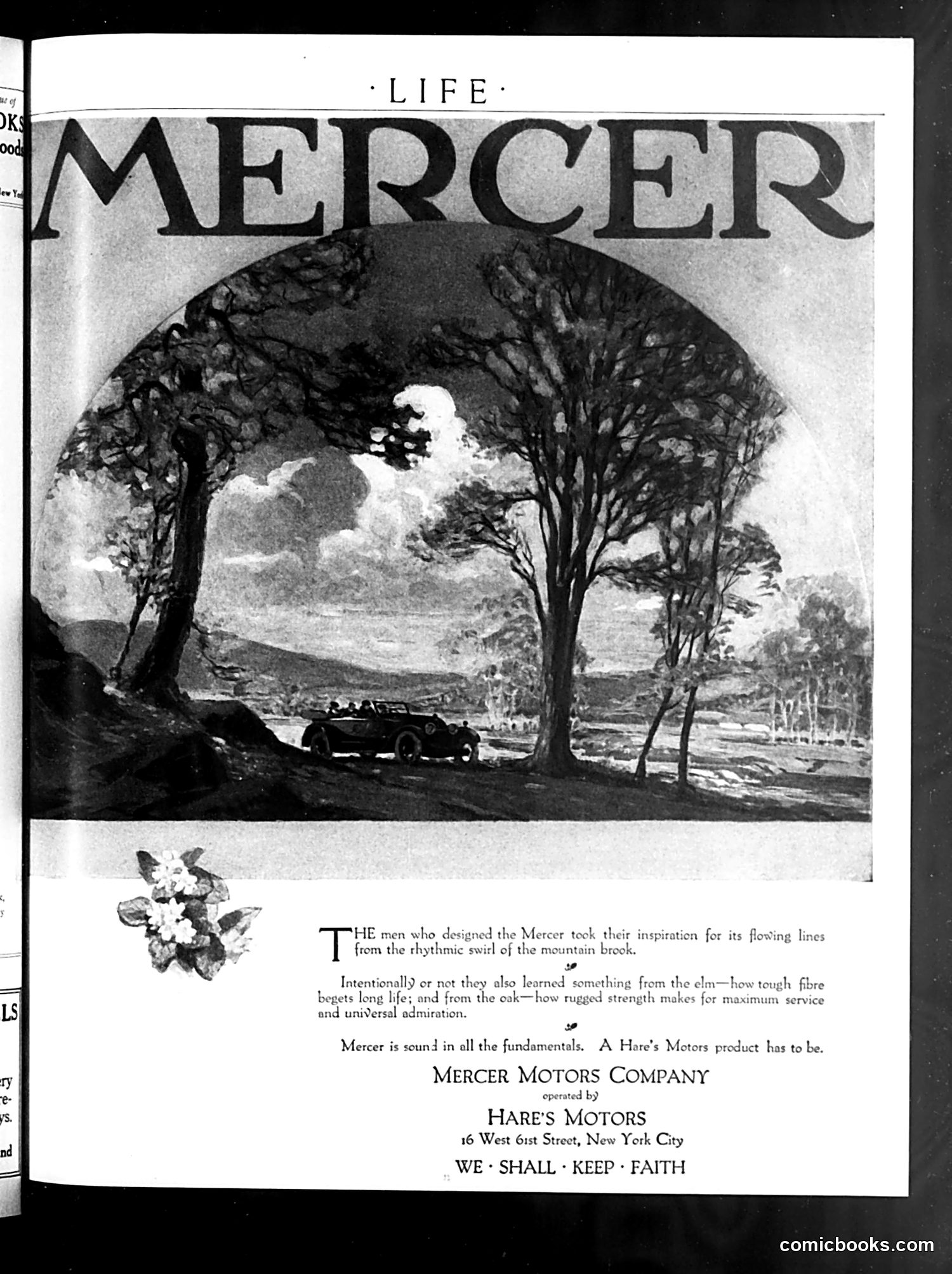
This is primarily an **advertisement for Mercer automobiles**, not a political cartoon. The page appears in *Life* magazine's advertising section. The ad features an artistic illustration of a Mercer car driving through a tree-lined countryside road, framed by large trees creating a natural archway. The accompanying text claims the Mercer's design drew inspiration from natural forms—specifically "the rhythmic swirl of the mountain brook" and structural principles learned from elm and oak trees' strength and longevity. This reflects early 20th-century **marketing that linked automobiles to nature and organic design**—a common advertising strategy positioning cars as harmonious with the natural world rather than industrial intrusions. The tagline "We Shall Keep Faith" emphasizes reliability and quality craftsmanship.
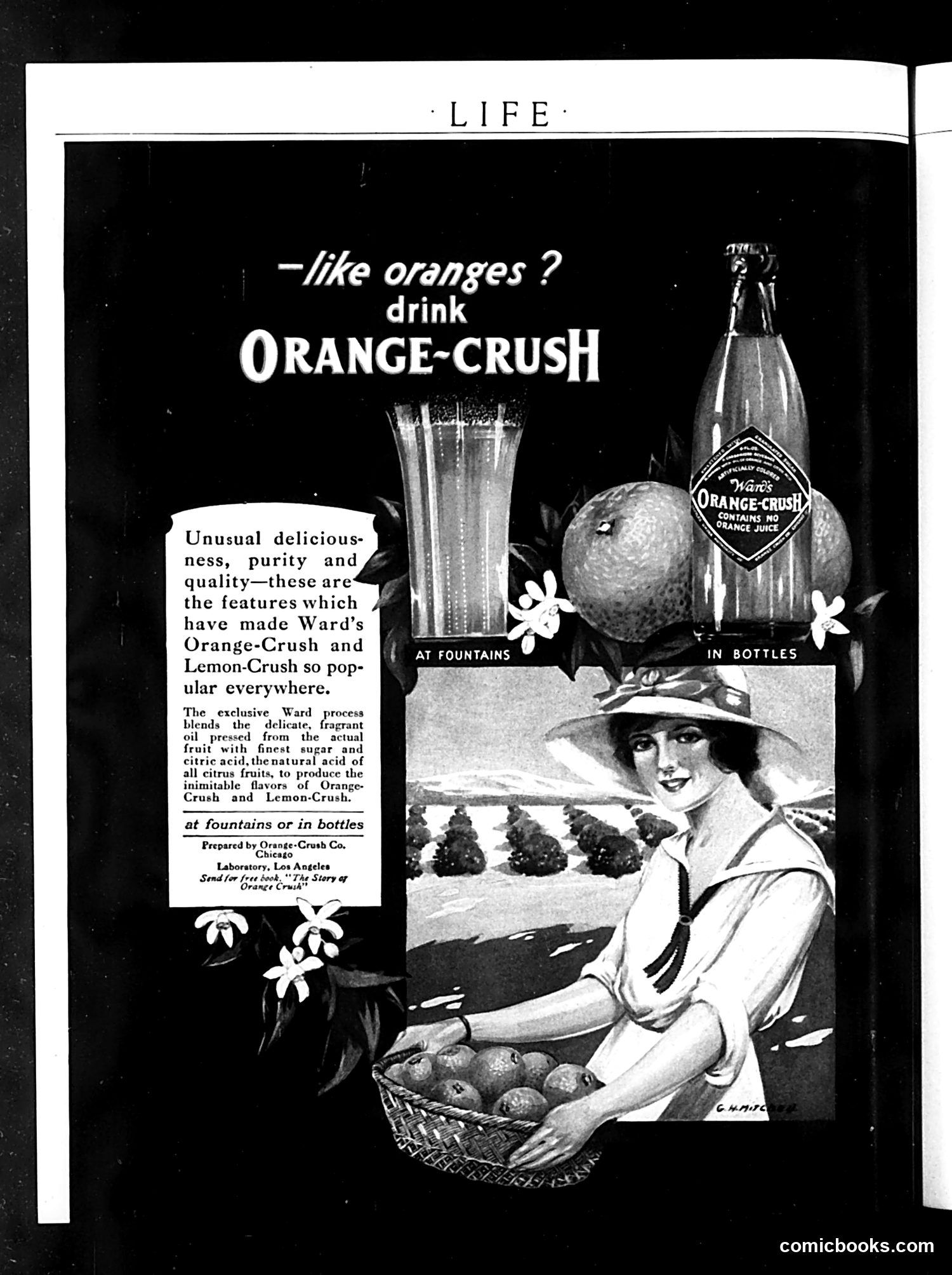
This is a vintage advertisement for Ward's Orange-Crush soft drink, not satirical content. The ad features a woman in 1920s attire holding a basket of oranges in an orchard setting. The marketing pitch—"like oranges? drink ORANGE-CRUSH"—emphasizes the product's natural ingredients: fragrant oil pressed from actual fruit, combined with sugar and citric acid to create authentic citrus flavor. The ad promotes availability "at fountains or in bottles," reflecting the era when soft drinks were sold both as fountain drinks and packaged beverages. The copy touts "unusual deliciousness, purity and quality," standard advertising claims of the period. There is no political satire present—this is straightforward product promotion typical of Life magazine's commercial content.
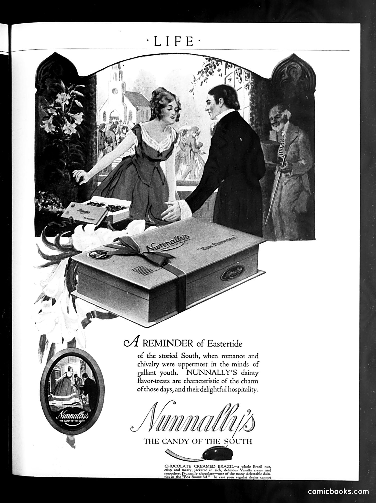
This is a **commercial advertisement**, not political satire. It promotes Nunnally's candy, "The Candy of the South." The ad uses nostalgic imagery of the antebellum South, depicting a genteel scene where a well-dressed man and woman exchange candy in what appears to be a Southern parlor. The text references "Eastertide" and evokes "romance and chivalry" associated with the "storied South" and "gallant youth." This is marketing that trades on romanticized Southern gentility and hospitality. The product advertised is "Chocolate Creamed Brazil"—a specific candy variety. The accompanying vignette (oval image, lower left) reinforces this Southern belle aesthetic. The ad exemplifies early-20th-century nostalgia marketing that sentimentalized the pre-Civil War South.
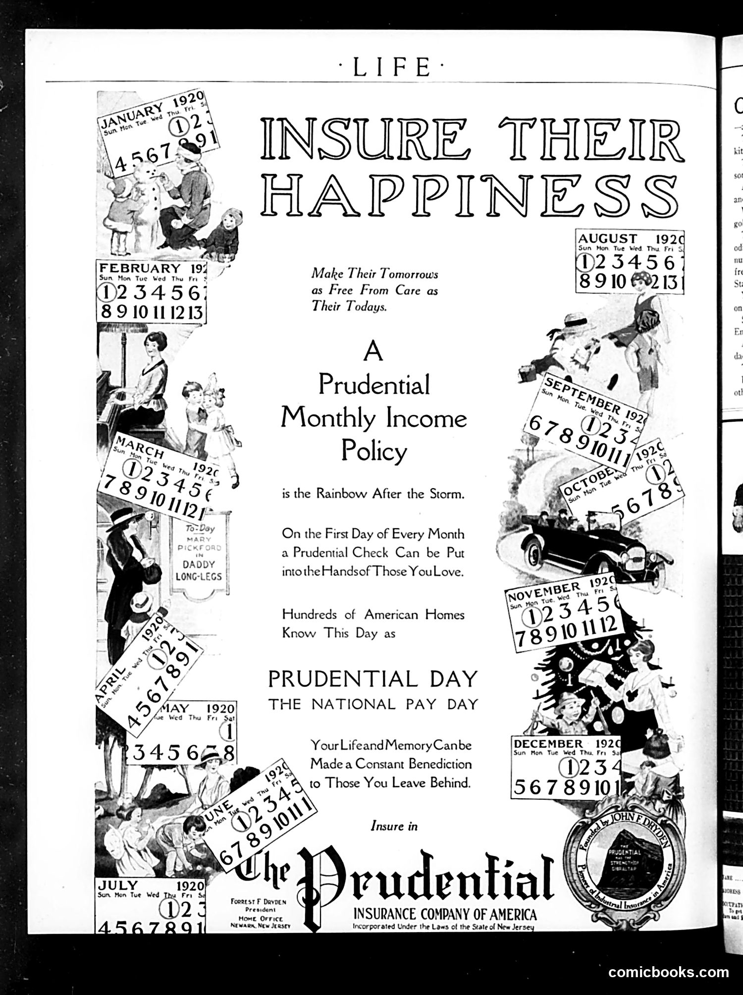
This is primarily a **Prudential Insurance advertisement** disguised as editorial content in Life magazine (circa 1920). The page features a calendar motif with illustrated vignettes for each month, promoting Prudential's "Monthly Income Policy." The tagline "Insure Their Happiness" and "Make Their Tomorrows as Free From Care as Their Todays" appeal to family security concerns. The repeated calendar imagery—spanning January through December 1920—emphasizes the monthly payment structure. The illustrations depict wholesome domestic scenes: children, mothers, working-class families, and leisure activities, positioning life insurance as essential for protecting loved ones. The phrase "Prudential Day—The National Pay Day" suggests insurance payments should be routine household expenses. The Prudential Insurance Company of America seal at bottom legitimizes the pitch. This represents early-20th-century insurance marketing targeting middle-class Americans through lifestyle aspiration.
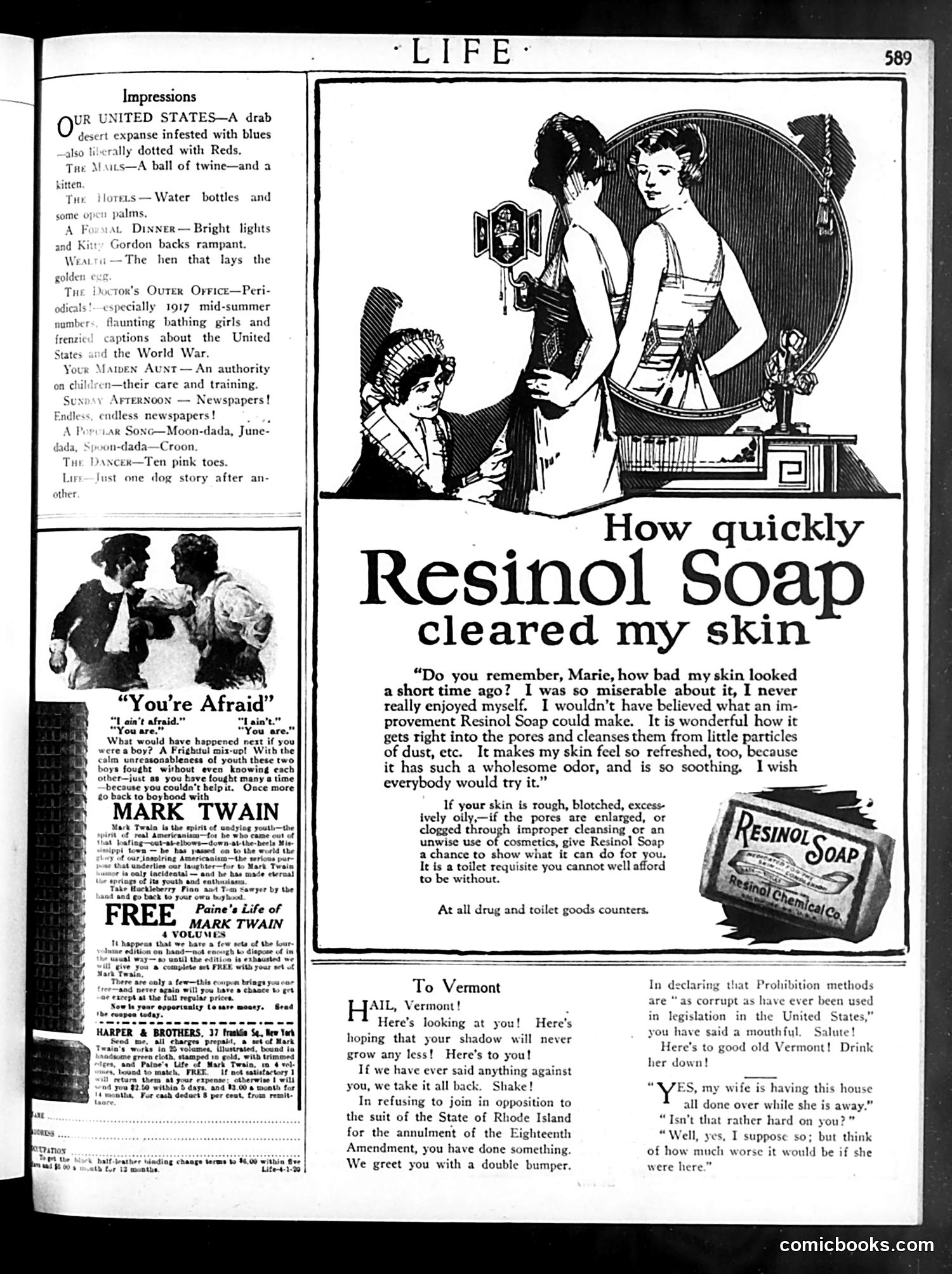
This page is primarily **advertising**, not political satire. The dominant feature is a large **Resinol Soap advertisement** showing women examining their skin in a mirror, with testimonial text claiming the soap quickly clears skin problems by cleaning pores. The left column contains **"Impressions"**—brief commentary on current topics (WWI references, newspapers, popular songs)—and a separate piece titled **"You're Afraid"** attributed to Mark Twain, discussing youth anxieties. Below is an advertisement for a free Mark Twain book offer. At bottom right is a brief piece titled **"To Vermont"** making light political commentary about Prohibition and the Eighteenth Amendment, but it's minor and unclear in context. The page reflects early 20th-century magazine layout mixing editorial content with advertising.
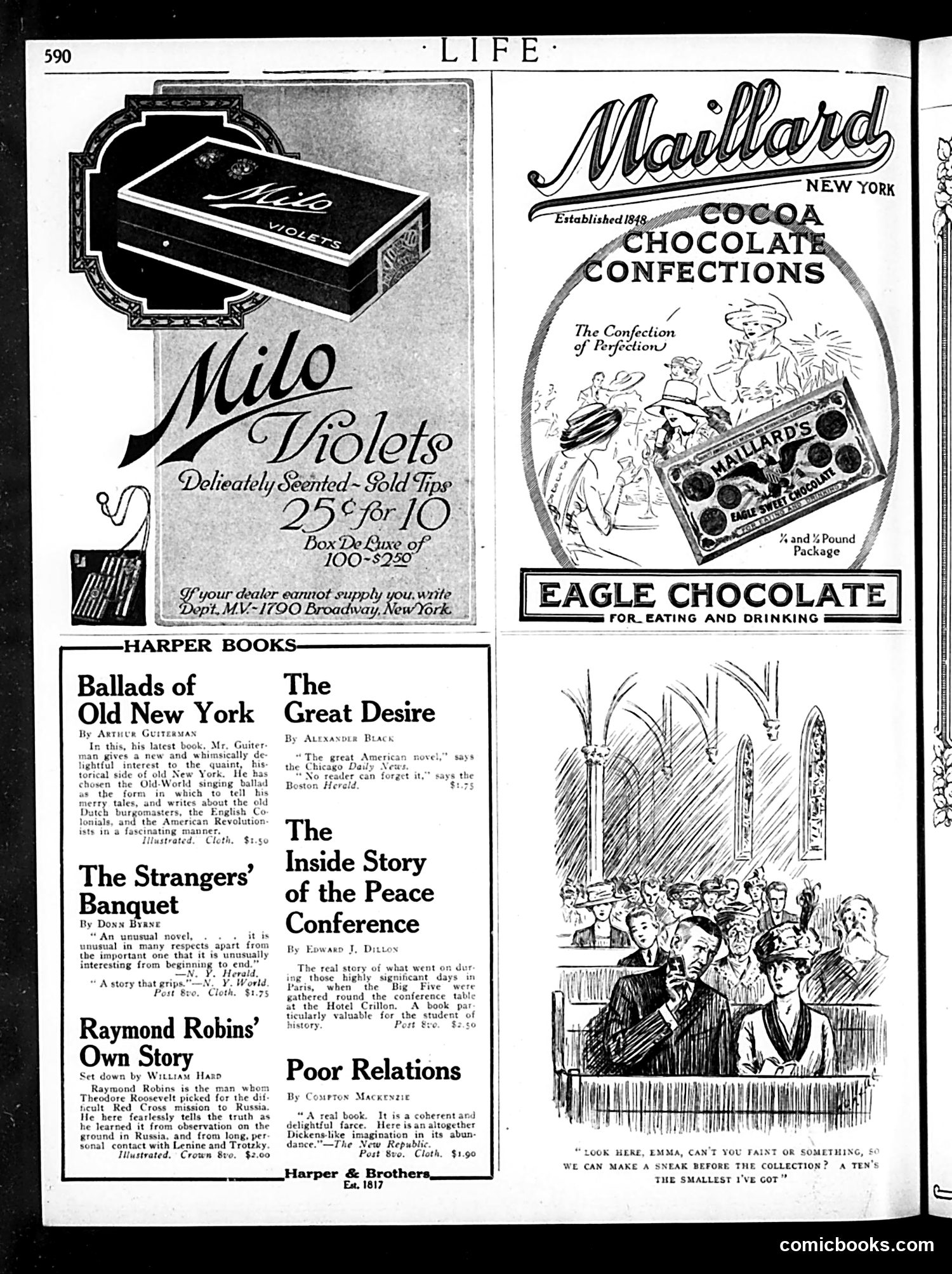
This page is primarily **advertising and book listings**, not political satire. The dominant content includes: - **Milo Violets** candy advertisement (top left) - **Maillard's Cocoa Chocolate Confections** ad (top right) - **Harper & Brothers book advertisements** (bottom half), promoting titles like "Ballads of Old New York," "The Great Desire," and "The Inside Story of the Peace Conference" The only illustration that might be considered editorial content is a sketch accompanying text about the Peace Conference—showing what appears to be diplomats or political figures in discussion. However, without clearer identification of specific individuals, it's impossible to determine targeted satirical intent. This is essentially a **commercial page** from Life's business section, not a political cartoon page.
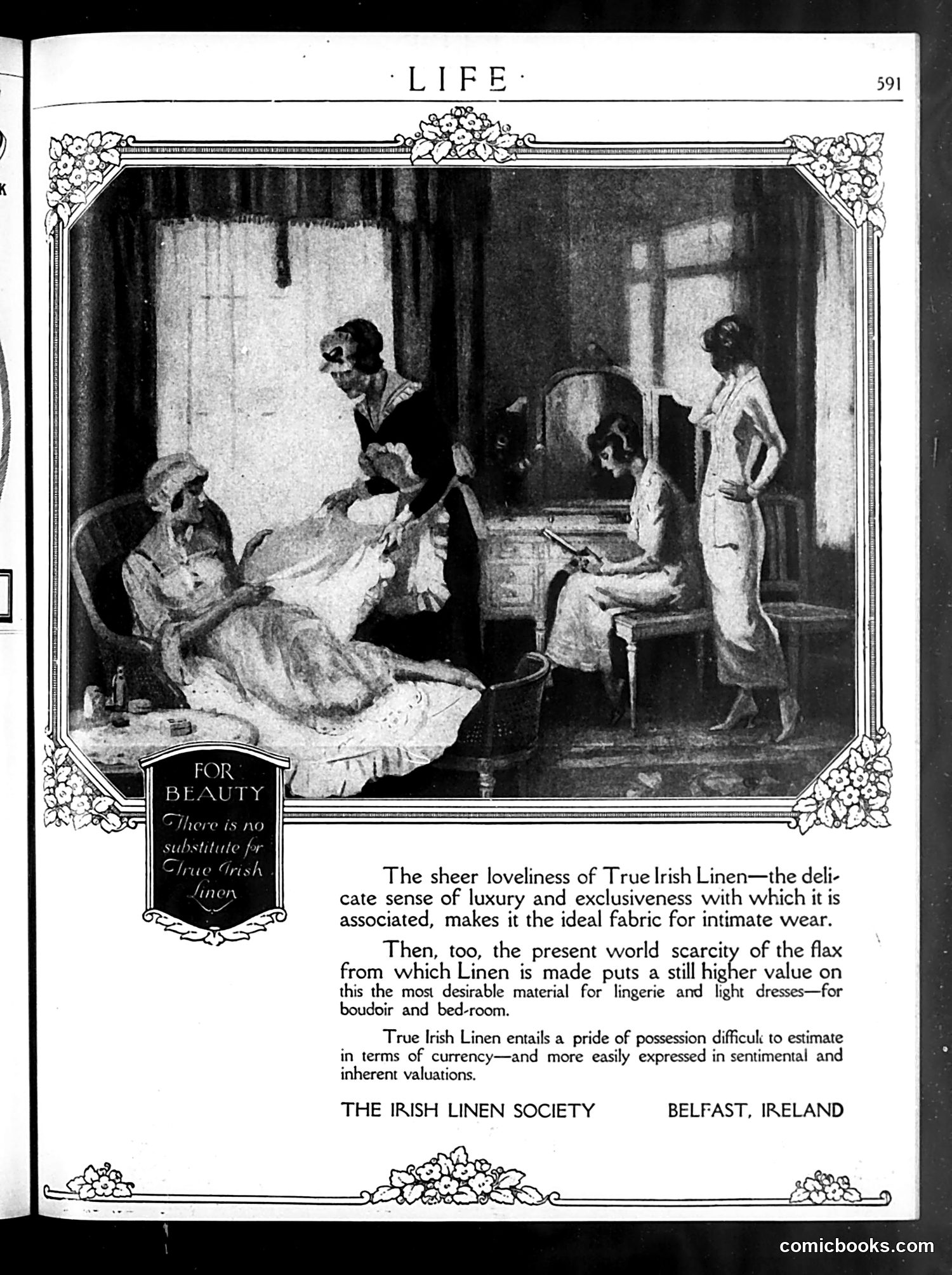
This is an **advertisement, not a political cartoon**. It promotes True Irish Linen products from the Irish Linen Society in Belfast. The image depicts a bedroom or intimate domestic scene with several women in early 20th-century dress. One woman reclines on a bed while others attend to her, suggesting a social visit or intimate moment. The advertisement emphasizes linen's luxury and exclusivity for "intimate wear," "lingerie," "light dresses," and "boudoir and bed-room" use. The copy stresses that True Irish Linen possesses exceptional quality due to flax scarcity, making it a high-status possession. The tagline—"There is no substitute for True Irish Linen"—suggests prestige and patriotic Irish manufacturing pride during a period of Irish economic development.
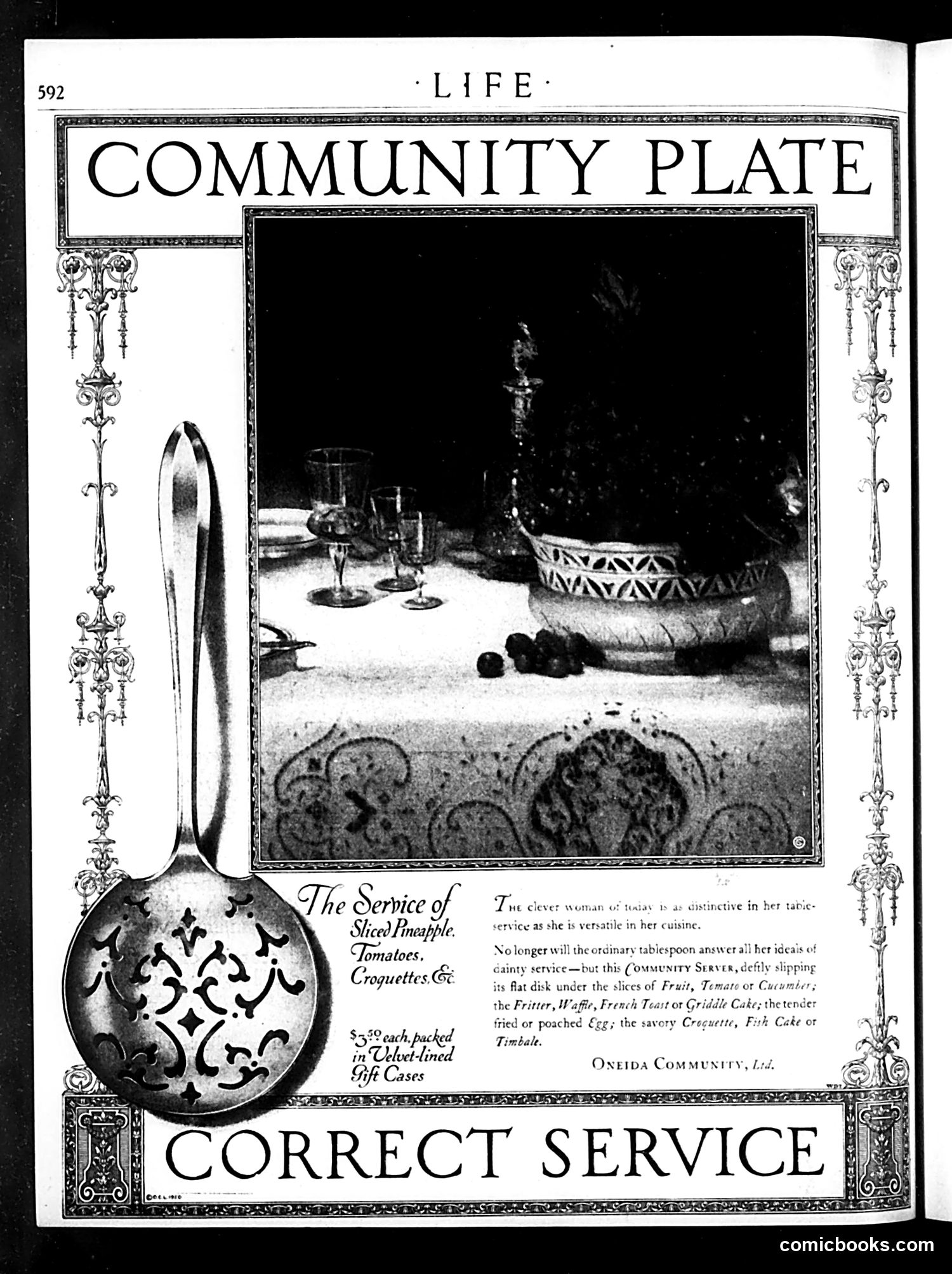
This is a **commercial advertisement**, not political satire. It promotes "Community Plate" flatware by Oneida Community, Ltd. The page displays an ornate serving spoon on the left and a photograph of an elaborate formal table setting on the right, featuring candlesticks, decorative bowls, and fine tableware arranged on what appears to be an expensive cloth. The ad's text emphasizes that Community Plate flatware enables "the clever woman of today" to maintain sophisticated table service without requiring extensive household staff. The spoon is advertised as suitable for serving "Sliced Pineapple, Tomatoes, Croquettes, Etc." and comes "packed in Velvet-lined Gift Cases." This reflects early 20th-century marketing targeting middle-class homemakers seeking to emulate upper-class dining standards affordably.
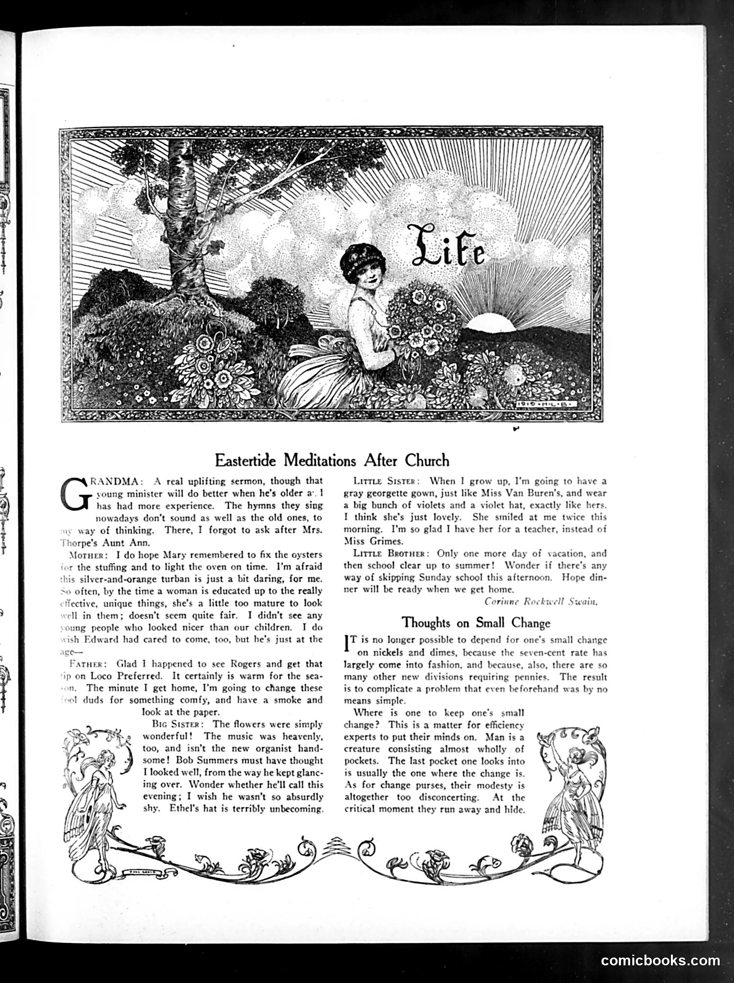
This page contains two distinct pieces of social satire from early 20th-century Life magazine. **"Eastertide Meditations After Church"** is a satirical family dialogue mocking the disconnect between church attendance and actual behavior. Each family member's "pious" church experience immediately gives way to mundane or self-interested thoughts: the grandmother critiques the sermon, the mother worries about her outfit and dinner preparations, the father thinks about stock tips, the big sister obsesses over a boy's attention, and the little brother schemes to skip Sunday school. The satire targets bourgeois hypocrisy—the gap between public religious devotion and private materialism and vanity. **"Thoughts on Small Change"** humorously complains about modern currency complications. The "seven-cent rate" reference appears garbled by OCR, but the piece satirizes how new monetary subdivisions (pennies, nickels, dimes) create practical annoyances—men have too many pockets, change purses are unreliable. It's gentle satire on everyday modern inconveniences and inefficiency.
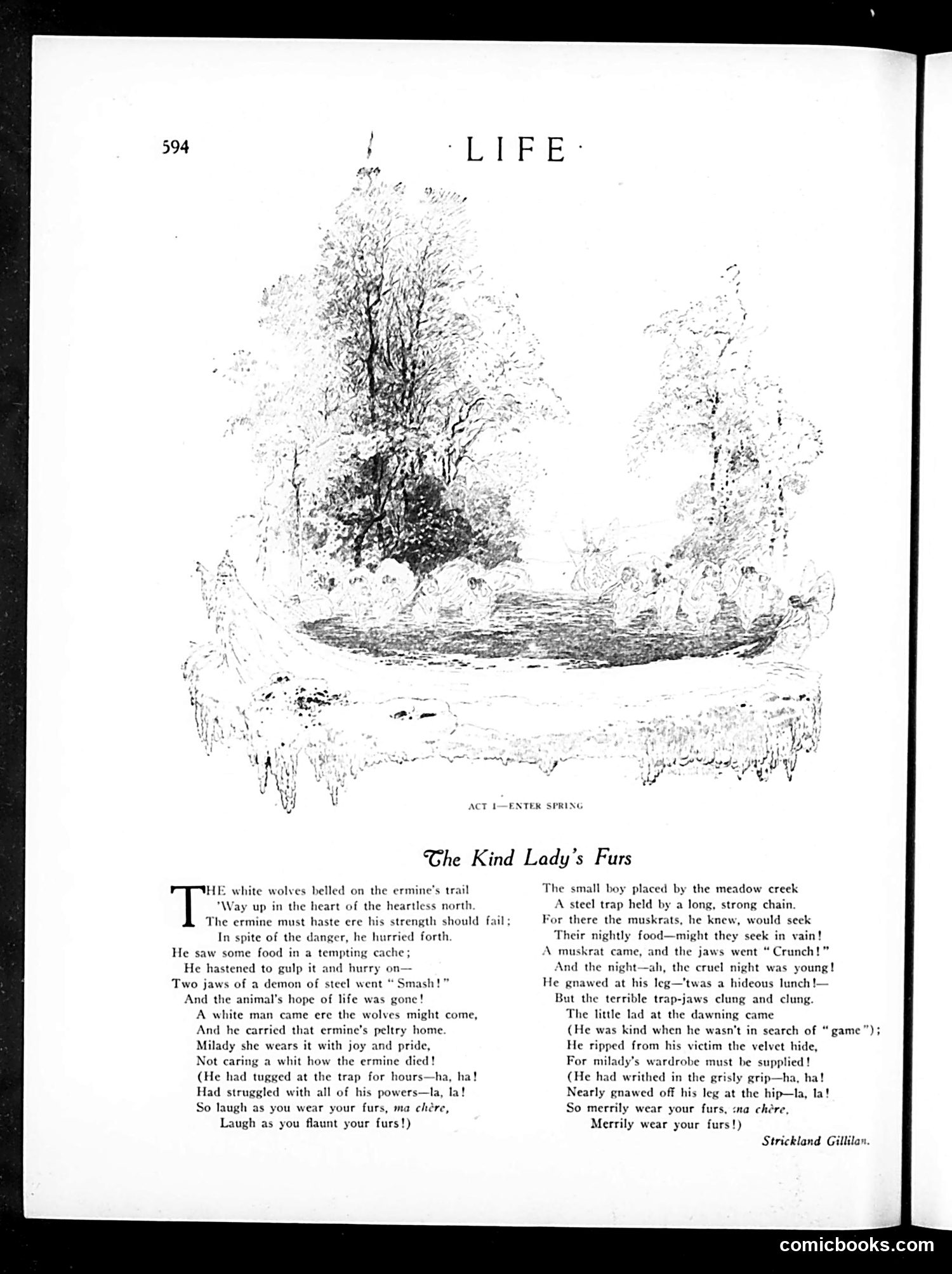
This is a satirical poem attacking the fur industry and the women who wear fur coats without regard for animal suffering. The illustration shows a spring landscape—the setting where traps are set. The poem uses dark irony to expose the cruelty behind fashionable fur garments. It depicts two scenarios: a white trapper killing an ermine in the northern wilderness, and a boy trapping a muskrat by a creek. Both animals suffer grotesquely in steel traps (gnawing at their own legs), yet the wealthy women who wear these furs do so with "joy and pride," indifferent to the animals' agony. The repeated refrain—"laugh as you wear your furs"—mocks ladies' obliviousness to the violence their vanity requires. The characterization of the boy as "kind when he wasn't in search of game" adds bitter sarcasm about selective morality. This reflects early 20th-century animal welfare activism, criticizing both commercial fur trapping and consumer complicity in animal cruelty.
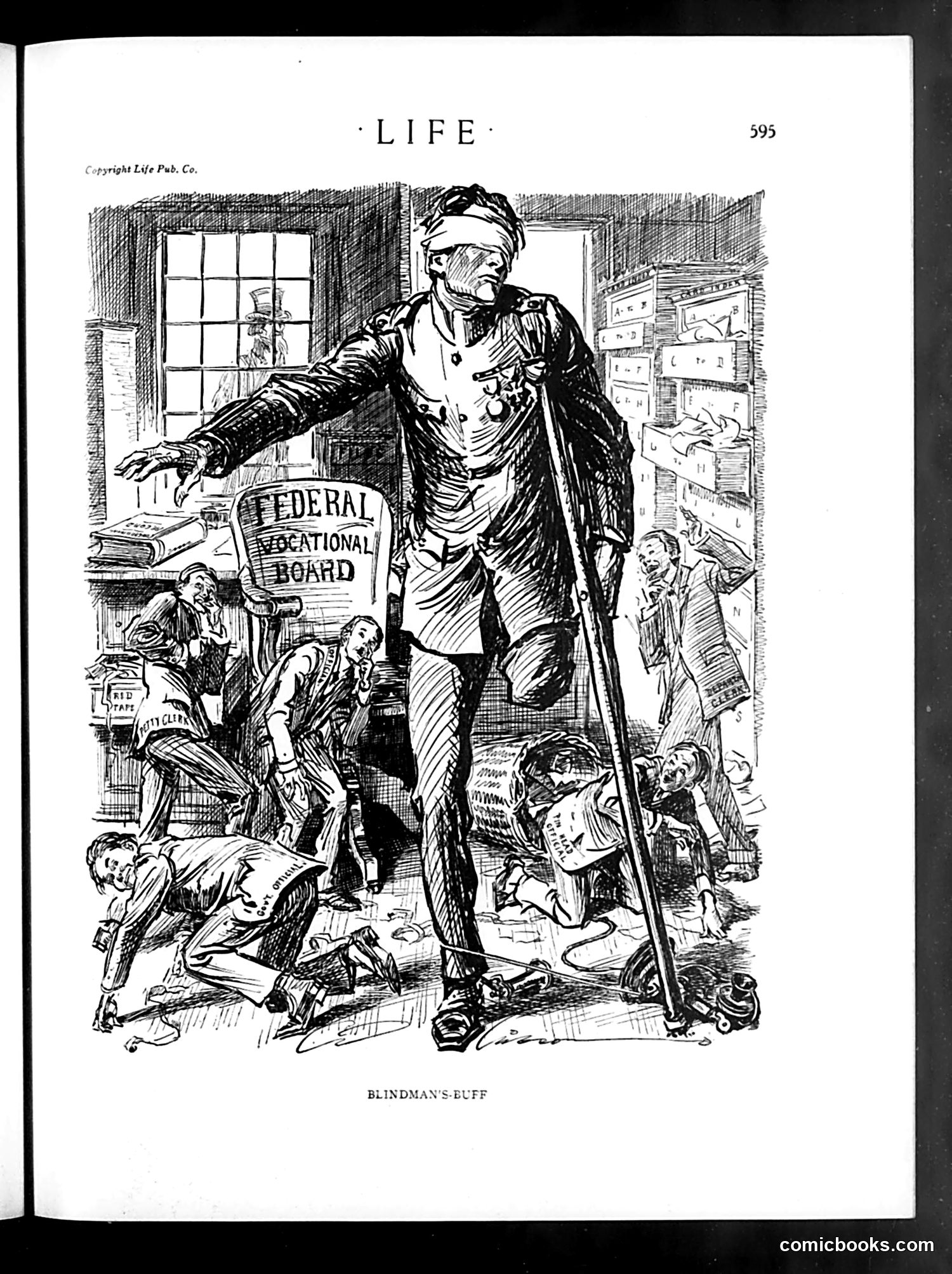
This political cartoon depicts a large blindfolded figure labeled "Federal Educational Board" towering over smaller bureaucrats and staff members in an office setting. The blindfold is the key visual metaphor: it suggests the Federal Educational Board operates without proper oversight or awareness of actual conditions. The surrounding smaller figures—labeled "STAFF"—appear bewildered or struggling beneath this blind authority. The cartoon satirizes federal education administration as incompetent and disconnected from reality, making decisions without seeing their actual impact on schools or educators. This likely responds to specific early 20th-century education policy debates, criticizing centralized federal control as removing decision-makers from ground-level realities. The "blindman's-buff" game reference reinforces the idea of blind, fumbling governance.
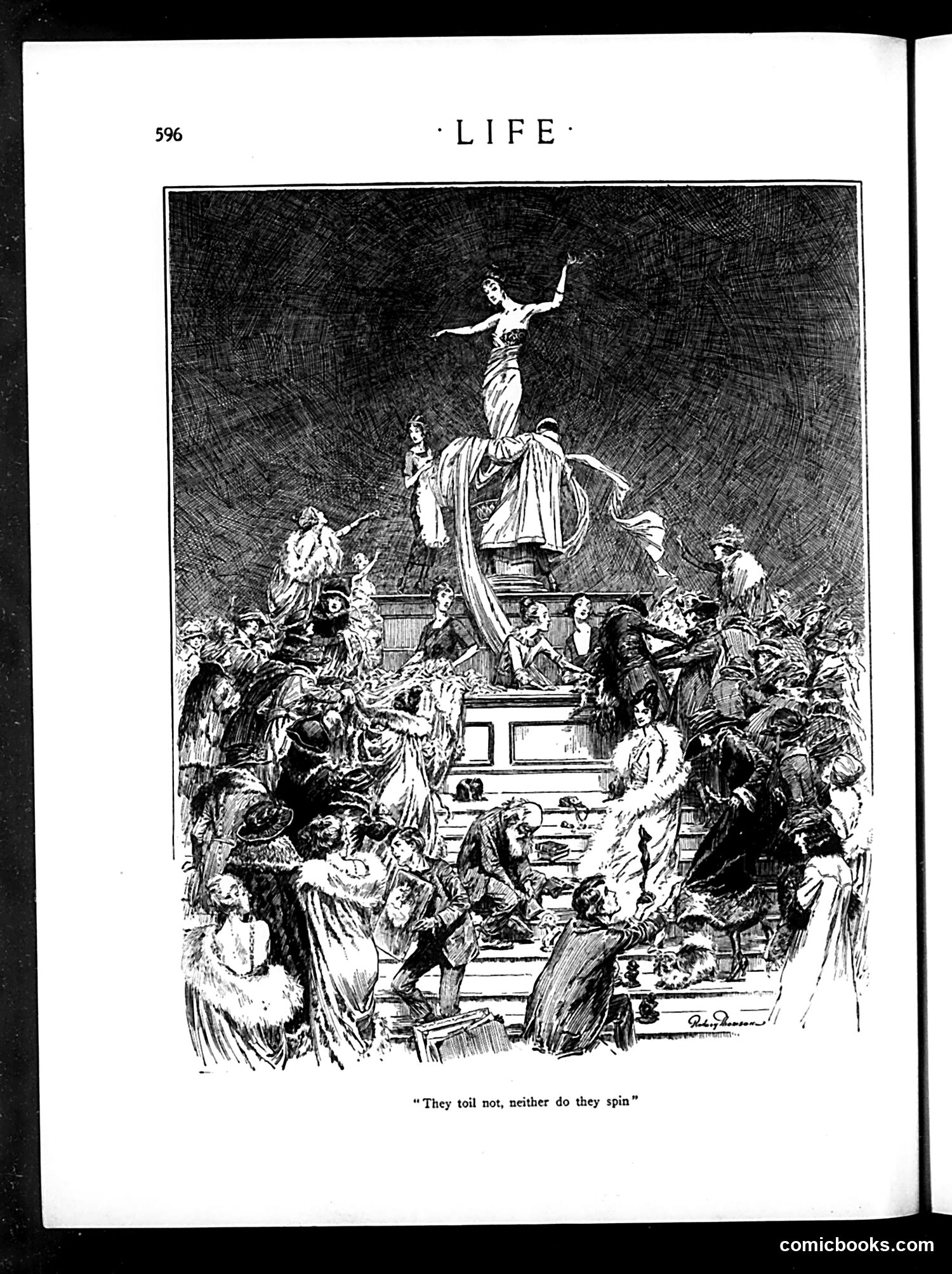
This illustration depicts a classical allegorical scene centered on a female figure (likely representing Liberty or Victory) standing atop a pedestal, surrounded by a diverse crowd of common people. The caption quotes Matthew 6:28, referring to lilies of the field that "toil not, neither do they spin." The satire appears to critique wealth disparity and idleness among the privileged classes. The figure at the apex suggests an idealized concept (liberty, progress, or national virtue), yet the masses below—depicted realistically and somewhat chaotically—appear to be the actual laborers and workers. The biblical reference implies irony: while the upper classes live without working (like lilies), ordinary people must toil. The artwork criticizes this social inequality structure.
This is not a cartoon page but an editorial essay on Easter. The text presents three worldviews: 1. **Pagan origins**: Spring festivals celebrating life's renewal—presented as compatible with Christianity 2. **Christian Easter**: Claims concrete, physical resurrection—Jesus's body vanished, appeared bodily to witnesses, ate food, showed wounds. The essay notes millions accept this as fact, supporting belief in an afterlife and prayer 3. **Materialist theory**: Dismisses Easter claims as "moonshine," arguing humans arose by chance from insect-like origins with no afterlife or purpose The piece appears to be *presenting* these positions neutrally rather than satirizing them. The decorative borders and layout suggest this is serious editorial content, not satire. Life magazine is discussing genuine theological disagreement about Easter's meaning and humanity's ultimate fate—debates still relevant today.
This page contains editorial commentary rather than political cartoons. The decorative header and footer feature stylized fish and abstract designs typical of Life's art nouveau aesthetic. The text discusses three philosophical/social topics: 1. **Darwinian materialism**: The author critiques the pre-WWI German adoption of evolutionary doctrine as justifying ruthless self-interest and material acquisition over human relations. The war supposedly discredited this worldview. 2. **Spiritism/Ouija boards**: The piece examines the contemporary popularity of séances and spirit communication, noting it parallels biblical precedent (Joan of Arc, the Delphic oracle). The author acknowledges both the appeal to truth-seekers and the dangers of deception and reputational harm. 3. **Democracy vs. autocracy**: The closing quote from "E. S. Martin" argues democracy requires moral education and character development—not mere material prosperity—to succeed against authoritarian alternatives. The overall tone is skeptical but intellectually engaged with early 20th-century spiritualism and its social implications.
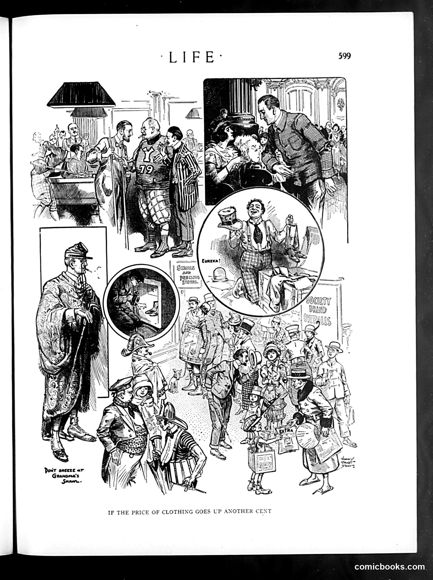
This satirical cartoon from *Life* magazine warns about the consequences of further clothing price increases. The bottom panel depicts chaos—children and working-class people in tattered clothes, some appearing to beg or scavenge, with a "Society Brand" sign visible, suggesting irony about luxury clothing becoming unaffordable. The upper panels show contrasting scenes: wealthy figures in fine dress at social gatherings, juxtaposed with what appears to be "Poor Grandma's Shame" (visible text), depicting an elderly person in shabby clothing. The cartoon critiques inflation's impact on ordinary people's ability to afford basic necessities. It's a commentary on economic inequality—while the wealthy maintain their lifestyle, working families face destitution if prices continue rising. The satire suggests that unchecked price inflation threatens social stability.
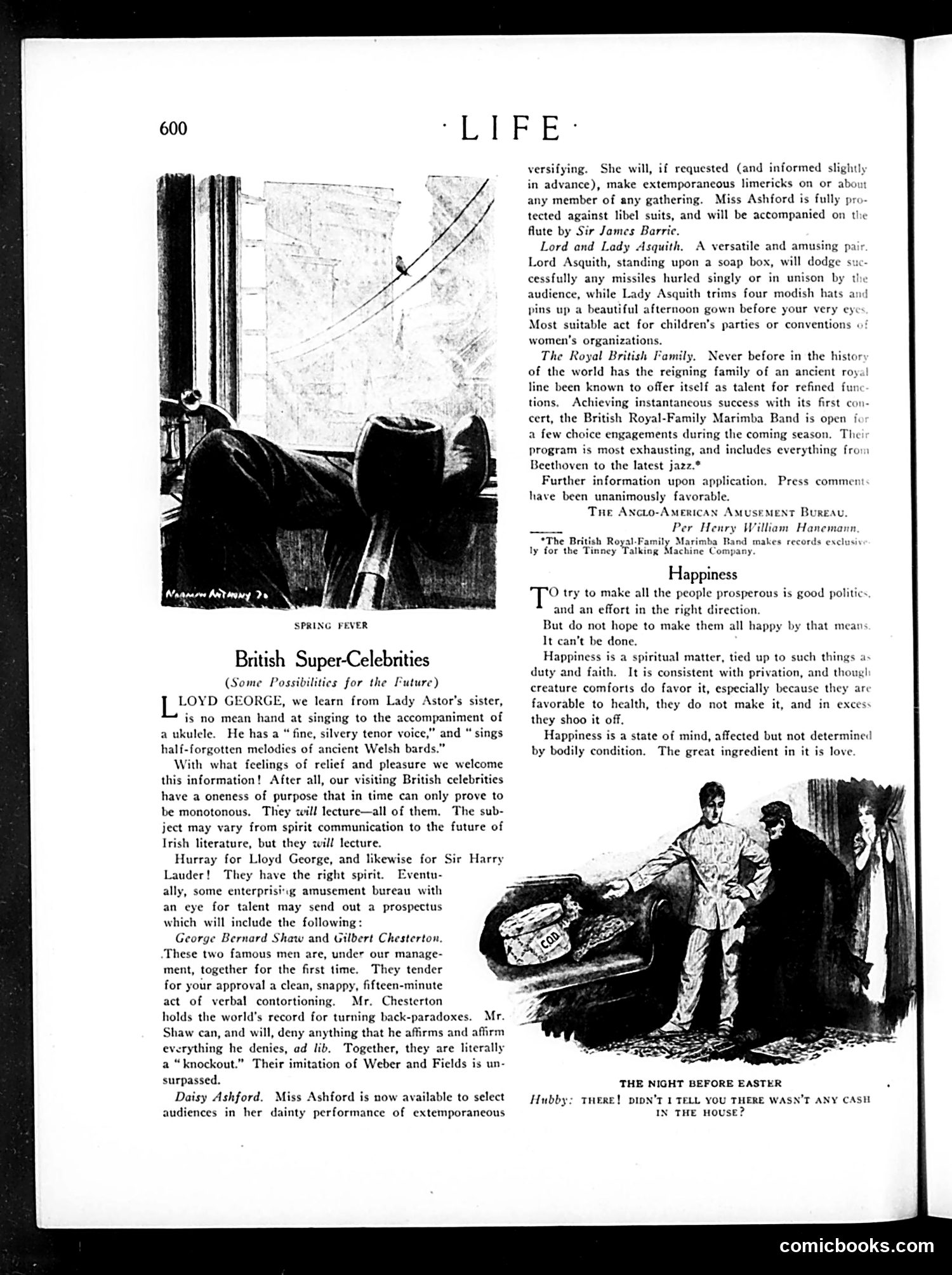
This is a satirical piece mocking British celebrities visiting America. The text proposes absurd "entertainment acts" featuring real public figures: **Lloyd George** (British Prime Minister) would sing Welsh songs with a ukulele. **Lord and Lady Asquith** would perform a vaudeville act—he dodges projectiles while she models hats. **The British Royal Family** forms a marimba band. The satire targets two things: (1) the British establishment's willingness to commercialize themselves for American amusement, and (2) Americans' fascination with British "super-celebrities." By proposing ridiculous performances, Life mocks both the celebrities' dignity-abandoning ambitions and audiences' gullible enthusiasm. The cartoon "Spring Fever" and "The Night Before Easter" appear unrelated illustrations. The "Happiness" essay is philosophical commentary, likely responding to celebrity culture's promise of fulfillment through entertainment. The overall message: British elites are becoming entertainers, and that's both funny and culturally degrading.
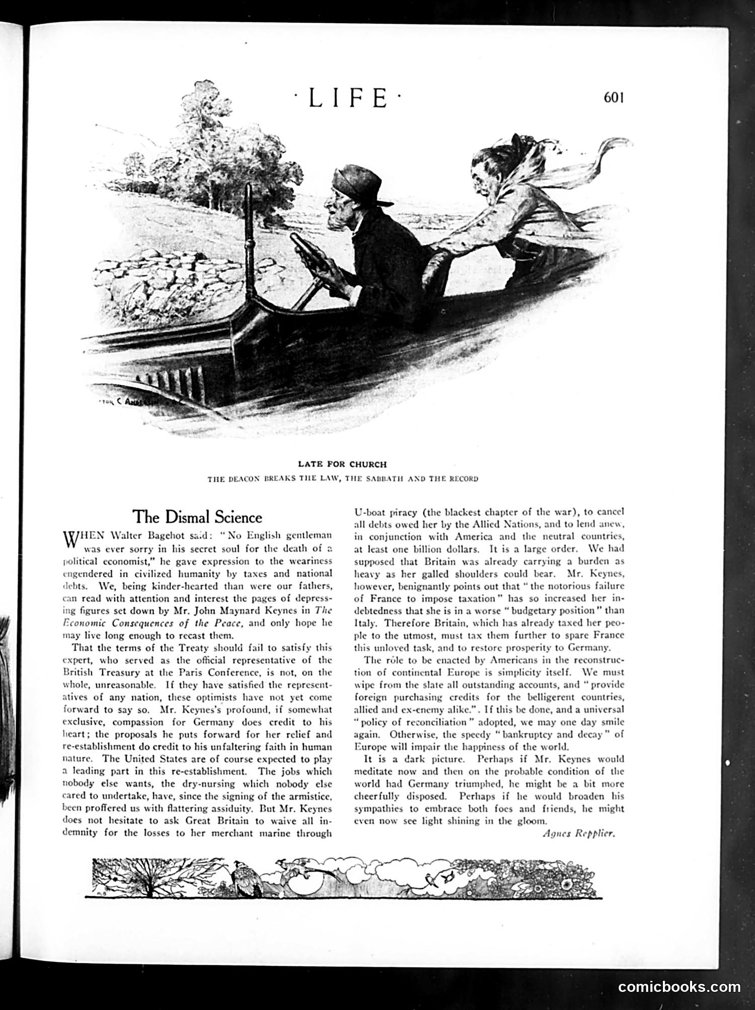
The cartoon depicts a deacon in a boat speeding recklessly, breaking the Sabbath law by traveling on Sunday. The humor plays on the irony: a church official violates religious law (no work/travel on the Sabbath) by rushing to church itself, apparently running late. The accompanying article, "The Dismal Science," discusses economist John Maynard Keynes's post-WWI proposals for Germany's economic relief and Allied debt forgiveness. Critic Agnes Repplier argues Keynes is overly compassionate toward Germany—asking Britain to cancel debts and provide loans despite her own financial strain. She suggests he lacks perspective on the war's actual outcome and should "broaden his sympathies to embrace both foes and friends." The cartoon's ironic title echoes the article's theme: good intentions creating contradictory outcomes.
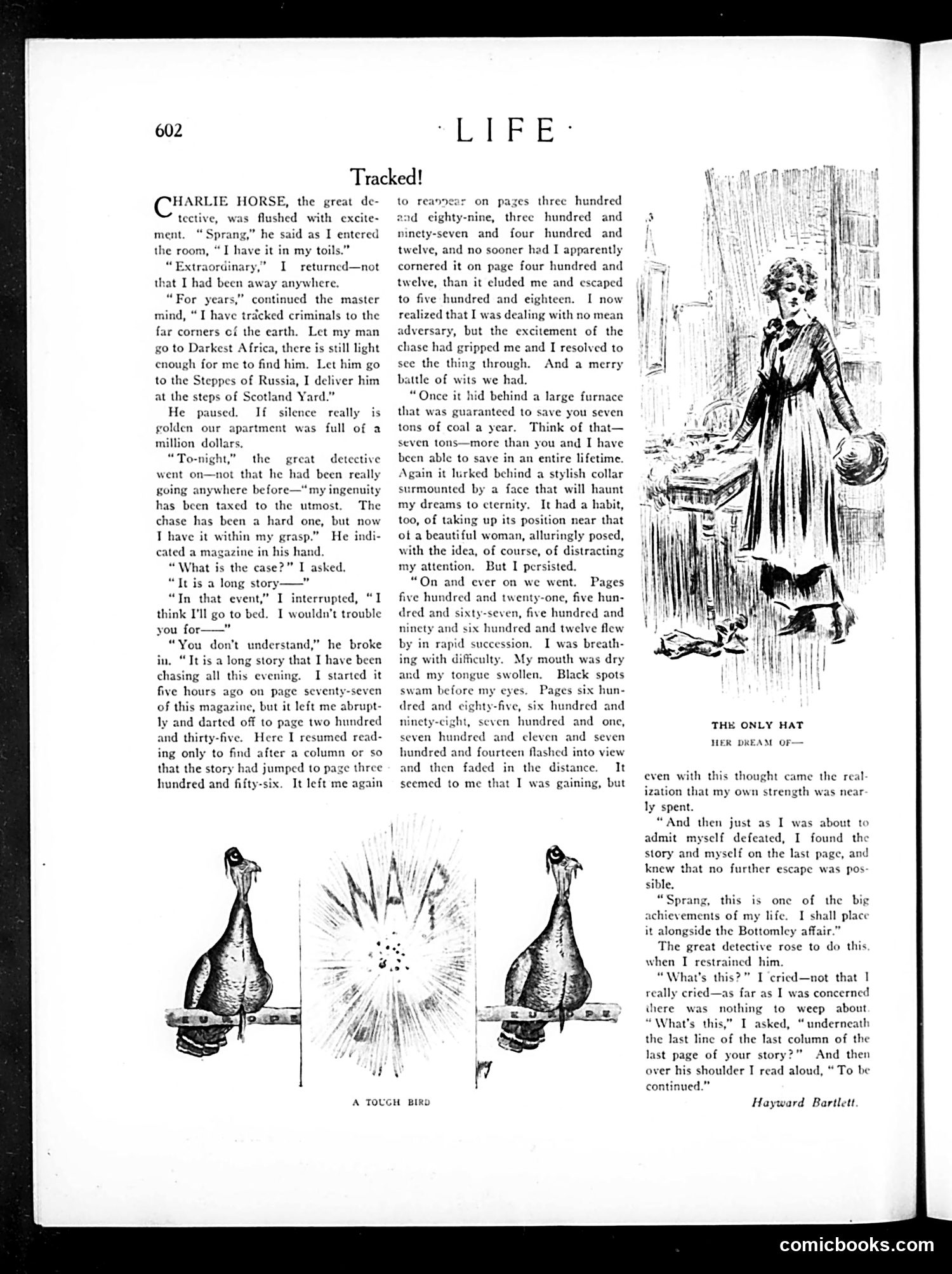
This is a humorous short story by Hayward Bartlett mocking the frustrating experience of reading serialized fiction in magazines like *Life*. The narrator describes "Charlie Horse," a celebrated detective, pursuing what he believes is a criminal—but it's actually a magazine story that jumps chaotically between non-consecutive pages (77, 235, 300+, etc.). The "chase" becomes a comedic metaphor for the reader's exasperating hunt through the publication. The satire targets two things: **magazine advertising** and **serialization practices**. Stories were deliberately fragmented across pages to force readers past advertisements—the real money-makers. The furnace ad, fashion collar advertisement, and beautiful woman imagery the detective encounters while pursuing the story are actual ads interrupting the narrative. The final punchline—"To be continued"—extends the frustration indefinitely, ensuring readers will return next issue and encounter more ads. The accompanying cartoon "A Tough Bird" appears unrelated, showing an explosion around a stylized bird.
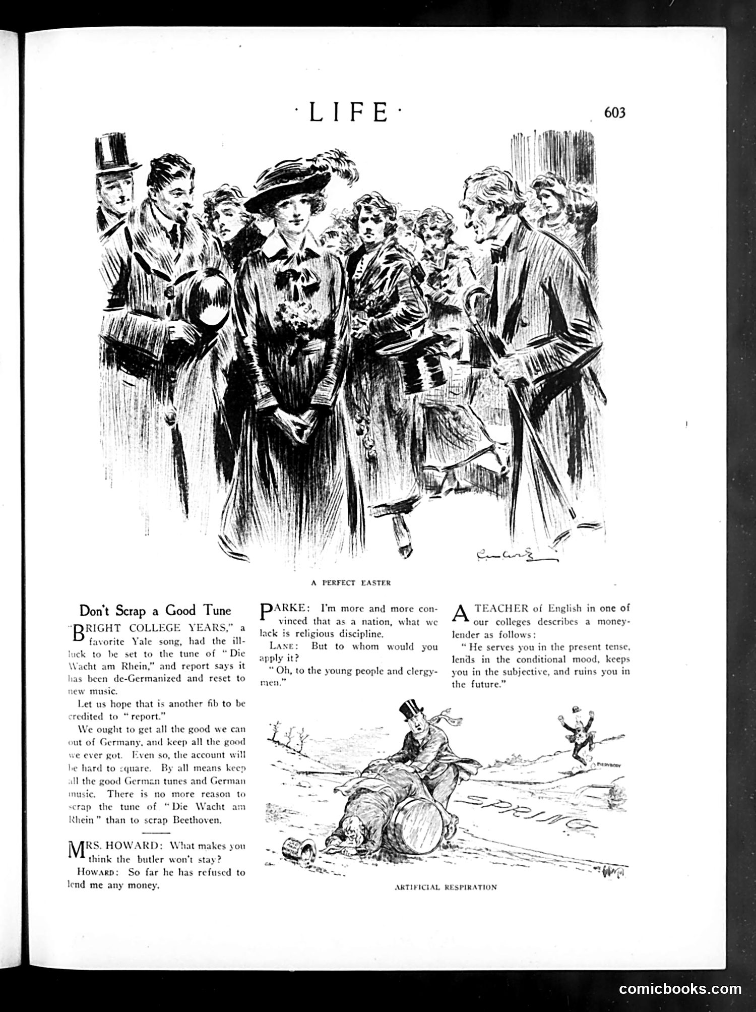
This page contains three separate satirical pieces from Life magazine, likely during or shortly after WWI. **"Don't Scrap a Good Tune"** argues against removing German music from American culture despite wartime hostility. It references "Die Wacht am Rhein" (a German patriotic song) and notes that a Yale song was reset to avoid German associations. The satire defends keeping valuable German compositions like Beethoven's work. **"A Perfect Easter"** mocks religious hypocrisy: a character advocates religious discipline for "young people and clergy" while presumably lacking it himself—the joke being his selective moralizing. **The money-lender joke** uses grammatical puns: the lender "serves in present tense, lends in conditional mood, keeps you subjective, and ruins you in future"—wordplay equating grammar with financial exploitation. The top illustration "A Perfect Easter" and "Artificial Respiration" cartoon appear to visualize these themes, though details are unclear from this reproduction.
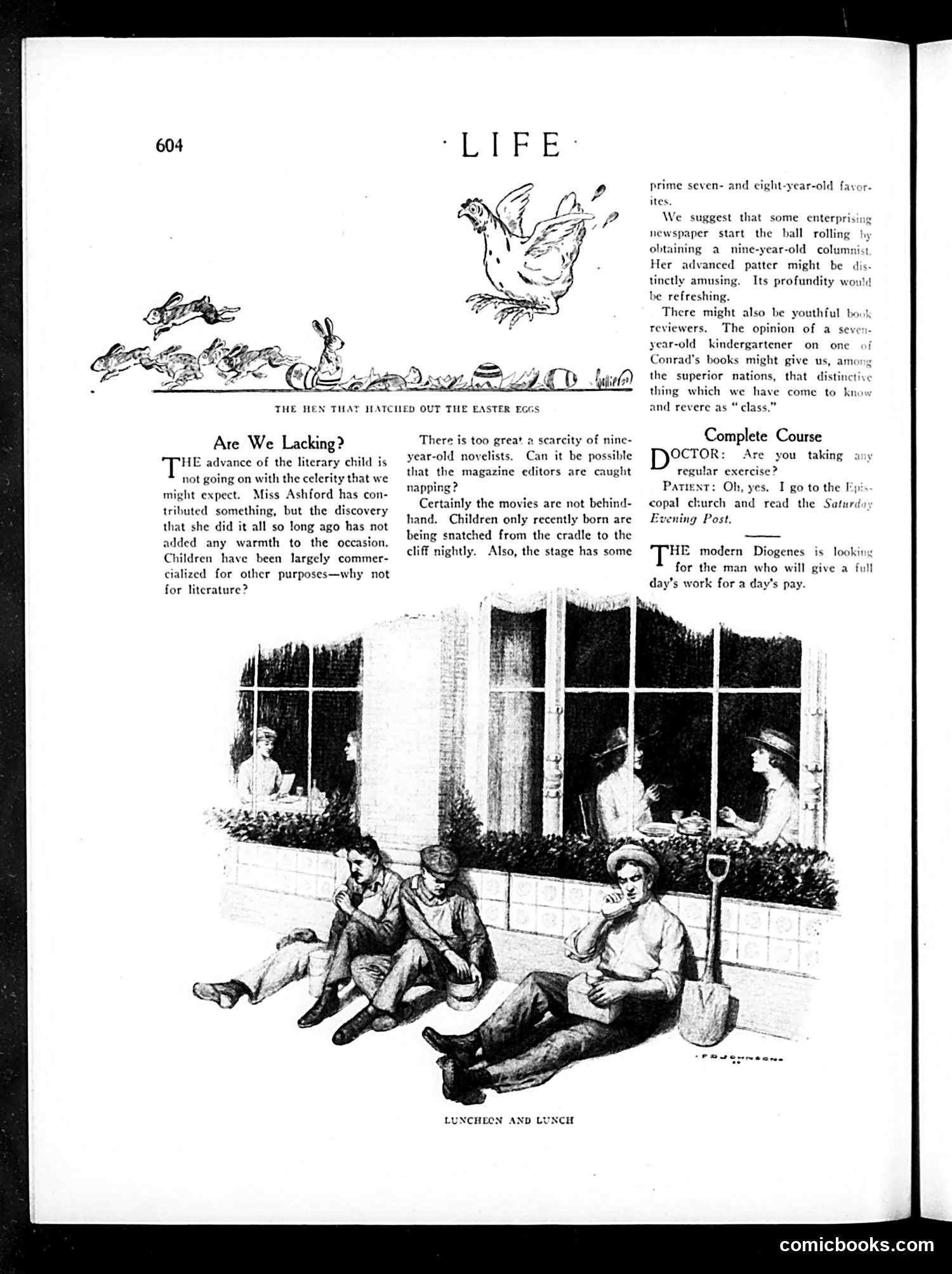
This page contains three distinct satirical pieces mocking early 20th-century American culture: 1. **"The Hen That Hatched Out the Easter Eggs"** (top illustration): A whimsical drawing satirizing the commercialization of childhood. The text argues that children are exploited for profit in movies and theater but neglected as literary contributors—sarcastically proposing newspapers hire nine-year-old columnists. 2. **"Are We Lacking?"** (main article): Critiques magazine editors for failing to discover child novelists, while film and stage industries eagerly exploit child performers. References Miss Ashford (likely the young author Daisy Ashford), mocking the gap between children's labor exploitation and their literary underutilization. 3. **"Complete Course"** and **"Luncheon and Lunch"** (brief jokes): Mock modern life—one suggests church and reading the *Saturday Evening Post* as exercise; the other jokes about the rarity of honest work-for-pay labor. The **"Luncheon and Lunch"** illustration shows working-class children at rest, contrasting the text's concerns about child labor commercialization.
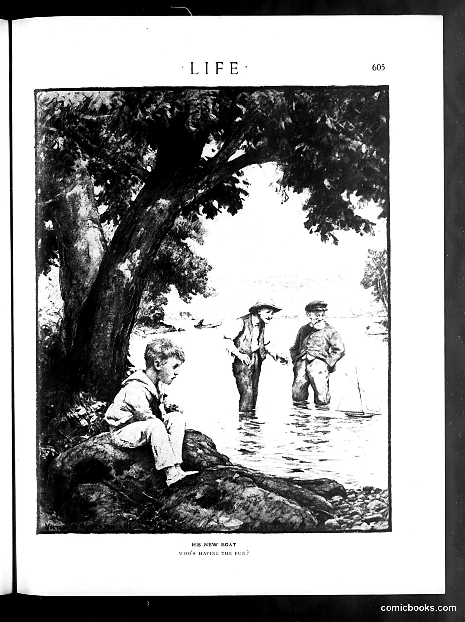
This illustration depicts three boys at a stream or shallow water. One boy sits alone on a rock beneath a large tree (left), while two others wade in the water with what appears to be a toy sailboat between them (right). The caption "His New Boat / Who's Having the Fun?" suggests social commentary on childhood experiences and possession versus enjoyment. The seated boy appears excluded from the activity despite owning the boat—the joke being that the other children are having more fun with his toy than he is. This likely satirizes how ownership doesn't guarantee enjoyment, or how children often have more fun *using* things communally than solitary possession allows. The illustration captures a relatable moment of childhood social dynamics and the irony of toy ownership.
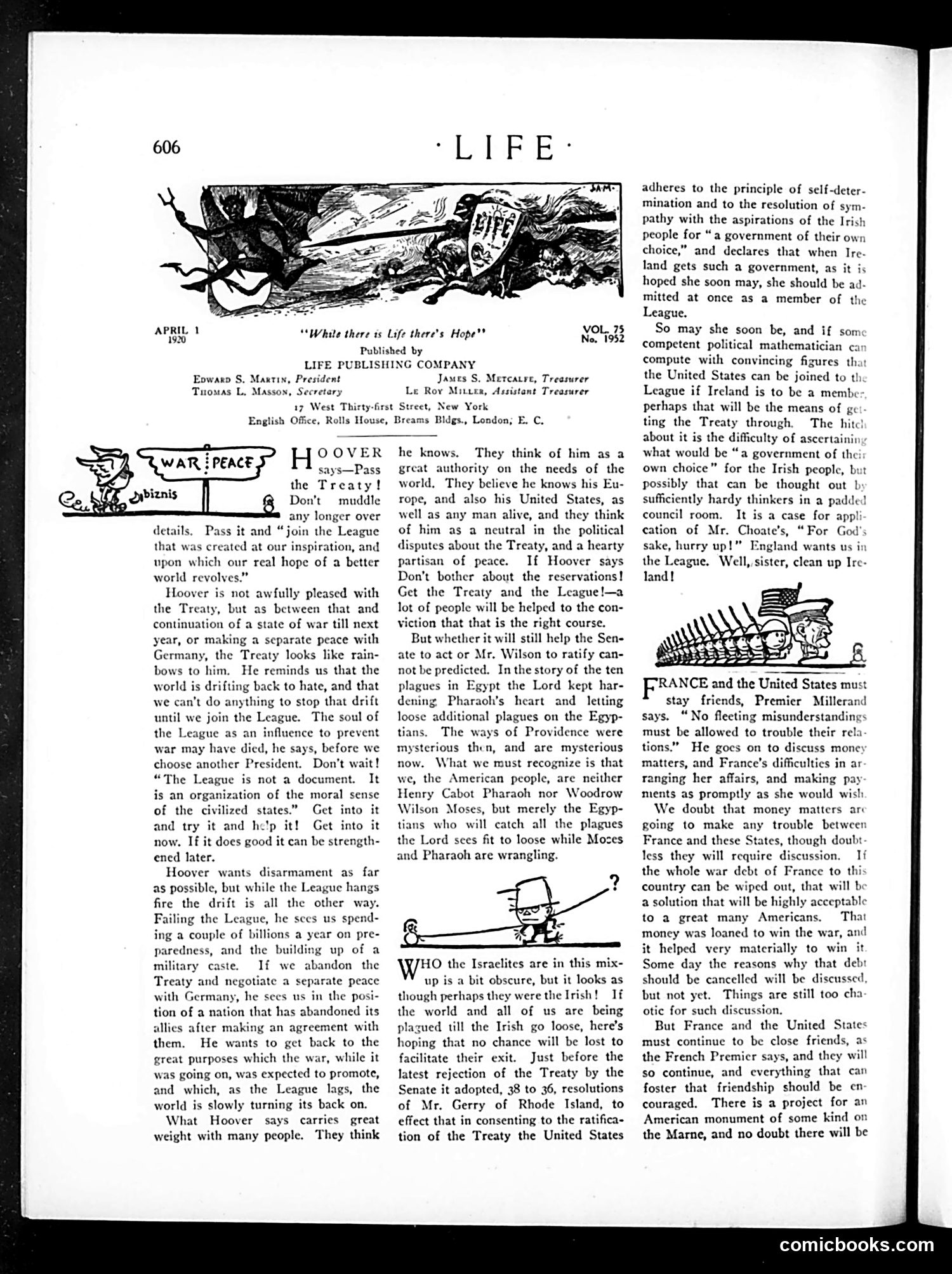
This page addresses post-WWI American politics, specifically the League of Nations treaty debate. The main text discusses Herbert Hoover's advocacy for ratifying the Treaty and joining the League, arguing it's necessary to prevent future war and moral drift. A secondary editorial satirizes the Senate's repeated rejection of the Treaty by comparing it to the Biblical plagues of Egypt. The author depicts Senators and President Wilson as "Pharaoh" and "Moses" respectively, with ordinary Americans as helpless "Egyptians" caught in their political dispute. The editorial sarcastically adds that Irish independence—apparently a complicating factor—will supposedly resolve everything. The cartoon (top left) depicts a graveyard/death imagery, likely referencing war's devastation and the failure of peace efforts. Overall, the page criticizes Congressional obstruction of Wilson's League of Nations as dangerous and absurd political theater.
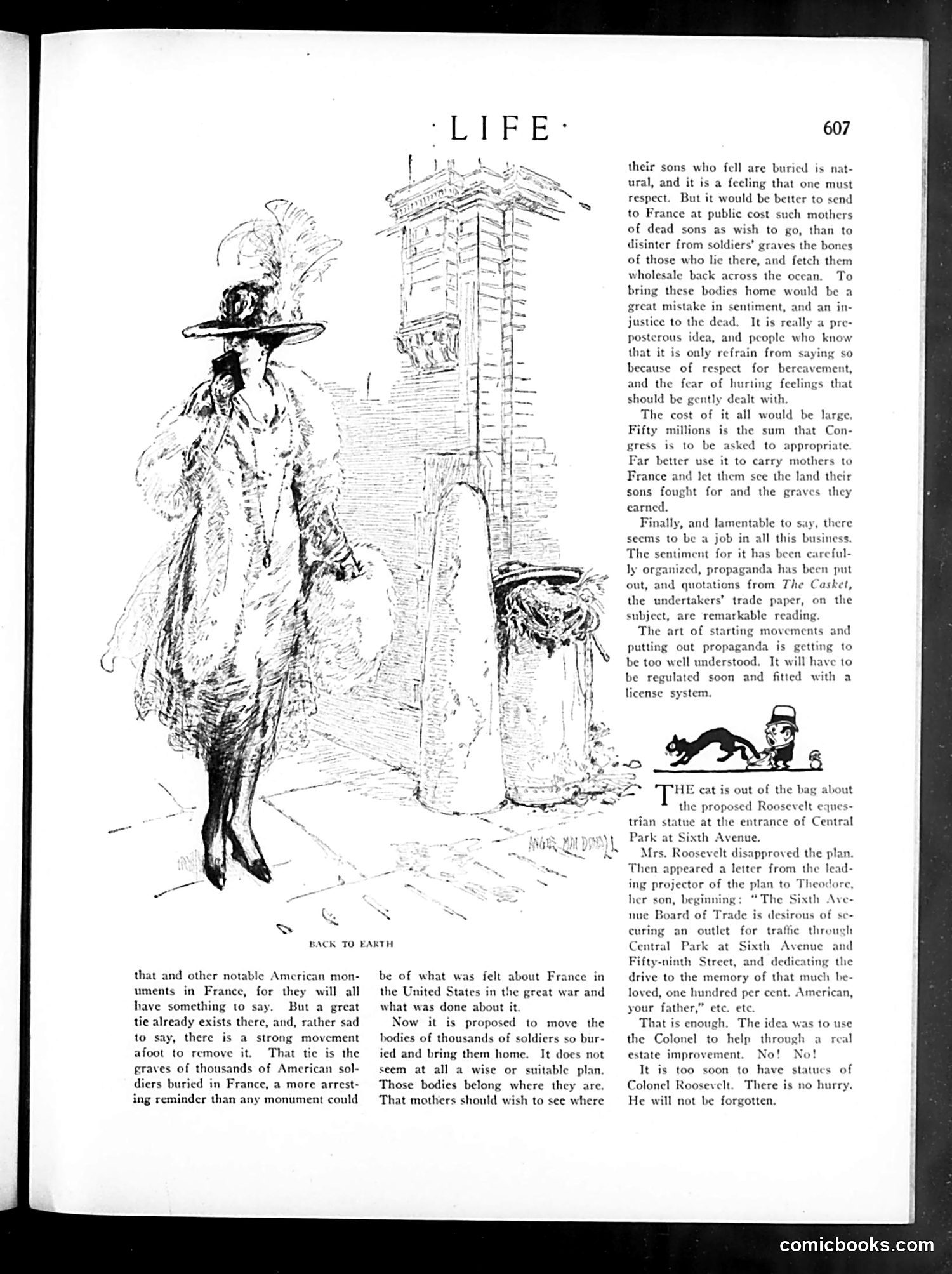
This page contains editorial satire about two post-WWI issues: **Main article**: Criticizes a proposal to exhume American soldiers' bodies buried in France and return them home. The author argues this is sentimentally misguided and wasteful ($50 million proposed). Instead, he suggests Congress fund trips for mothers to visit their sons' graves in France. He also attacks the organized propaganda campaign supporting the repatriation, particularly noting quotes from *The Casket* (an undertakers' trade publication), implying financial motives behind the movement. **Roosevelt Statue controversy**: Exposes that a proposed equestrian statue of Theodore Roosevelt at Central Park was actually a disguised real estate scheme—the project's leader wrote to Roosevelt's son framing it as honoring the deceased Colonel, but really sought to facilitate a traffic outlet for commercial development. The satirist condemns the manipulation. Both pieces critique organized manipulation of sentiment for profit or development purposes.
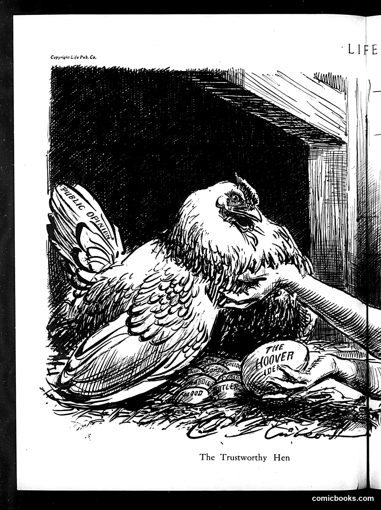
This political cartoon depicts an eagle (symbolizing America or American leadership) examining a hen labeled "The Hoover Hen." The hen sits among scattered items including what appears to be "Public Opinion" and references to "Hoover" and "Rugged Individualism." The satire likely critiques President Herbert Hoover's policies during the Great Depression. The "trustworthy hen" imagery suggests Hoover promoted self-reliance and private charity over government aid—a hen that would theoretically provide for itself and others. The eagle's scrutiny implies skepticism about whether these policies actually worked or were trustworthy, given economic hardship. The scattered materials suggest broken promises or failed expectations from Hoover's administration.
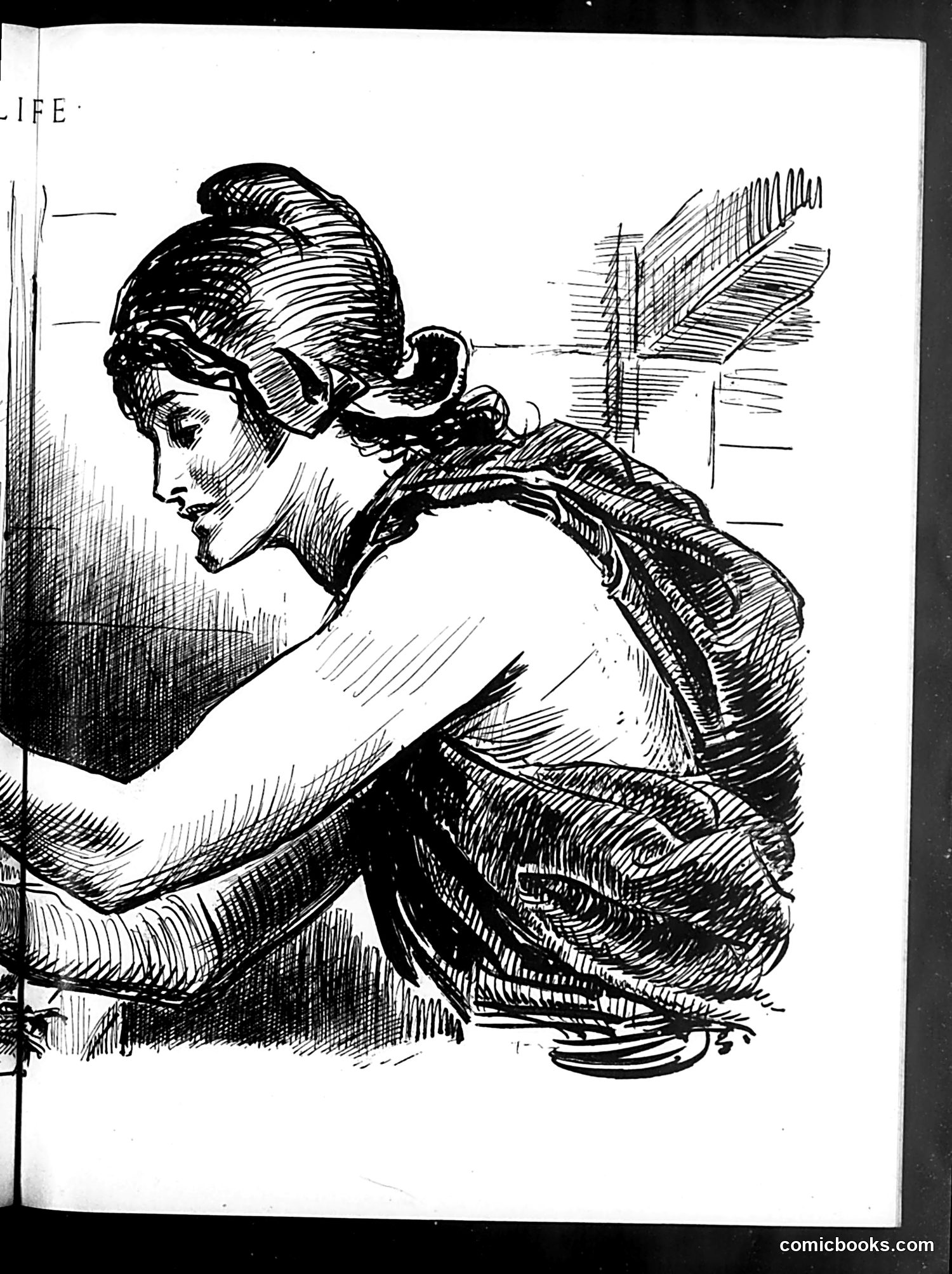
This appears to be a single ink-drawn illustration from *Life* magazine rather than a complete satirical cartoon with clear political messaging. The image shows a woman in profile, drawn in an elegant linear style typical of early-to-mid 20th century illustration. She wears her hair up in a fashionable style and is dressed in what appears to be a coat or jacket with decorative details. Without legible OCR text or identifying captions, I cannot determine the specific satirical point, the subject being referenced, or what social/political commentary this illustration intended. The artistic quality and *Life* publication context suggest social satire, but the specific target remains unclear from the image alone.
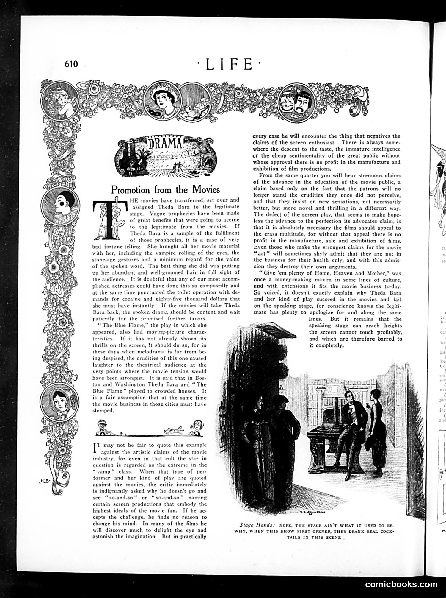
This article attacks actress **Theda Bara**, a famous silent-film "vamp" star attempting to transition to Broadway theater. The satire's core argument: movies have corrupted legitimate stage performance. The complaint is specific—Bara brought her exaggerated film mannerisms (melodramatic eye-rolling, primitive gestures, disregard for spoken dialogue) to the stage production "The Blue Flame." The author grudgingly admits she did one thing well: arranging her hair visibly during a toilette scene, which showed technical competence but hardly validates film-to-stage crossover. The broader critique attacks cinema's artistic claims. The author concedes films contain visual beauty but argues they're fundamentally compromised by their need to appeal to "the crass multitude" for profit. Even filmmakers admit this profit motive, undermining claims of artistic integrity. The famous maxim "Give 'em plenty of Home, Heaven and Mother" explains why lowbrow content succeeds commercially but fails artistically—a tension the author sees as insurmountable.
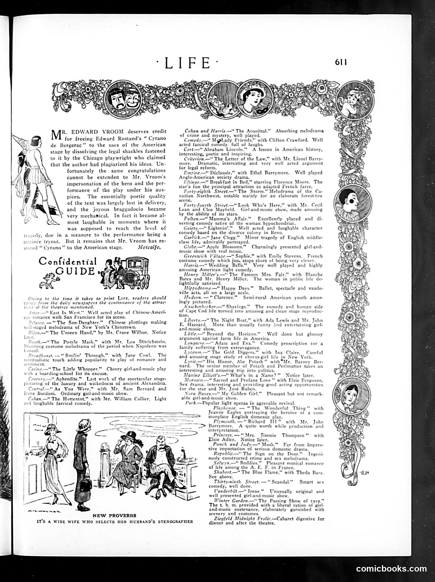
This is a **theater review and guide page** from Life magazine, primarily comprising capsule reviews of Broadway productions rather than political cartoons. The page opens with Edward Vroom's production of *Cyrano de Bergerac*, praising him for legally freeing the play from plagiarism claims by a Chicago playwright, though criticizing Vroom's own performance as lacking poetic quality and appearing "almost laughable." The bulk of the page is the "Confidential Guide"—brief reviews of contemporary Broadway shows. These include musicals (*Apple Blossoms*, *Wedding Bells*), comedies (*The Hottentot*, *Lightnin'*), dramas (*Abraham Lincoln*), and melodramas. The reviews note acting quality, plot, and entertainment value. **Bottom illustration**: Shows three figures in what appears to be an office or domestic setting, captioned "It's a wise wife who selects her husband's stenographer"—a joke about marital fidelity and workplace relationships, reflecting period anxieties about attractive female office workers. The page reflects early 1920s American theater and contemporary social humor.
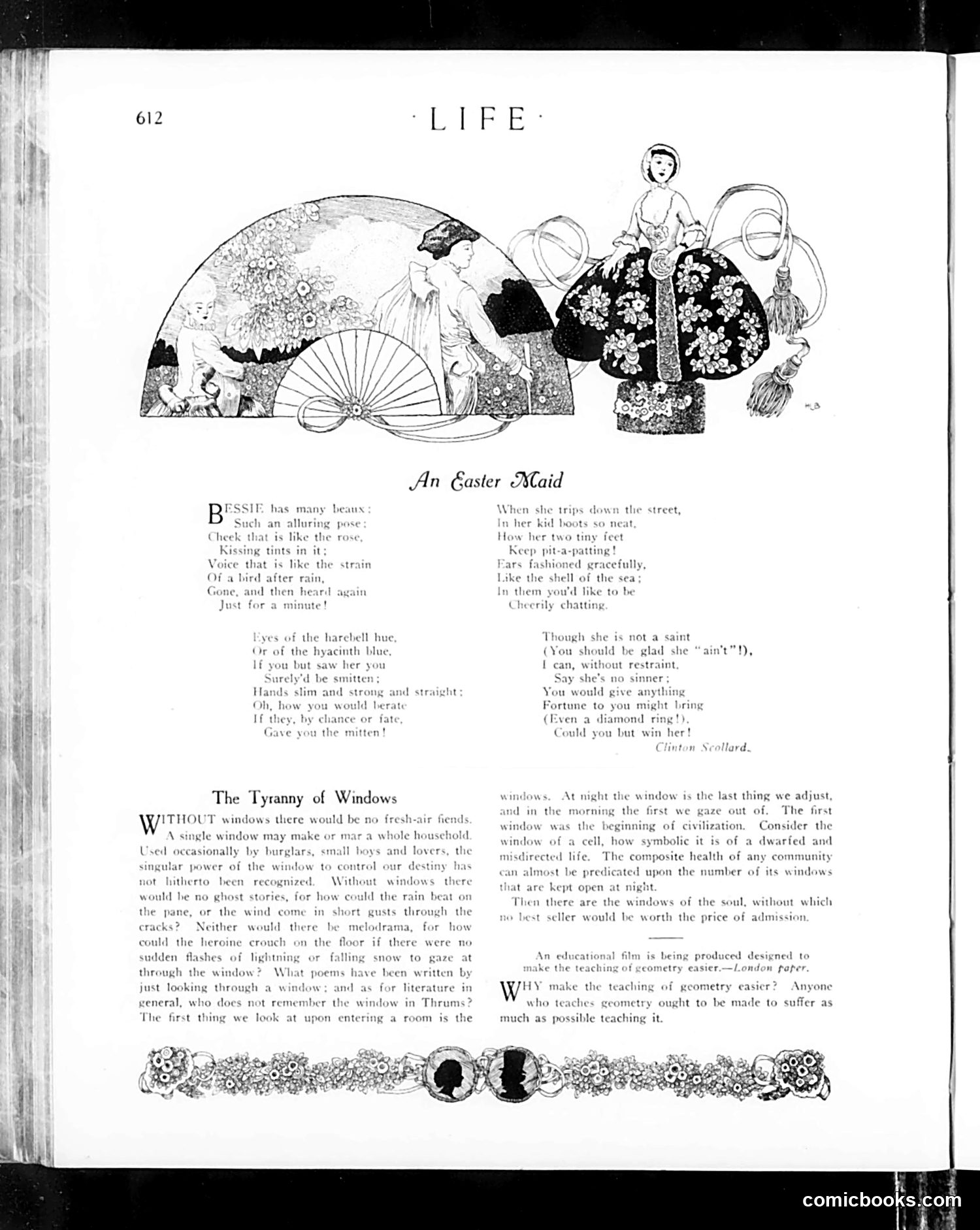
**"An Easter Maid"** is a poem celebrating a fashionable young woman ("Bessie") with desirable qualities—lovely eyes, graceful bearing, tiny feet. The accompanying illustration shows her in elegant Easter attire with a decorative fan and fashionable coat, embodying the idealized "Gibson Girl" aesthetic popular in early 20th-century America. The poem humorously catalogs her charms while playfully suggesting she's neither saint nor sinner, but charming enough to make a suitor overlook her faults. **"The Tyranny of Windows"** is an essay arguing that windows symbolize freedom and civilization—both literally (fresh air, light) and metaphorically (openness, hope). The author suggests a community's health correlates with how many windows remain open at night. Windows also matter to literature and storytelling. The piece is partly satirical social commentary on how such small details reveal character and condition. Both pieces reflect genteel, lighthearted *Life* magazine content aimed at educated readers interested in fashion, romance, and philosophical musings.
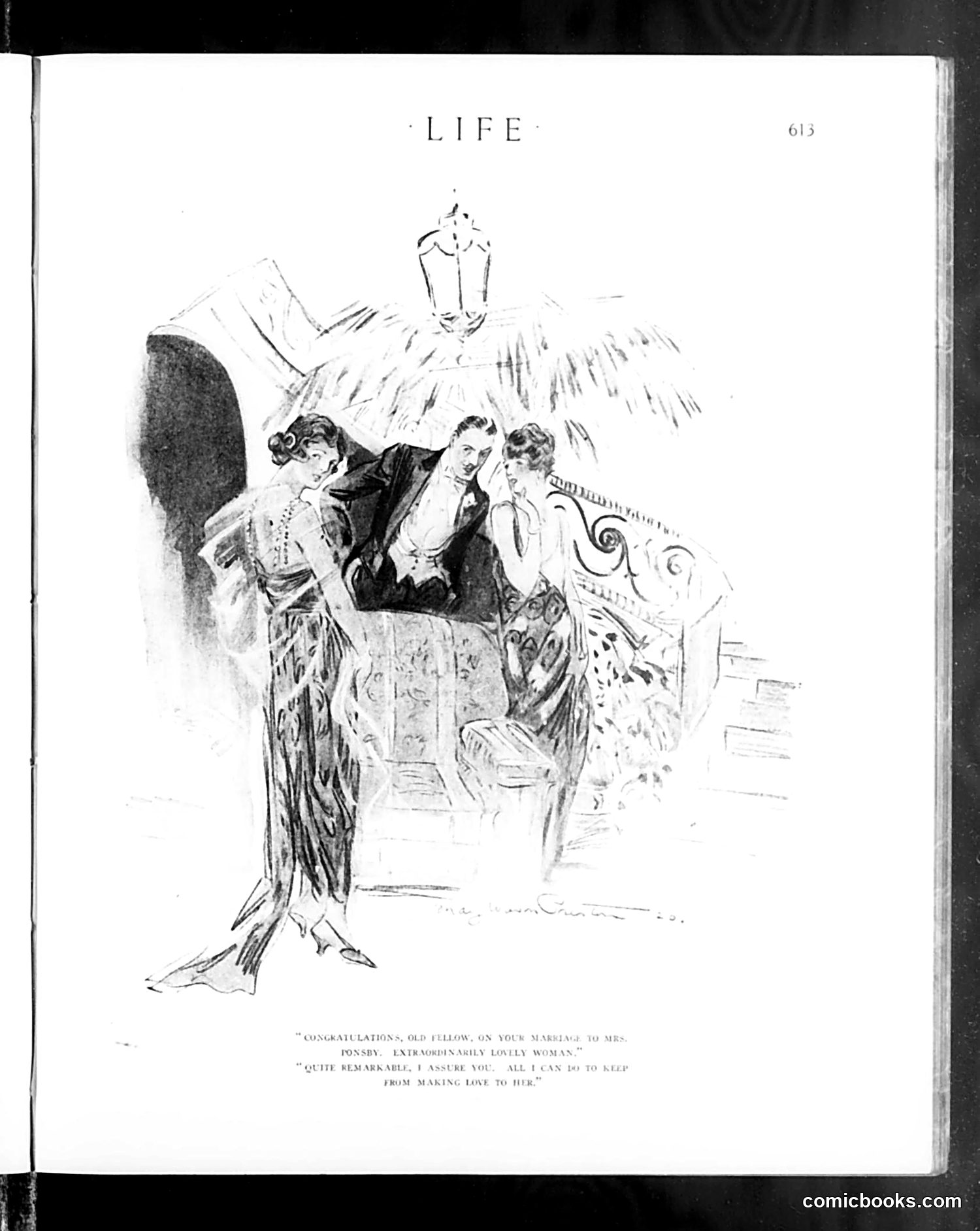
This page contains a satirical illustration depicting a social scene with four figures. The caption reads: "CONGRATULATIONS, OLD FELLOW, ON YOUR MARRIAGE TO MRS. PONSBY. EXTRORDINARILY LOVELY WOMAN." / "QUITE REMARKABLE, I ASSURE YOU. ALL I CAN DO TO KEEP FROM MAKING LOVE TO HER." The cartoon appears to satirize marital infidelity and impropriety among wealthy society. A man congratulates another on his marriage, who then boasts—shockingly for the era—about his difficulty restraining himself from romantic advances toward his own wife. The humor derives from this frank admission of desire crossing social boundaries of propriety and restraint expected of gentlemen. The elegantly dressed figures and ornate interior suggest upper-class setting, making the crude sentiment a commentary on hypocrisy within refined society.
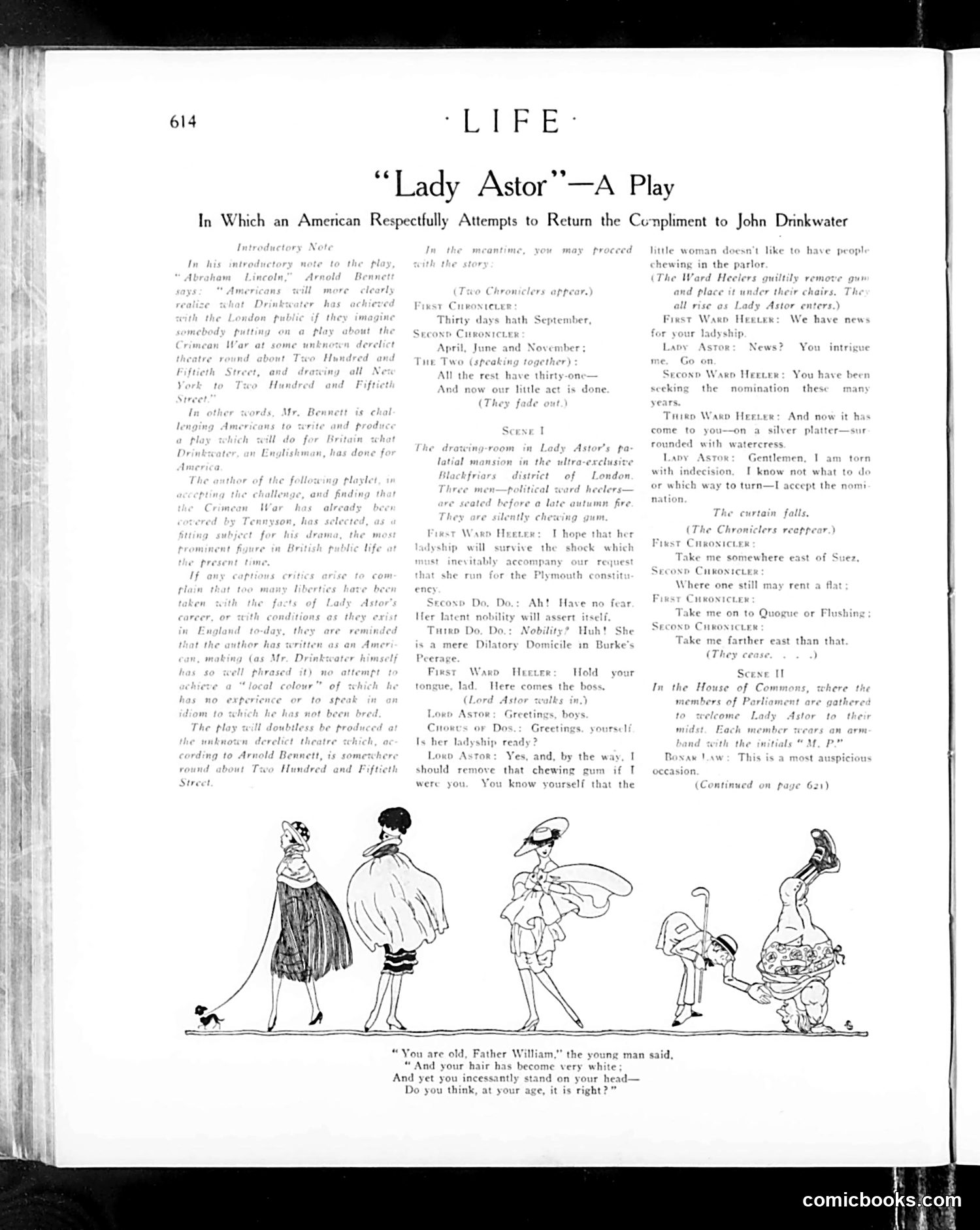
This 1920s *Life* magazine page satirizes Lady Astor, the first female Member of Parliament in Britain, through a theatrical parody titled "Lady Astor." The subtitle indicates it's "an American respectfully attempting to return the compliment to John Drinkwater"—referencing Drinkwater's play "Abraham Lincoln," which presented an American historical figure to British audiences. The satire mocks Lady Astor's prominence and manner by reimagining her in a theatrical setting with Parliament members. The bottom illustration quotes Lewis Carroll's "Father William" poem, suggesting the piece uses literary parody to critique her age and authority—implying skepticism about an older woman holding political power. This reflects 1920s attitudes: while American media applauded women's suffrage, they simultaneously ridiculed prominent female politicians, particularly British ones, as inappropriate or absurd. The playful tone masks underlying sexism about women in government.
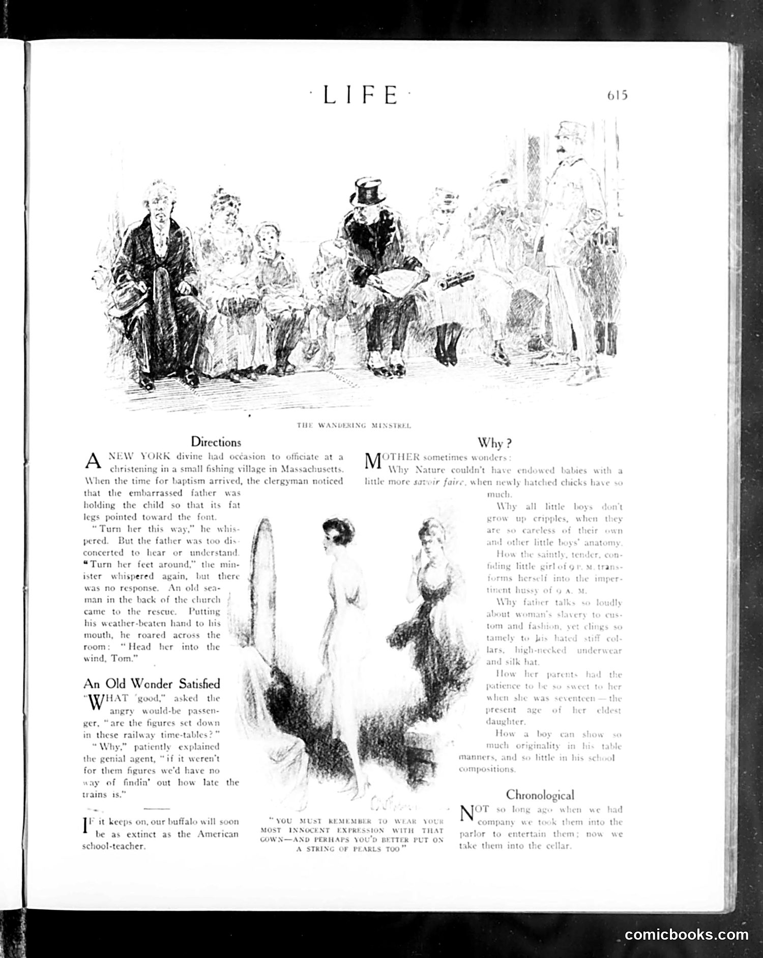
This page contains three separate humorous anecdotes illustrated with sketches, typical of Life magazine's satirical format. **"The Wandering Minstrel"** (top): A clergyman attempts to baptize a child while the confused father holds the infant incorrectly oriented toward the baptismal font. The joke satirizes rural incompetence and miscommunication—the father cannot understand simple directions, and requires a bystander to literally shout instructions across the church. **"An Old Wender Satisfied"** (middle): A railroad passenger complains that timetables are useless. An agent responds that without the numbers, travelers would have no way to calculate how late trains actually run—implying chronic unreliability is accepted as normal. The satire mocks both railroad inefficiency and passenger resignation to poor service. **Bottom section**: References pearls and innocent expressions (text partially unclear from OCR), likely another brief joke about social pretension or hypocrisy. All three pieces employ situational humor targeting institutional incompetence and human foolishness rather than specific political targets.
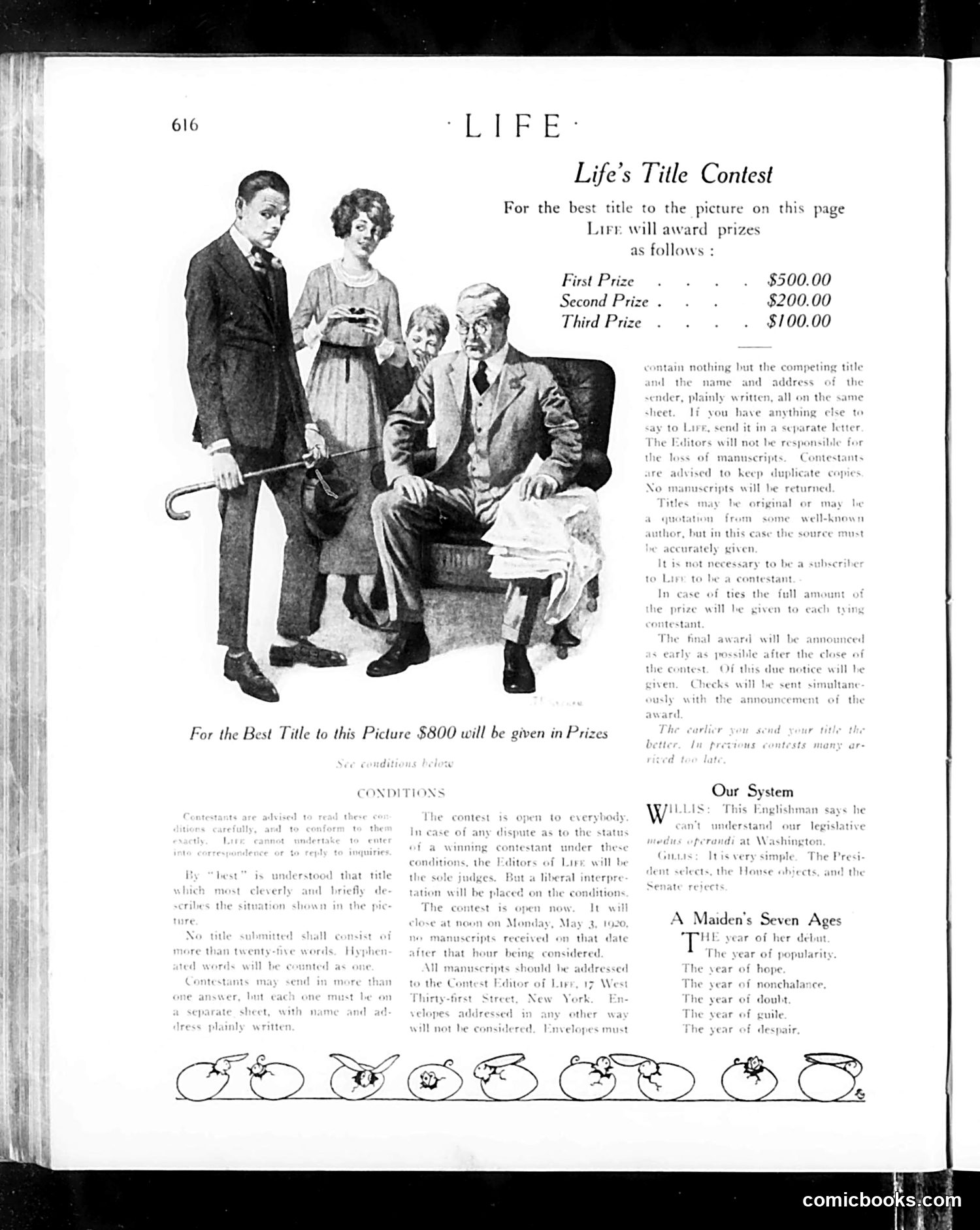
This page is primarily a **contest announcement**, not a political cartoon. Life magazine is soliciting reader-submitted titles for the illustration shown—a domestic scene depicting four figures: two men (one standing with a cane, one seated reading), a woman, and a child. The image appears to depict a **family or household scenario**, though without the contest's winning title, the specific satirical point is unclear to modern readers. The humor likely depends on the situation's absurdity or irony, which the title would make explicit. The page includes standard contest rules (word limits, submission format, deadline of May 2, 1926) and concludes with two unrelated short pieces: "Our System" (about an Englishman's view of American government) and "A Maiden's Seven Ages" (listing life stages). **Key point**: This functions as interactive satire—readers were meant to *complete* the joke by proposing titles, making the commentary participatory rather than fixed.
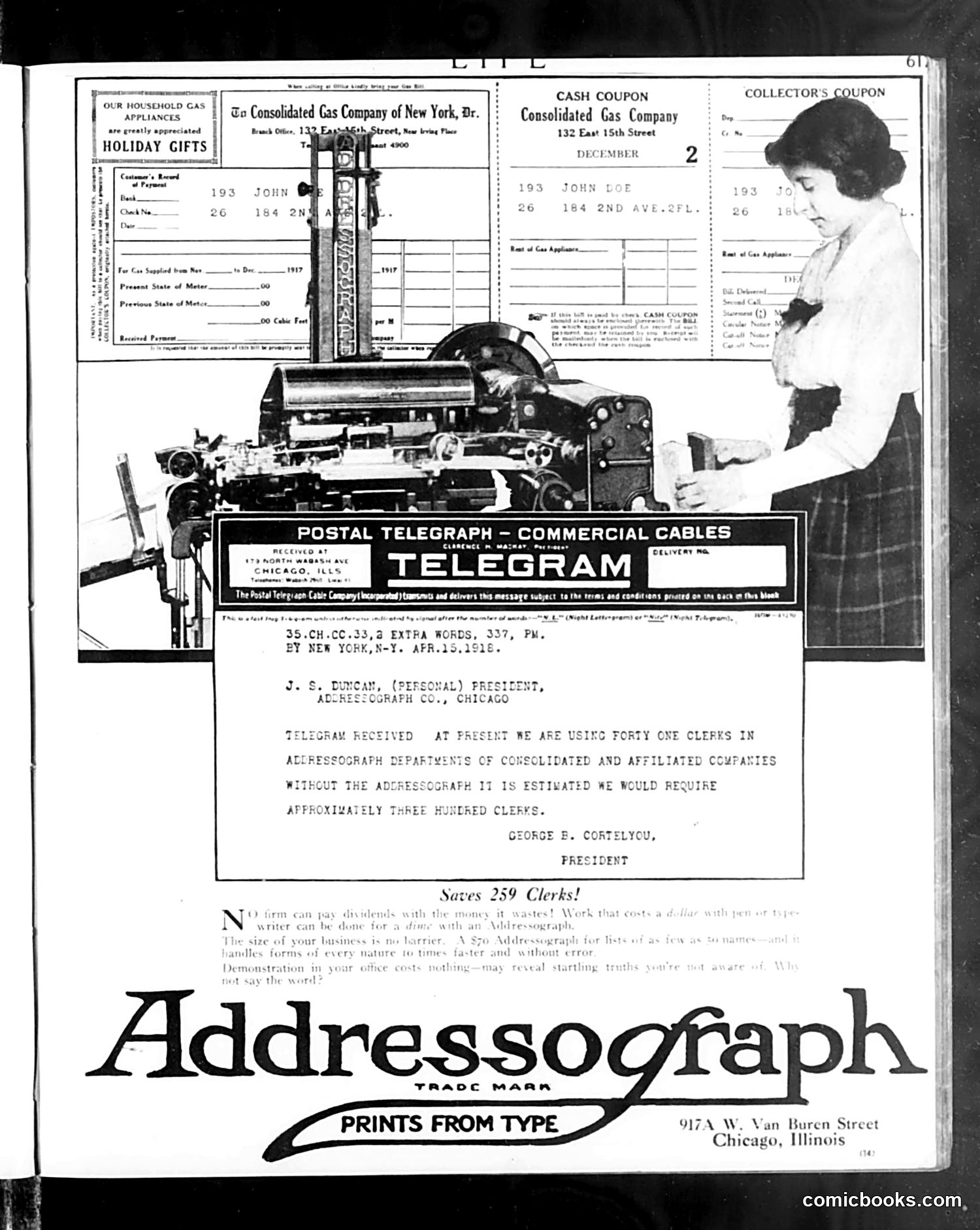
This page is **primarily advertising**, not editorial content or satire. The main elements are: 1. **Gas company coupons and bills** (top) — household utility documents from Consolidated Gas Company of New York, promoting "holiday gifts" 2. **A telegram** (center) — a business communication from April 15, 1916, to J.S. Duncan at Addressograph Co. in Chicago, discussing clerical staffing needs across multiple departments. The telegram notes they currently use 41 clerks and would need approximately 300 more without an addressograph machine. 3. **Addressograph advertisement** (bottom) — promoting their machine as a time-saving, labor-reducing device that could handle addressing tasks faster than manual clerks. The headline claims "Saves 259 Clerks!" **The point**: This is an integrated advertisement using a fake telegram to demonstrate the Addressograph machine's practical business value by showing how many clerical workers it could replace—a sales pitch to efficiency-conscious corporate managers of the era.
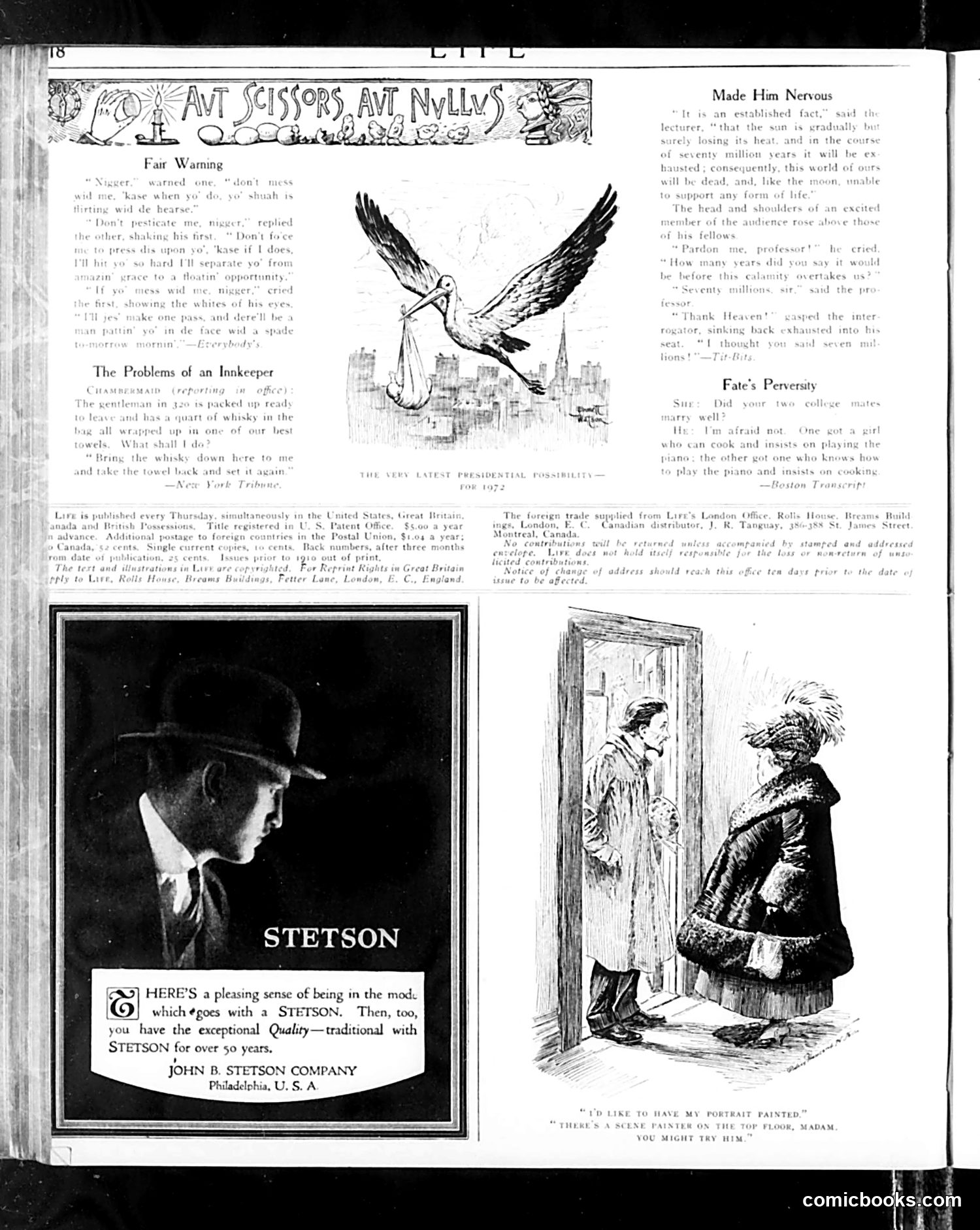
This page contains **three distinct humor pieces** typical of Life's satirical content: 1. **"Fair Warning"** (top left): A dialogue between a man and a woman where he threatens to leave her if she nags him. The joke plays on marital discord and traditional gender dynamics. 2. **"The Problems of an Innkeeper"** (middle left): A brief anecdote (source: *New York Tribune*) about whisky delivery, likely satirizing Prohibition-era complications for innkeepers operating under legal restrictions. 3. **"Fate's Perseverity"** (right): A brief exchange mocking a man's dating failures—his two college acquaintances with opposite talents (one cooks, one plays piano), implying his romantic misfortune. The bottom illustration shows a woman asking a man to have her portrait painted by a scene painter on the top floor—likely a joke about artistic pretension or unconventional choices. The **Stetson advertisement** is a separate commercial feature, unrelated to the editorial content. All pieces employ mild, domestic humor typical of 1920s Life magazine.
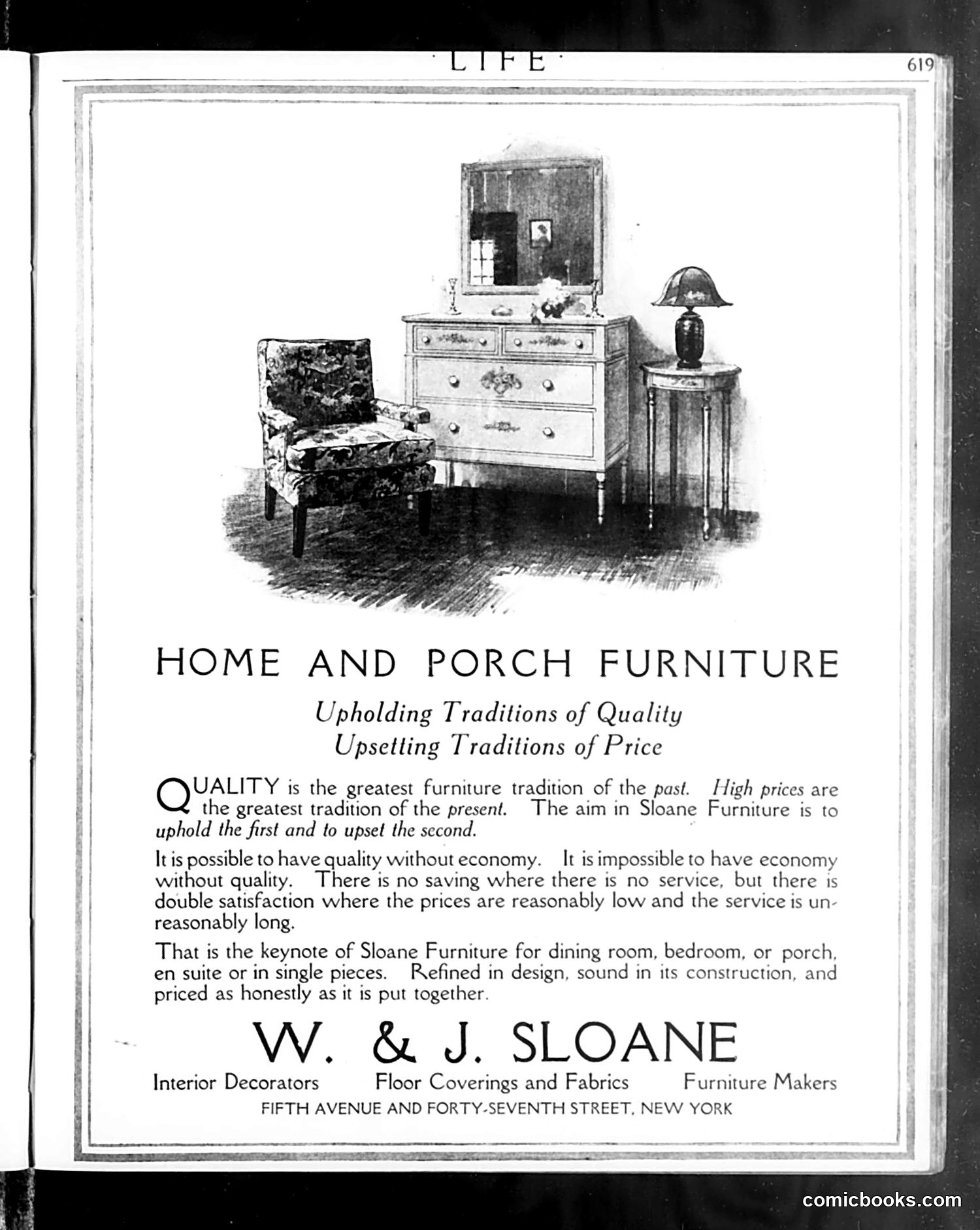
The page from *Life* magazine features a full-page ad for W. & J. Sloane, a New York furniture company. The illustration shows bedroom furniture (a chair, dresser with mirror, and side table with lamp) arranged as a display. The "satire" is rhetorical rather than visual: the ad's headline plays on irony by claiming to "upset traditions of price" while "upholding traditions of quality." The copy argues that quality and affordability aren't mutually exclusive—that Sloane offers good design and construction at "reasonably low" prices with "unreasonably long" service. This appears to be early-to-mid 20th century advertising that uses clever wordplay to position the brand as breaking the convention that quality furniture must be expensive. There are no political references or caricatures—just commercial persuasion dressed in witty language.
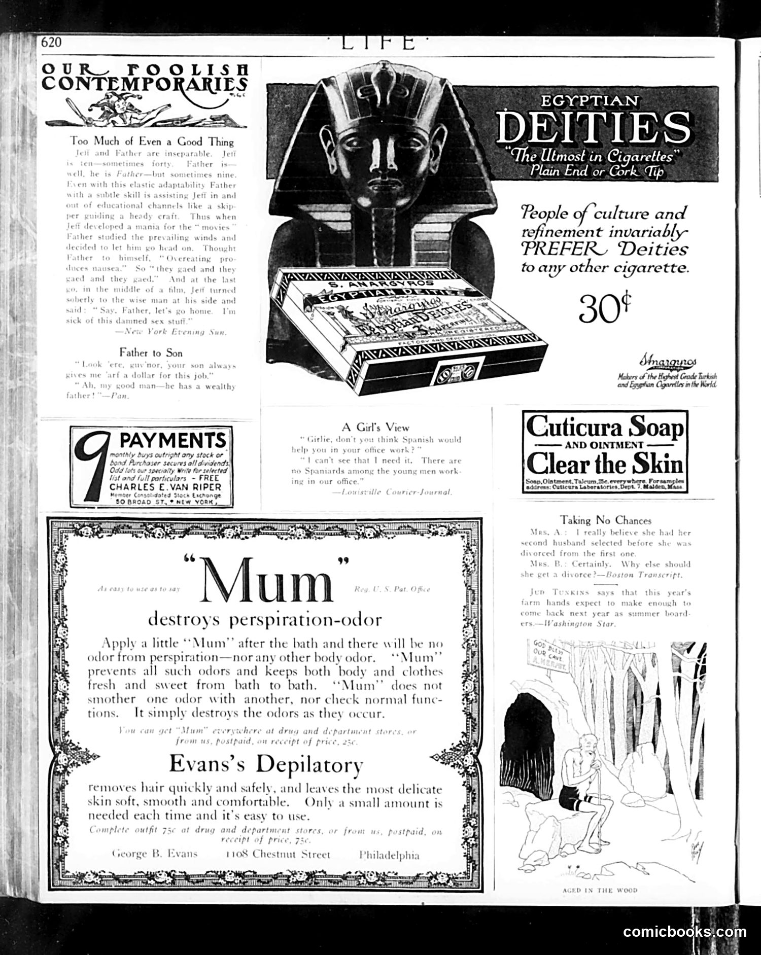
This page is primarily **advertising**, not political satire. The dominant content includes: 1. **Egyptian Deities cigarettes ad** (top right): Features an Egyptian pharaoh's mask. The copy claims people of "culture and refinement" prefer this brand—a common advertising strategy using aspirational messaging and vague appeals to sophistication. 2. **"Our Foolish Contemporaries"** (top left): A small satirical column with anecdotes mocking everyday behavior, including a story about a father and son's dialogue about work and wealth. 3. **Personal care product ads**: For "Mum" deodorant, Cuticura Soap, and Evans's Depilatory—all targeting bodily anxieties common to the era (perspiration, skin blemishes, unwanted hair). The page reflects **early-to-mid 20th century consumer culture**, where advertisements exploited insecurities while simultaneously promising self-improvement through purchasing. The Egyptian imagery was fashionable following King Tutankhamun's tomb discovery (1922), making it a contemporary cultural reference point for marketing "exotic" luxury goods.
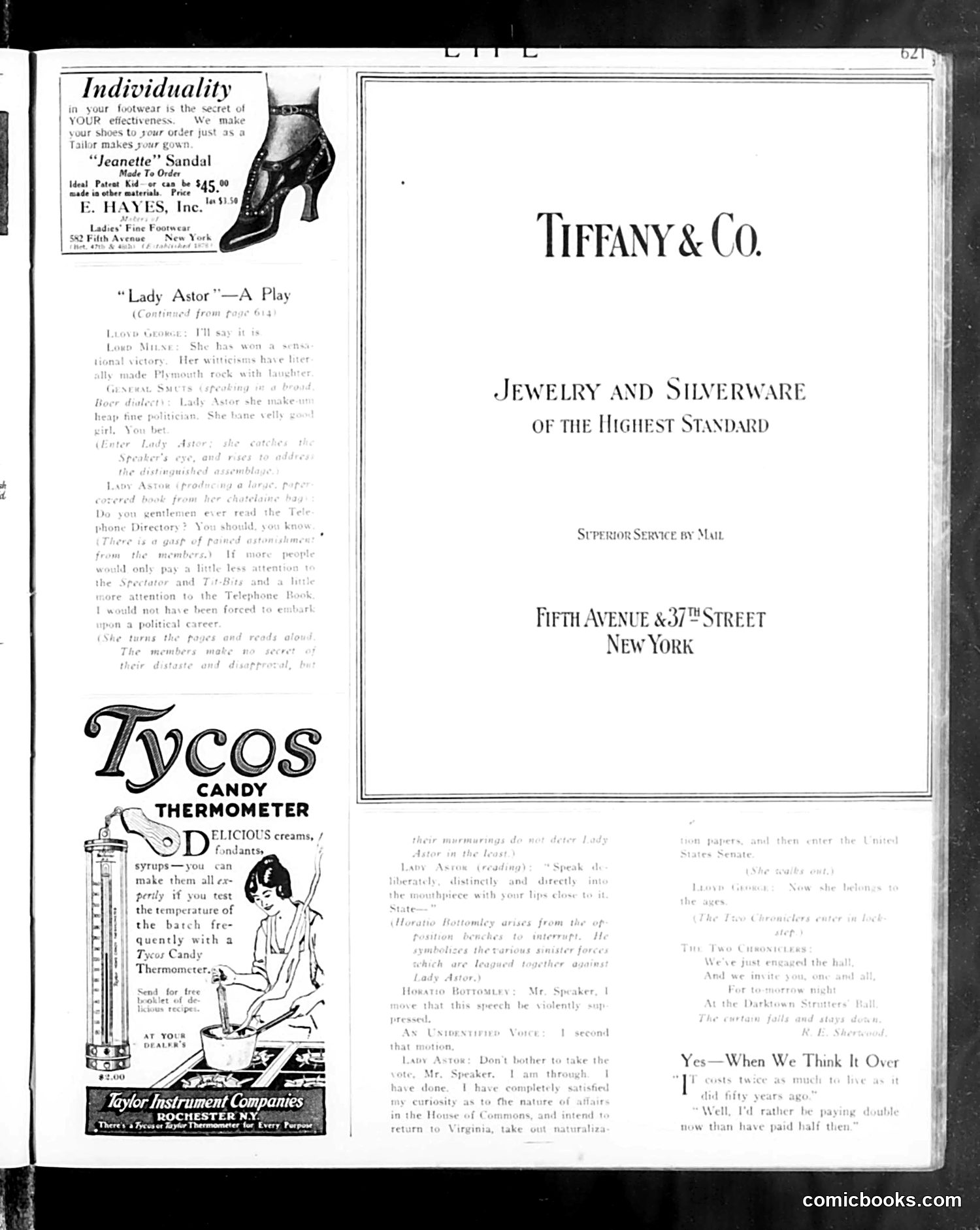
This page is primarily advertising and a magazine title page rather than political satire. It features: **Tiffany & Co.** advertisement (right): A luxury jewelry and silverware company promoting mail-order service from their Fifth Avenue location in New York. **E. Hayes, Inc.** (top left): An advertisement for custom-made "Jeanette" sandals priced at $45.00. **Tycos Candy Thermometer** (bottom left): An advertisement for a novelty thermometer designed to test candy temperature during cooking, marketed by Taylor Instrument Companies in Rochester, NY. **"Lady Astor—A Play"** (left column): A continuation of theater criticism discussing the play's plot and characters. **"Yes—When We Think It Over"** (bottom right): A brief poetic verse, likely concluding a longer piece from an earlier page. The page contains no discernible political cartoons or social satire—it's a standard magazine layout mixing editorial content with period advertisements.
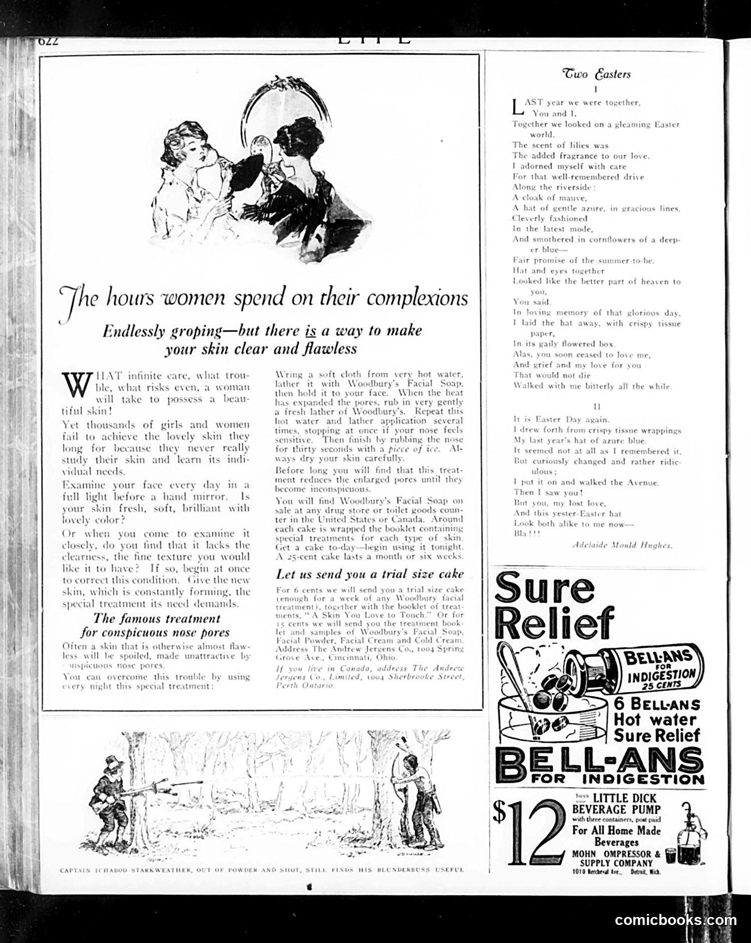
This page contains **no political cartoon**. Instead, it features: **Main Content:** A Woodbury's Facial Soap advertisement disguised as editorial advice. The text addresses women's skincare concerns—particularly enlarged nose pores—and promotes a specific beauty treatment regimen using their products. This reflects early 20th-century advertising strategy of embedding product promotion within lifestyle editorial. **Poetry Section:** "Two Easters" by Adelaide Mould Hughes, a sentimental poem about romantic memory and lost love, typical of the era's literary fare. **Sidebar Ads:** Bell-Ans antacid and a Little Dick beverage pump advertisement. The page exemplifies how Life magazine (primarily a humor and satire publication) also carried substantial advertising and serious content. The skincare article's tone—treating complexion care as a scientific/medical matter requiring specific treatments—reflects period attitudes toward beauty as both a woman's duty and a solvable consumer problem.
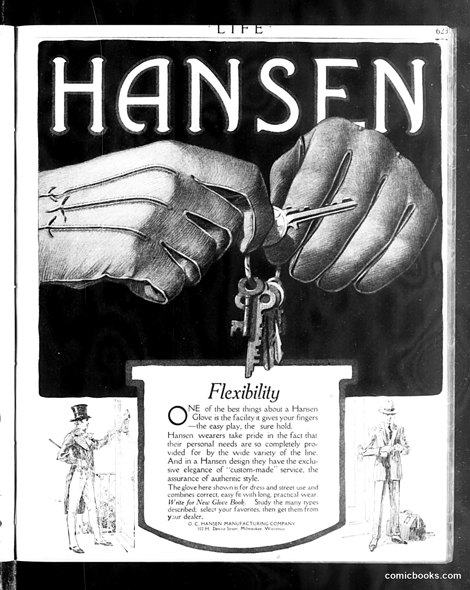
This is primarily a **glove advertisement**, not a political cartoon. The page advertises Hansen Manufacturing Company's gloves, emphasizing their flexibility and quality craftsmanship. The visual imagery shows two hands demonstrating the glove's flexibility by holding keys—a practical metaphor for reliability and ease of use. Two illustrated figures in fashionable dress flank the text, representing the gloves' appeal for "dress and street use." The "satire" here, if any exists, is gentle commercial messaging typical of early 20th-century advertising: Hansen gloves are presented as offering "custom-made" elegance and service to meet varied personal needs. The text invites readers to request a "New Glove Book" to browse styles before purchasing from dealers. There are no identifiable political figures or social commentary—this is straightforward product marketing disguised within *Life* magazine's pages.
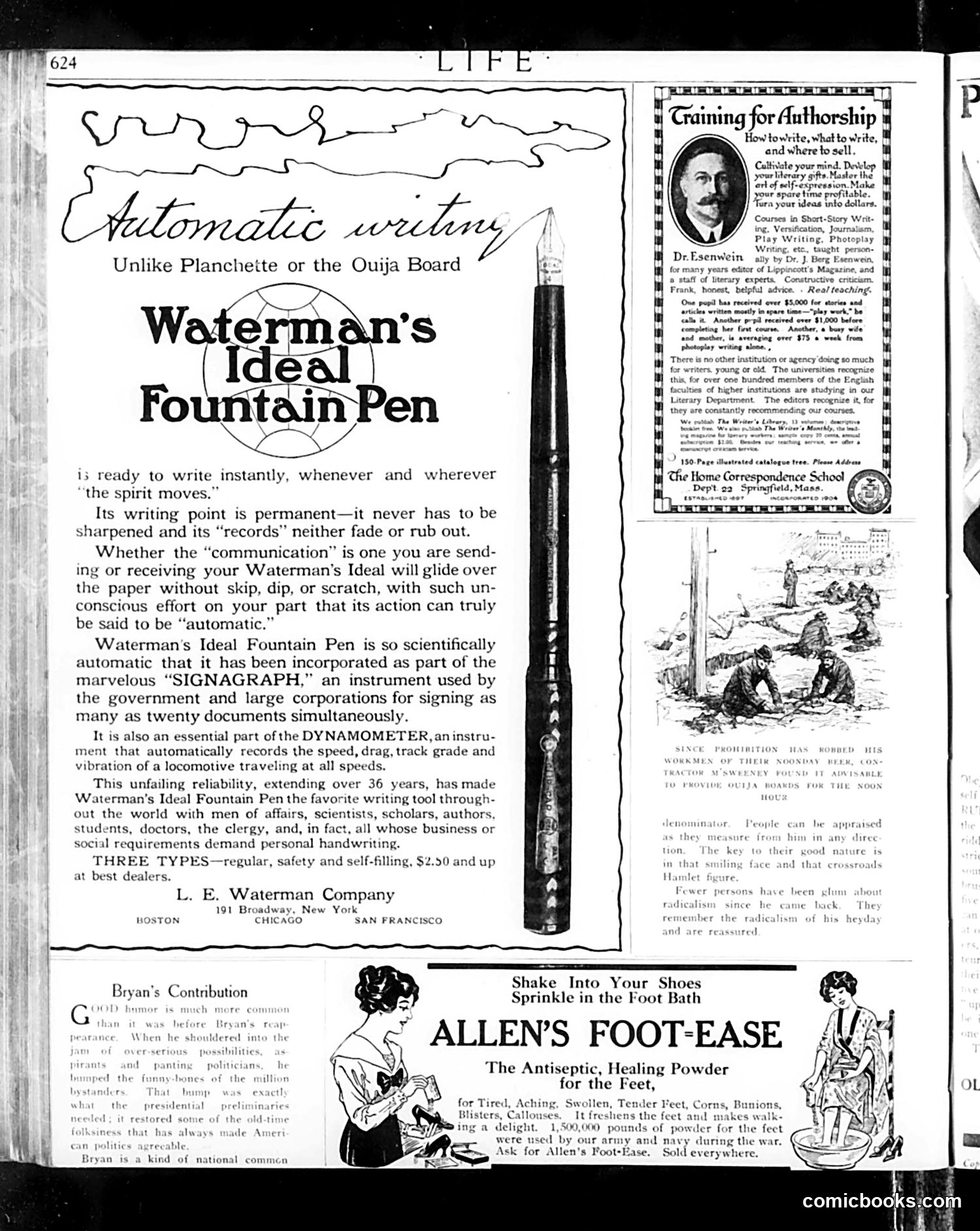
This page is primarily **advertising content** rather than political satire or comics. The dominant advertisement promotes **Waterman's Ideal Fountain Pen**, positioning it as superior to spiritualist divination tools like Planchettes or Ouija Boards—a humorous comparison suggesting the pen is the only "automatic writing" device one needs. The ad claims the pen's reliability is so remarkable it's used by government and corporations for official document signing. Secondary advertisements include a **correspondence school** offering writing instruction for aspiring authors, and **Allen's Foot-Ease powder**, a foot treatment marketed as having military use. The only text block with social commentary is "Bryan's Contribution," which briefly discusses humor in politics, likely referencing William Jennings Bryan, though the passage is fragmentary and context is unclear from this excerpt alone. Overall, this reflects early 20th-century magazine advertising conventions rather than satirical content.
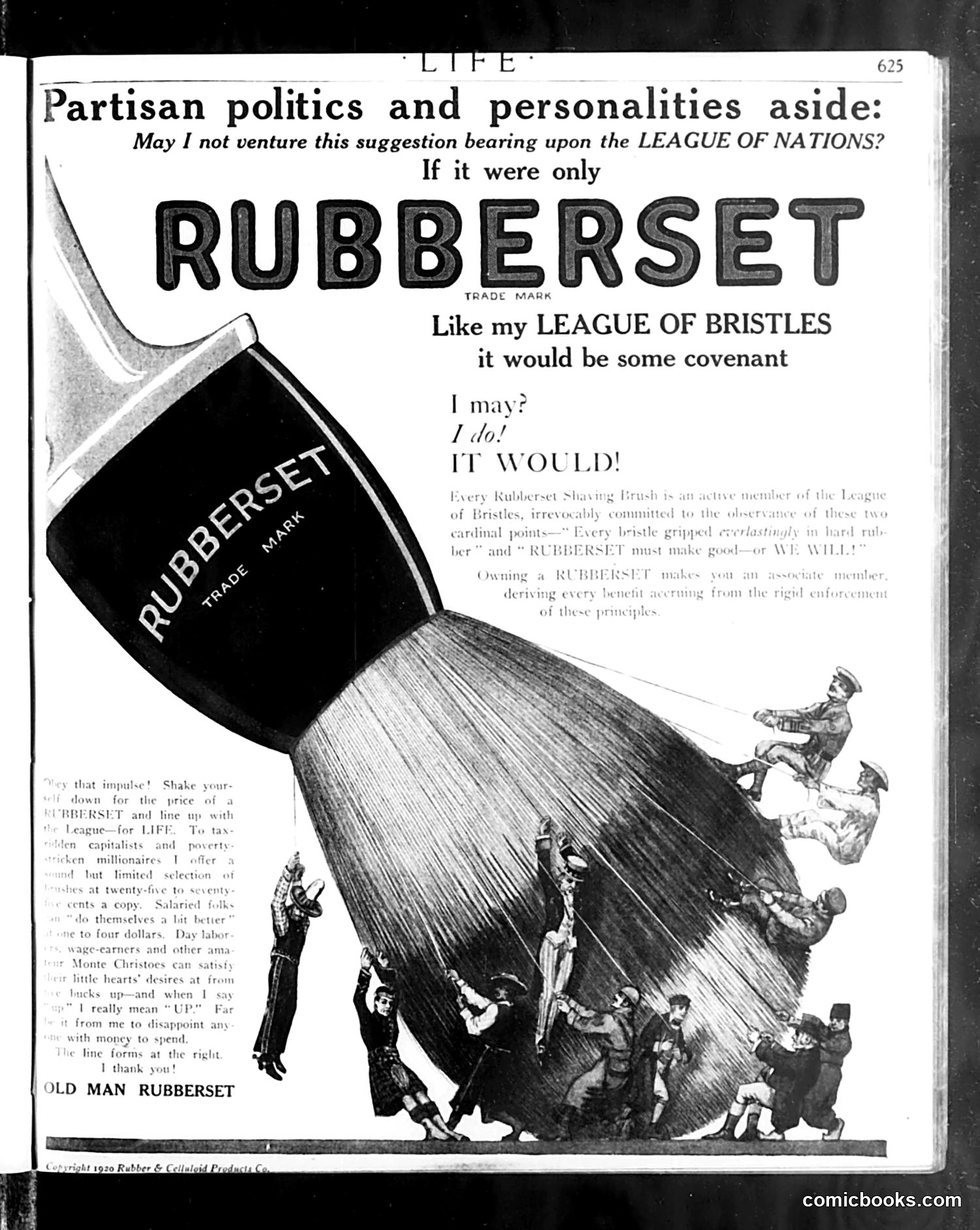
This is a **Rubberset shaving brush advertisement** disguised as political satire. The ad plays on 1920s debate over the League of Nations by suggesting that if the League operated with the strict principles of a "League of Bristles" (a fictional governing body for shaving brushes), it would function better. The satire compares international diplomacy to shaving brush manufacturing standards—the implication being that nations, like bristles, need firm rules and binding covenants to work together effectively. The illustration shows figures seemingly caught under or supporting a giant brush, suggesting the weight of international obligations. The text by "Old Man Rubberset" humorously presents buying their brush as becoming an "associate member" of this league, binding oneself to quality standards. **Context:** This reflects contemporary skepticism about whether the actual League of Nations could enforce its principles—a common American concern in the early 1920s.
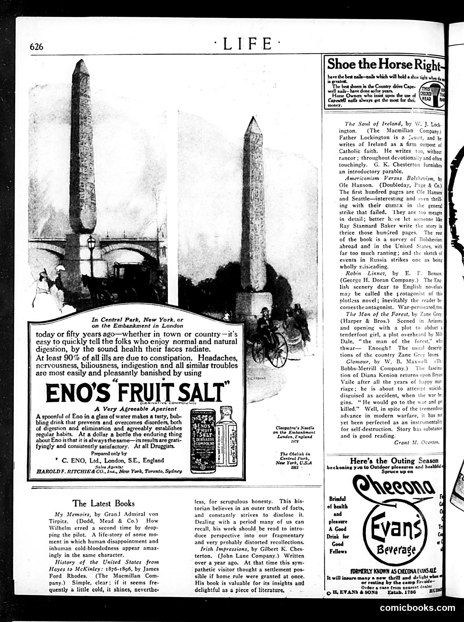
This page is primarily **advertising and book reviews**, not political satire. The dominant visual content shows two tall monuments—likely the **Cleopatra's Needle obelisk in London** (left) and a similar structure (right)—used to advertise **Eno's Fruit Salt**, a digestive remedy. The advertisement's joke is straightforward: just as these monuments stand permanently and visibly, Eno's salt provides reliable, consistent digestive relief. The tagline emphasizes that 90% of common ailments stem from constipation—a typical health claim of early 20th-century patent medicines. The page's bottom half reviews recent books, including works on Irish Catholicism, anti-Bolshevism, and war-era fiction. Nothing here constitutes political satire; it's standard Life magazine content mixing commercial promotions with literary commentary. **No political cartoon or satirical commentary is present on this page.**
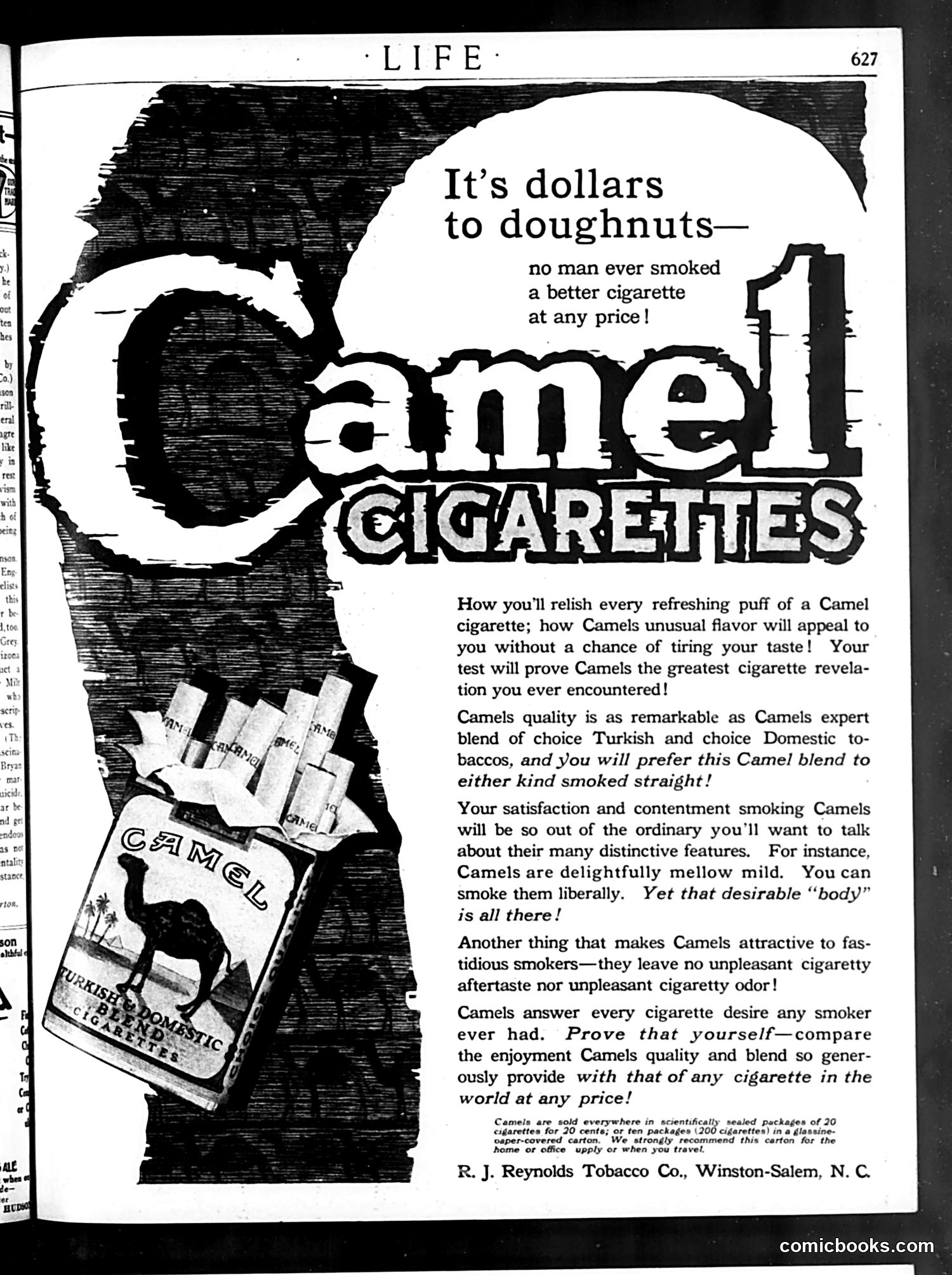
This is a **full-page advertisement**, not satire or editorial content. It's a 1920s-era Camel cigarette ad from Life magazine, published by R.J. Reynolds Tobacco Co. The imagery shows a camel (the brand mascot) against a dark background, with cigarette packs displayed. The headline uses the idiom "dollars to doughnuts" (meaning a sure bet) to claim Camels are superior at any price. The copy emphasizes qualities modern readers would find shocking in advertising: claims that Camels are "mellow mild" yet have full "body," produce no "unpleasant cigaretty aftertaste," and leave no odor. These selling points reflect early-20th-century anxieties about tobacco's downsides. The ad also highlights the Turkish-domestic tobacco blend and scientific packaging—marketing strategies targeting "fastidious smokers" concerned with quality. **Context for modern readers**: This represents an era before cigarette health warnings, when tobacco companies openly advertised health and taste claims that would be illegal today.
This page contains a short story titled "No Compensation," featuring Mr. Berwind, a Wall Street businessman. The narrative satirizes upper-class leisure and family dynamics in the early 20th century. The setup is ironic: Berwind anticipates a rare family evening together while his wife returns from Palm Beach. He enthusiastically proposes improving family life through cultured activities—card games, then reading Emerson's essay on "Compensation." The humor builds as Berwind falls asleep during Emerson's philosophical meditation on life's rewards and balance. The final joke arrives via telegram: the wife's train is stalled; she won't return until tomorrow. The family's planned evening of intellectual and emotional enrichment is cancelled. The title "No Compensation" mocks Emerson's philosophy—there's no reward for Berwind's virtuous efforts at family togetherness. The satire targets genteel pretensions, suggesting that even well-intentioned middle-class attempts at meaningful domestic life are disrupted by modern inconveniences (railroad delays) and that philosophical ideals don't compensate for life's practical frustrations.
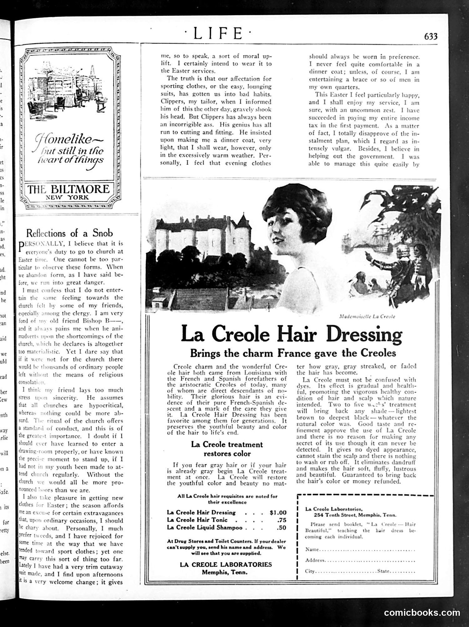
This page contains a satirical essay mocking upper-class pretension and social anxiety. The unnamed narrator obsesses over Easter clothing etiquette—insisting evening wear is morally superior to casual dress, praising his new cutaway suit as a "moral uplift," and boasting about paying his income tax in full rather than installments to appear generous to the government. The humor lies in the character's obvious insecurity masked by pompous justifications. His dismissal of his tailor as "an incorrigible ass" while following his suit recommendations, and his self-congratulatory tone throughout, reveal the author's mockery of class-conscious affectation. The piece satirizes how the wealthy use clothing and financial displays to signal moral virtue and social superiority—absurdities Life magazine's satirical tradition regularly exposed. The adjacent La Creole Hair Dressing advertisement appears unrelated to the satire.
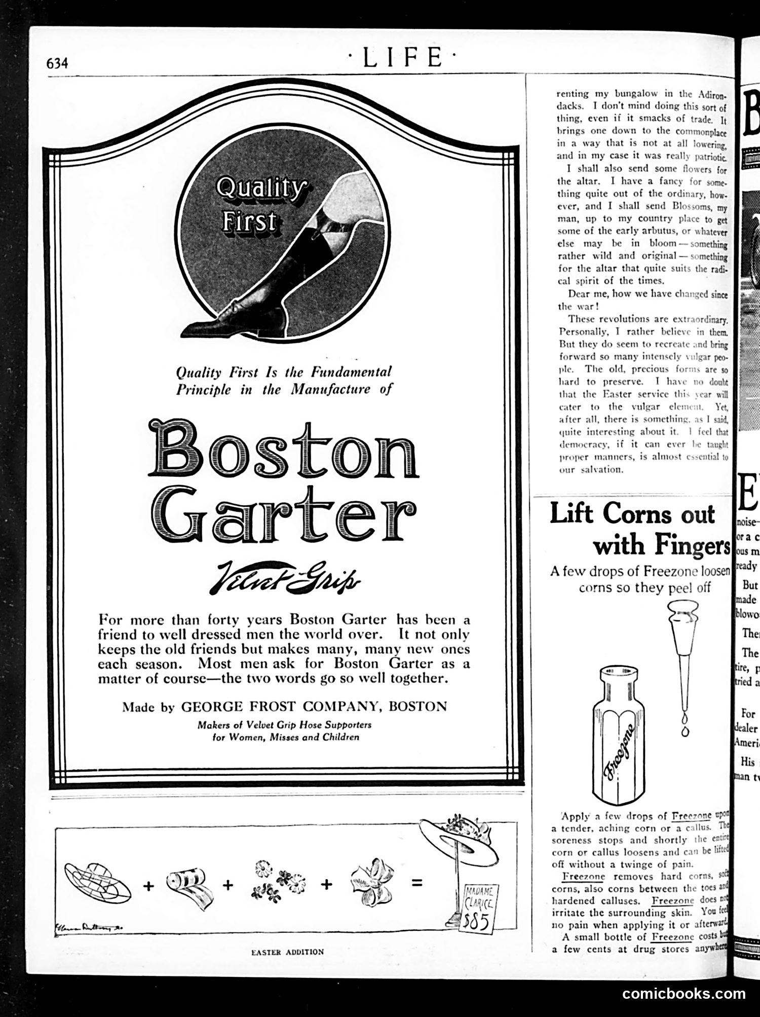
This page is primarily **advertising**, not satire or political commentary. The main advertisement promotes **Boston Garter** (men's garters/hose supporters) by the George Frost Company. The "Quality First" message emphasizes the product's forty-year reputation for quality among well-dressed men. Below that is an advertisement for **Freezone**, a corn-removal product. The illustration shows a bottle with application instructions: drops of the liquid loosen corns so they can be peeled off painlessly. The right column contains what appears to be a serialized story or editorial commentary about post-WWI social changes—discussing Easter services, class attitudes, and democratic manners—but this is unrelated to the advertisements. The page is labeled "EASTER ADDITION," suggesting this is a holiday issue of *Life* magazine featuring seasonal advertising. Both products advertised are practical goods marketed to early 20th-century readers.
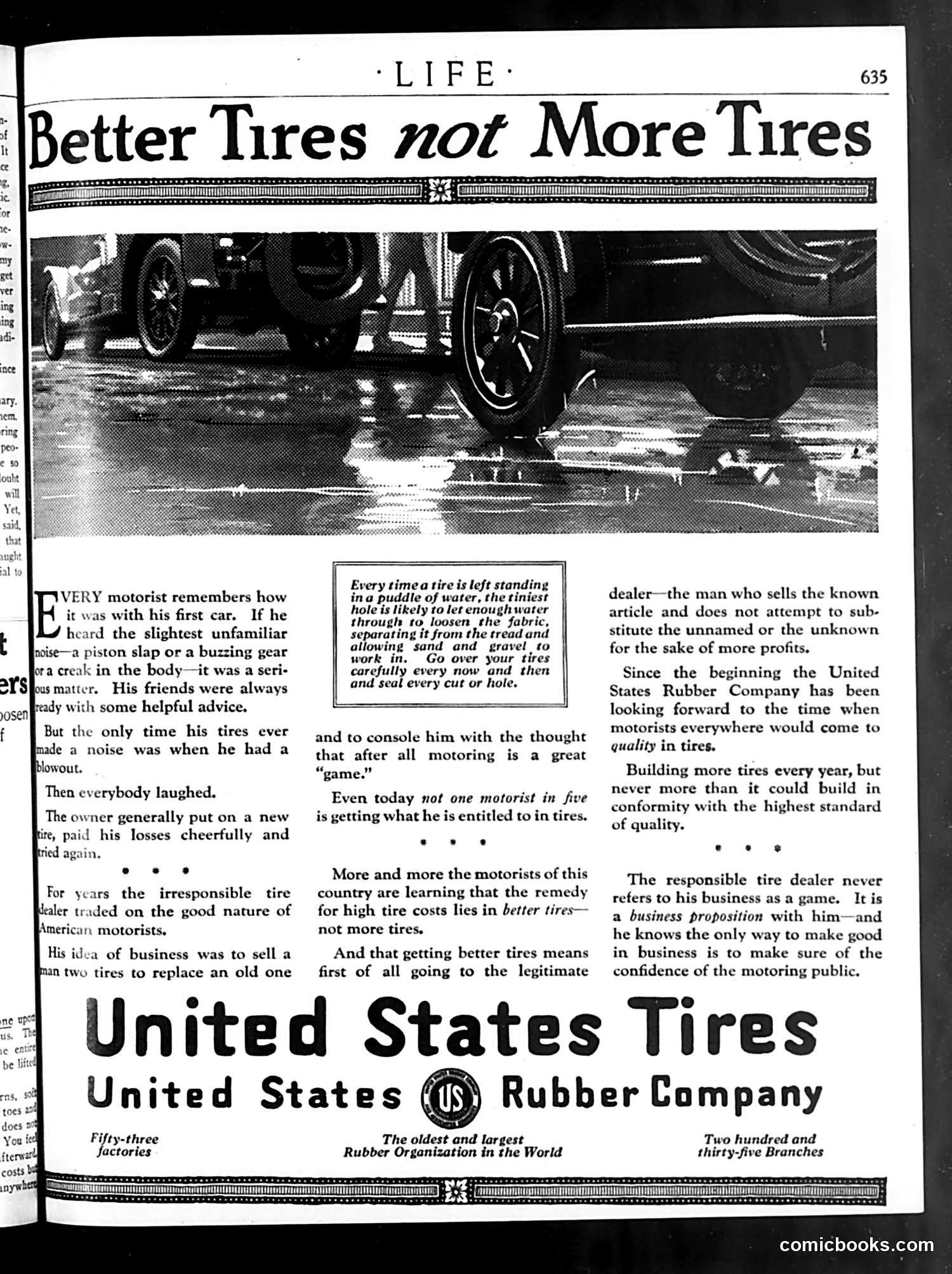
This is a **United States Rubber Company advertisement**, not a political cartoon. The page addresses a social problem in early automotive culture: unscrupulous tire dealers who sold inferior or mismatched tires to naive motorists, profiting from ignorance. The narrative describes how early car owners would naively replace worn tires with whatever dealers recommended, treating tire failures as inevitable and humorous ("everybody laughed"). The ad criticizes "irresponsible tire dealers" who exploited this attitude by selling cheap, low-quality tires rather than quality products. The advertisement promotes a shift toward "better tires not more tires"—emphasizing quality over quantity and encouraging consumers to buy from legitimate dealers selling known, reliable brands. US Rubber positions itself as the ethical alternative: a company building fewer but superior tires and maintaining high standards. This reflects Progressive Era consumer-awareness messaging, appealing to motorists' growing sophistication about purchasing decisions.
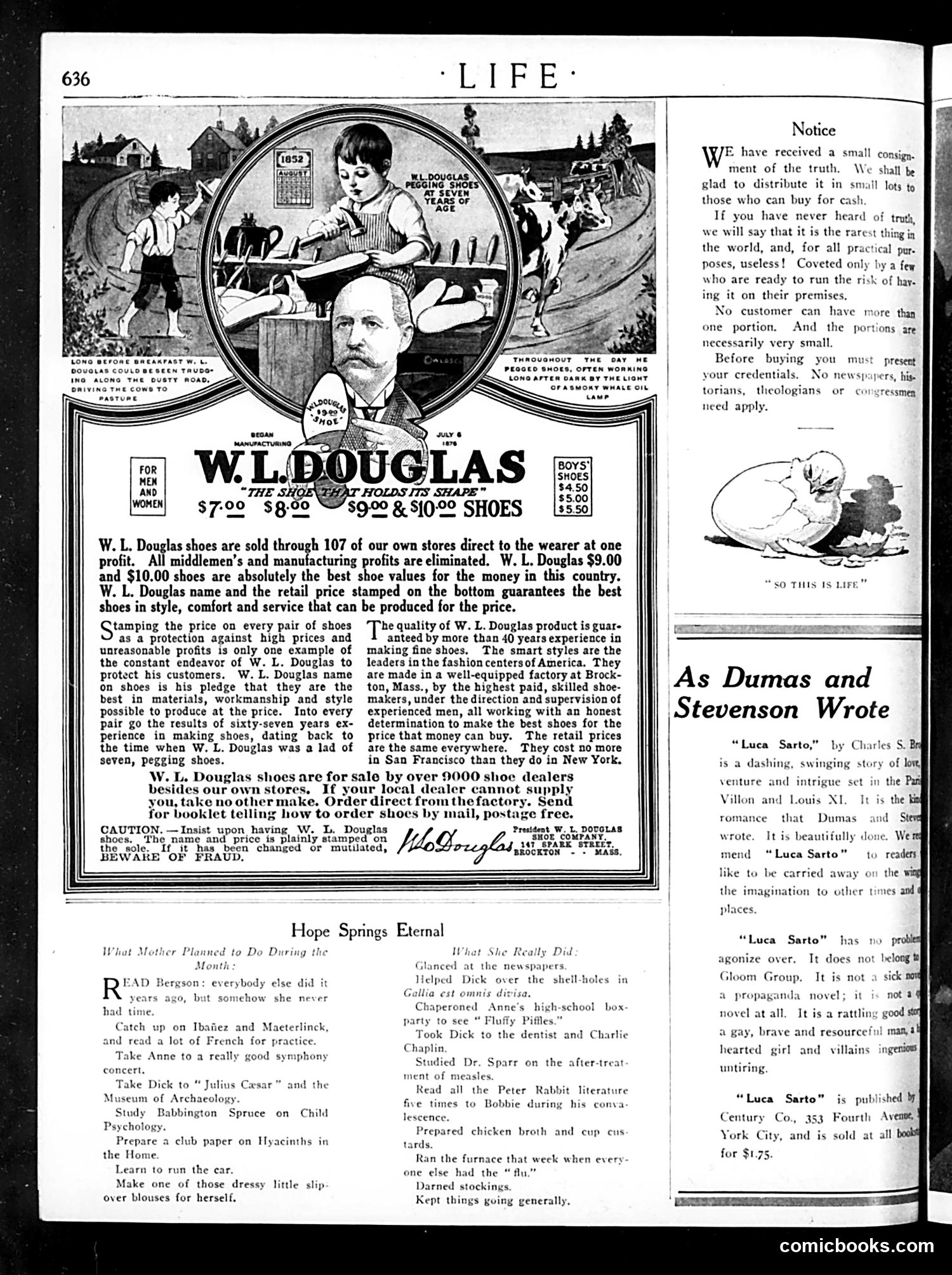
This Life magazine page contains primarily **advertising**, not political satire. The dominant content is a large W.L. Douglas shoe company advertisement emphasizing direct-to-consumer sales, fair pricing, and worker wages—a Progressive Era marketing approach highlighting manufacturing transparency as a virtue. The page also includes a humorous section titled "Hope Springs Eternal" contrasting what a mother *planned* to do during a month versus what she *actually* did—satirizing the gap between middle-class aspirational self-improvement (reading French literature, attending concerts) and domestic reality (darning socks, running the furnace). This is gentle domestic humor, not political commentary. A book review discusses "Luca Sarto," described as an adventure novel by Dumas and Stevenson. The small "Notice" section uses ironic humor, treating "truth" as a rare, dangerous commodity—likely satirizing contemporary political or social dishonesty, though specifics aren't clear from context alone.
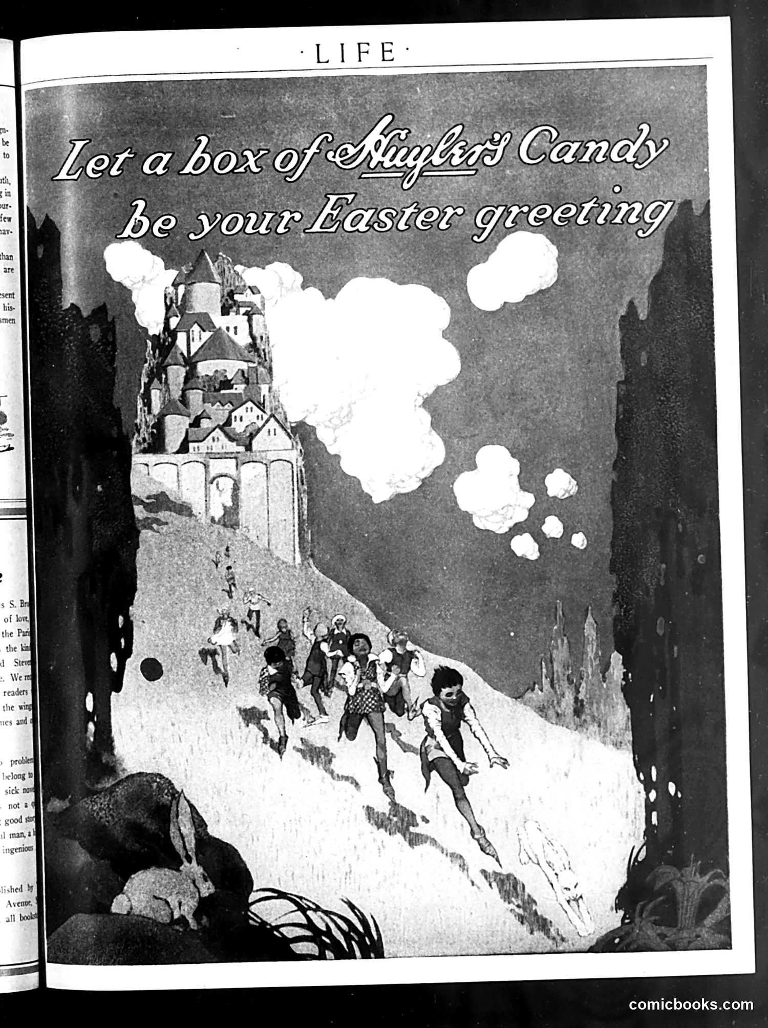
This is a **Mayfield's Candy advertisement** from Life magazine, not political satire. The ad depicts a fantastical Easter scene: children climbing a snow-covered mountain toward an elaborate castle perched on a cliff, with white clouds dotting the sky. The tagline reads: "Let a box of Mayfield's Candy be your Easter greeting." The imagery evokes a fairy-tale or storybook aesthetic—likely drawing on references familiar to early-20th-century American readers (possibly Grimm's tales or similar children's literature). The castle and adventurous children suggest whimsy and aspiration, positioning Mayfield's candy as an appropriate, imaginative Easter gift for children. This is commercial marketing rather than political commentary or satire.
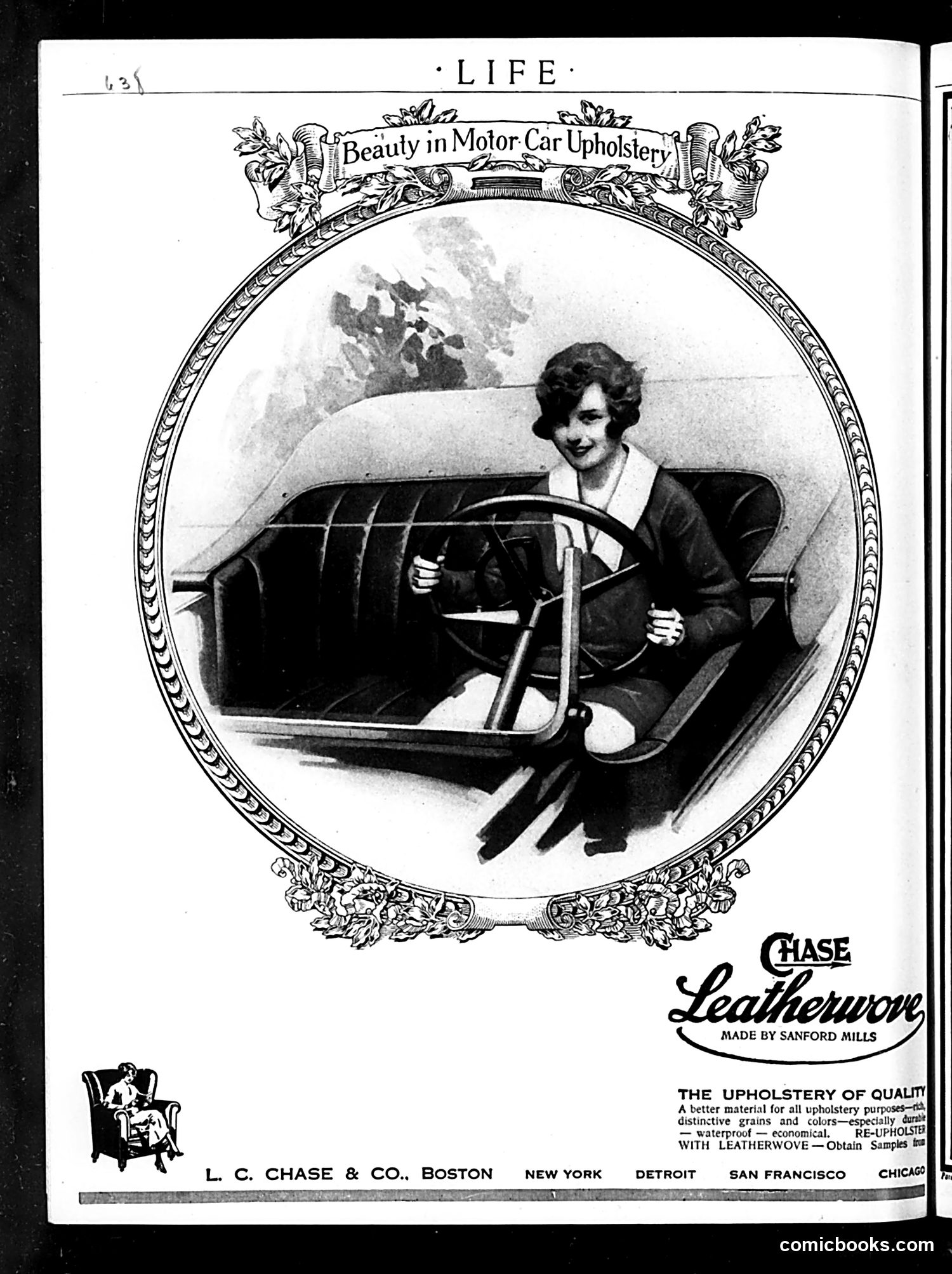
This is primarily an advertisement rather than satirical content. It promotes "Chase Leatherwove," an upholstery material made by Sanford Mills and distributed by L.C. Chase & Co. The ad features an elegant woman at a car's steering wheel, emphasizing "Beauty in Motor Car Upholstery." The messaging highlights that Leatherwove offers quality, distinctive appearance, durability, waterproofing, and economy—practical benefits for automobile interiors during an era when car upholstery was a significant selling point. The ornate decorative border and formal presentation reflect early 20th-century advertising aesthetics. This appears designed to appeal to affluent consumers purchasing or upgrading automobiles, positioning the material as both luxurious and practical.
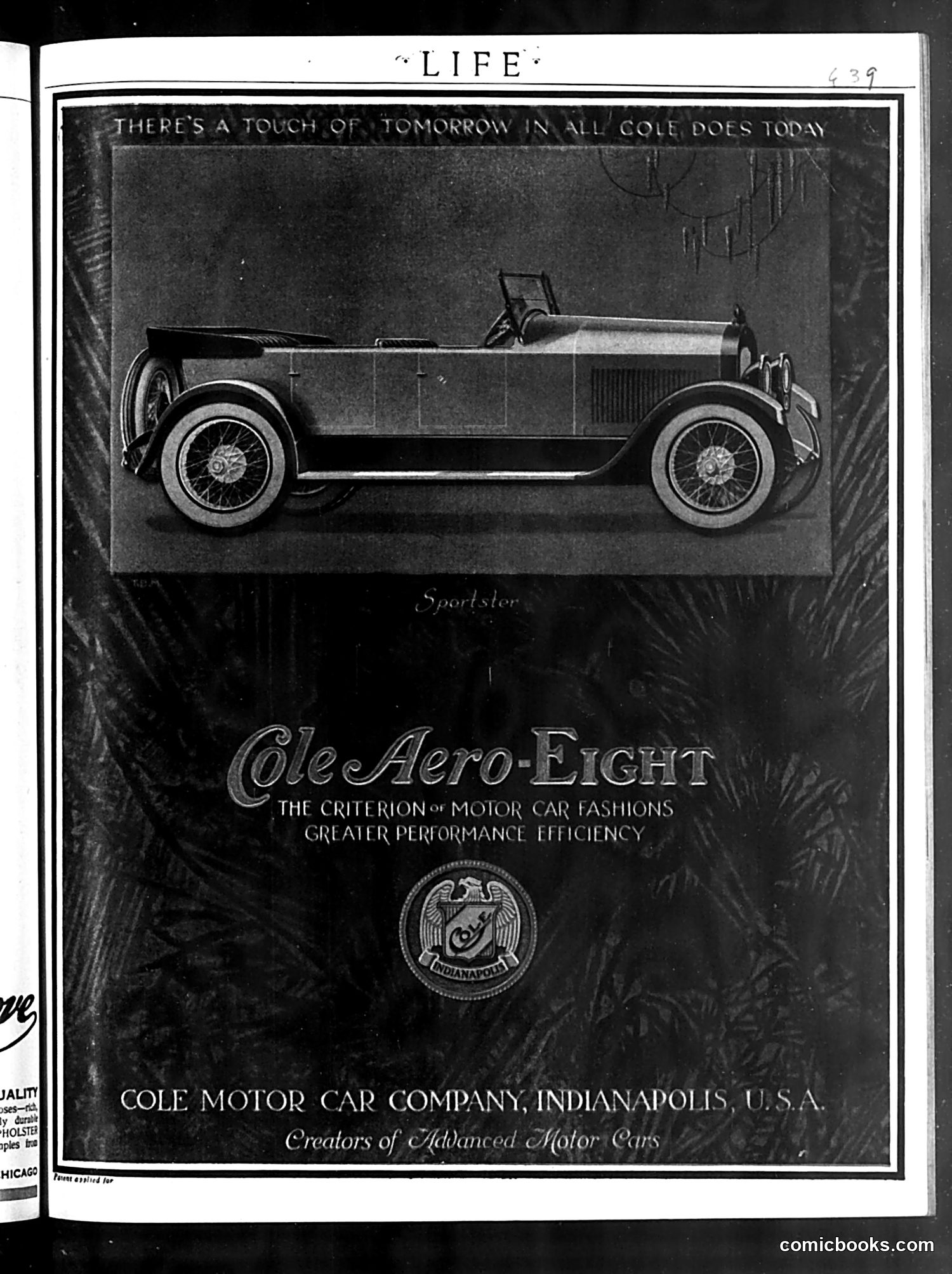
This is **not a cartoon or satire**—it's a straightforward automobile advertisement from Life magazine. The page promotes the Cole Aero-Eight, a luxury car manufactured by the Cole Motor Car Company in Indianapolis. The headline "There's a touch of tomorrow in all Cole does today" emphasizes the car's modern, forward-looking design. The image shows a side view of the open-air "Sportster" model, highlighting its streamlined body and spoke wheels—design features considered innovative for the era. The advertisement positions the Cole Aero-Eight as embodying "the criterion of motor car fashions" with emphasis on "greater performance efficiency," appealing to wealthy consumers seeking status and cutting-edge automotive technology. The company identifies itself as "Creators of Advanced Motor Cars," reflecting early automotive industry competition and marketing strategies.
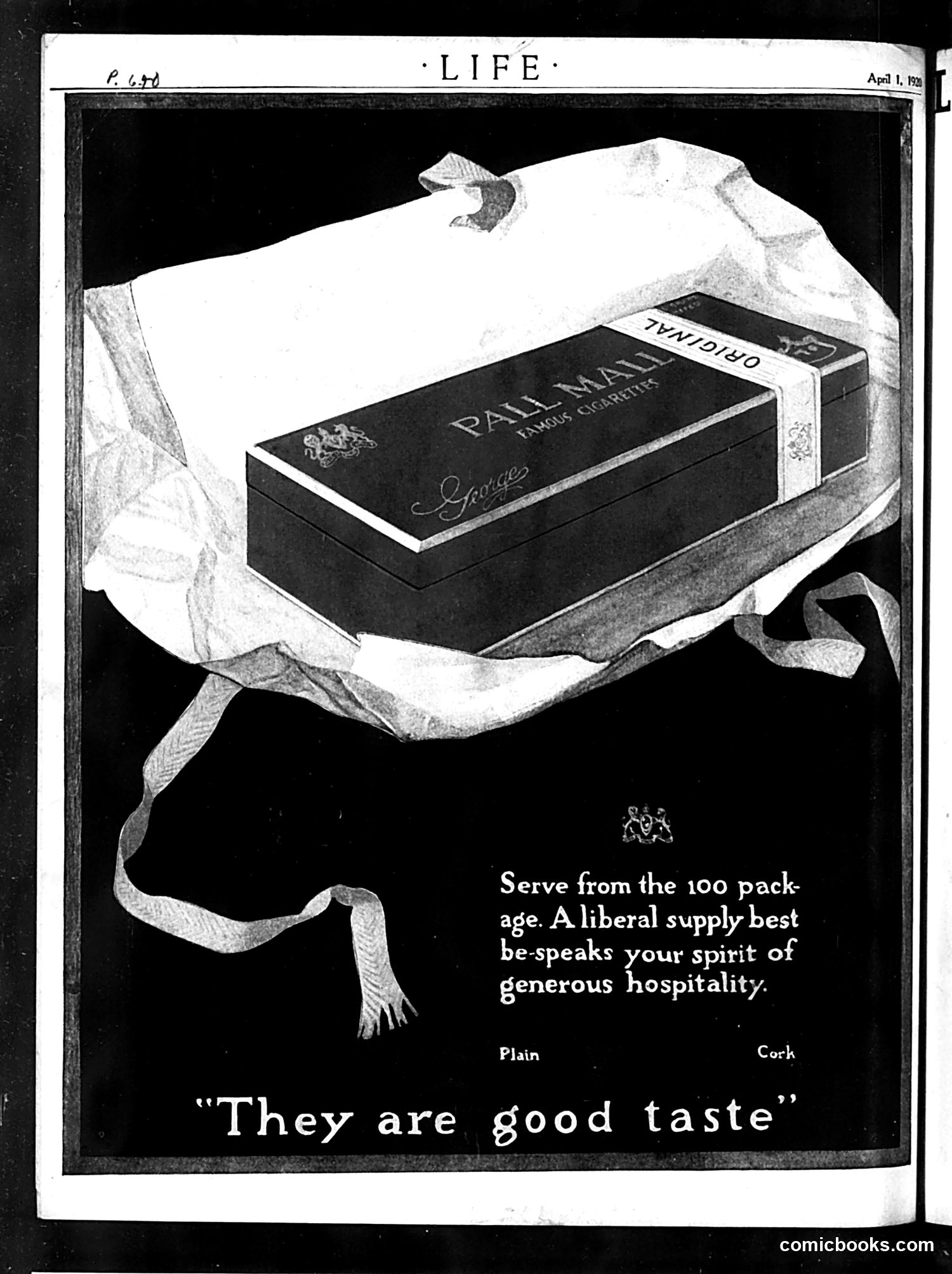
This is a cigarette advertisement for Pall Mall brand, not a political cartoon. The ad appears in Life magazine (dated April 1, 1928, based on the header). The image shows a cigarette package elegantly wrapped in tissue paper with a decorative ribbon, presented as a gift. The advertisement targets affluent hosts by suggesting that serving cigarettes from a 100-pack demonstrates "generous hospitality" and "good taste." The mention of "Plain" and "Cork" refers to available filter options. This reflects 1920s social attitudes when offering cigarettes to guests was considered a mark of refinement and generosity—before widespread awareness of smoking's health dangers. The luxurious presentation emphasizes the product's status as a sophisticated gift.