
A complete issue · 52 pages · 1920
Life — June 3, 1920
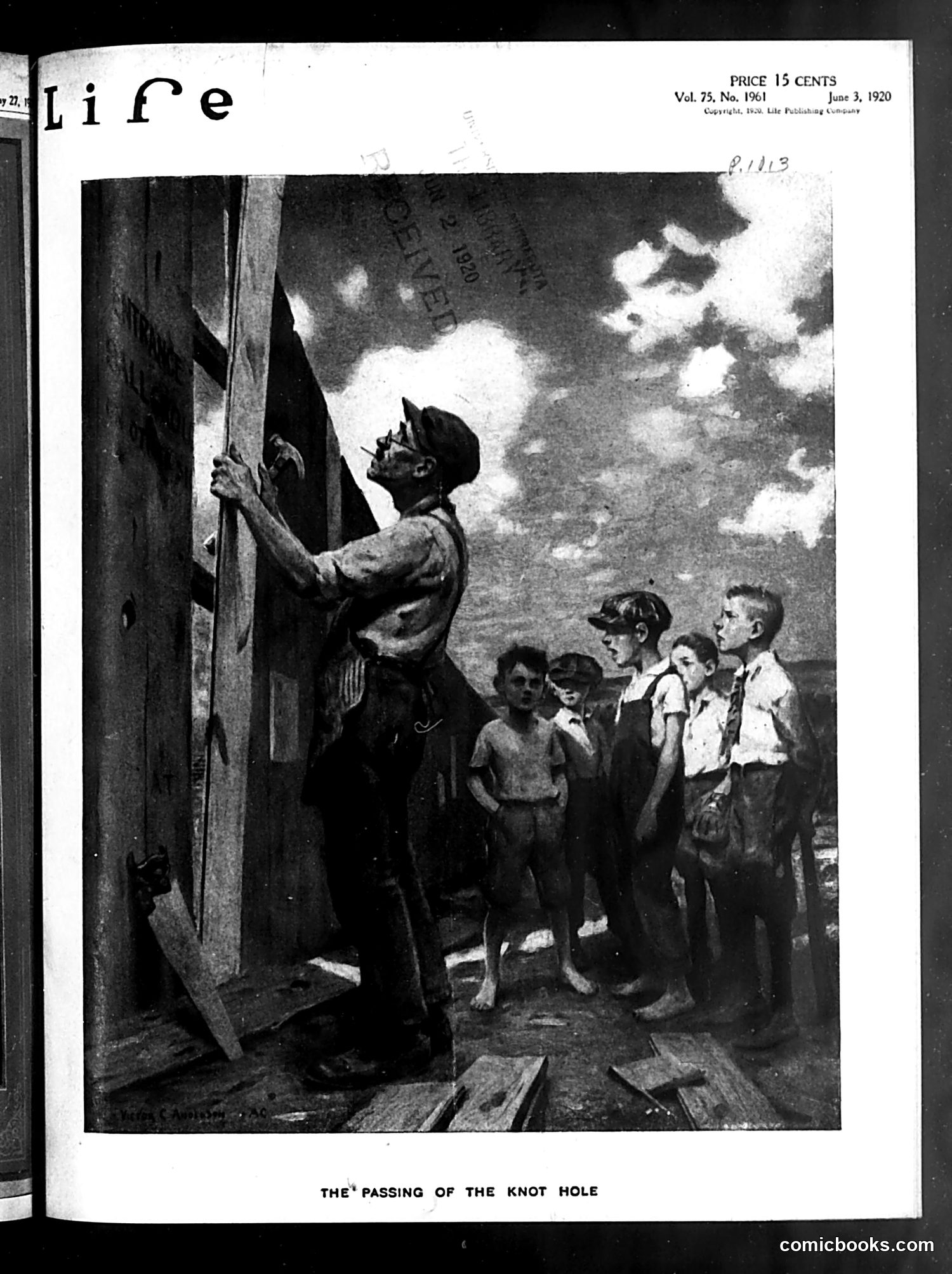
This June 1920 *Life* magazine illustration satirizes the disappearance of free baseball viewing. The image shows a uniformed official (likely a ballpark security guard or policeman) preventing children from watching through a hole in the fence—a traditional way poor kids accessed games without paying admission. The satire laments modernization and commercialization of baseball: as stadiums became more professional and profit-focused, they eliminated the "knot hole," closing off free access for working-class children. The children's disappointed faces emphasize the loss of this informal tradition. The cartoon critiques how commercial interests were eliminating affordable public access to America's pastime, representing broader anxieties about capitalism displacing innocent childhood pleasures.
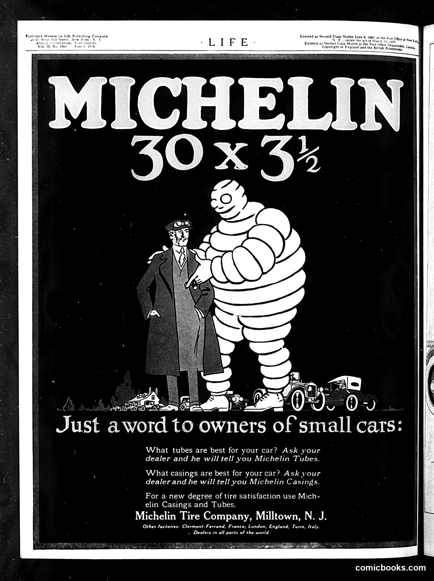
This is primarily a **Michelin Tire advertisement**, not political satire. The famous Michelin Man mascot (the rotund, puffy figure made of tire rings) stands alongside a well-dressed gentleman in a coat and goggles, positioned next to toy cars. The ad's humor is straightforward product positioning: it targets "owners of small cars" with messaging that Michelin tubes and casings provide superior satisfaction. The visual joke plays on scale—the enormous Michelin Man dwarfs both the man and the automobiles, suggesting Michelin's dominance in the tire market. The goggles on the gentleman suggest early automotive era (likely 1910s-1920s), when such eyewear was standard for motorists. This represents straightforward commercial advertising disguised as humorous content—typical of Life magazine's revenue model.
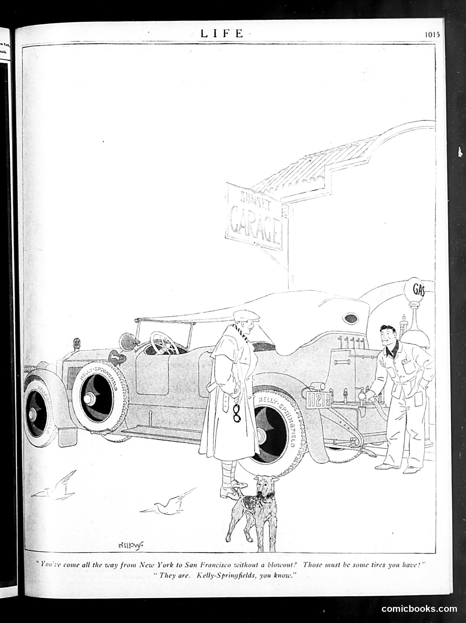
This cartoon depicts a woman and man at a gas station garage, with a dog and vintage automobiles. The dialogue references a cross-country journey from New York to San Francisco "without a blowout"—a significant feat in early automotive travel when tire failures were common. The woman's comment about the tires ("Those must be some tires you have") prompts the man's response identifying them as "Kelly-Springfields, you know"—a brand advertisement disguised as dialogue. This is fundamentally **advertising content disguised as humor**. The joke plays on the remarkable durability of Kelly-Springfield tires, presented as if the tires' quality is so renowned it explains an entire cross-country journey without mechanical failure. The cartoon promotes the product while appearing to tell a casual anecdote about automotive reliability.
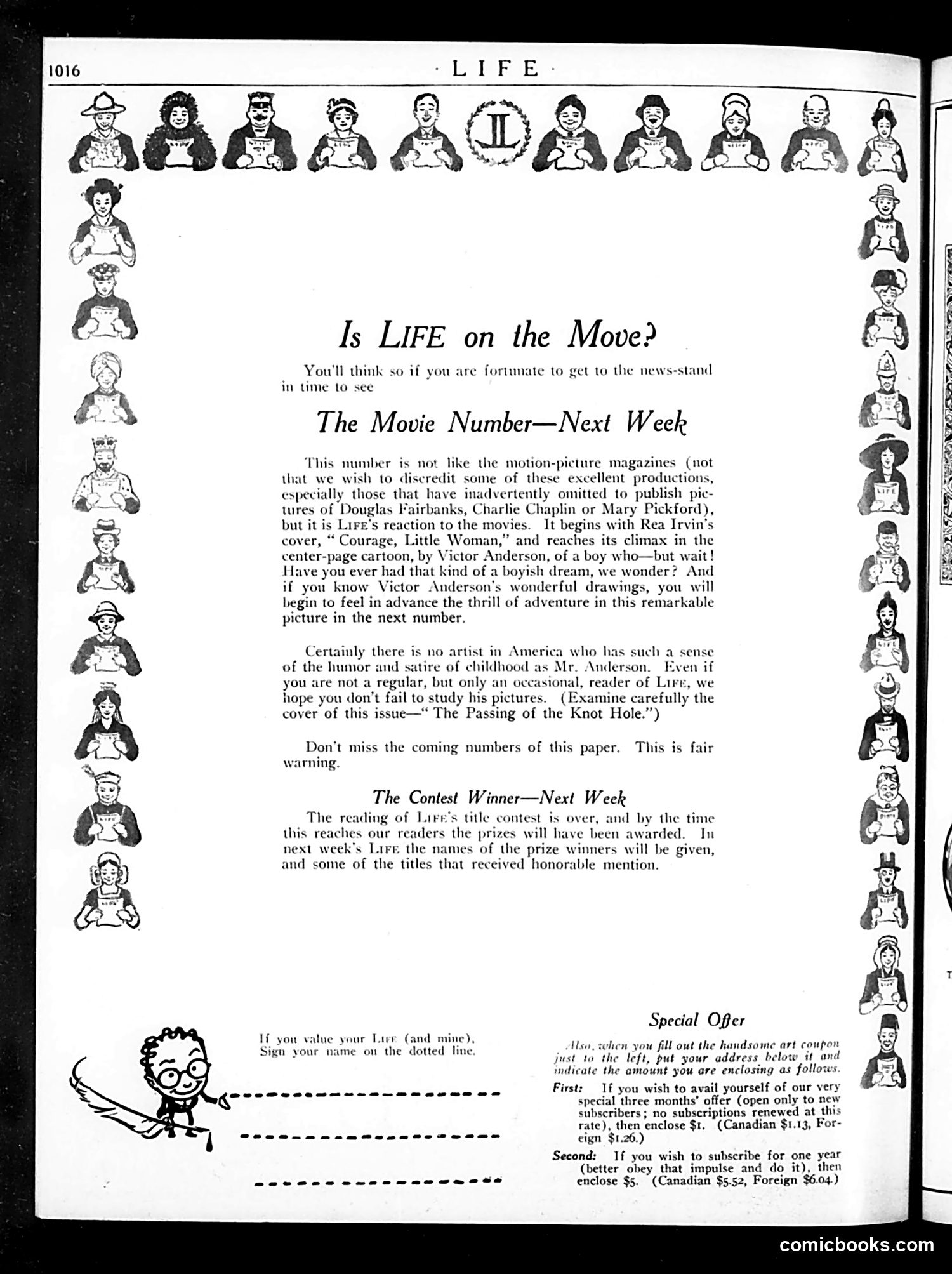
This page is primarily **promotional content for Life magazine**, not political satire. The border of small illustrated heads appears to be decorative or perhaps representing Life's readership/contributors. The main text announces three items: 1. **"The Movie Number"** — Life will feature a special issue about movies, prominently showcasing illustrator Victor Anderson's artwork and discussing films (mentioning Douglas Fairbanks, Charlie Chaplin, and Mary Pickford as examples). 2. **A contest winner announcement** for Life's title contest, with results coming next week. 3. **Subscription offers** with pricing for new and renewal subscriptions. The small cartoon figure at bottom left appears to be a mascot encouraging readership. This is essentially a **table of contents/promotional page** rather than satirical political commentary.
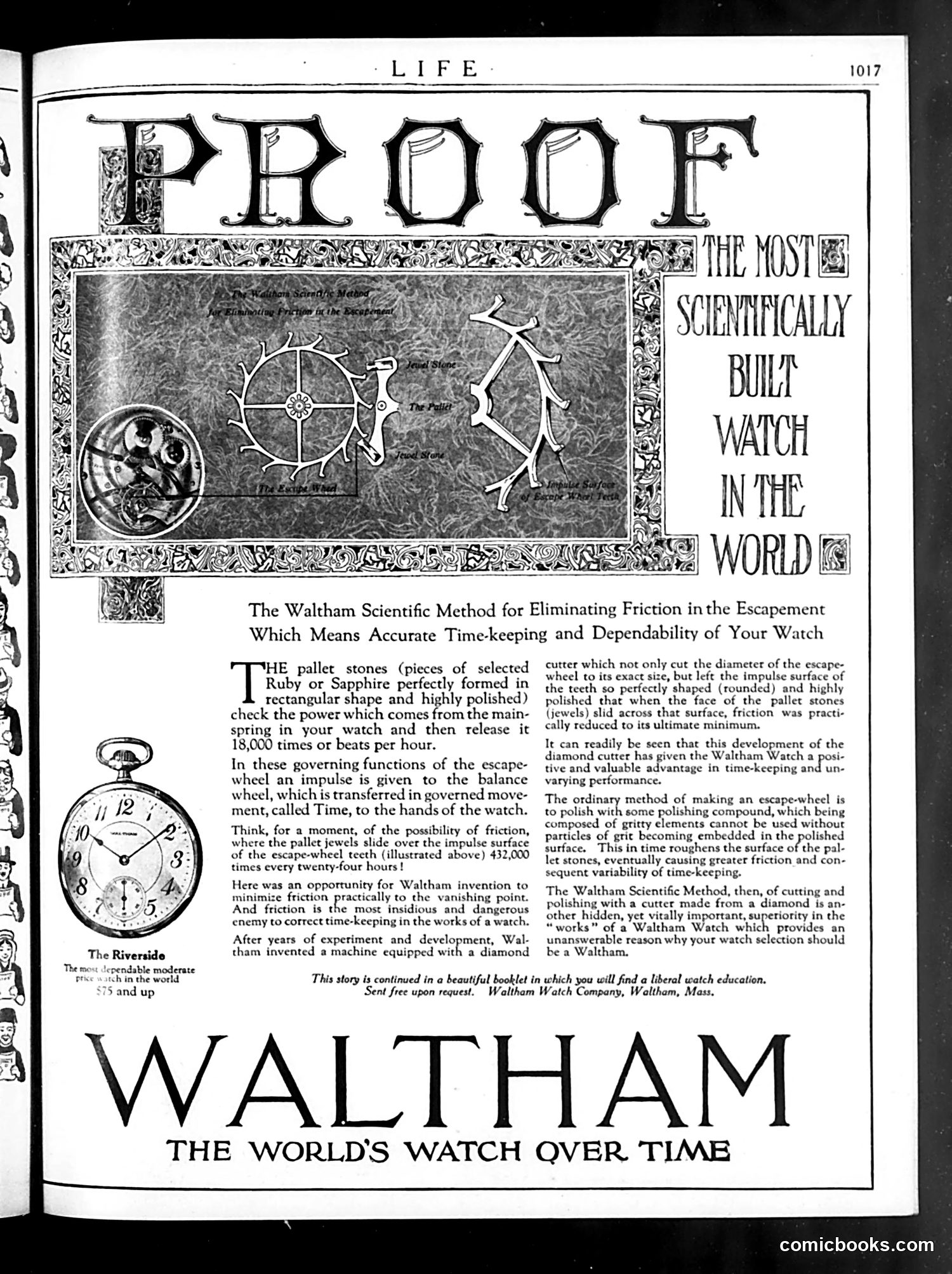
This page is **primarily an advertisement** for Waltham watches, not political satire. The large "PROOF" headline and decorative astronomical/mechanical imagery promote Waltham as "THE MOST SCIENTIFICALLY BUILT WATCH IN THE WORLD." The ad emphasizes technical innovation: a diamond-cutter innovation for the escapement mechanism that reduces friction and improves accuracy. The text highlights that Waltham invented a machine with a diamond cutter to perfect watch components. The small watch illustration labeled "The Riverside" shows the actual product. There is **no political cartoon or satire** on this page—it's a straightforward early 20th-century advertisement leveraging scientific credibility and precision engineering to market luxury watches to affluent readers of *Life* magazine.
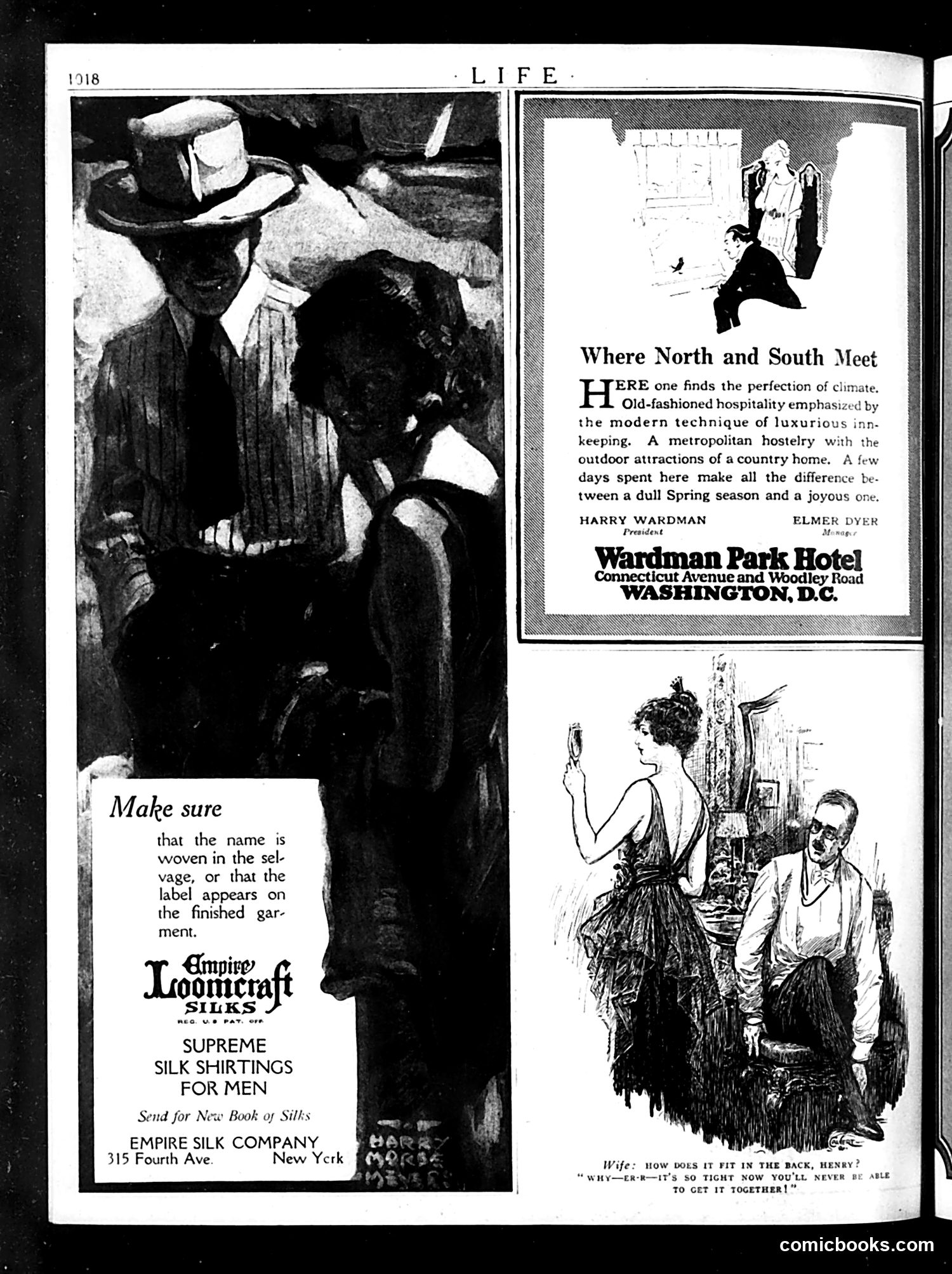
This page is primarily **advertising**, not political satire. The left side features an Empire Loomcraft Silks ad for men's dress shirts, emphasizing quality ("Make sure that the name is woven in the selvage"). The top right advertises the Wardman Park Hotel in Washington, D.C., highlighting its combination of "old-fashioned hospitality" with modern luxury. The bottom right contains a domestic humor cartoon showing a wife and husband struggling with tight clothing—she's unable to fasten a dress in back. The joke plays on the tension between fashion and practicality: her complaint that the garment is "so tight now you'll never be able to get it together" is both literal (the dress won't close) and metaphorical (marital discord). This reflects early 20th-century humor about women's restrictive fashion.
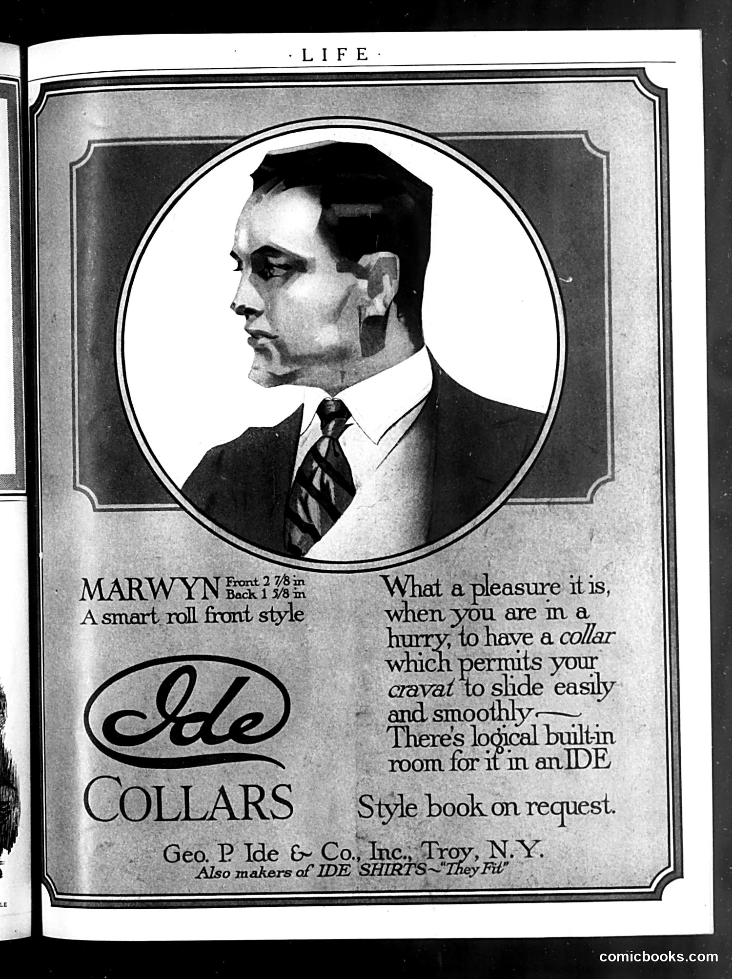
This is an advertisement, not a political cartoon. It promotes **Ide Collars**, a men's clothing product made by Geo. P. Ide & Co., Inc. of Troy, New York. The ad features a portrait of a man named "Marwyn" wearing a "smart roll front style" collar (Front 2 7/8 inch, Back 1 3/8 inch). The accompanying text emphasizes the collar's practical convenience—it allows neckwear to "slide easily and smoothly" and offers "built-in room" for the cravat. This reflects early 20th-century men's fashion concerns: collars were removable, stiff accessories that required careful adjustment. The ad's appeal to busy men "in a hurry" suggests marketing to professionals valuing efficiency and comfort. A style book was available on request—typical period marketing.
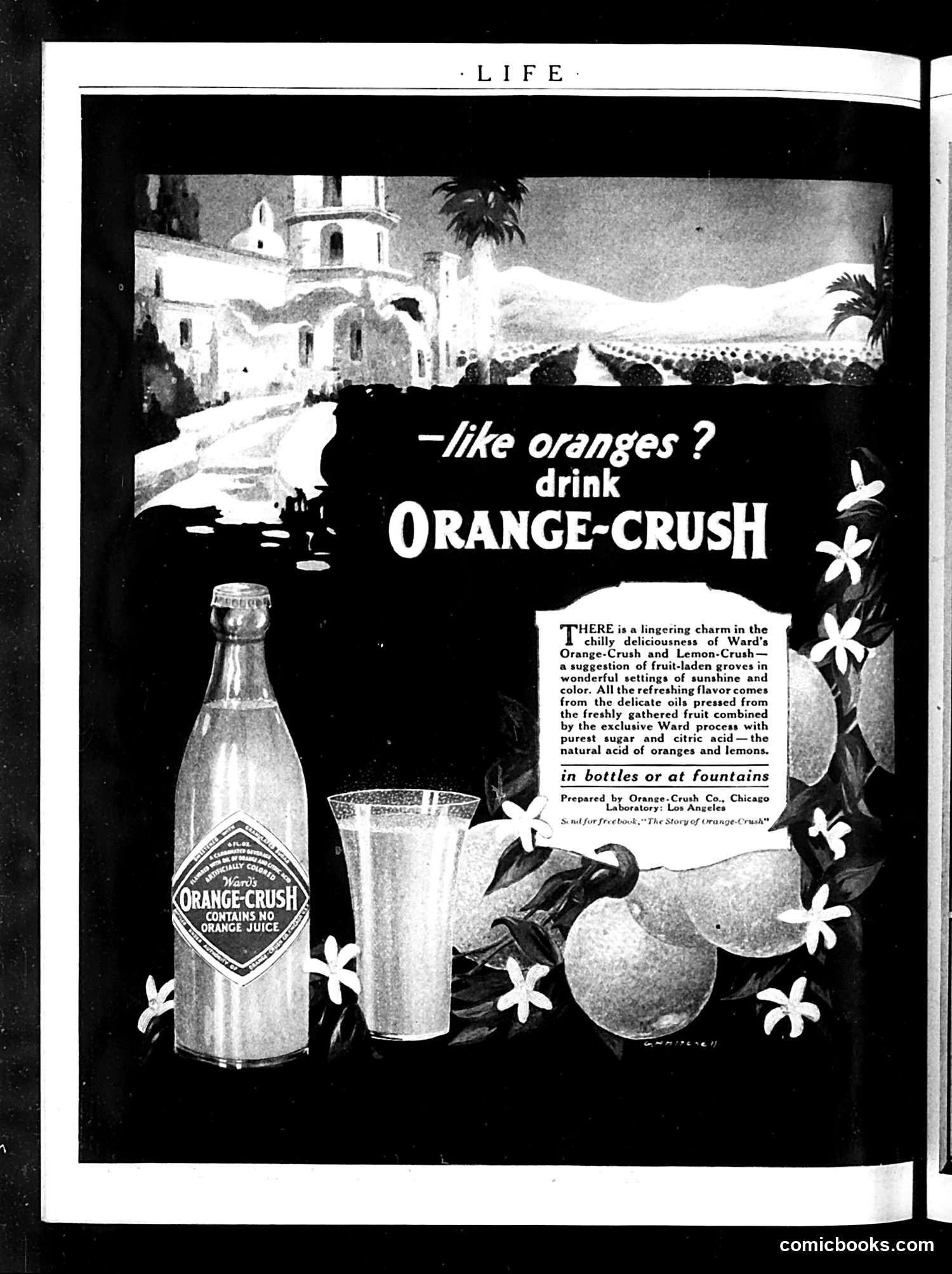
This is a **product advertisement, not a cartoon or satirical content**. It promotes Orange-Crush, a carbonated soft drink, published in *Life* magazine. The ad uses an exotic Mediterranean or Middle Eastern setting (white buildings, palm trees, mountains) to convey luxury and leisure. The tagline "—like oranges? drink ORANGE-CRUSH" makes a straightforward product appeal. The bottle label notably states "CONTAINS NO ORANGE JUICE," which modern readers might find ironic—the drink is flavored to taste like oranges but contains no actual orange juice, relying instead on "delicate oils pressed from freshly gathered fruit" combined with "purest sugar and citric acid." The design employs period-typical advertising aesthetics: scenic backdrops, fresh fruit imagery, and an elegant glass to suggest refreshment and sophistication.
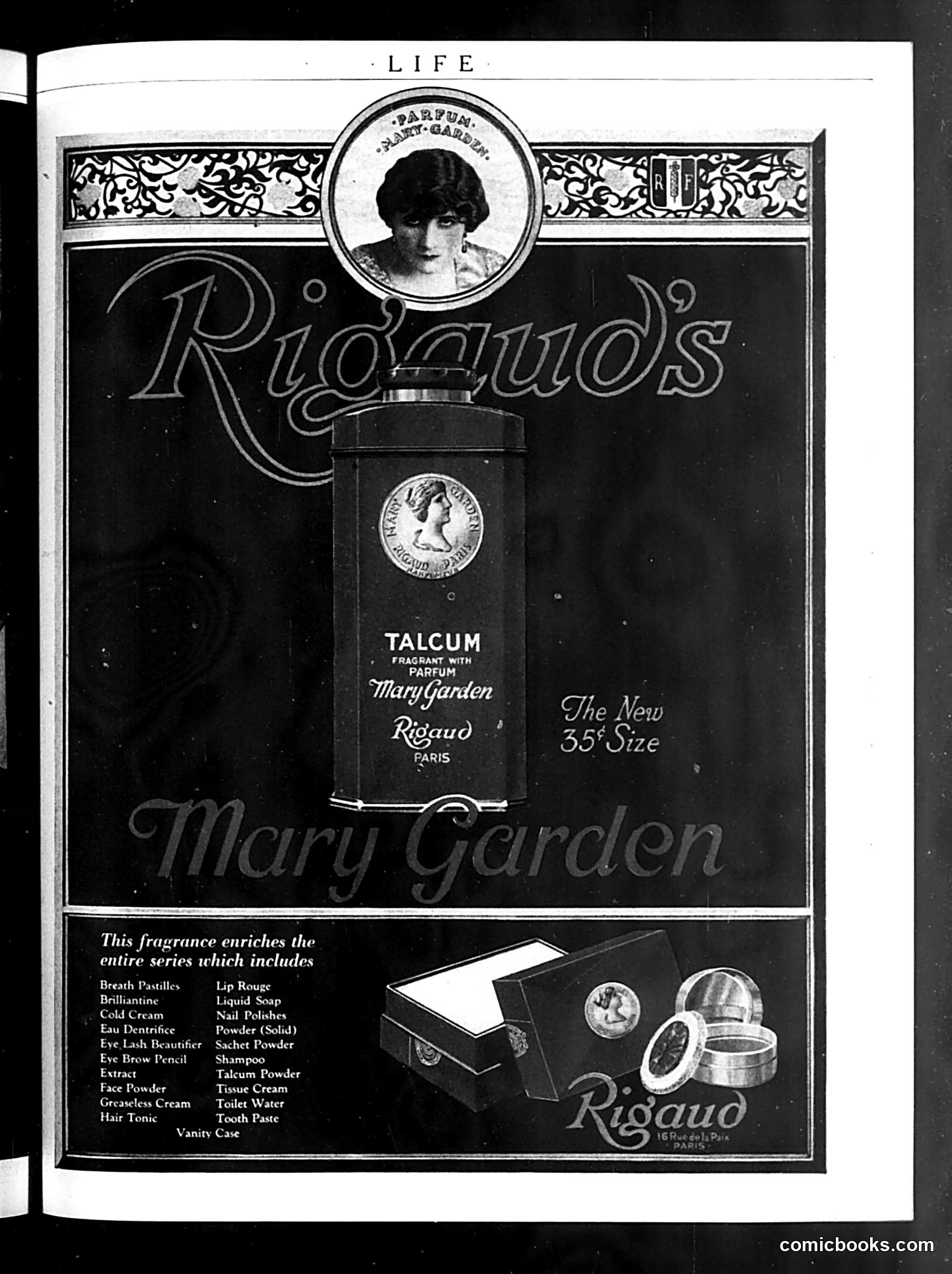
This is **not a cartoon or satirical content** — it's a **Rigaud beauty products advertisement** from Life magazine. The page promotes "Rigaud's Mary Garden" line, a fragrance-based talcum powder with parfum. The ad features a woman's portrait in a circular medallion at top, the product bottle prominently displayed, and lists an extensive beauty product line (creams, powders, soaps, etc.) below. "Mary Garden" likely references the famous opera singer of that name, a common marketing strategy of the era — associating products with celebrities. The "$0.35 size" notation and "Paris" attribution suggest positioning as an affordable yet sophisticated French import. This represents early 20th-century women's beauty marketing, emphasizing an extensive integrated product line and celebrity endorsement.
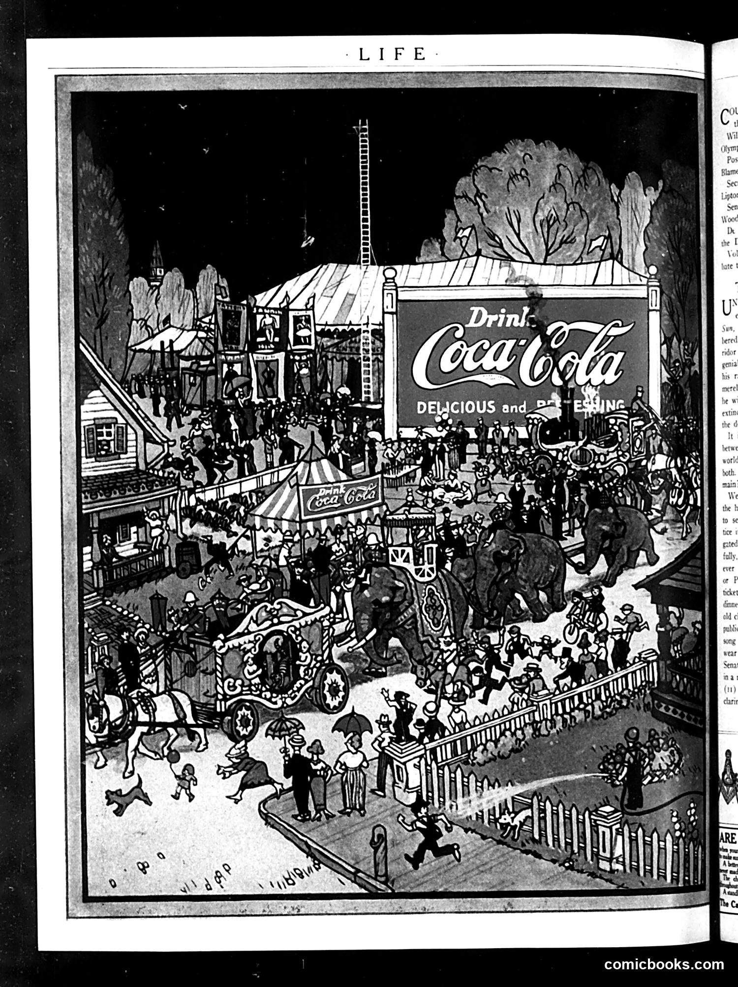
This is a Coca-Cola advertisement depicting a bustling fairground or carnival scene. The illustration shows a massive crowd enjoying various attractions—rides, entertainments, and festivities—all centered around a prominent Coca-Cola billboard advertising the drink as "Delicious and Refreshing." The satire appears gentle: the image humorously suggests that Coca-Cola has become so culturally dominant that it's the focal point of American public leisure and entertainment. The elaborate carnival setting with its numerous attractions and crowds implies that the brand itself has become a major draw or entertainment destination. This reflects early-20th-century advertising's aspirational messaging—positioning a commercial product at the heart of American social and recreational life.
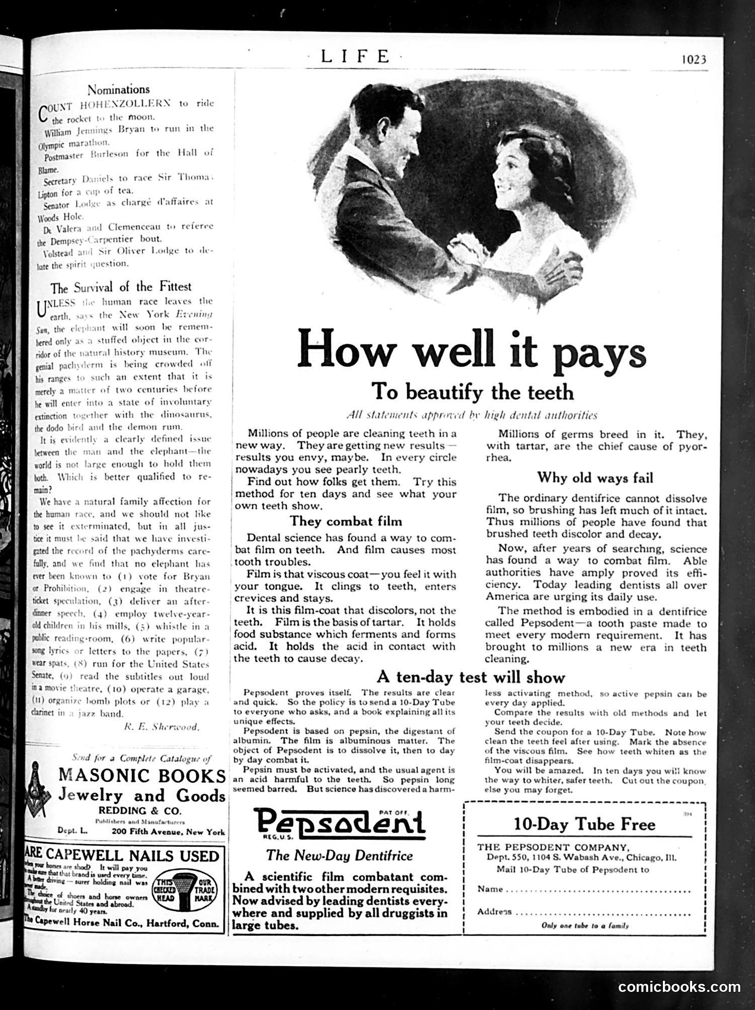
This page is primarily **advertising content**, not satire or political commentary. The dominant feature is a large advertisement for Pepsodent toothpaste ("The New-Day Dentifrice"), which occupies roughly half the page. The illustration at top shows a couple in an intimate moment, which is typical period advertising imagery meant to suggest that good dental hygiene improves romantic attractiveness—a common marketing angle in 1920s consumer advertising. The text promotes Pepsodent's supposed scientific innovation: a "film combatant" ingredient that fights tooth decay better than traditional methods. The ad includes a free sample offer coupon. The page also contains small advertisements for other products (Masonic Books, Capewell Nails) and a "Nominations" column of satirical candidates for various positions, but these occupy minimal space. The content reflects early 20th-century marketing practices emphasizing pseudo-scientific claims.
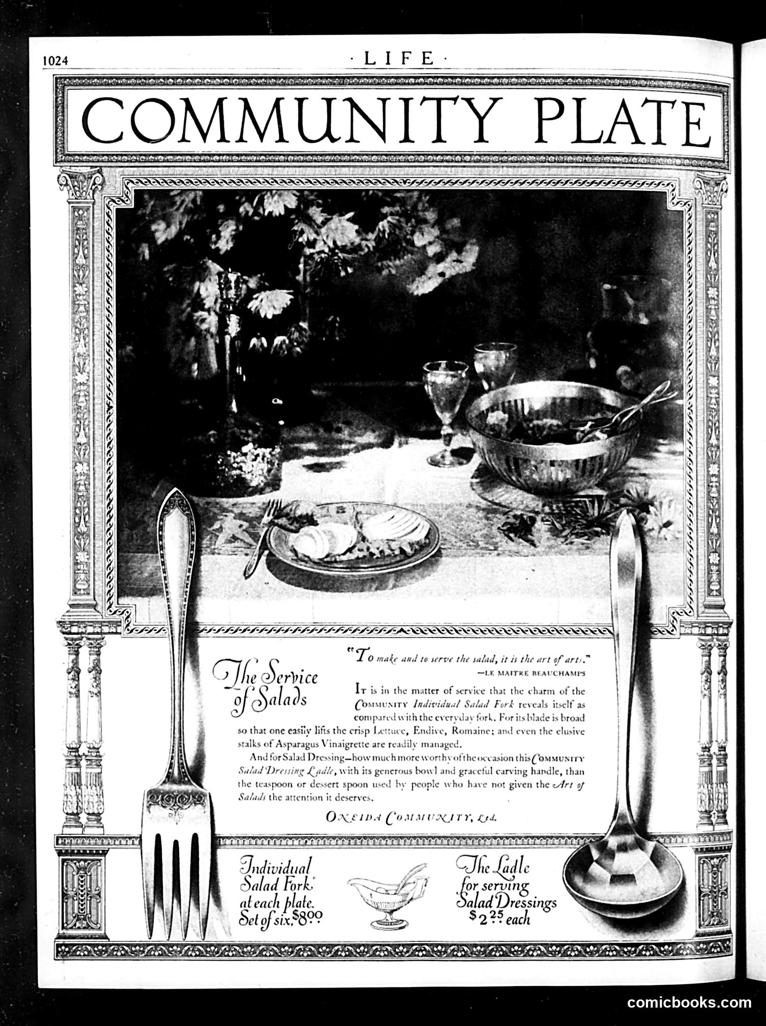
This is a **product advertisement**, not political satire. The page promotes tableware from Oneida Community, Ltd., specifically salad service items. The "Community Plate" heading refers to Oneida's affordable flatware line (as opposed to solid silver). The advertisement emphasizes the elegance and practicality of their salad fork and ladle for serving salads properly—a concern suggesting salad service was becoming fashionable among middle-class households. The atmospheric photograph shows an outdoor table setting with flowers, glassware, and prepared food, establishing aspirational domesticity. Pricing ($8.00 for a set of six forks; $2.25 each for the ladle) indicates this was marketed to ordinary consumers wanting refined table manners and presentation. This reflects early 20th-century American consumer culture emphasizing proper etiquette and accessible luxury goods.
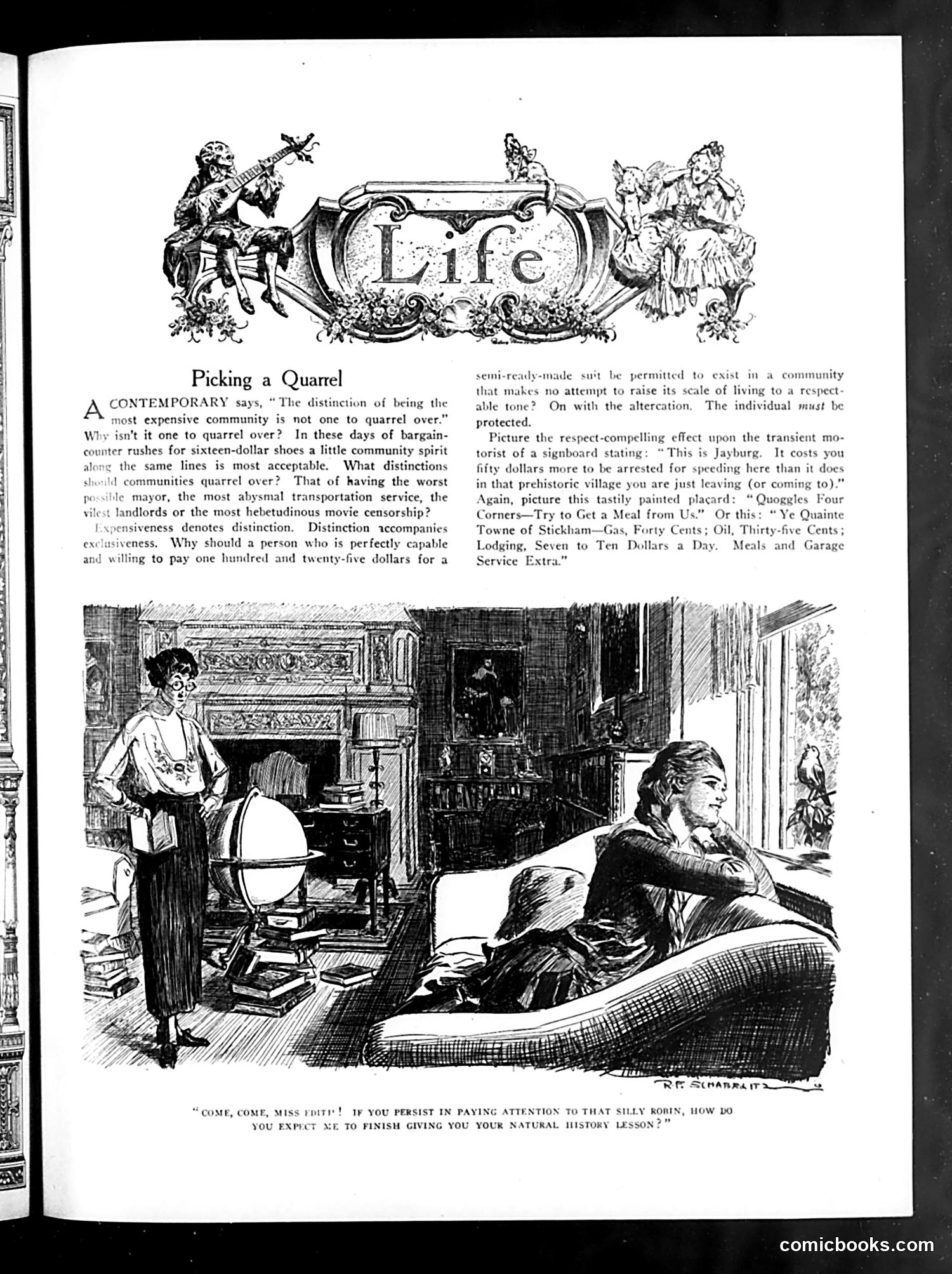
This page satirizes social pretension and class consciousness. The article mocks wealthy communities that pride themselves on exclusivity while squabbling over status. It questions why expensive neighborhoods argue over who can afford to live there, pointing out the hypocrisy: if you can pay $125 for housing, why quarrel about it? The illustration depicts a domestic scene where a woman stands confronting a man lounging on a couch. The caption suggests she's interrupting his attention to dismiss her educational efforts, implying marital discord rooted in class anxiety. The page references specific villages (Jayburg, Stickliam) with satirically quoted advertising slogans about costs, mocking how wealthy communities market their "respectability" while obsessing over minor status distinctions.
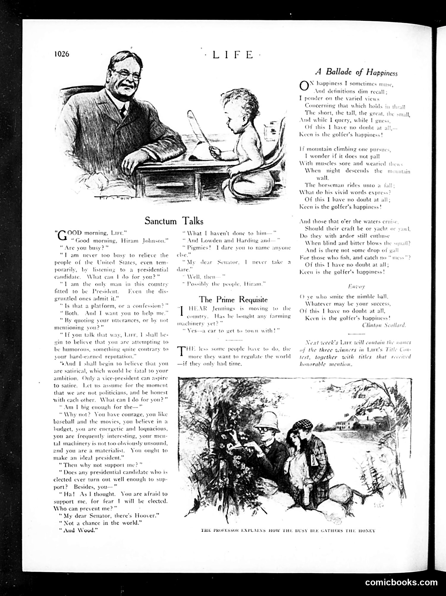
This page contains three separate pieces: 1. **"Sanctum Talks"** - A dialogue between "Life" and "Hiram Johnson," a U.S. Senator discussing presidential ambitions. The conversation satirizes political candidates who claim they don't want office while clearly pursuing it. Johnson mentions potential rivals like Lowden and Harding. 2. **"A Ballade of Happiness"** - A poem by Clinton Scollard celebrating the golfer's contentment, contrasting it with other pursuits (mountain climbing, water activities). 3. **"The Prime Requisite"** - A brief humorous exchange about farming and regulation, likely satirizing government overreach. The top illustration shows a man and child at a desk, appearing pedagogical in nature. The bottom illustration depicts what appears to be beekeeping or agricultural instruction ("The Professor Explains How the Busy Bee Gathers the Honey").
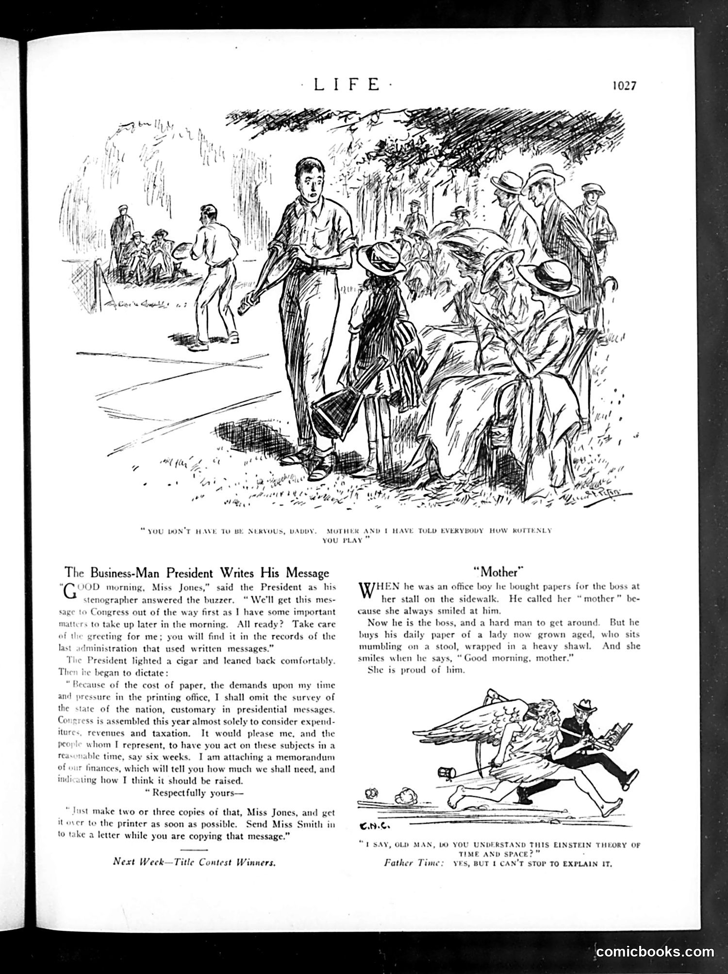
This page from *Life* magazine contains three separate pieces of satirical content: **"The Business-Man President Writes His Message"** satirizes a president who bureaucratizes communication excessively. He dictates a memo about reducing paper costs by surveying "the state of the nation," requesting Congress consider expenditures, revenues, and taxation—turning what should be direct leadership into red-tape bureaucracy. The joke mocks overly formal, procedure-laden governance. **"Mother"** tells a sentimental story about a factory boss who calls a newspaper vendor "mother" because she always smiled at him. Now elderly and powerful, he buys papers from her daily—a touching tale of humble origins shaping character. **The bottom cartoon** depicts a father unable to explain Einstein's relativity theory to his son—contemporary satire on the bewildering new physics of the era that even educated adults struggled to comprehend.
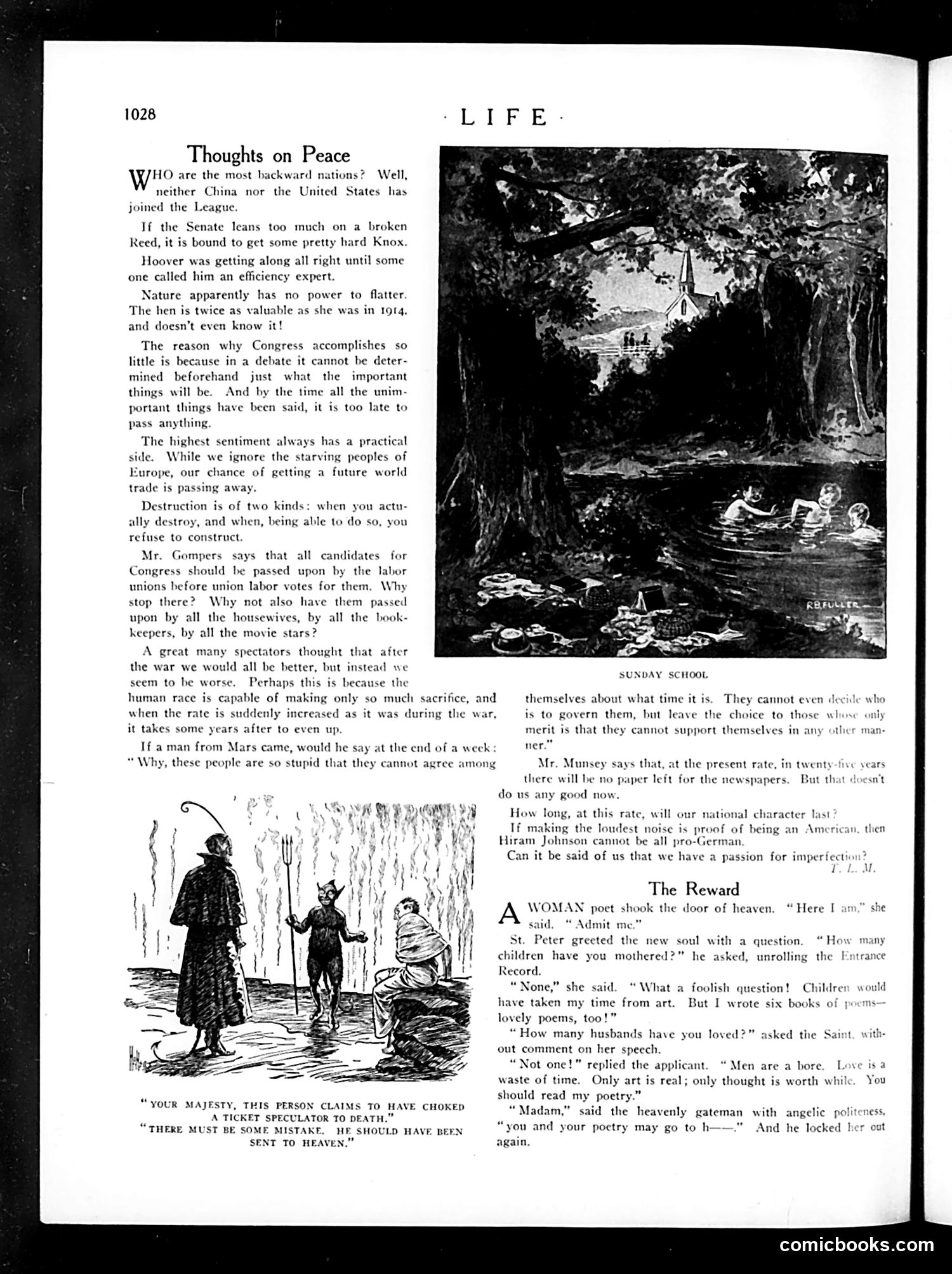
The page contains two distinct editorial cartoons satirizing post-WWI America: **"Thoughts on Peace"** (top): A philosophical essay questioning American political ineffectiveness, mentioning Congress's inability to debate substantively and comparing America unfavorably to other nations on peace issues. **Lower cartoon**: Depicts a tall figure (appearing to represent authority or judgment) confronting a shorter figure, with caption: "YOUR MAJESTY, THIS PERSON CLAIMS TO HAVE CHOKED A TICKET SPECULATOR TO DEATH. THERE MUST BE SOME MISTAKE. HE SHOULD HAVE BEEN SENT TO HEAVEN." This satirizes ticket scalping as such a despised practice that murdering a scalper would be morally justified—even heaven-worthy. It reflects public anger at profiteering during the post-war period. The page also includes "The Reward," a humorous dialogue between a female poet and Saint Peter.
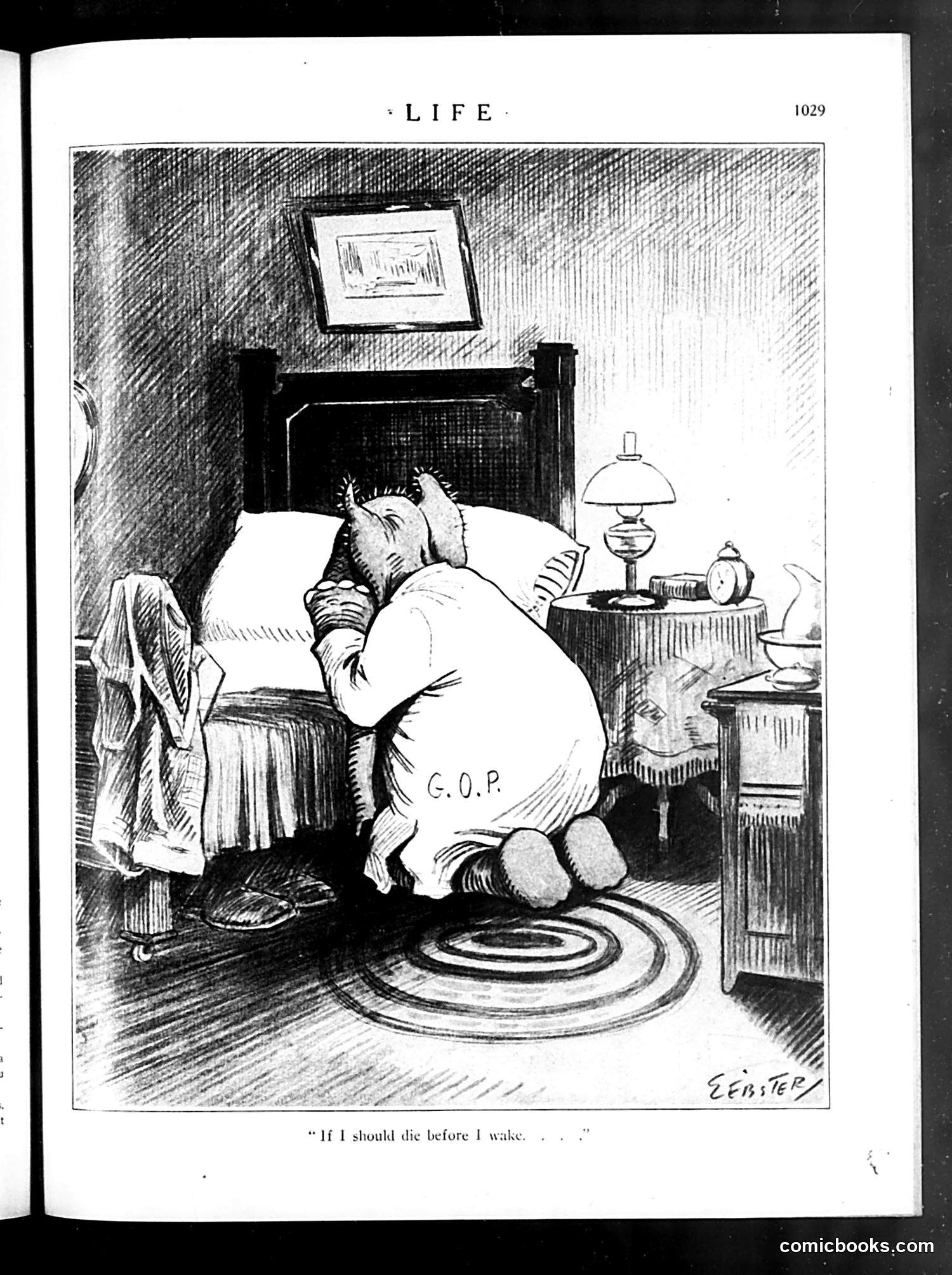
This is a satirical cartoon from *Life* magazine depicting a figure labeled "G.O.P." (Republican Party) kneeling in prayer beside a bed, with the caption "If I should die before I wake..." The cartoon references the children's prayer "Now I lay me down to sleep / If I should die before I wake..." to mock the Republican Party's precarious political position. The figure's posture—on knees in apparent desperation—suggests the GOP faced existential political danger and was literally praying for survival. Without a visible date, the specific historical crisis is unclear, but this likely references a period when Republicans faced significant electoral or institutional threats. The crude, exaggerated rendering emphasizes the cartoon's contemptuous tone toward the party.
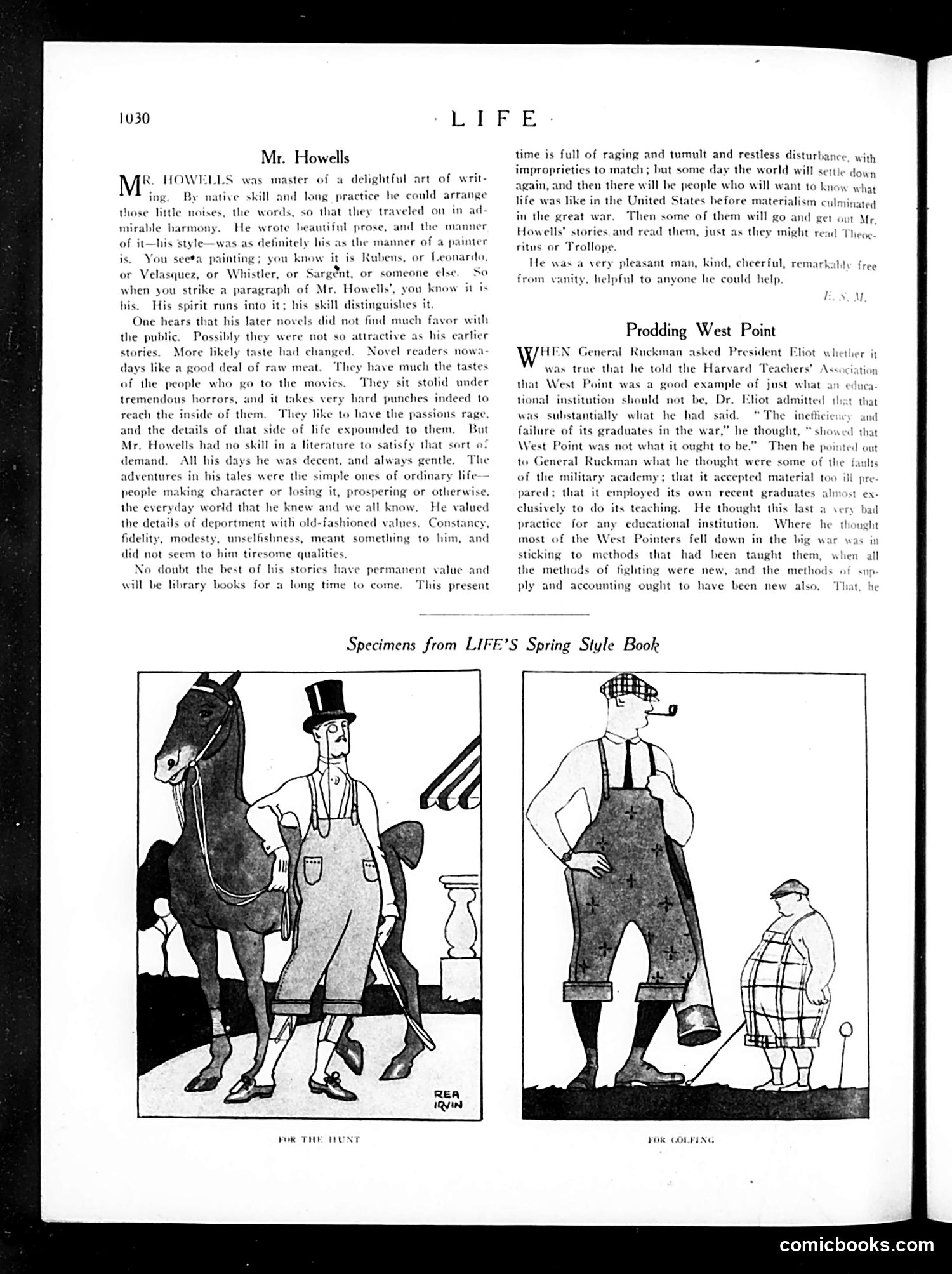
This page contains two distinct sections: **Upper Section - Mr. Howells Tribute:** An obituary/appreciation of writer William Dean Howells praising his distinctive literary style and moral values. The text criticizes modern readers' preference for sensational content over Howells' quiet, character-driven stories about ordinary life. It suggests future generations will value his work as a historical record of pre-materialist America. **Lower Section - West Point Critique:** A brief article about Harvard President Charles W. Eliot's criticism of the U.S. Military Academy. Eliot reportedly told General Ruckman that West Point exemplified what a good institution should *not* be—accepting unprepared cadets and staffing itself exclusively with recent graduates. The satire suggests West Pointers failed in WWI because they rigidly applied outdated methods rather than adapting to new warfare tactics and logistics. **Bottom - Fashion Cartoons:** Two humorous illustrations labeled "For the Hunt" and "For Golfing" showing exaggerated period clothing styles, typical of Life magazine's satirical fashion commentary.
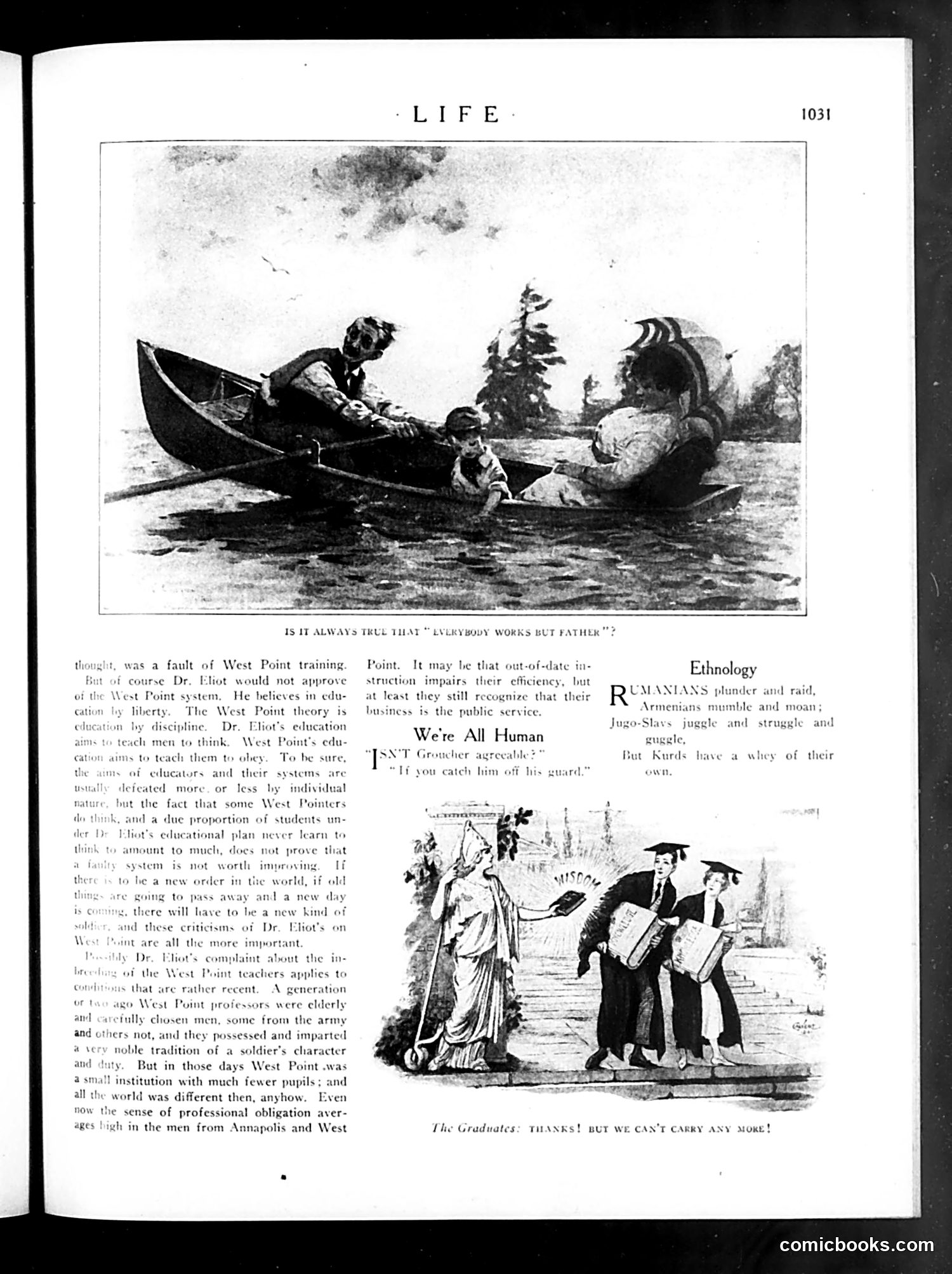
This page contains commentary on West Point military academy education and two cartoons satirizing social issues. **Top Cartoon:** "Is It Always True That 'Everybody Works But Father?'" depicts a domestic scene where a man relaxes in a boat while a woman and child labor nearby, literalizing the popular saying. The joke critiques the gender imbalance in household work. **Text Section:** Discusses Dr. Eliot's criticisms of West Point's educational approach, arguing that rigid military discipline ("teach them to obey") rather than critical thinking ("teach men to think") poorly serves officers. The author defends West Point's tradition while acknowledging reform is needed. **Bottom Cartoon:** "The Graduates: Thanks! But We Can't Carry Any More!" shows Lady Liberty handing diplomas to graduating men while she herself is already burdened with heavy responsibilities (represented visually). This satirizes the expectation that newly educated citizens will contribute to national burdens they didn't create, suggesting skepticism about whether education adequately prepares graduates for real-world obligations.
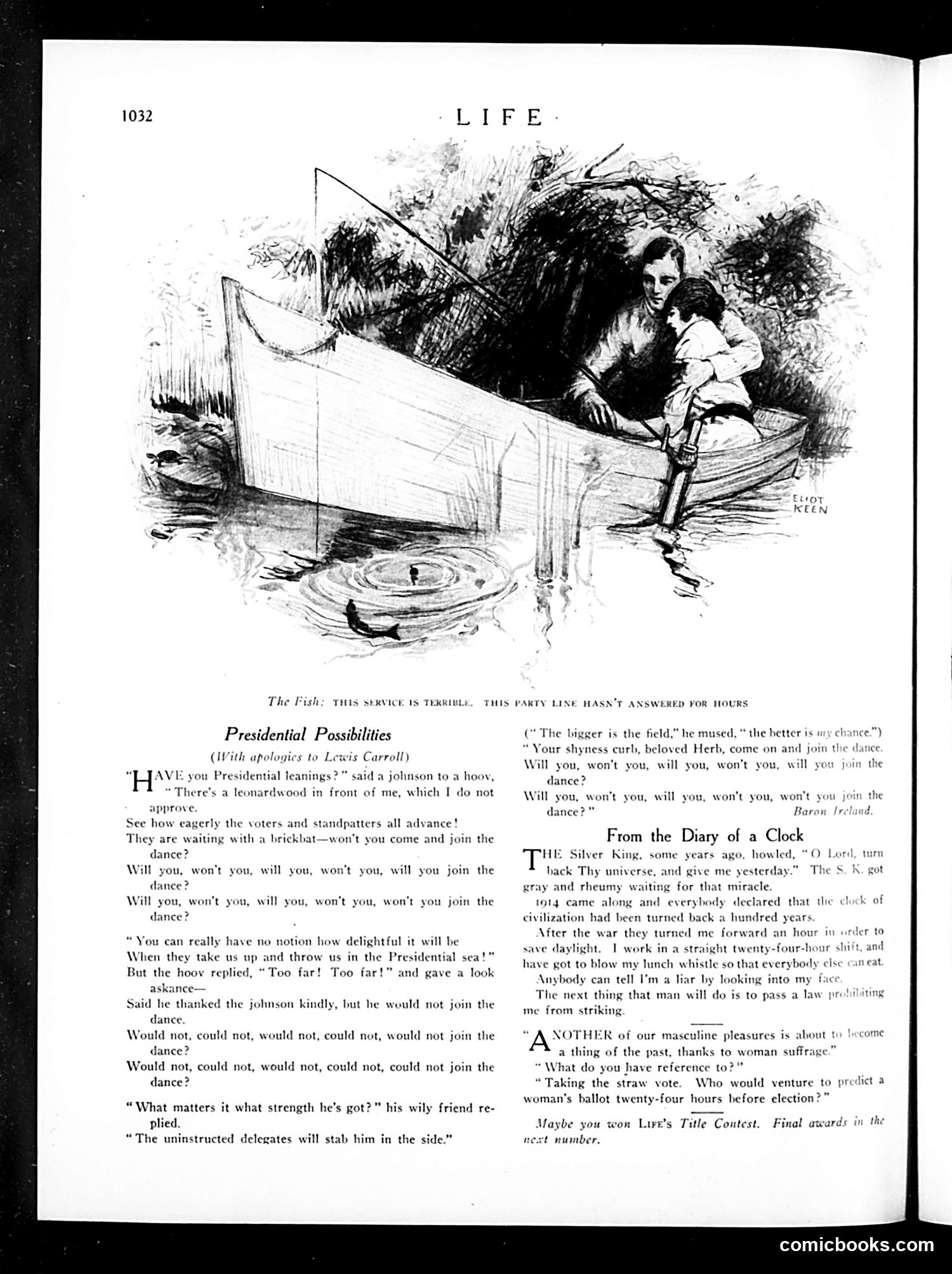
This page satirizes the 1920 U.S. presidential race using Lewis Carroll's "Lobster Quadrille" as its template. The cartoon references several potential candidates: "johnson" (likely James M. Cox), "hoov" (Herbert Hoover), and "leonardwood" (General Leonard Wood)—all figures discussed for the Republican nomination that year. The satire mocks how politicians are pressured into running despite reluctance, using Carroll's whimsical invitation-to-dance metaphor. The "uninstructed delegates will stab him in the side" references the backroom dealing and treachery of convention politics. The "Presidential sea" suggests the dangerous, unpredictable nature of electoral campaigns. The sketch of a woman and child fishing illustrates accompanying text about feminine political power—women had recently gained voting rights (1920), and the piece jokes that women now make straw polls unpredictable, removing a traditional male political advantage.
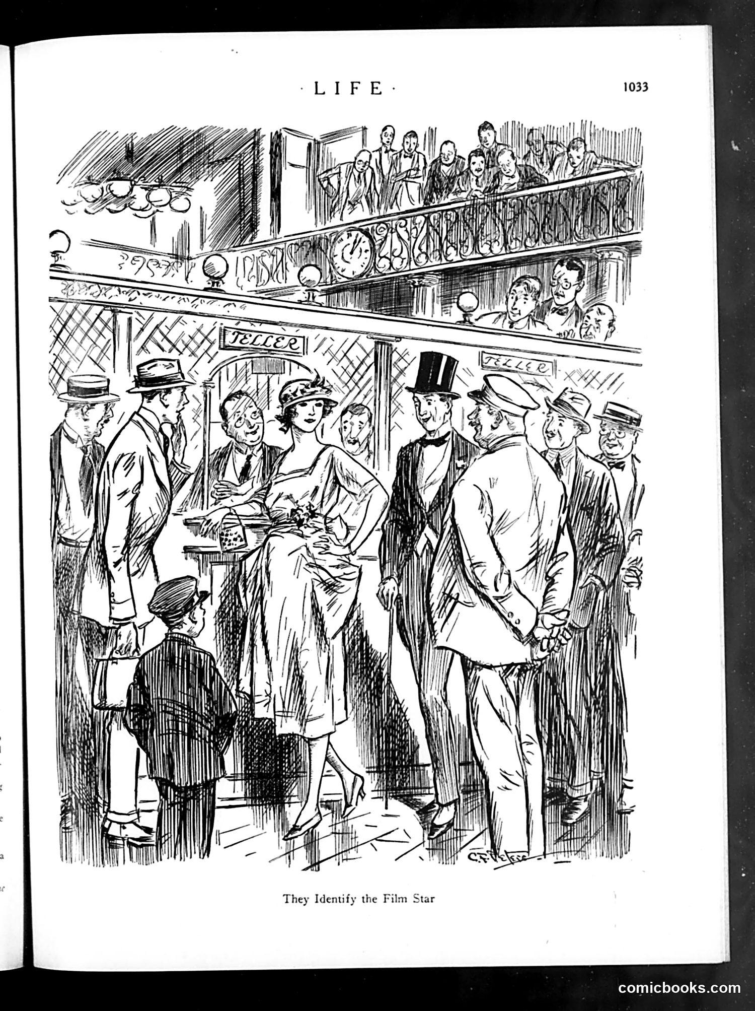
This cartoon satirizes the cult of celebrity and public obsession with movie stars in the early 20th century. The scene depicts a crowd of well-dressed men and women at what appears to be a theater or public venue, eagerly pointing out and identifying a female figure in their midst—the "film star." The humor lies in the contrast between the ordinary setting and the frenzy of recognition. The crowd's animated reactions suggest that spotting a celebrity in public was a significant social event worthy of excitement and collective confirmation. The cartoon mocks both the public's celebrity worship and the performative nature of social status, where identification and acknowledgment by peers validates one's importance.
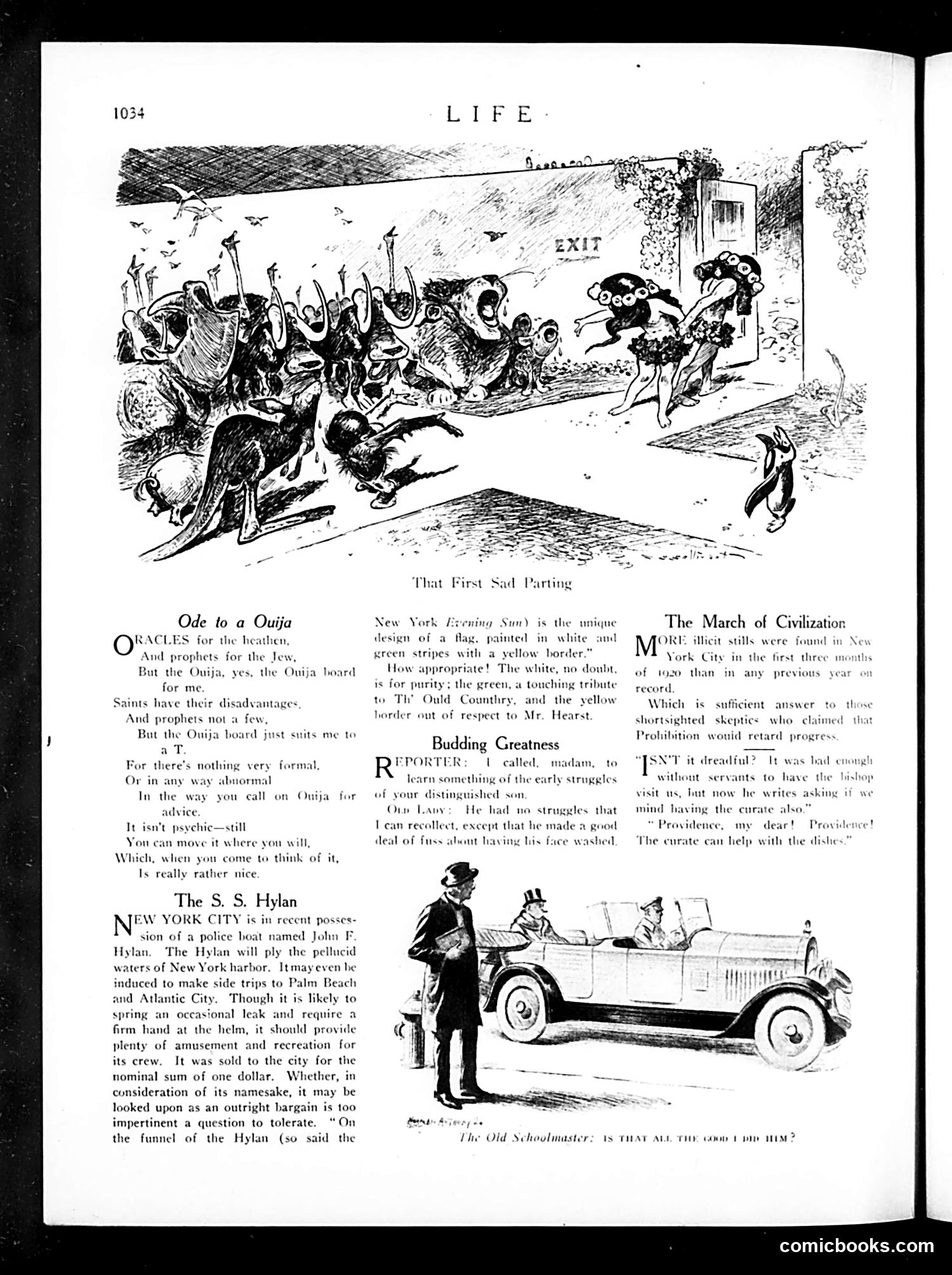
This page contains satirical commentary on 1920s American culture: **"Ode to a Ouija"** mocks the popularity of Ouija boards as a supposedly mystical device, sarcastically praising them because they're actually just pieces of wood you move yourself—making the "spiritualism" entirely fraudulent and controllable. **"The S.S. Hylan"** satirizes NYC Mayor John F. Hylan, ridiculing a police boat named after him. The sarcastic description of the flag's colors (white for purity, green for "The Old Country," yellow for publisher William Randolph Hearst) implies Hylan is corrupt and influenced by Hearst. **"The March of Civilization"** celebrates Prohibition's enforcement, noting more illegal stills were found in 1929 than ever before—presented as "progress," though the irony suggests Prohibition is actually failing spectacularly. **Top cartoon** depicts animals leaving a theater marked "EXIT," captioned "That First Sad Parting," likely commenting on something in popular entertainment. The page overall satirizes government incompetence, public gullibility, and Prohibition's obvious failure.
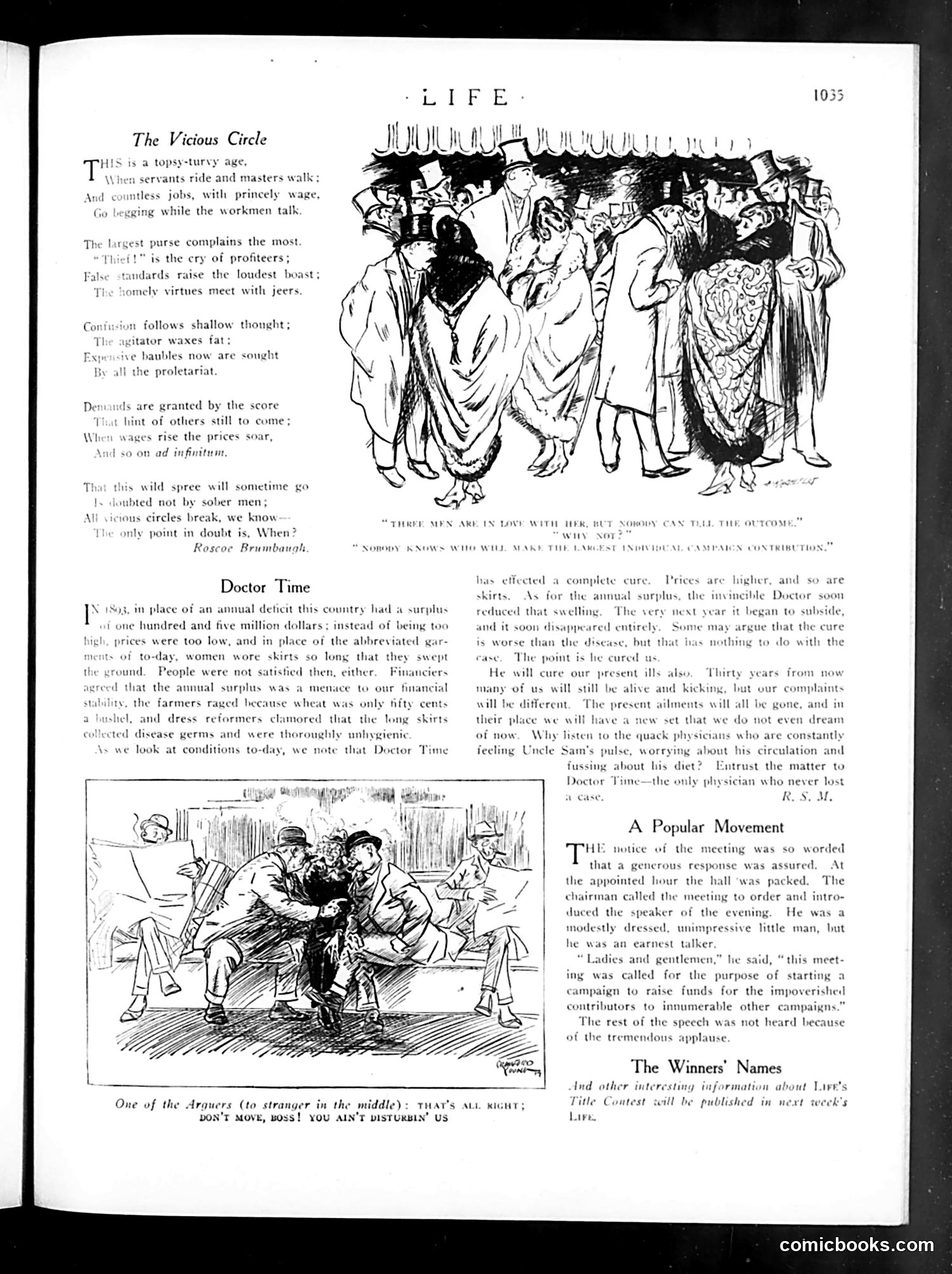
This page contains satirical commentary on post-WWI American economic cycles and class dynamics. **"The Vicious Circle"** poem by Roscoe Brumbaugh critiques economic inequality: servants now ride while masters walk; the wealthy complain most; profiteers cry "thief"; wages and prices spiral upward endlessly. The cartoon above depicts a crowded, chaotic crowd, illustrating social disorder from this economic inversion. **"Doctor Time"** satirizes economic complacency. It references 1893's surplus (replacing a deficit), noting that while prices subsequently rose and skirts shortened, people remained unsatisfied. The piece mocks those seeking quick financial fixes, arguing only "Doctor Time" cures economic ills—implying current problems will eventually resolve naturally, regardless of policy. **"A Popular Movement"** shows an earnest speaker at a packed hall raising funds for "impoverished contributors to innumerable other campaigns"—a joke about chronic fundraising fatigue among wealthy donors. The audience applauds because they didn't hear his actual pitch. The lower cartoon depicts the Argonaut (stranger in middle) being told not to move, suggesting he's serving as a convenient seat or prop.
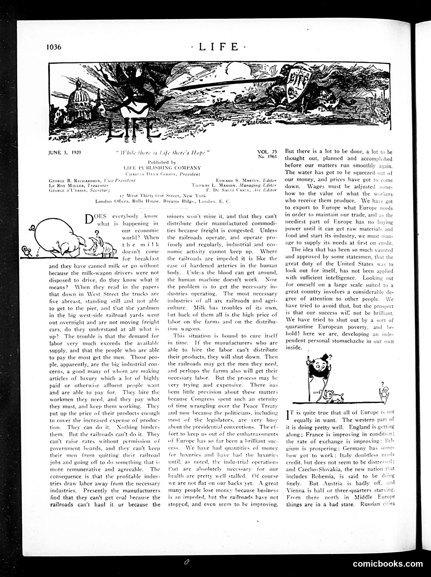
This page discusses post-WWI economic disruption, particularly labor shortages affecting railroads and milk delivery—critical infrastructure for American industry. The cartoon (upper left) depicts a cow, illustrating the article's opening about milk supply failures when wagon drivers strike or quit. The text explains that wage-seeking workers abandon railroad jobs for better-paying luxury industries, creating a cascade: railroads can't operate → coal doesn't move → manufacturers can't produce → the economy seizes up like "hardened arteries." The author argues railroads, unlike private manufacturers, can't simply raise prices to retain workers (government boards control rates). The solution requires voluntary worker restraint until conditions improve—though the author acknowledges this will be "very trying and expensive." The piece reflects 1920 anxieties about labor unrest, inflation, and postwar economic chaos, while blaming politicians distracted by Peace Treaty negotiations for failing to address industrial problems proactively.
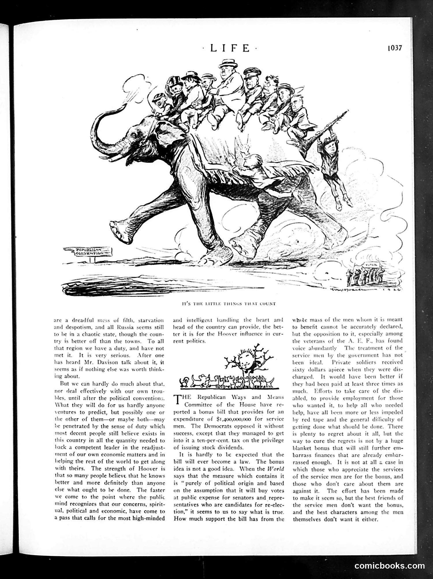
The cartoon depicts an elephant—the Republican Party symbol—carrying numerous politicians on its back while trudging through clouds of dust. A soldier with a rifle stands nearby, observing. **The satire targets the 1928 bonus bill debate.** The text criticizes a $1.4 billion service bonus proposed by Republicans as politically motivated—designed to "buy votes" rather than genuinely help veterans. The cartoon suggests politicians are using returning soldiers as mere weight or burden for partisan gain. **Key context:** After WWI, veterans received only $60 upon discharge and faced unemployment and bureaucratic obstacles. While acknowledging legitimate grievances, the article argues the proposed bonus is financially irresponsible. The "little things that count" implies sincere aid (employment, disability care) matters more than a massive cash payout designed for electoral advantage. The soldier's presence symbolizes those for whom politicians claim to legislate while actually prioritizing their own political survival.
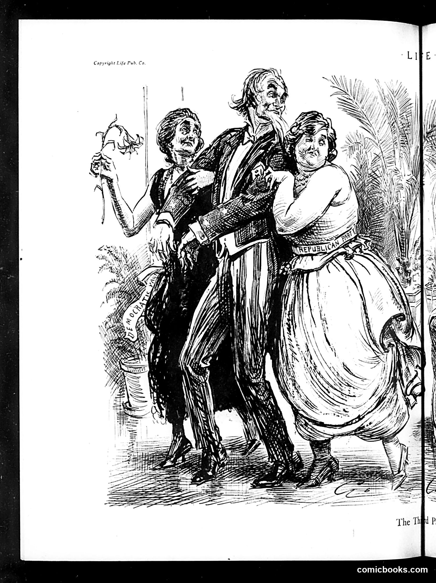
This is a political cartoon satirizing Republican Party leadership during what appears to be the Gilded Age or Progressive Era. The central figure (a tall man in formal dress) is flanked by two women representing different political constituencies or interests the party was attempting to court or manage. One woman holds a withered plant, suggesting depleted resources or failed promises. Text visible includes "REPUBLICAN PARTY" on one figure's garment. The cartoon likely critiques Republican attempts to balance competing political factions or interests—possibly addressing women's suffrage, labor concerns, or competing regional interests. The exaggerated facial expressions suggest mockery of the party's political juggling act. Without clearer text identification of the specific figures or date, the exact political moment remains unclear, but it exemplifies Life magazine's characteristic satirical commentary on party politics.
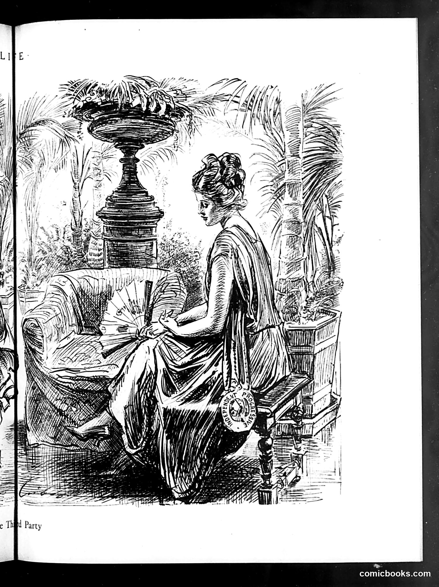
The OCR text is too corrupted to read reliably. However, the image itself shows a pen-and-ink illustration depicting a woman in an elegant, flowing dress seated in what appears to be a luxurious indoor garden setting with potted palms. She wears a locket or pendant and has her hair styled in an elaborate updo typical of early 20th-century fashion. A decorative urn with flowering plants sits prominently in the background. The caption partially visible at bottom reads "...e Third Party," suggesting this illustration relates to some political or social commentary about a "third party" — possibly referencing political factions or social movements of that era. Without clearer text, the specific satirical point remains unclear. The illustration style and setting suggest commentary on wealth, leisure, or social dynamics among upper-class women.
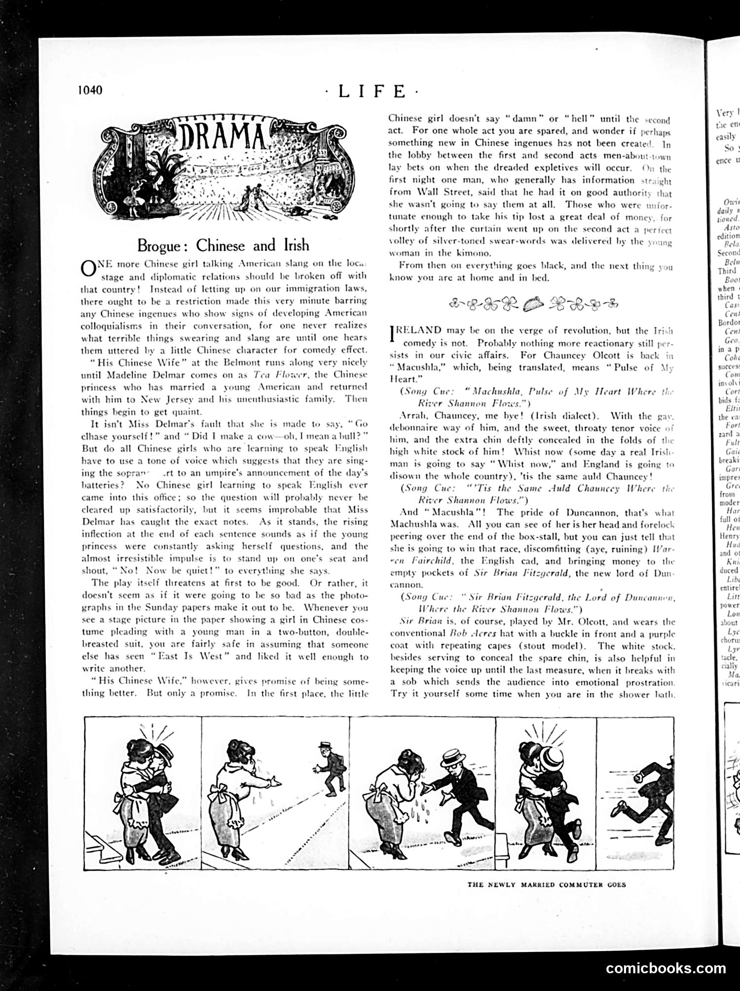
This page reviews two Broadway plays featuring ethnic stereotypes popular in early 20th-century American theater. **"His Chinese Wife"** mocks a Chinese actress (Madeline Delmar) playing a princess who adopts American slang and profanity. The critic finds her exaggerated accent—a rising inflection suggesting constant questioning—implausible and grating. The satire targets both the play's reliance on tired "East meets West" plots (following the success of "East Is West") and the absurdity of casting choices that require performers to adopt offensive vocal mannerisms for comic effect. **"Macushla"** features Irish-American actor Chauncey Olcott performing Irish-dialect comedy with exaggerated physical comedy (the strip below shows "The Newly Married Commuter"). The reviewer criticizes it as hopelessly old-fashioned and reactionary—even as Ireland faces political upheaval. Both reviews expose how mainstream entertainment relied on caricatured ethnic performances for humor, treating linguistic and cultural differences as inherently comedic.
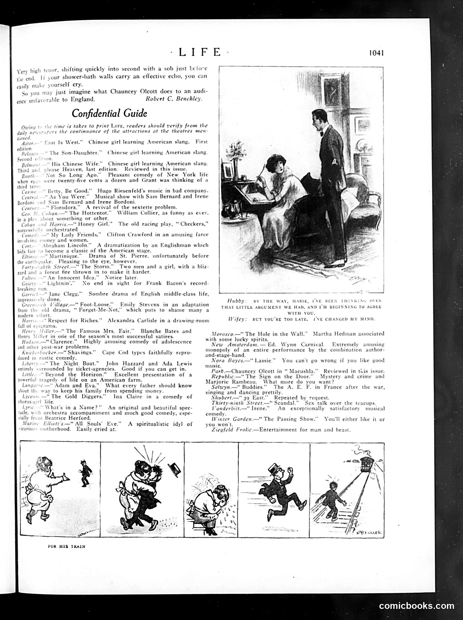
This page is primarily a "Confidential Guide" to Broadway theater attractions from the early 1920s. The OCR'd text is a theater listing/review guide, not politically satirical content. The main illustration shows a domestic scene: a husband apologizing to his wife about an argument, but she interrupts him—"But you're too late. I've changed my mind." This is social satire about marital dynamics, mocking the husband's expectation that his concession will resolve conflict, only to discover women's autonomy and changeability. The small comic strip at bottom labeled "For His Train" (partially visible) appears to show slapstick humor about someone missing or chasing a departing train—typical physical comedy of the era. The page references theater performers like Chauncey Olcott and Blanche Bates, and mentions several plays involving Chinese characters, reflecting 1920s theatrical trends. There's no apparent political cartoon or major historical reference—this is primarily entertainment-industry content and light domestic humor.
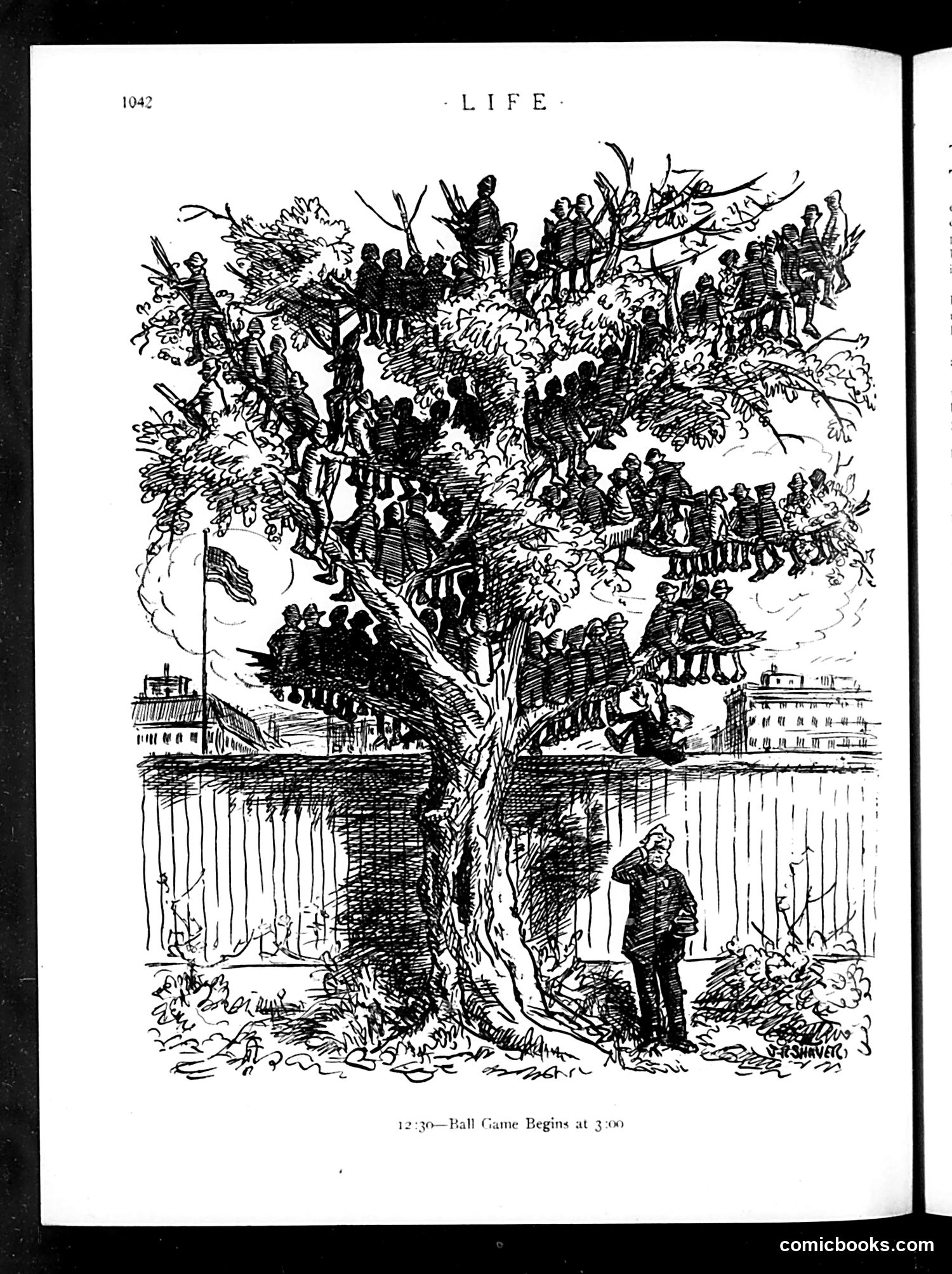
This is a single illustration titled "12:30—Ball Game Begins at 3:00," depicting a massive tree filled with uniformed figures (appearing to be military or police) crowded throughout its branches and trunk. A solitary uniformed official stands at the base examining the tree. The cartoon appears to satirize bureaucratic or military organization—the absurdity of packing large numbers of personnel into a confined space, with the time notation suggesting impatience or wasted waiting time before an event begins. The "ball game" likely references a specific public event or gathering. The satirical point seems to be criticizing institutional inefficiency, overcrowding, or possibly bloated administrative/military hierarchies. Without additional context about Life magazine's publication date or current events referenced, the specific target remains unclear, though the image effectively conveys organizational chaos through visual metaphor.
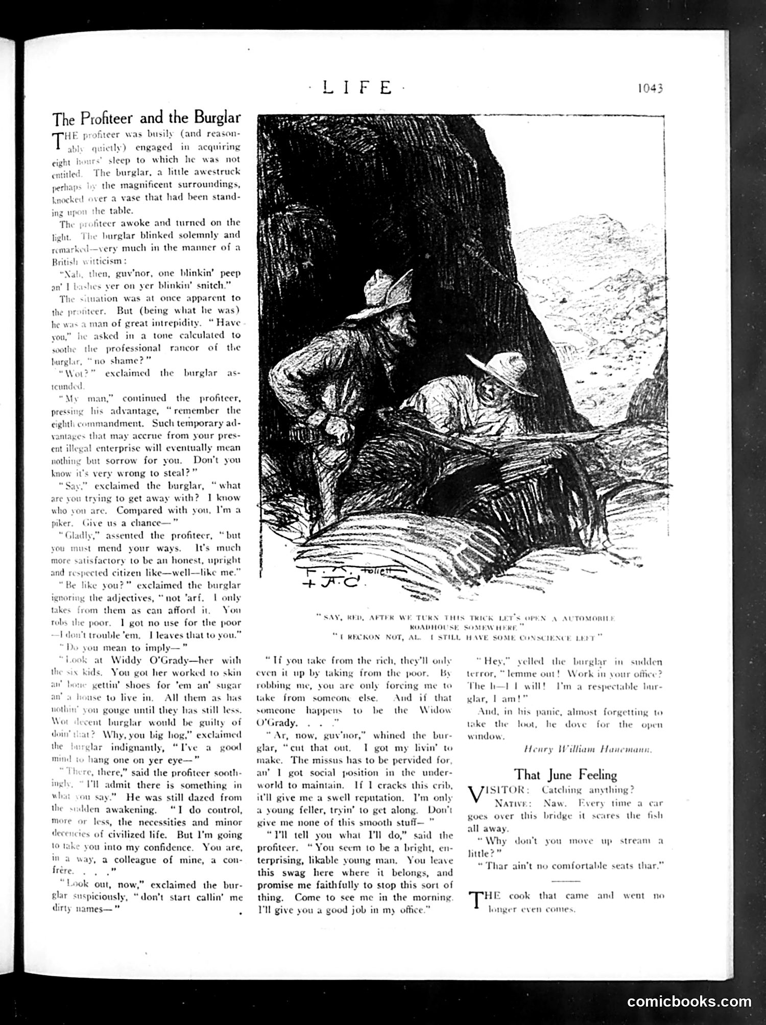
This satirical story contrasts two criminals with opposing moral frameworks. A wealthy **profiteer** (a businessman who exploits wartime shortages for illegal profit) is burgled by a working-class **burglar**. When caught, the profiteer lectures the burglar about morality—don't steal, it's wrong. The burglar responds by pointing out the profiteer's own exploitation: he robs the poor through legal business practices while the burglar steals only from those who can afford it. The profiteer even admits controlling "necessities and minor luxuries of civilized life." The satire's point: both are criminals, but one operates within the law while the other doesn't. The profiteer's self-righteous moralizing is exposed as hypocrisy. When offered legitimate employment, the burglar flees—suggesting legal "respectability" under such a system is merely another form of theft. This reflects post-WWI disillusionment with capitalism and class inequality.
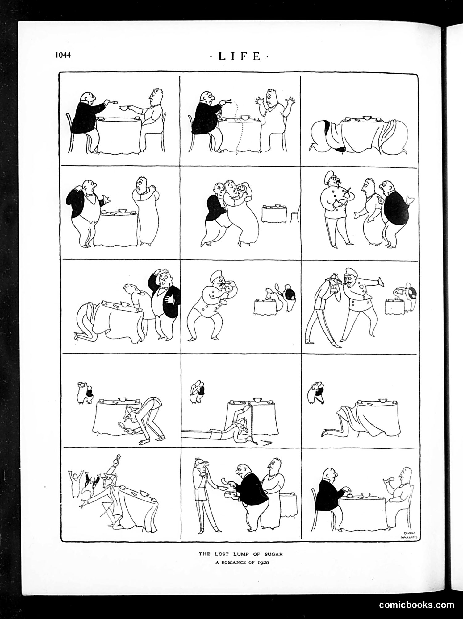
This comic strip satirizes post-WWI sugar rationing in America. The narrative follows a man's desperate pursuit of a single lump of sugar—depicting it as a romantic "quest" object during a period of severe shortage. The strip shows escalating chaos: the man negotiates with a woman at a table, chases her, physically struggles with other characters, involves police or authority figures, and culminates in widespread pandemonium over this single commodity. The humor mocks how trivial items became precious during shortages, treating a sugar lump with the gravity of a valuable treasure or romantic prize. It reflects genuine 1920 scarcity conditions when sugar rationing created unexpected social conflict and absurd desperation among ordinary Americans.
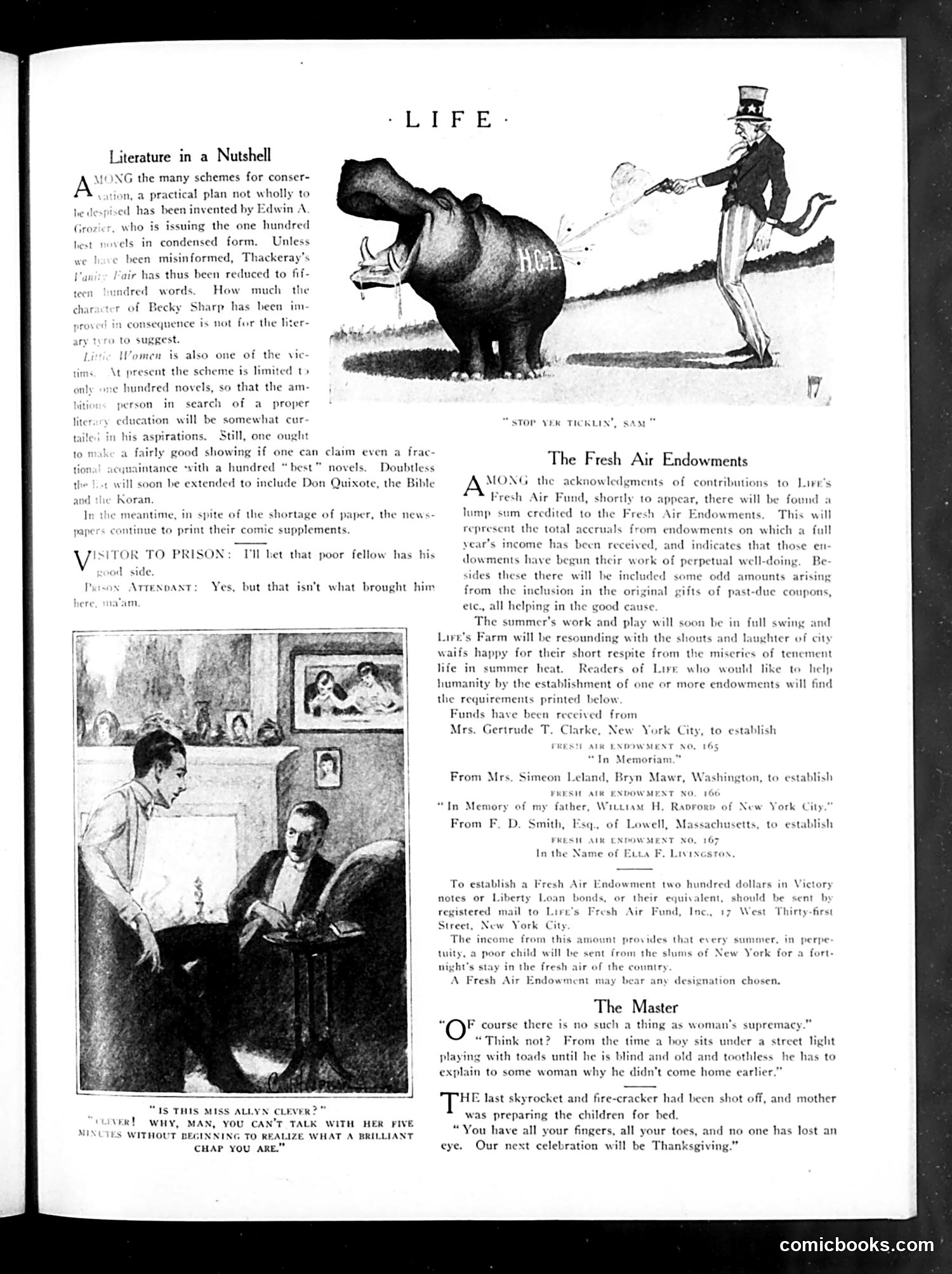
This page contains three satirical pieces: **"Literature in a Nutshell"** mocks a condensation scheme by Edwin A. Grozier, who is publishing classic novels in abbreviated form. The satire attacks the absurdity of reducing substantial works like Thackeray's *Vanity Fair* to mere hundreds of words, arguing this cultural shortcut is ridiculous—though the author admits one could claim familiarity with "a hundred 'best' novels" this way. **"The Fresh Air Endowments"** announces a charitable fundraising campaign for Life magazine's farm program, which sends poor urban children to the countryside for summer respite. It lists specific donors and their memorial contributions. **"The Master"** and accompanying dialogue mock gender relations. The cartoons satirize male complaints about women's power (a woman won't let a man explain why he came home late) and a woman's ability to make men feel brilliant simply by listening to them talk. The hippo cartoon captioned "STOP YER TICKLIN', SAM" appears to illustrate a separate humorous anecdote, though context is unclear from this page.
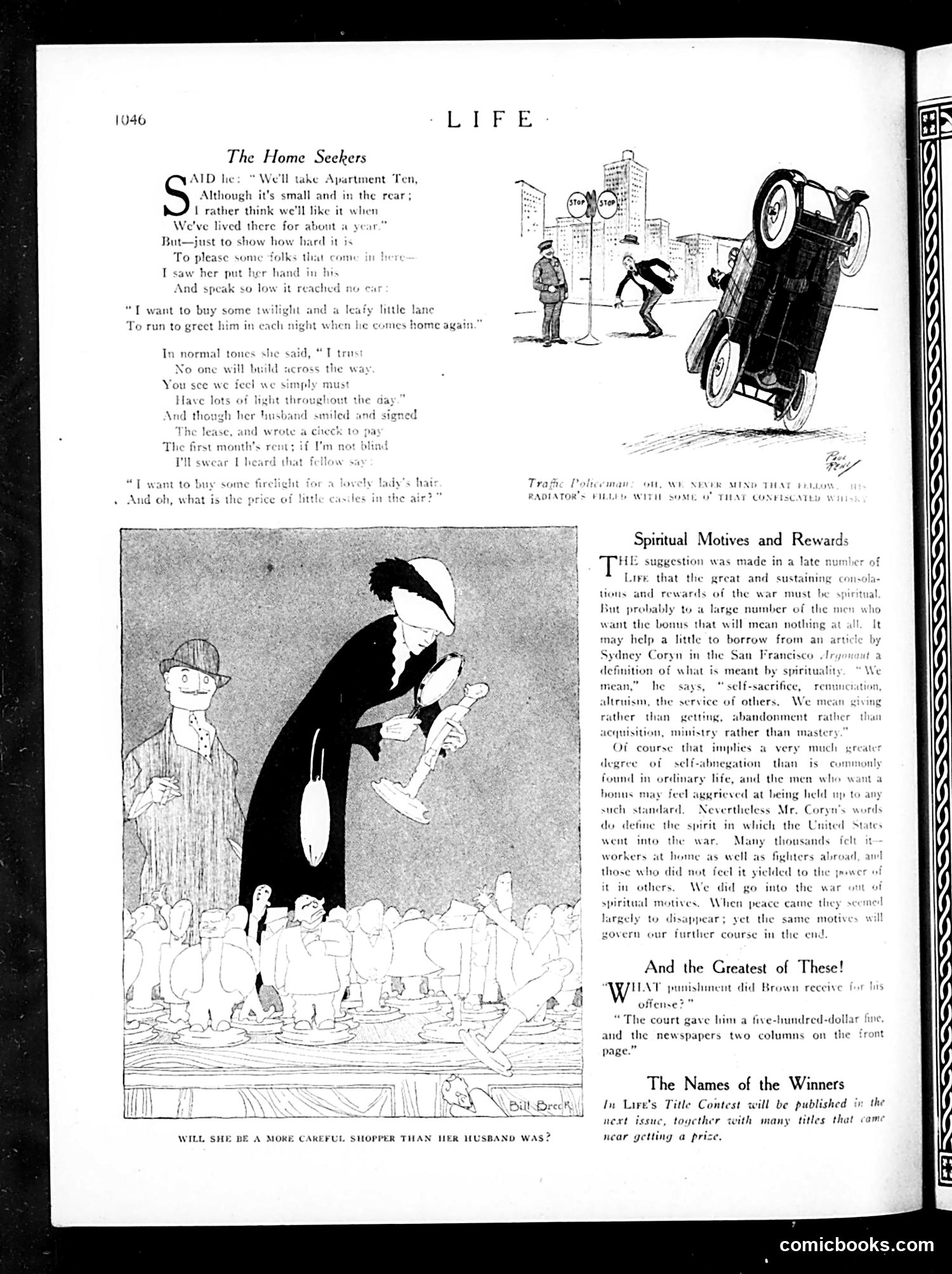
This page contains two main pieces: **"The Home Seekers"** (top): A humorous poem and cartoon about a married couple apartment hunting. The wife whispers her real desires to the landlord (wanting twilight, leafy lanes, firelight for her hair) while her husband publicly claims they'll be satisfied with a small rear apartment. The joke satirizes the gap between what newlyweds *want* versus what they can *afford* post-WWI, and the wife's need to hide her aspirations from her husband. The cartoon shows her towering over tiny figures below, captioned "Will she be a more careful shopper than her husband was?"—suggesting wives manage household finances better than husbands. **"Spiritual Motives and Rewards"**: An editorial discussing post-WWI bonus debates, arguing that war's true rewards should be *spiritual* (self-sacrifice, service) rather than financial. It references Sydney Coryn's definition and suggests soldiers should embrace higher ideals rather than expect monetary compensation. **"And the Greatest of These!"**: A brief anecdote about someone named Brown receiving a five-hundred-dollar fine and newspaper coverage as punishment—the "greatest" irony being public humiliation over the fine itself.
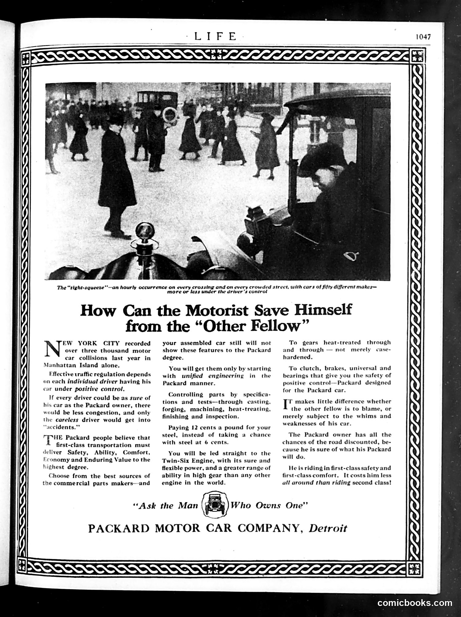
This is primarily a **Packard automobile advertisement**, not political satire. The page uses a photograph of crowded 1920s Manhattan street traffic—labeled "the 'tight-squeeze'"—to illustrate the chaos of urban driving with vehicles of many makes competing for space. The ad's argument is that individual driver skill matters less than having a mechanically superior car. It presents Packard as the solution to traffic accidents: the car's superior engineering (Twin-Six engine, precision parts, quality steel) gives drivers "positive control" regardless of "the other fellow's" driving ability or car quality. The satire is gentle: the ad suggests that blaming other drivers for accidents is less useful than acknowledging that most cars lack reliable controls. Packard positions itself as the premium alternative—safer, more comfortable, and ultimately cheaper than "riding second class" in inferior vehicles. This reflects 1920s concerns about automobile safety as car ownership exploded, before traffic laws and licensing became standardized.
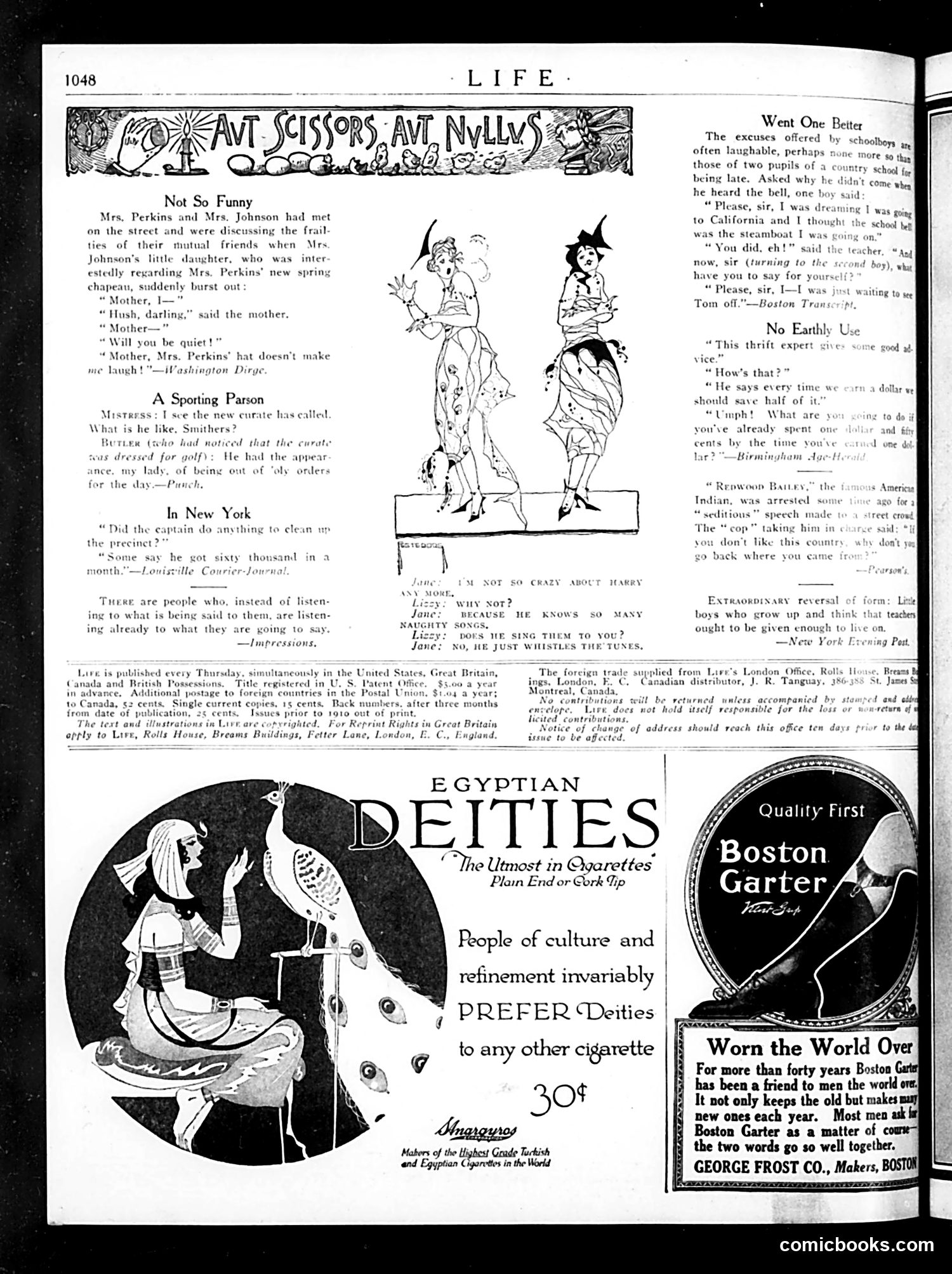
This page from Life magazine (appears to be early 20th century) contains several brief humorous anecdotes and advertisements rather than a single political cartoon. The jokes target everyday social awkwardness: a child's unfiltered comment about an ugly hat, a clergyman inappropriately dressed for golf, and bureaucratic corruption in New York. The "schoolboy excuses" section mocks children's implausible lies about tardiness. A brief dialogue suggests someone who only whistles popular songs rather than speaking—likely satirizing shallow entertainment culture. The advertisements occupy significant space: Egyptian Deities cigarettes (30¢) market cigarettes as refined, and Boston Garter garters emphasize their forty-year reputation and global reach. The overall tone is gentle domestic satire rather than political commentary, focusing on relatable social embarrassments and consumer products typical of Life's satirical but accessible humor for middle-class readers.
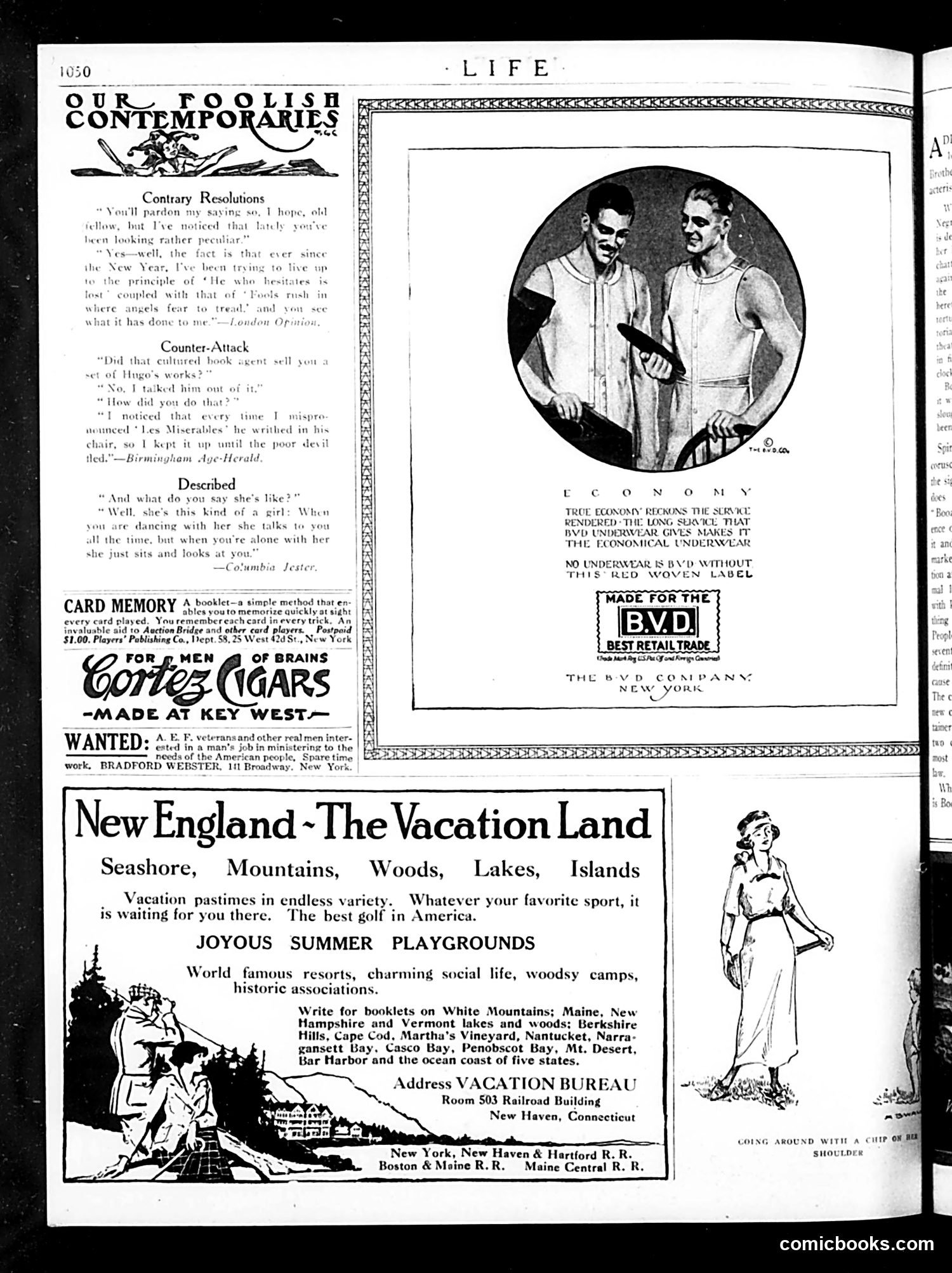
This page is primarily **advertising and filler content** rather than political satire. The main elements are: **"Our Foolish Contemporaries"** (top left): A humor column with three brief, disconnected jokes about everyday life—one involving Hugo's works, another about a girl who talks too much. These are gentle social satire targeting common annoyances, not political commentary. **Central Image**: An advertisement for BVD brand underwear, featuring two men in undergarments. The copy emphasizes "true economy" and quality construction—a straightforward product advertisement typical of the era. **Remaining Content**: A "Card Memory" booklet ad, Cortez Cigars ad, and a large **New England tourism advertisement** promoting vacation destinations across five northeastern states. **Verdict**: This page contains no significant political cartoons or satire. It's a commercial page mixing light humor columns with period advertising. The BVD ad is notable primarily as a historical artifact of men's underwear marketing in the 1920s.
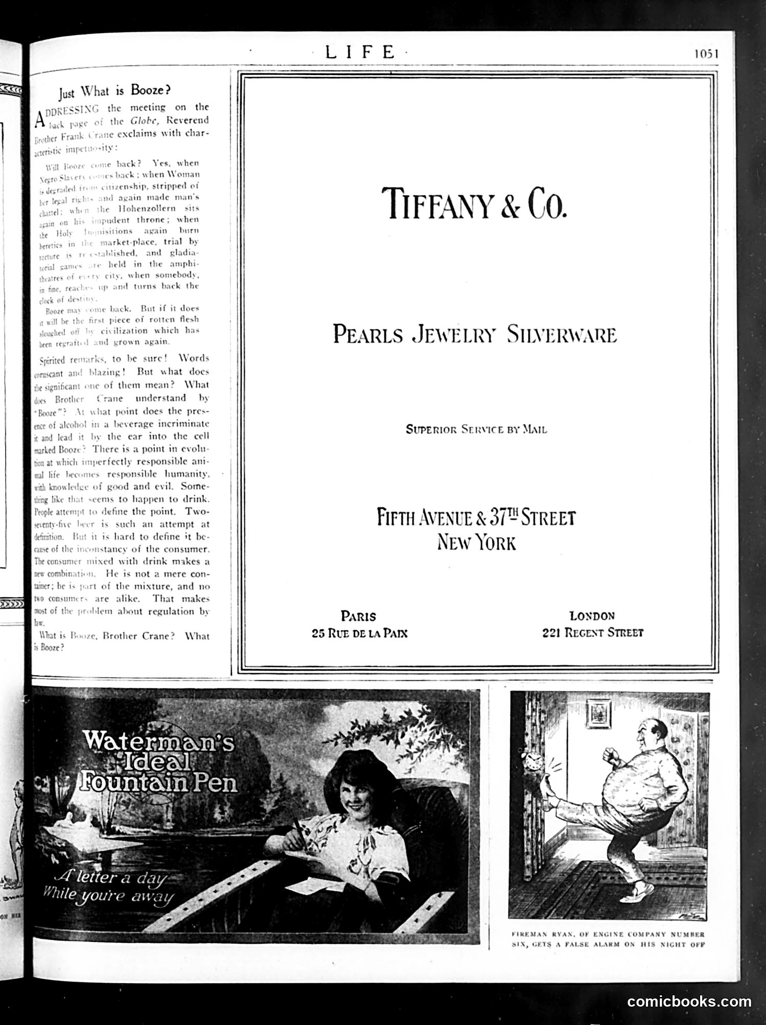
**Main Content:** This page is primarily a **Tiffany & Co. advertisement** for luxury goods (pearls, jewelry, silverware) with store locations in New York, Paris, and London. **Editorial Content (Left):** A discussion titled "Just What is Booze?" where Reverend Brother Frank Crane addresses the metaphysical and moral implications of alcohol consumption. The text debates whether "booze" is merely a beverage or represents a broader social problem—exploring the inconsistency of holding consumers responsible for their actions when intoxicated. **Cartoons (Bottom):** 1. **Left:** Waterman's Ideal Fountain Pen advertisement featuring a romantic scene ("Flitter a day while you're away") 2. **Right:** A humorous illustration captioned "FIREMAN RYAN, OF ENGINE COMPANY NUMBER SIX, GETS A FALSE ALARM ON HIS NIGHT OFF"—depicting a firefighter being startled awake, satirizing the irritation of false alarms disrupting off-duty time. The page blends high-end advertising with light social commentary typical of Life's satirical style.
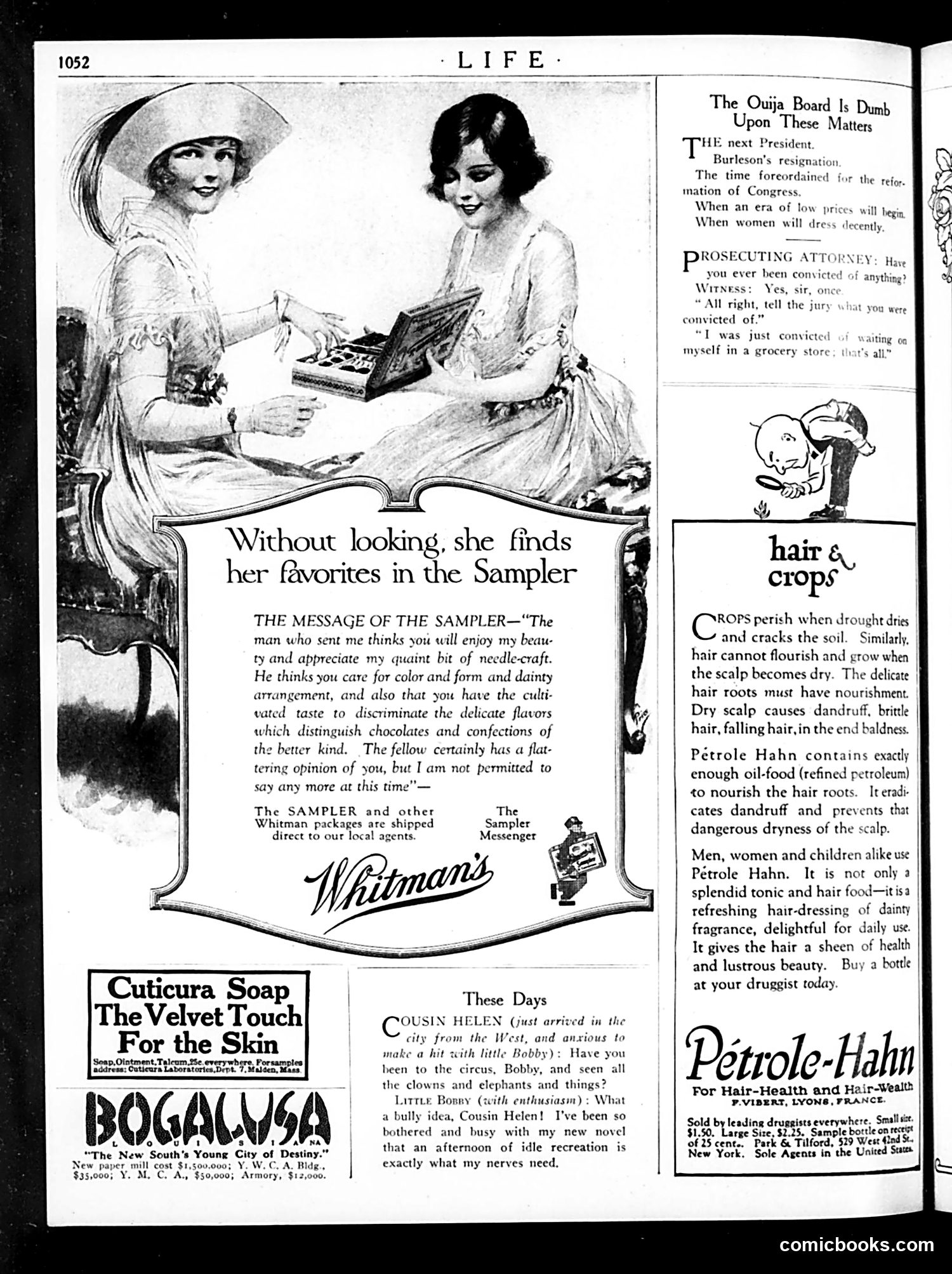
This page mixes political satire with period advertising. The main cartoon satirizes the **Ouija board** as unreliable for predicting serious matters—listing concerns like the next president, Burleson's resignation (likely Albert Burleson, Wilson-era Postmaster General), and congressional reform. The joke: a mystical parlor game cannot solve real political problems. A smaller comic depicts a **prosecutor cross-examining a witness** about prior convictions. The witness admits to "loitering in a grocery store"—a trivial "crime" highlighting either the absurdity of minor charges or witness evasion. The bulk of the page features **product advertisements** for Whitman's chocolates (the "Sampler"), Cuticura Soap, Petrole-Hahn hair tonic, and Bogalusa real estate—typical of Life's revenue model. A brief gossip section mentions "Cousin Helen" visiting from the West, bantering about circuses and novels—light social commentary reflecting 1920s leisure culture.
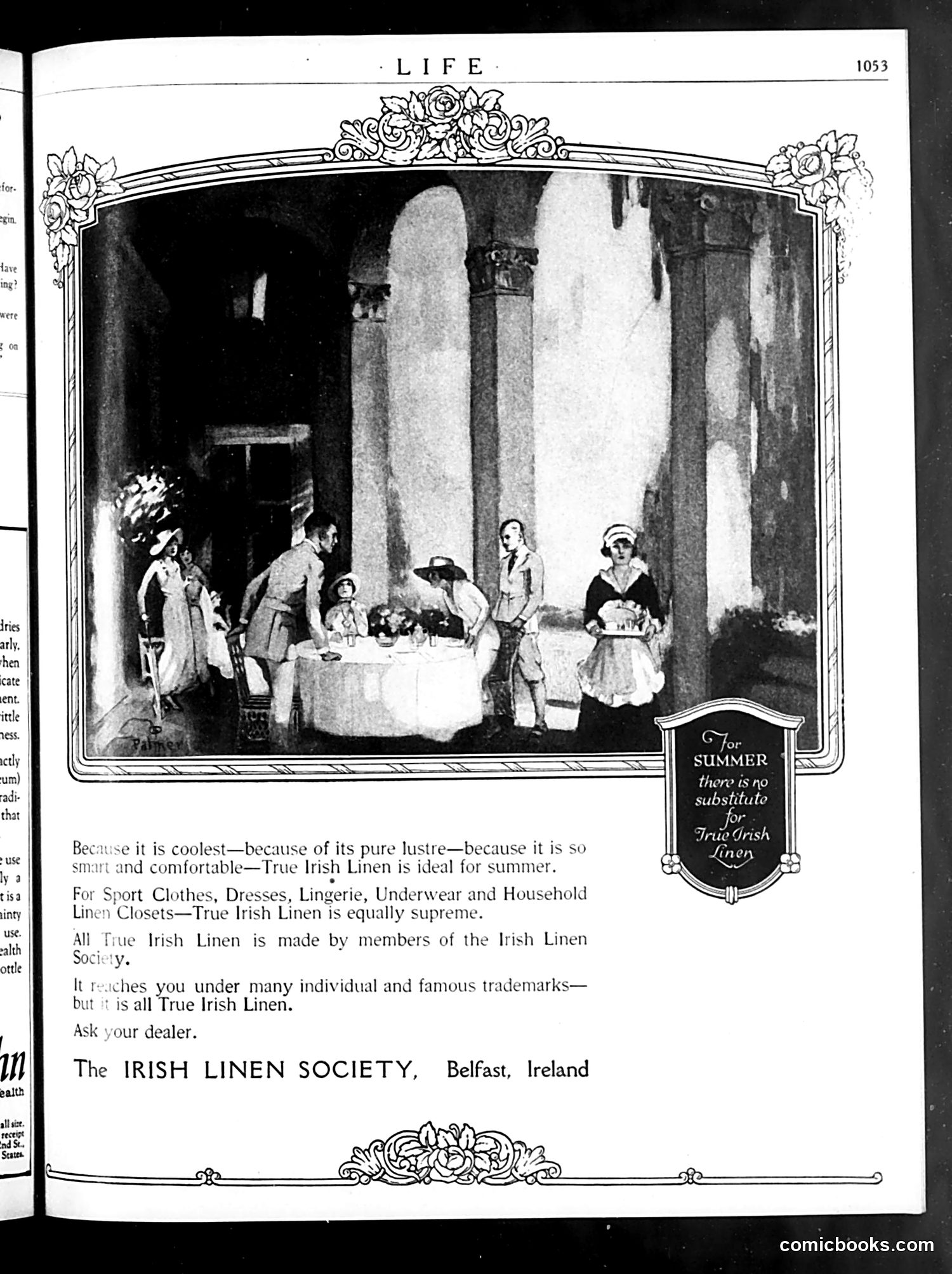
This is primarily a **product advertisement**, not political satire. The page promotes True Irish Linen manufactured by the Irish Linen Society in Belfast. The illustration depicts an elegant outdoor scene—likely a garden party or summer gathering—where well-dressed women and men enjoy leisure activities. The scene exemplifies the aspirational lifestyle associated with linen products: comfort, sophistication, and refinement suitable for summer wear. The key marketing message emphasizes that Irish linen is superior for summer clothing due to its coolness, lustrous appearance, and comfort. The ornamental border and the tagline "For SUMMER there is no substitute for True Irish Linens" frame this as a luxury product. This represents straightforward early-20th-century advertising, using idealized social scenes to associate the product with desirability and class status—not satire or political commentary.
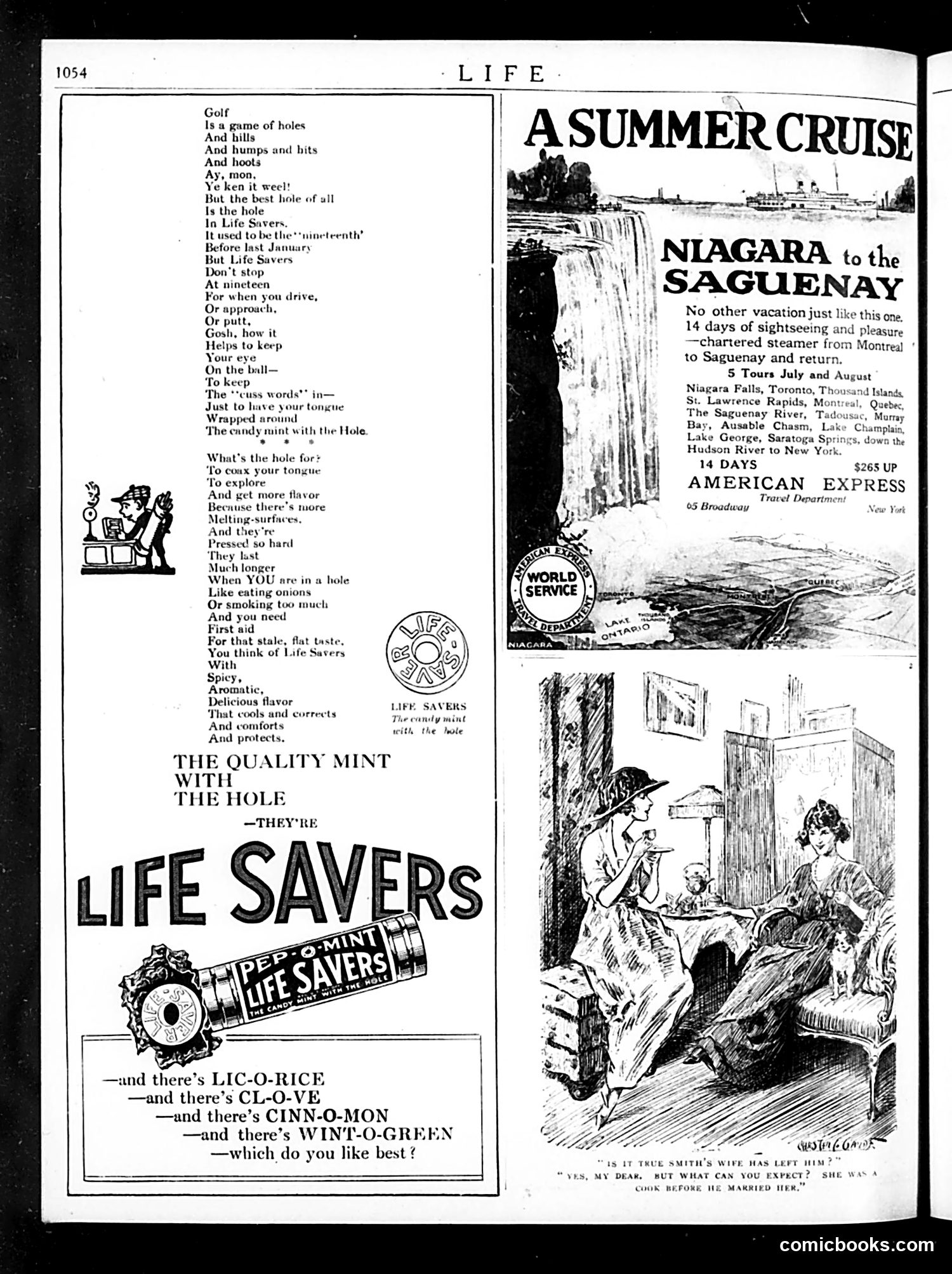
This page contains two distinct elements: a humorous poem about golf and Life Savers candies (left), and advertisements (right). **The Golf Poem/Ad:** A Scottish-accented verse jokes that golf's "best hole" is the hole in Life Savers mints. The satire suggests Life Savers are essential for golfers—offering refreshment and "first aid" for the "stale, flat taste" of fatigue during play. The poem lists the candy's flavors (licorice, clove, cinnamon, wintergreen) while maintaining the golf metaphor throughout. **The Cartoon (bottom right):** A domestic scene showing a woman serving tea to a man, with caption implying his wife has left him. The punchline: "Yes, my dear, but what can you expect? She was a cook before we married her"—suggesting her departure is unsurprising given her profession, likely a mild joke about women's roles or the difficulty of marriage with a working spouse. **The Advertisements:** A cruise vacation ad (Niagara to Saguenay) and American Express travel services occupy the upper right. The overall page blends product advertising with light social humor typical of 1920s-era Life magazine.
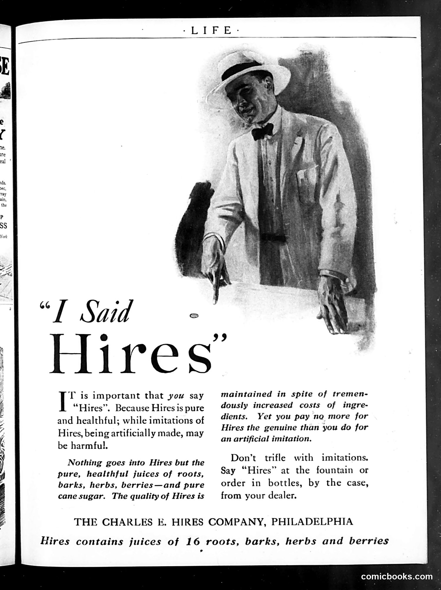
This is a **product advertisement**, not satire or political commentary. It promotes Hires root beer, manufactured by the Charles E. Hires Company of Philadelphia. The illustrated figure is an unnamed gentleman in formal attire (straw hat, bow tie) holding a bottle, serving as the brand's spokesperson. The ad's central message warns consumers to specifically request "Hires" by name rather than accepting imitations, claiming genuine Hires contains only natural ingredients (16 roots, barks, herbs, and berries with cane sugar) while cheaper imitations are "artificially made" and potentially harmful. The appeal was typical of early 20th-century marketing: emphasizing purity, health benefits, and brand authenticity during an era when consumer trust in manufactured goods was uncertain and product standardization was inconsistent. The phrase "Don't trifle with imitations" reinforced brand loyalty.
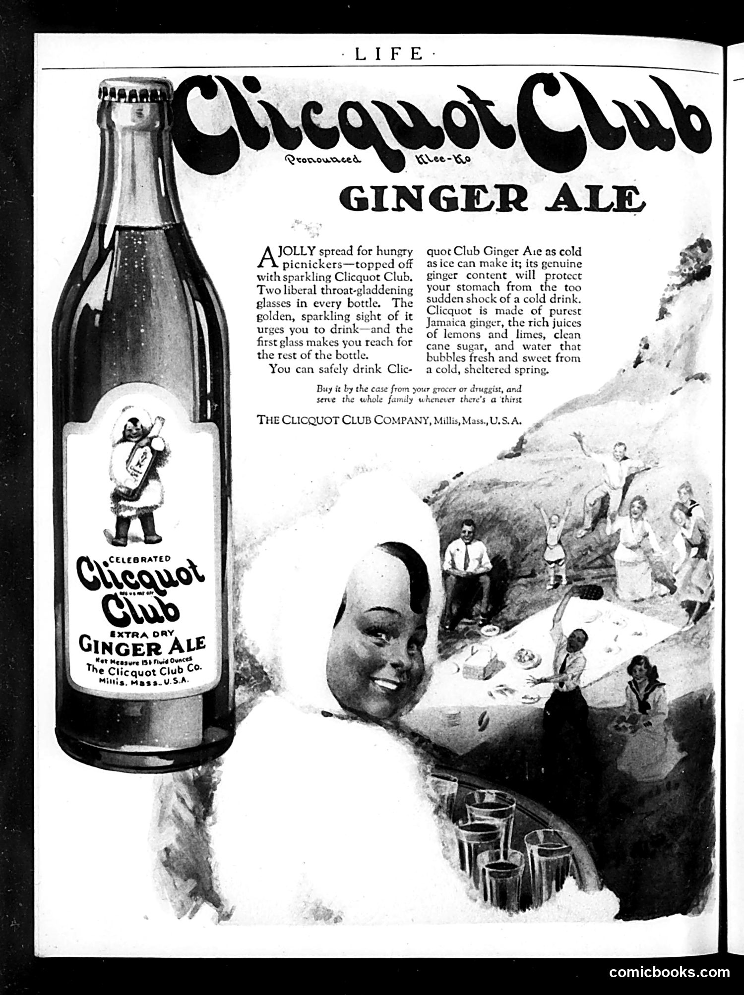
This is a **product advertisement**, not political satire. It promotes Clicquot Club Ginger Ale, manufactured in Millis, Massachusetts. The ad features a large bottle on the left and a caricatured figure with exaggerated facial features in the center-right, positioned among a picnicking scene. The imagery appears to employ **racist caricature conventions common in early 20th-century advertising**—a deeply troubling aesthetic standard of that era that modern viewers would recognize as offensive stereotyping. The ad's text emphasizes the drink's appeal for outdoor leisure activities, claiming its ginger content protects the stomach from cold beverages. The tagline encourages bulk purchasing "by the case" for family consumption. The page reflects historical advertising practices that normalized harmful racial imagery alongside consumer marketing—material that documents period attitudes rather than endorsing them.
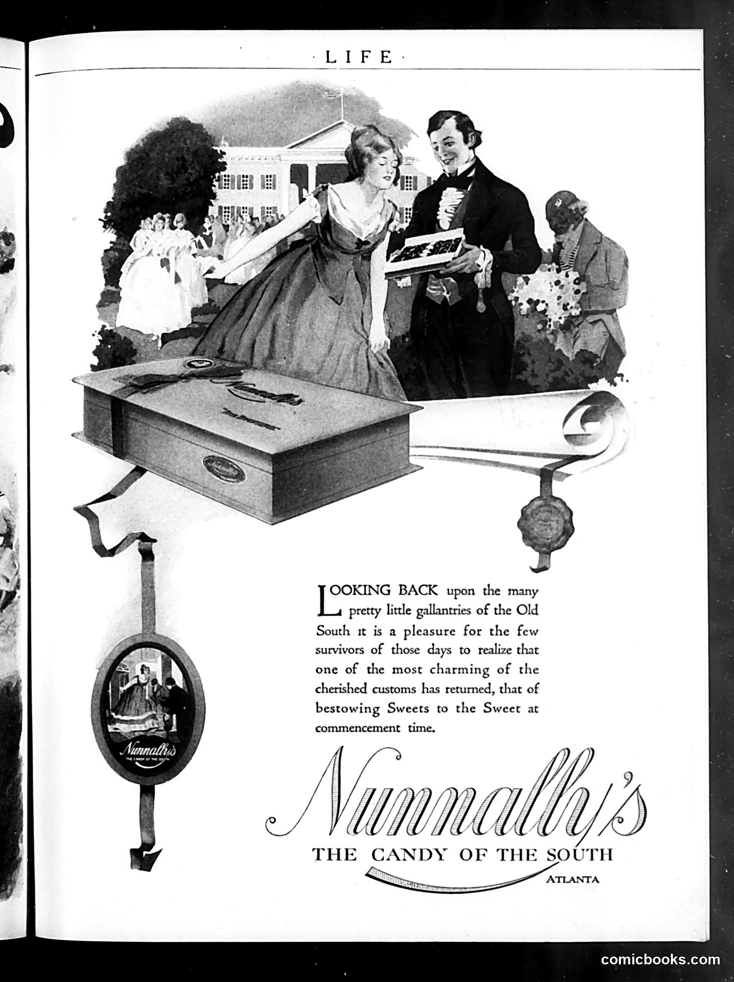
This is primarily a **Nunnally's candy advertisement**, not political satire. The page depicts a nostalgic scene of a young woman receiving chocolates at what appears to be a college commencement ceremony, set against a Southern antebellum backdrop (note the White House-like building). The ad's text romanticizes the "Old South" and the custom of giving sweets to young women at graduations. It frames Nunnally's as reviving this "charming" Southern tradition. The imagery—elegant dress, formal setting, architectural references—evokes pre-Civil War gentility. For modern readers: this represents how early 20th-century marketing exploited nostalgia for the antebellum South, glossing over its slavery-based economy. The advertisement sentimentalizes Southern "customs" without acknowledging the context of that era, using romanticized imagery to sell candy by associating the product with supposed refinement and tradition.
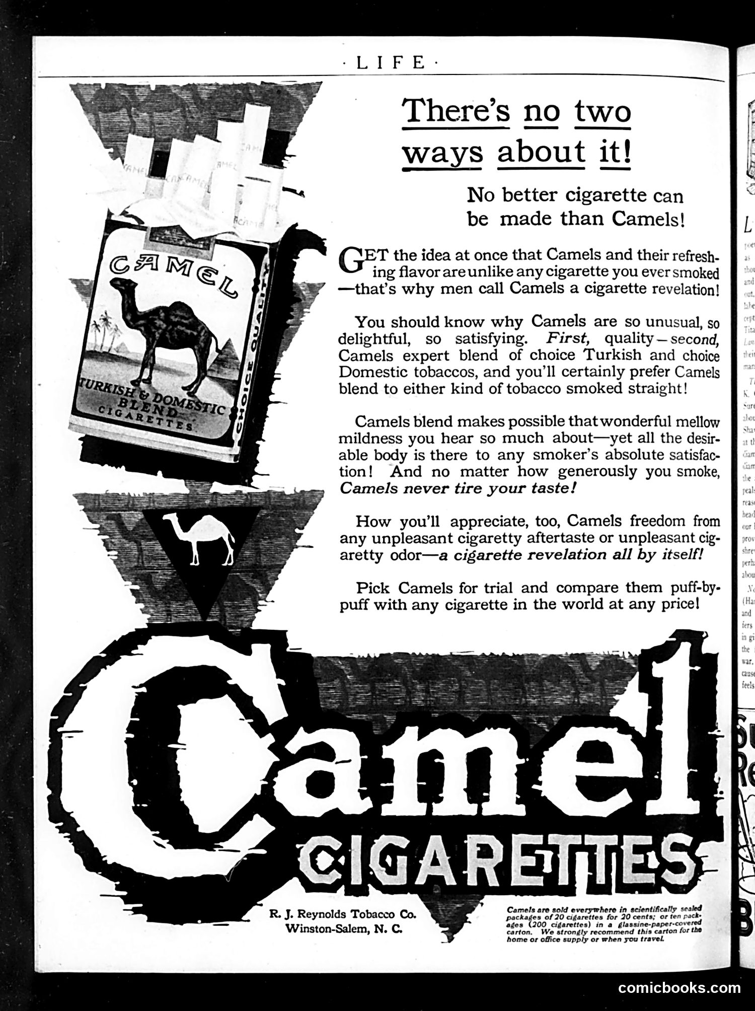
This is a **Camel cigarette advertisement**, not satire or political commentary. The page promotes R.J. Reynolds' Camel brand cigarettes, emphasizing their "expert blend of choice Turkish and choice Domestic tobaccos" and claiming superior mildness and flavor compared to competitors. The camel imagery (the brand mascot, shown in silhouette) is purely commercial branding. The headline "There's no two ways about it!" is advertising copy asserting cigarette superiority. For modern readers: This represents pre-warning-label tobacco advertising that made health claims ("never tire your taste," "freedom from...unpleasant...odor") now understood as misleading. The ad ran when cigarette marketing was unrestricted and ubiquitous in mainstream publications. The emphasis on "quality" and "satisfaction" reflects mid-20th-century advertising conventions before tobacco's serious health risks were publicly acknowledged.
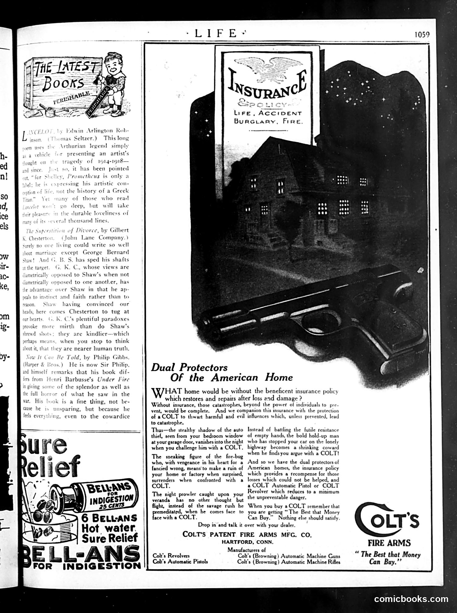
This page is primarily **advertising**, not political satire. The dominant content is a Colt firearms advertisement titled "Dual Protectors of the American Home." **The Advertisement's Message:** The ad presents insurance and Colt firearms as complementary home security. It uses dramatized scenarios—car thieves, burglars, arsonists, highway robbers—where owning a Colt pistol or revolver deters criminals. The rhetoric is paternalistic: a homeowner displaying a firearm causes criminals to instantly surrender ("a shrinking coward"). **Historical Context for Modern Readers:** This reflects early 20th-century attitudes toward armed self-defense as normal, desirable, and morally justified. The ad's casual equation of guns with home protection—without acknowledging risks—and its stereotype of criminals as cowardly if confronted, represents period marketing assumptions that would face significant scrutiny today. The page also includes book reviews and a Bellans antacid ad, typical Life magazine content filler around advertisements.
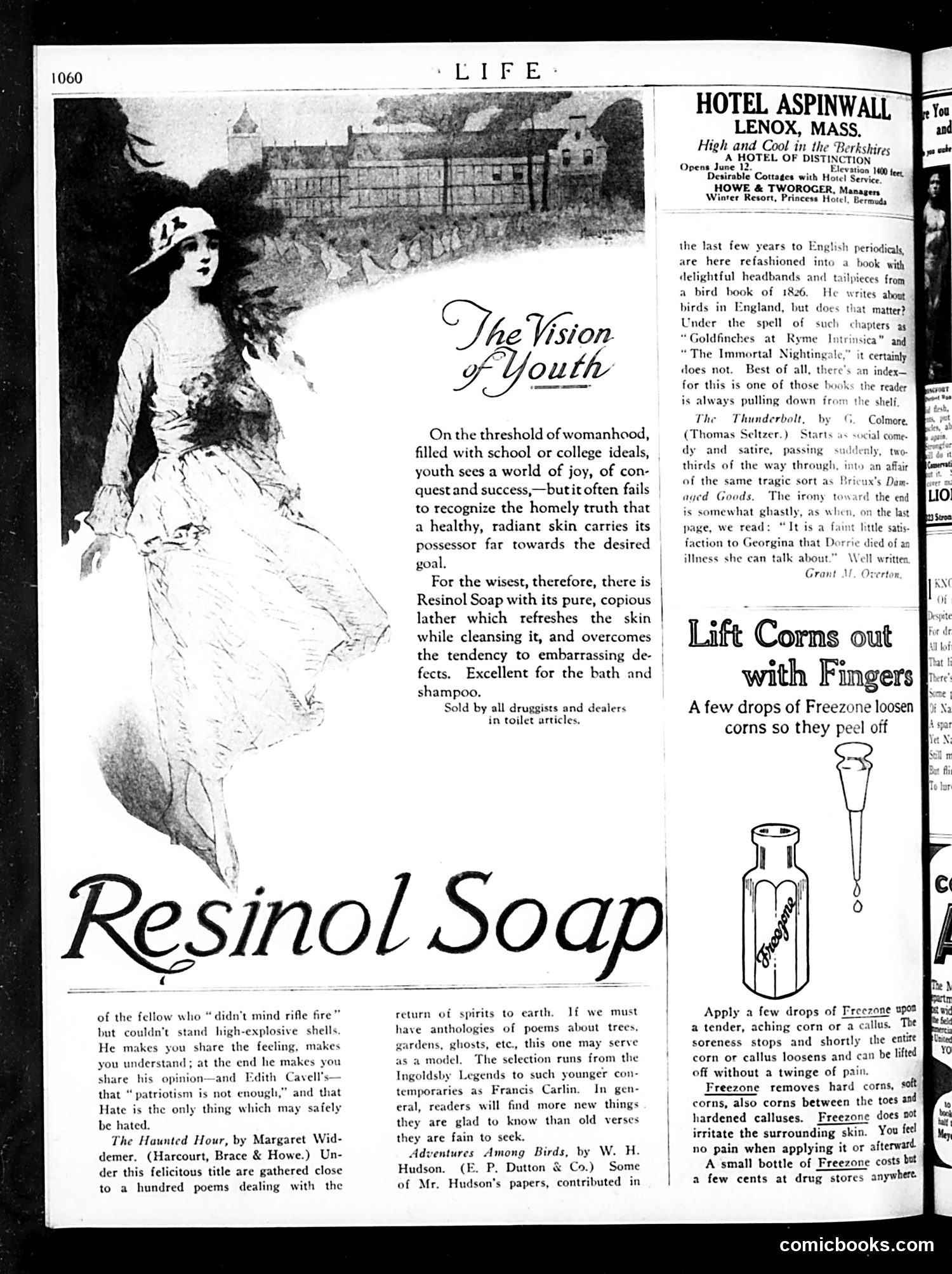
This page is primarily **advertising and book reviews**, not satirical content requiring historical context. The dominant feature is a **Resinol Soap advertisement** using "The Vision of Youth"—an idealized illustration of a young woman to market soap as essential for achieving beauty and success. The copy suggests that clear skin is crucial for young women's ambitions, linking personal grooming to social advancement. Below are additional **product ads** (Freezone corn remover) and **hotel/resort promotions** (Hotel Aspinwall in Massachusetts). The remaining space contains **literary reviews** discussing poetry collections and nature writing, including references to Edith Cavell (likely the WWI-executed nurse), indicating this is a wartime or immediate postwar issue. No political cartoons or satirical commentary appear on this page—it's a standard magazine layout mixing advertising, consumer products, and cultural criticism typical of early 20th-century *Life* magazine.
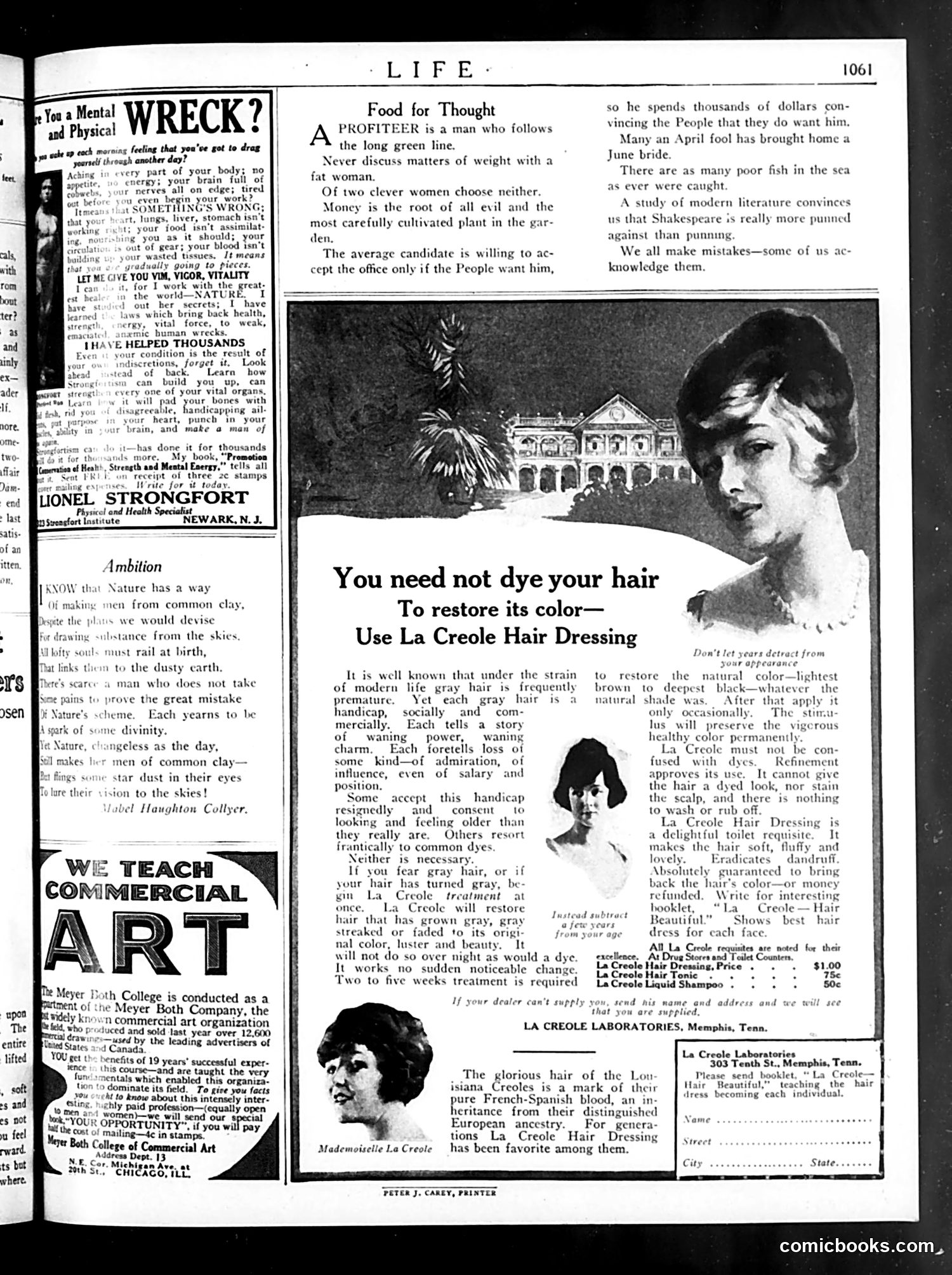
This page contains **satirical advice columns and advertisements** typical of 1920s Life magazine. The "Food for Thought" section offers cynical social commentary: a "profiteer" exploits people's desires; discussing weight with fat women is foolish; clever women aren't preferable choices; and politicians only seek office if voters want them. These are light social jabs at vanity, greed, and political opportunism. The advertisements promote dubious health products: **Lionel Strongfort** sells physical fitness training and a book promising to cure exhaustion and weakness ("human wrecks"). The Meyer Roth College advertises commercial art training. **La Creole Hair Dressing** dominates the right side, marketing itself as a hair restoration product that avoids the stigma of hair dyes—an important social distinction in this era when dyeing hair suggested artificiality or moral looseness, while "dressing" suggested natural enhancement. The page reflects 1920s anxieties about modernity's physical toll, appearance standards, and the proliferation of commercial solutions to social insecurity.
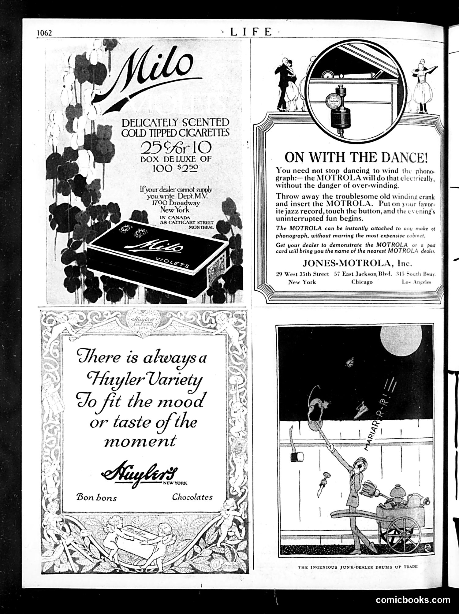
This page contains **advertisements and one editorial cartoon**, typical of 1920s Life magazine content. **Advertisements:** - **Milo Cigarettes**: Luxury smokes with gold tips, pitched as delicately scented - **Huyler's Chocolates**: Bon-bons and chocolates for various moods - **Motrola**: An electric phonograph motor attachment allowing dancers to continue without manually winding records—marketed as modern convenience for jazz-age parties **Editorial Cartoon** (bottom right): Titled "The Ingenious Junk-Dealer Drums Up Trade," it depicts a junk dealer collecting discarded items—appearing to be old winding cranks from phonographs—presumably to resell or recycle. This satirizes both commercial waste and the rapid obsolescence of technology, as the Motrola advertisement above directly made manual phonograph cranks unnecessary, generating business for salvage dealers. The page humorously juxtaposes consumer innovation with waste, typical of 1920s satirical commentary on modern consumption.
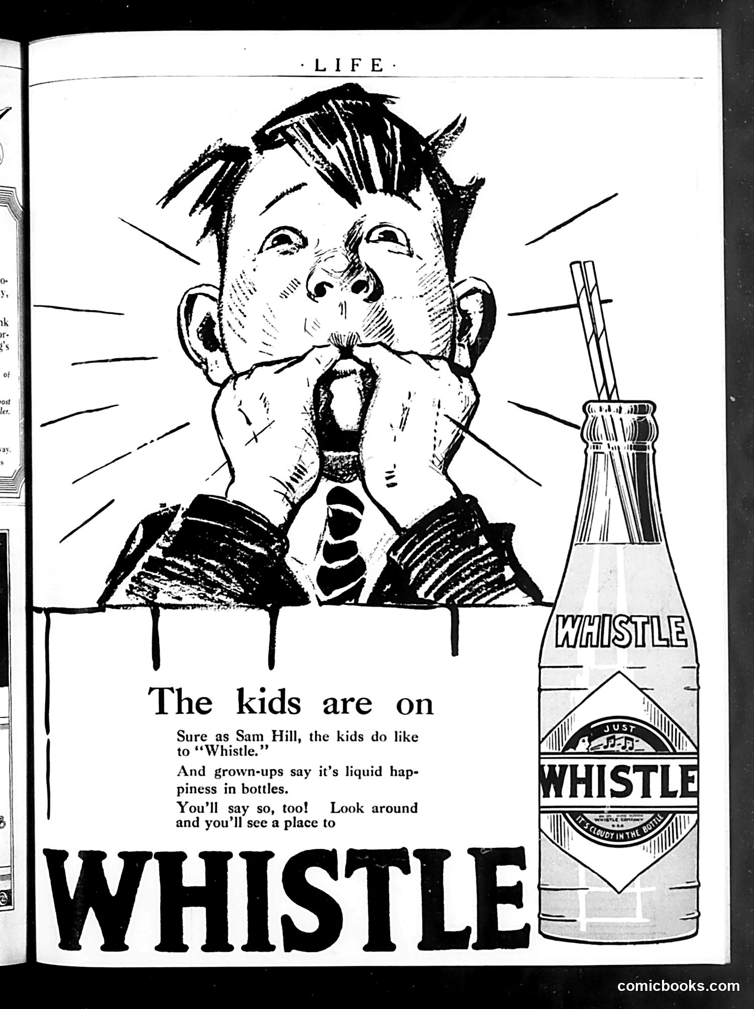
This is a **Whistle soft drink advertisement** from Life magazine. The cartoon depicts a child enthusiastically whistling while holding a Whistle bottle, with radiating lines emphasizing excitement. The ad uses the phrase "Sure as Sam Hill" (a common American idiom meaning "certainly"), playing on the product name. The copy claims that children love Whistle and that adults describe it as "liquid happiness in bottles." The satire appears gentle—the exaggerated child's expression and the claim that a soft drink brings "happiness" reflect early-to-mid 20th century advertising's bold, unironic product claims. Modern readers would note how casually the ad markets sugary drinks to children and promises emotional fulfillment through consumption—messaging now considered problematic. This represents vintage American consumer advertising before modern health and marketing regulations.
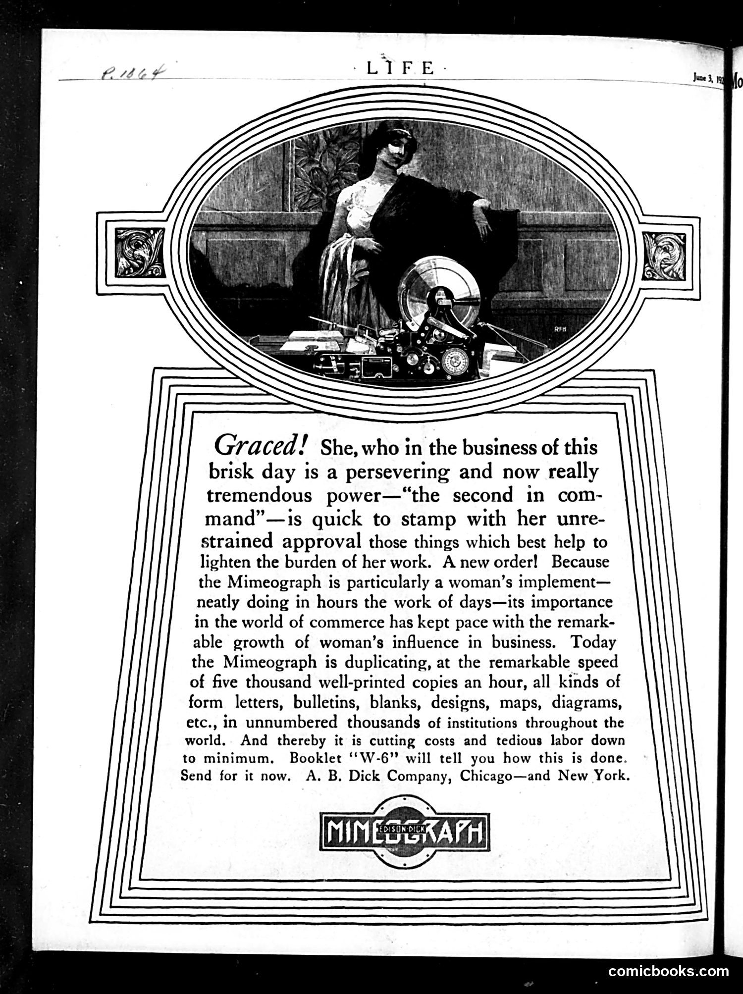
This is a **product advertisement**, not political satire. It promotes the Mimeograph copying machine by appealing to early-20th-century notions about women in business. The "Graced!" headline addresses female office workers—specifically secretaries and administrative assistants ("the second in command")—portraying them as powerful decision-makers who approve workplace tools. The text celebrates how the Mimeograph supposedly empowers women by automating tedious copying work, reducing labor from days to hours. The illustration shows a well-dressed woman overseeing the machine, positioning it as a "woman's implement" that enhances her influence in commerce. The ad reflects genuine historical changes: women were increasingly entering clerical work during this period. However, it also reveals period attitudes—praising women's labor-saving devices while reinforcing their subordinate "second in command" role rather than challenging their limited advancement.