
A complete issue · 36 pages · 1925
Life — February 5, 1925
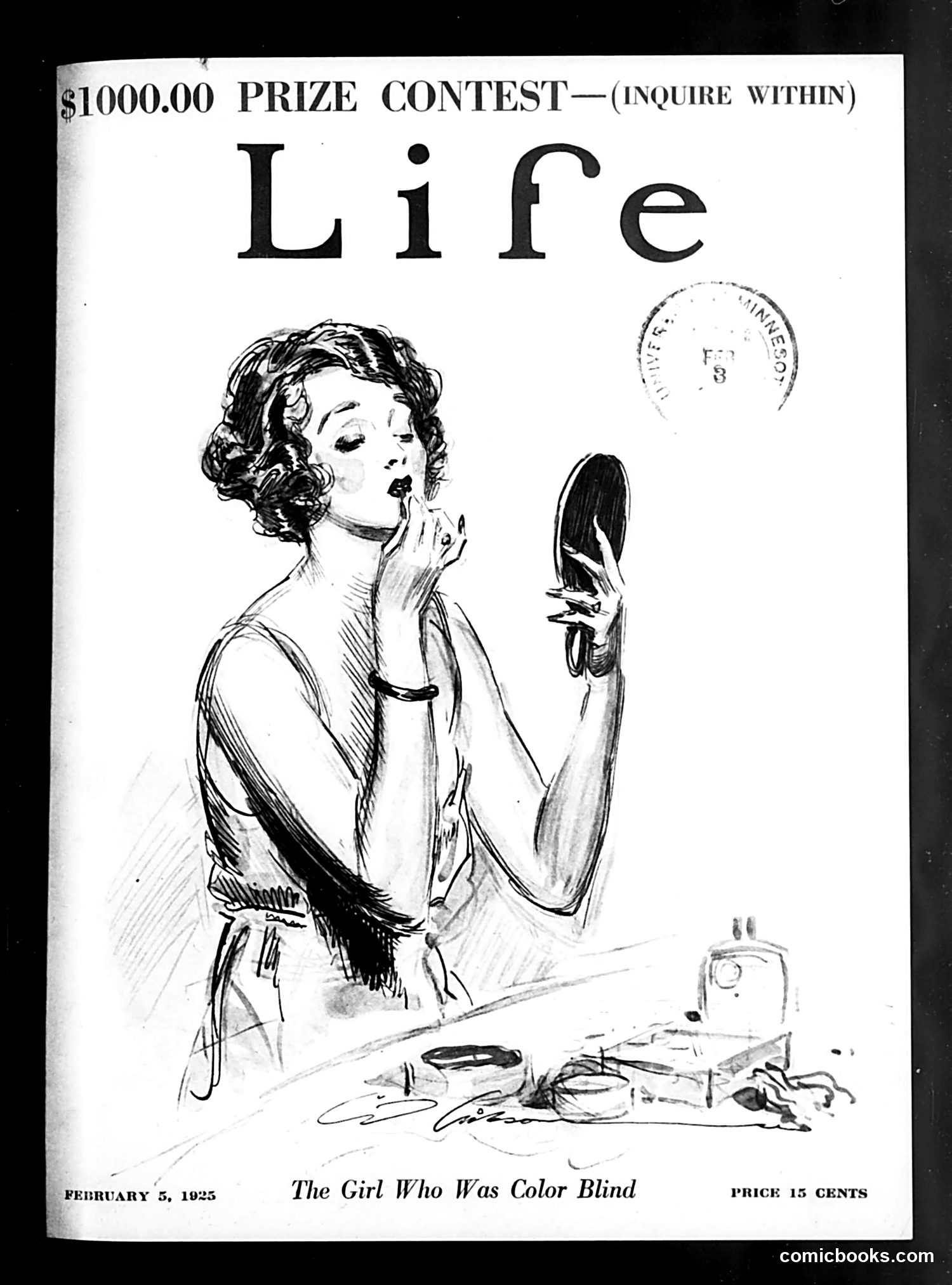
This is a **magazine cover**, not a political cartoon. It advertises a story titled "The Girl Who Was Color Blind" and promotes a $1,000 prize contest (details unclear from the image alone). The illustration shows a woman at a vanity table with cosmetics and a mirror, examining her fingernails with apparent concern. The title suggests the story involves a woman unable to perceive color—a medical condition. The visual irony appears to be that despite her condition, she's engaged in beauty routines and grooming that typically depend on color discrimination (makeup application, nail polish selection). This likely represents either a human-interest story or a romantic/comedic narrative popular in 1920s magazines. The specific contest details require additional context.
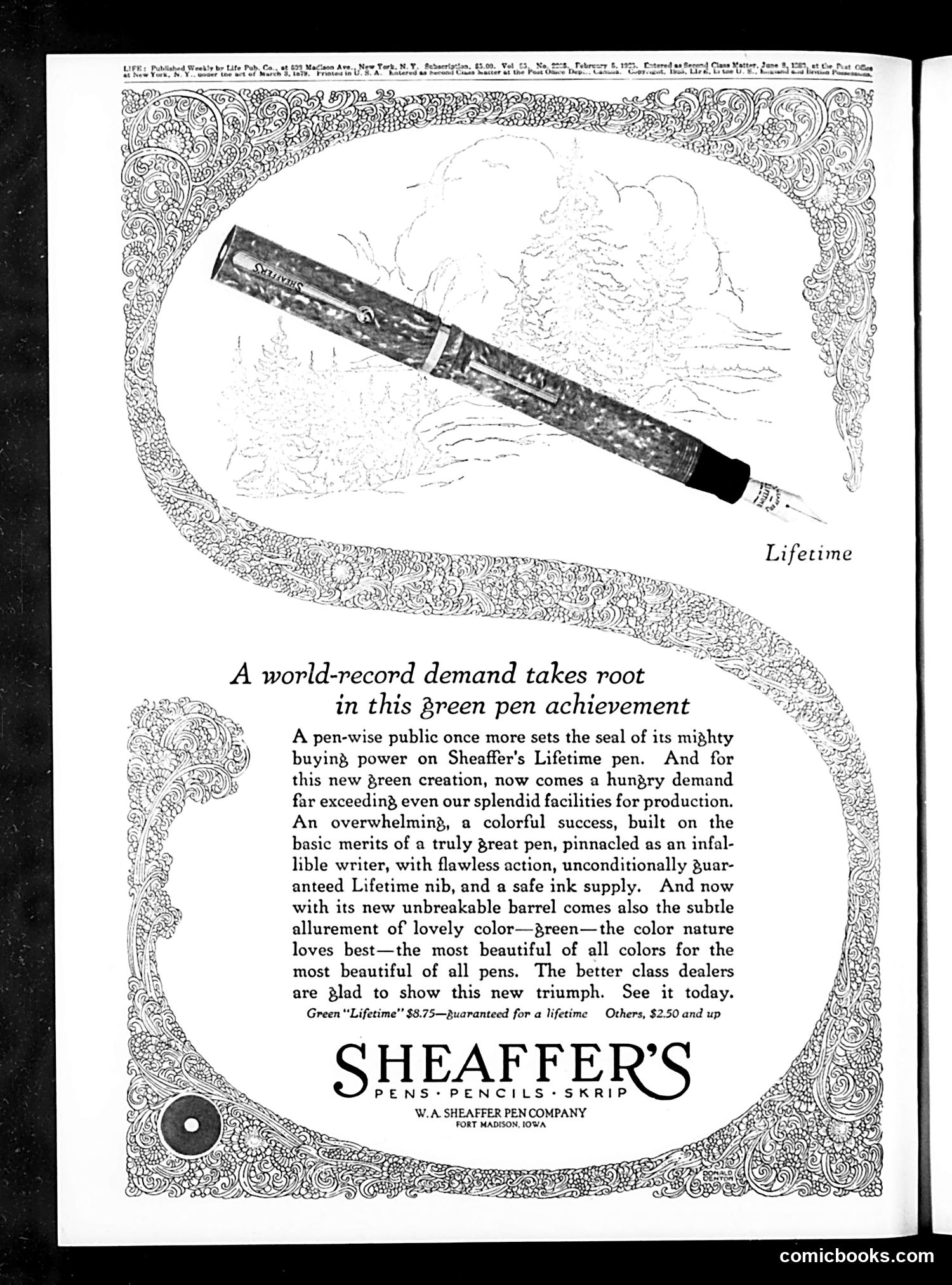
This is **not a political cartoon or satire** — it is a **full-page advertisement** for Sheaffer's Lifetime fountain pen, published in Life magazine. The ad promotes a new green-colored pen, emphasizing its quality and durability with claims of a "guaranteed Lifetime" warranty. The ornate decorative border frames a sketch of the pen alongside marketing copy praising its "flawless action" and "safe ink supply." The headline "A world-record demand takes root in this green pen achievement" uses flowery language typical of 1920s advertising to suggest the product's popularity and innovation. The price point ($8.75 for the green model) positions it as a premium item. This is purely commercial content with no satirical intent—just period advertising design and promotional language.
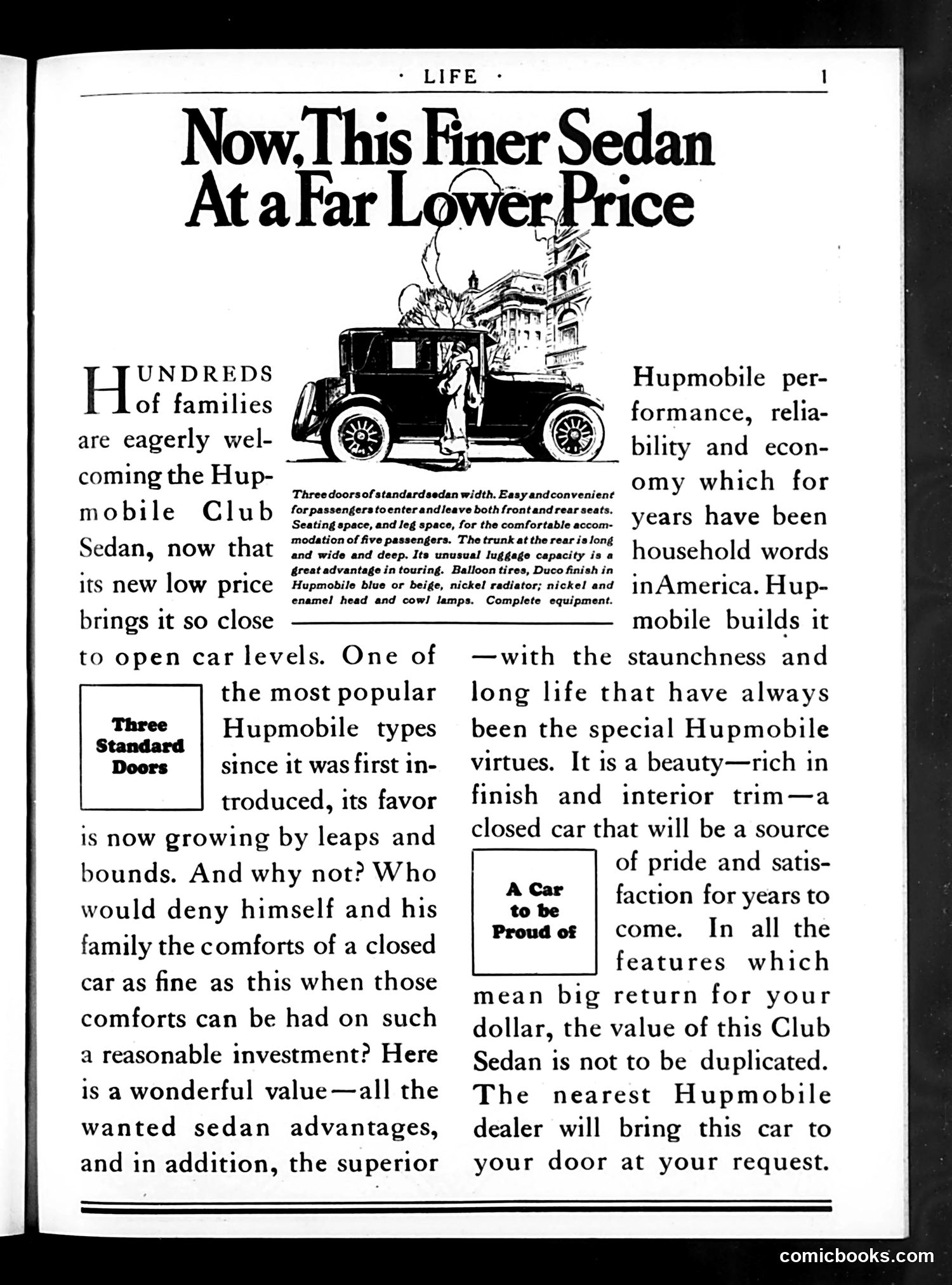
This is **not a cartoon or satire page**, but rather a straightforward **automobile advertisement** for the Hupmobile Club Sedan, published in *Life* magazine. The ad promotes the Hupmobile's appeal to middle-class families by emphasizing it offers "sedan advantages" at a lower price point than competitors. The illustration shows a three-door sedan with passengers, highlighting features like easy entry/exit and trunk space for touring. The marketing pitch stresses Hupmobile's established reputation for "performance, reliability...and economy"—positioning it as an affordable luxury. Callout boxes ("Three Standard Doors," "A Car to Be Proud of") reinforce value messaging. No political or social satire is present here. This represents typical early-20th-century automotive advertising in a general-interest magazine, targeting aspirational consumers.

This page is **primarily an advertisement**, not editorial content or satire. It's a full-page ad for Phoenix Hosiery from Milwaukee. The ad uses ornate decorative borders with diamond-shaped panels containing elaborate floral/mythological designs—typical Art Deco styling of the era. The text emphasizes that Phoenix selects silk for hosiery based on durability ("stoutest of all strands") combined with elegance, making it "the popular hosiery of the world." There is **no political cartoon or satire present**. The page simply showcases commercial advertising with visual sophistication designed to appeal to consumers seeking quality women's stockings. The decorative framing reflects the luxury positioning of the product.
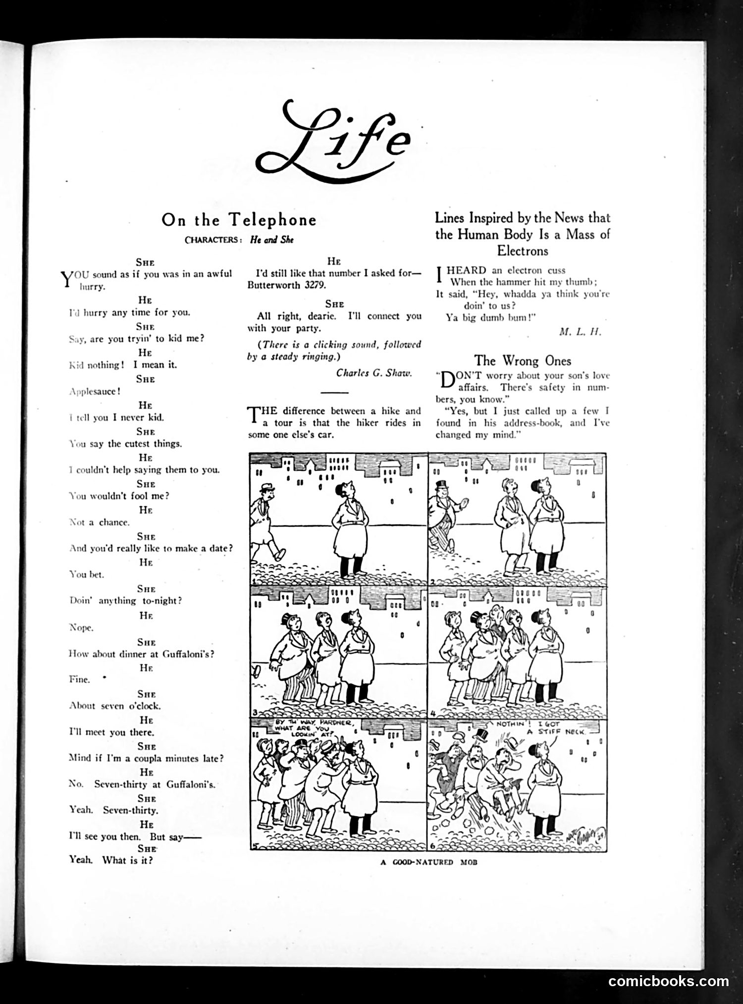
This page contains three separate pieces of satire: 1. **"On the Telephone"**: A flirtatious dialogue between a man and woman arranging a date at Guffaloni's restaurant at 7:30, playing on awkward romantic chitchat and hesitation. 2. **"Lines Inspired by the News that the Human Body Is a Mass of Electrons"**: A brief joke about an electron mishap, referencing contemporary scientific discoveries about atomic structure. 3. **"The Wrong Ones"**: A comic strip (titled "A Good-Natured Mob") showing what appears to be a case of mistaken identity or wrong-person mix-up on a street, with multiple panels depicting confusion among the characters. The page reflects 1920s-30s humor: dating culture, modern physics popularization, and physical comedy from case-of-mistaken-identity scenarios.
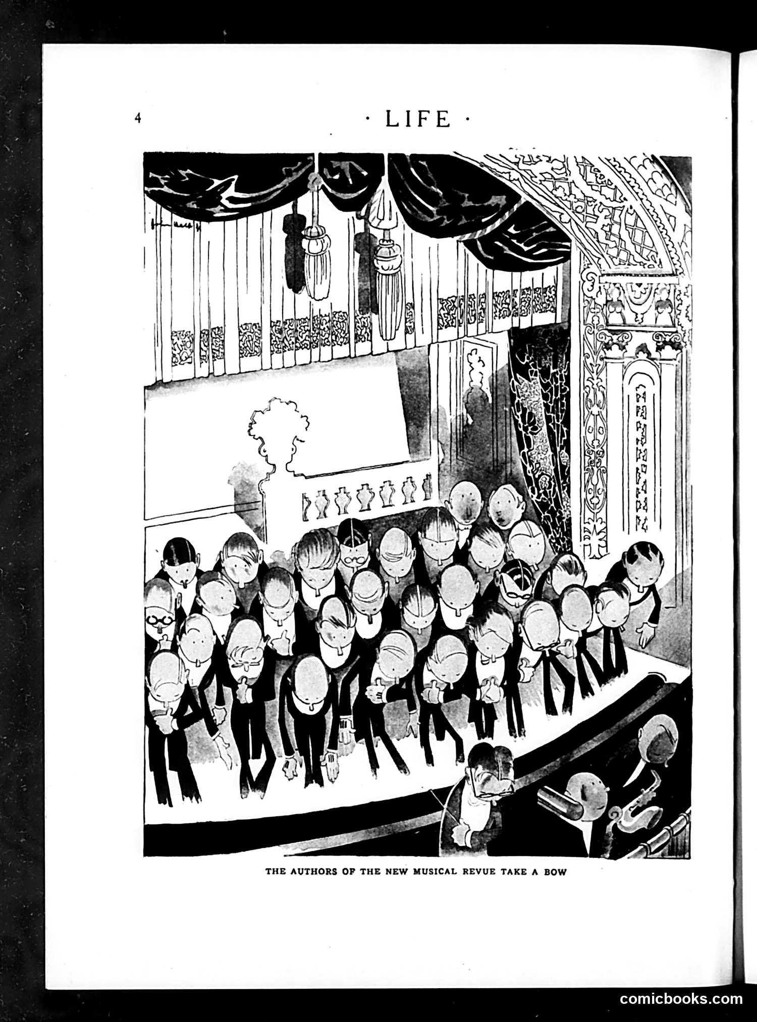
This page from *Life* magazine shows "The Authors of the New Musical Revue Take a Bow"—a satirical illustration of theatrical creators acknowledging applause after a performance. The cartoon depicts numerous caricatured figures in formal attire taking a curtain call on a stage, with ornate theatrical drapery and decorative elements overhead. The exaggerated, simplified character designs are typical of early 20th-century satirical cartooning. However, **without additional context about which specific musical revue is referenced or when this was published, I cannot identify the particular authors or pinpoint the intended satirical targets.** The humor likely relies on recognizing these theatrical personalities for contemporary readers, but that specific identity information isn't determinable from the image and caption alone.
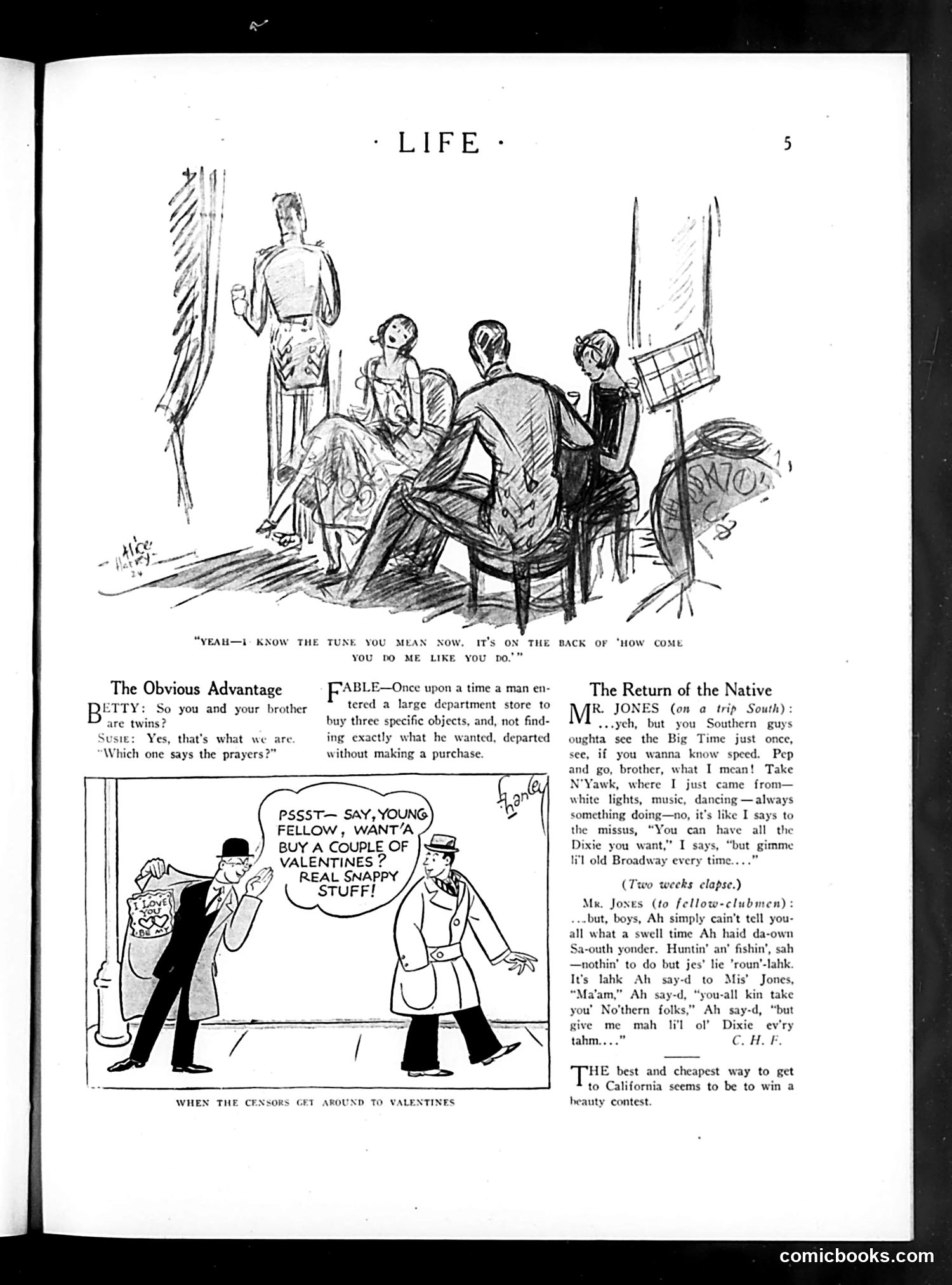
This page contains three separate humorous pieces satirizing early 20th-century American social life. "The Obvious Advantage" cartoon jokes about censorship of Valentine's Day cards—two men discuss buying "snappy stuff" that will pass the censor's review, implying romantic cards were being censored or heavily monitored for propriety. "The Return of the Native" presents dialogue from someone recently returned from the South, using exaggerated dialect to mock both Southern speech patterns and the speaker's enthusiasm for regional culture and leisure activities like hunting and fishing. The top sketch depicts what appears to be an artist's studio or salon setting with multiple figures, though its specific satirical target is unclear from the visible text. Overall, the page reflects contemporary anxieties about morality enforcement and cultural regionalism.
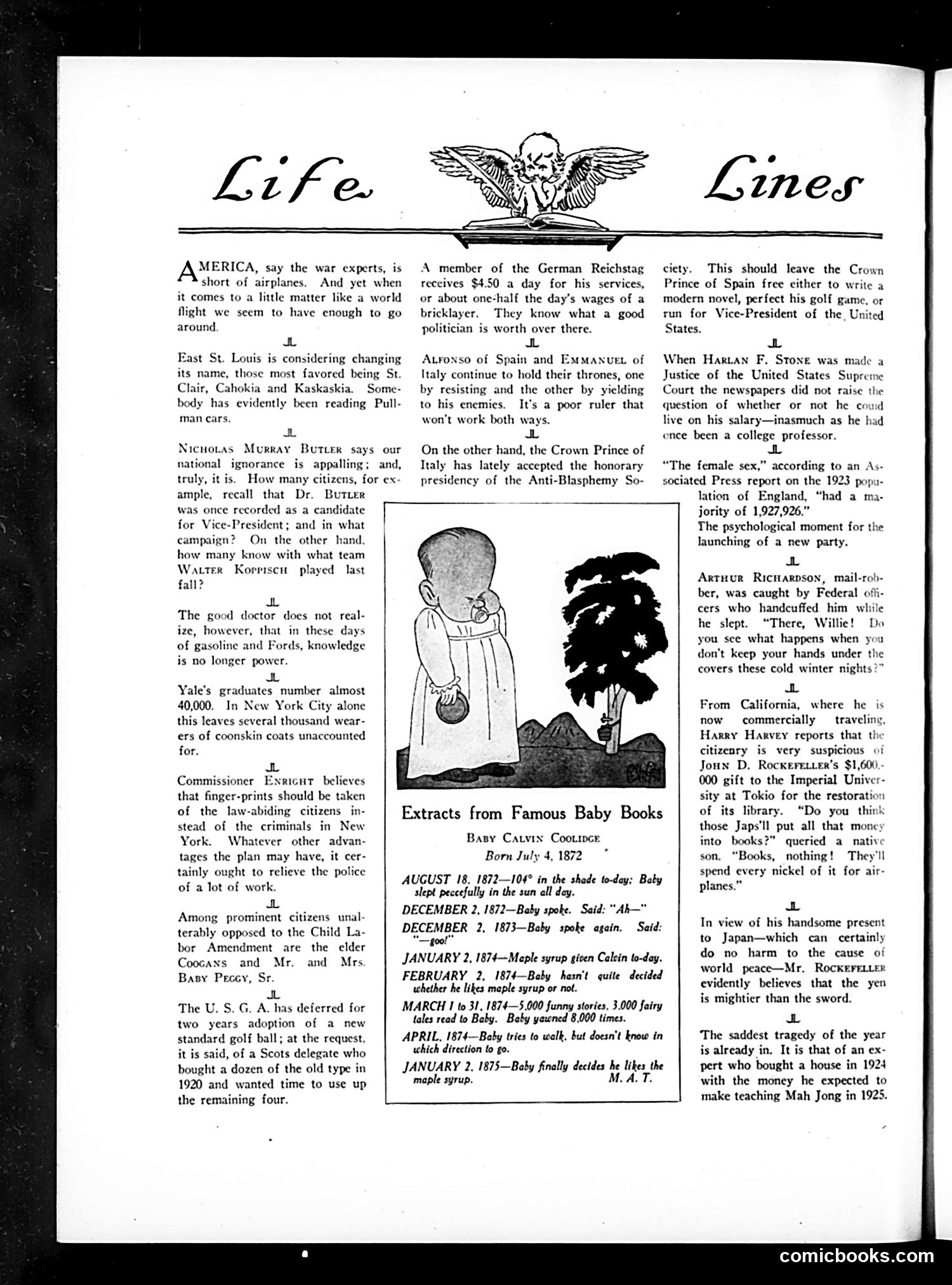
This page collects brief satirical observations on contemporary issues. The central illustration shows a baby in a cradle with a dark figure (possibly representing war, danger, or economic hardship) looming over it—likely commenting on child welfare or societal threats to the next generation. The text snippets mock various topics: America's shortage of airplanes, East St. Louis considering a name change, Nicholas Murray Butler's political ambitions, and Walter Koppisch's football career. There's commentary on Yale's large graduating class and New York's coonskin coat shortage. The "Extracts from Famous Baby Books" parodies Calvin Coolidge's actual childhood diary, humorously annotating mundane entries about maple syrup and walking to absurdist effect—satirizing both Coolidge's dullness and overwrought biographical reverence.
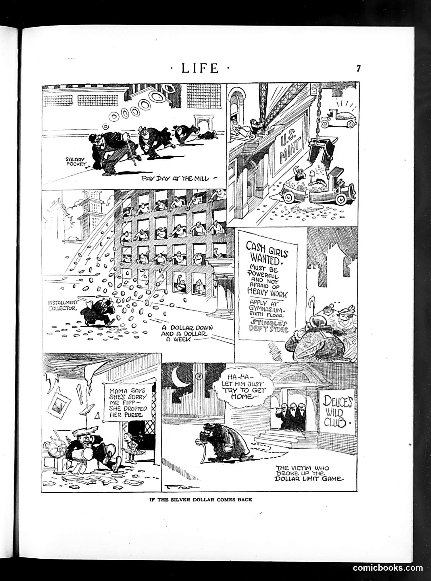
This satirical comic strips shows the economic chaos anticipated if the U.S. silver dollar were reinstated as currency. The narrative follows a silver dollar's journey through working-class life: 1. **"Pay Day at the Mill"**: Workers receive silver dollars instead of paper wages, depicted with "Salary Pocket" overflowing with coins. 2. **Labor shortage**: A sign advertises "Cash Girls Wanted" at a department store, suggesting women would be needed to handle the heavy coin-based currency. 3. **Domestic chaos**: A mother drops her coin-laden purse; children lose money everywhere. 4. **Social breakdown**: The coin causes a "deuce[d] wild club" and a man "broke up the dollar limit game." The satire mocks the impracticality of returning to heavy metal currency for everyday transactions in modern commerce.
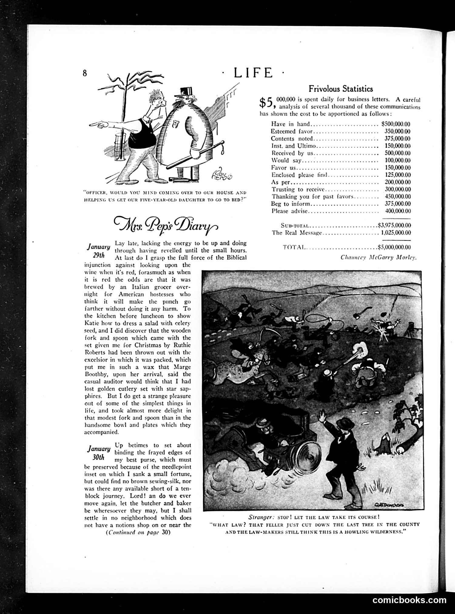
The top cartoon satirizes military bureaucracy. An officer asks another man to help get his five-year-old daughter to bed, treating this personal domestic task with the same formal urgency as military orders. The humor lies in the absurd contrast between the officer's stiff, hierarchical communication style and the mundane nature of bedtime—mocking how military language infiltrates everyday life. The bottom illustration accompanies "Mrs. Popi's Diary" and depicts what appears to be a forest scene with figures and an animal. The caption references cutting down the last tree in a county, with someone protesting that "law-makers still think this is a howling wilderness"—satirizing governmental neglect of environmental destruction and outdated attitudes toward land management.
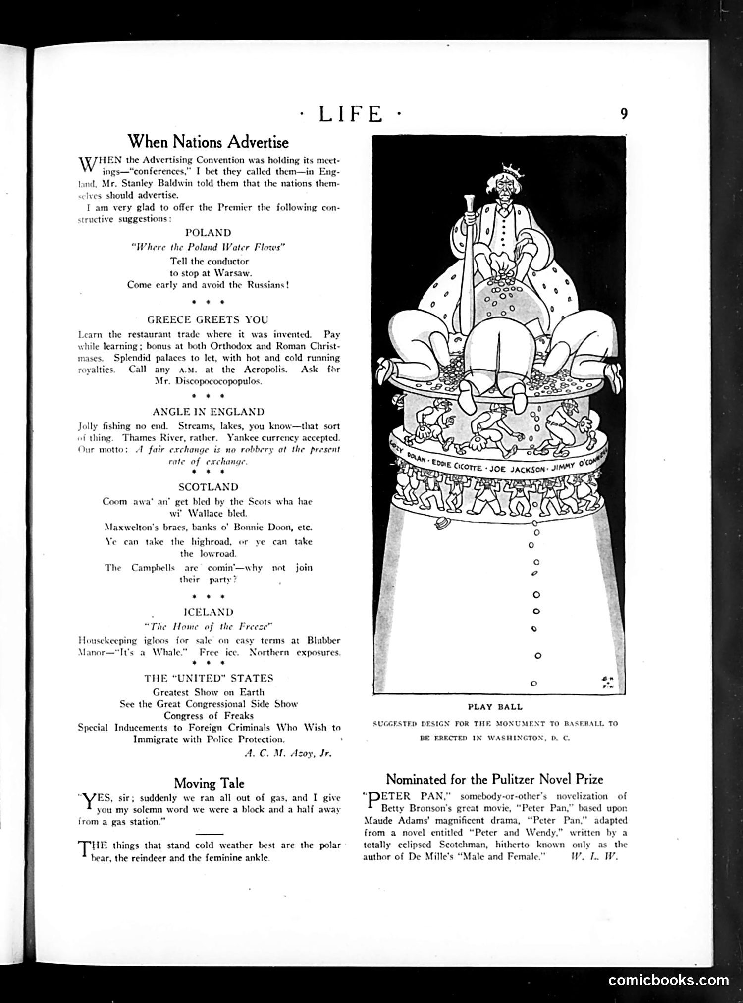
The main illustration, titled "PLAY BALL," depicts a satirical monument design proposed for Washington, D.C. It shows a bloated figure seated atop a massive structure, surrounded by smaller figures at the base labeled with names including "Eddie Cociotte," "Joe Jackson," and "Jimmy O'Connell." This references the **1919 Black Sox scandal**, where Chicago White Sox players allegedly fixed the World Series. The cartoon mocks this corruption by suggesting a monument celebrating these disgraced players. The swollen, enthroned figure likely represents the scandal's central corruption or the sport's compromised integrity. The page also contains humorous "national advertising suggestions" mocking various countries' characteristics—Poland's Russian borders, Greece's restaurants, etc.—typical of Life magazine's satirical approach to international stereotypes.
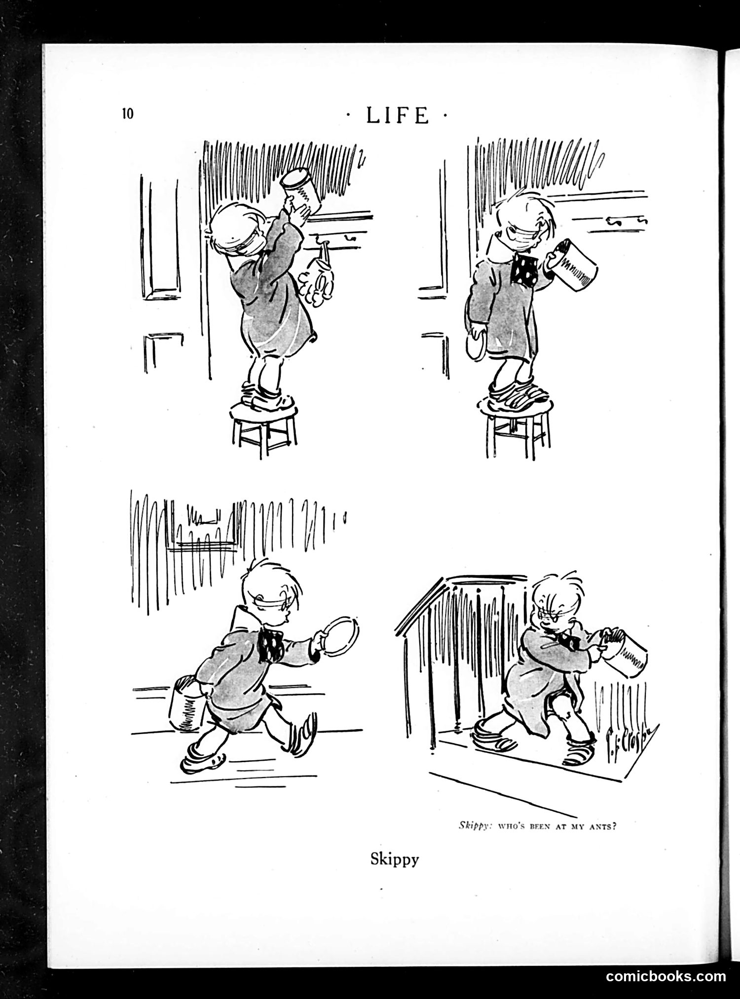
This is a comic strip page from *Life* magazine featuring "Skippy," a character known from the popular newspaper comic strip of the same name. The four panels show a small boy (Skippy) engaging in mischievous behavior: 1. Top left: Standing on a stool, peering through a window with binoculars 2. Top right: Holding what appears to be a paint can or bucket 3. Bottom left: Running with what looks like a frying pan 4. Bottom right: Near what appears to be an ant farm or similar container The caption reads: "SKIPPY: WHO'S BEEN AT MY ANTS?" The humor derives from classic children's mischief—Skippy suspects someone of tampering with his ant farm while he himself is clearly up to various pranks. It's gentle, domestic comedy about childhood troublemaking rather than political satire.
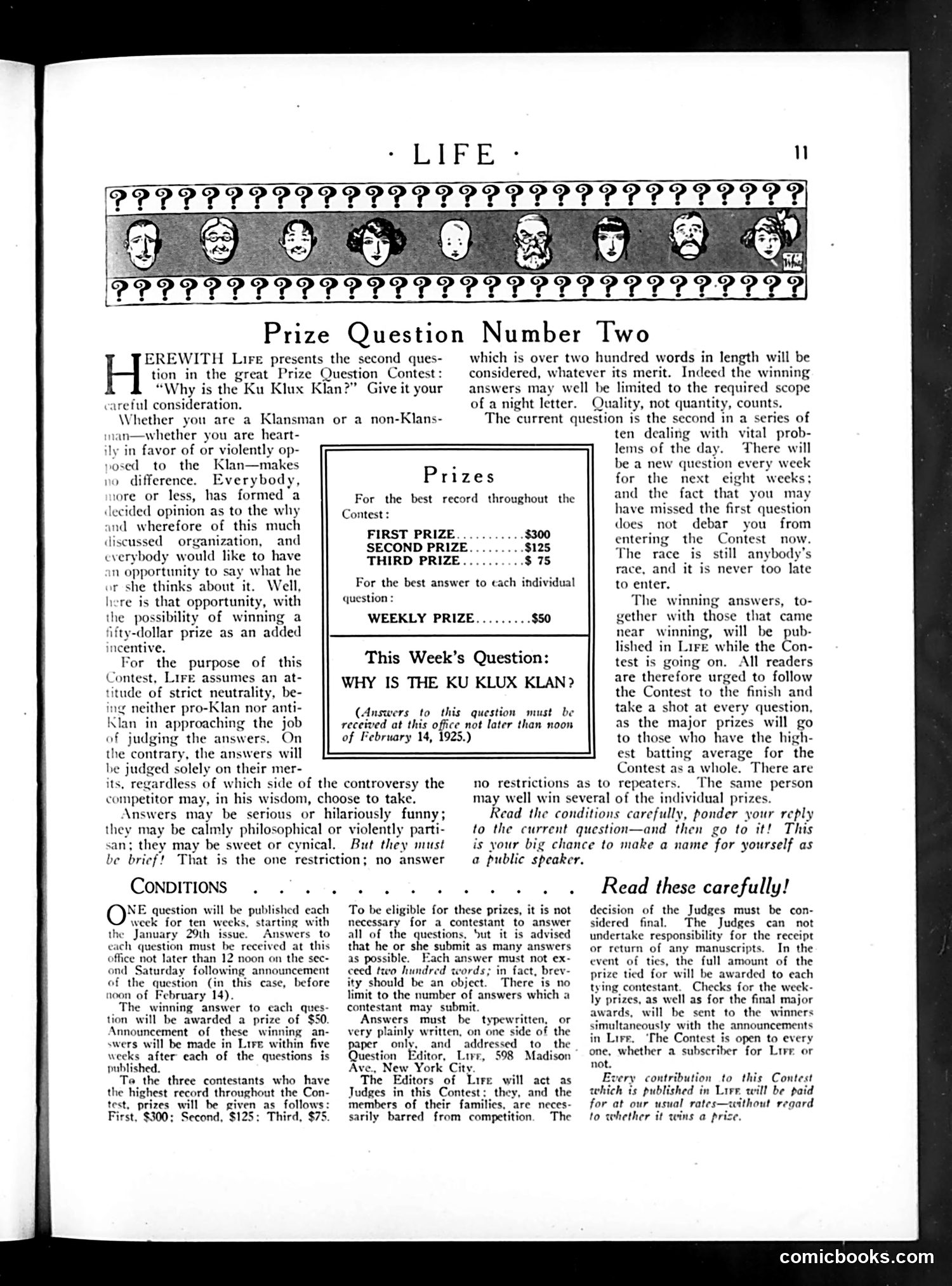
This page announces Life magazine's second weekly prize question in a contest asking readers: **"Why is the Ku Klux Klan?"** The contest invites answers from both Klansmen and non-Klansmen, explicitly stating the magazine assumes "an attitude of strict neutrality" on the issue. Notably, the page emphasizes that answers will be judged on merit alone, "regardless of which side of the controversy the contributor may...choose to take." The nine illustrated faces at the top appear to be caricatured types—likely representing different perspectives or demographics—though specific identities are unclear. This reflects 1920s America when the KKK was experiencing significant resurgence and public debate. Life's ostensible neutrality itself becomes the satire—treating a hate organization's existence as merely a debatable question worthy of prize money.
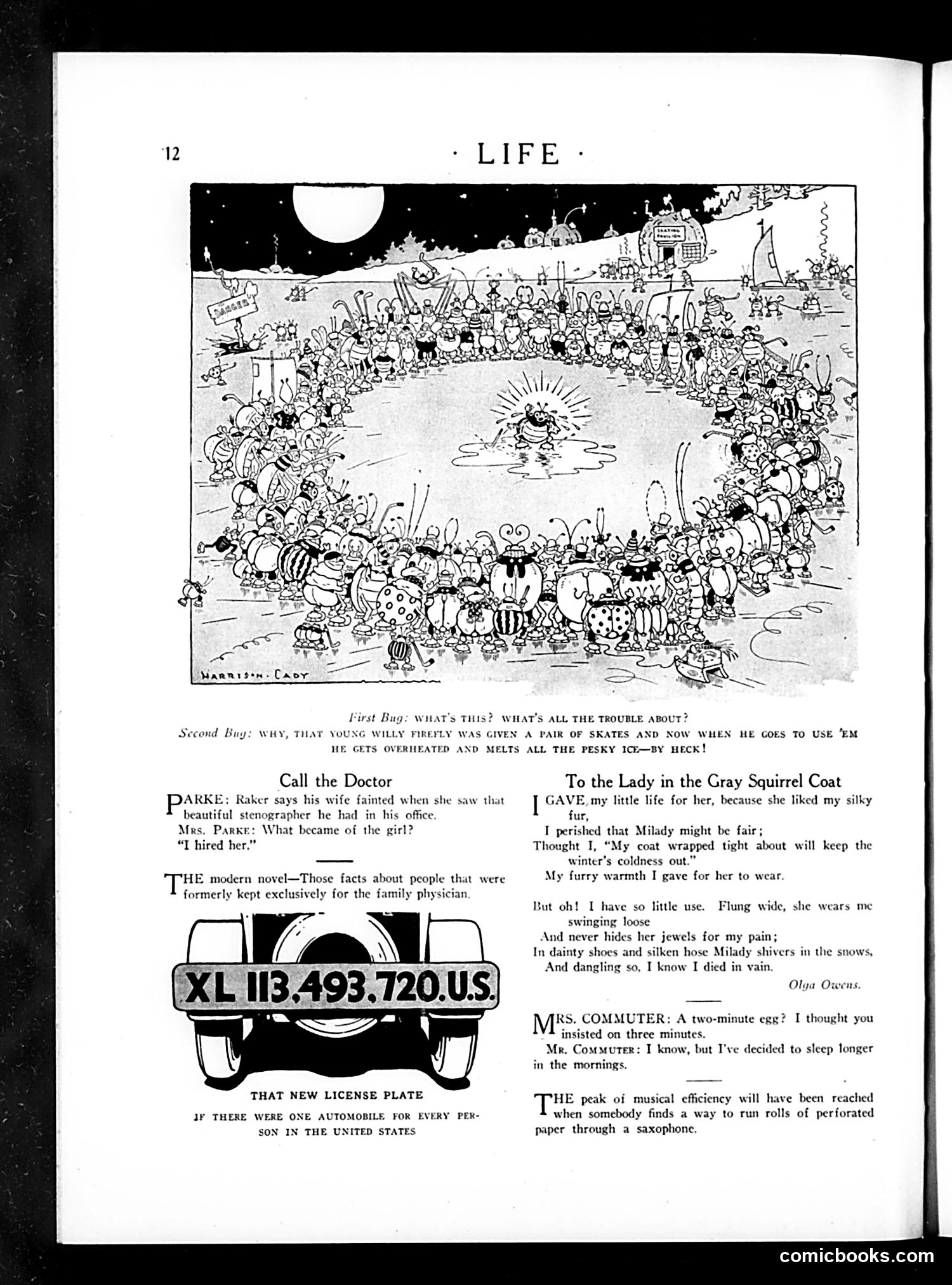
This page from *Life* magazine contains several humorous pieces aimed at early 20th-century readers: **Top cartoon** by Harrison Cady depicts a crowded beach scene with anthropomorphic insects having a social gathering, satirizing human beach culture through animal characters. **"Call the Doctor"** section jokes about modern novels revealing private family matters once kept confidential—a commentary on changing social openness in literature. **License plate advertisement** humorously notes that if there were one automobile per U.S. person, the combined license plate number would be XL 113,493,720—satirizing America's rapid automobile proliferation. **Poetry and brief humor pieces** include jokes about domestic life (cooking times, morning schedules) and musical pedantry, reflecting typical *Life* magazine's lighthearted social observation. The overall tone targets urban, educated readers aware of contemporary social changes.
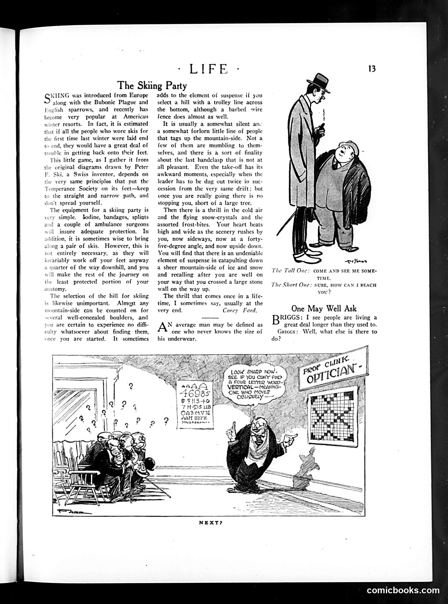
The page contains two distinct pieces: **"The Skiing Party"** (upper section) is a humorous essay about skiing as a fashionable winter sport, describing the equipment, hill selection, and thrills of downhill skiing. **The cartoon below** satirizes an optometrist's clinic. A bespectacled eye doctor stands bewildered before a chart covered in illegible scribbles and mathematical notation, while confused patients sit in the waiting room surrounded by question marks. The joke: the optometrist's own eye chart is incomprehensibly messy—he cannot even read his own prescription test. It's a classic ironic gag mocking a professional's inability to practice his own specialty. The "Prof. Clinic Optician" sign confirms the setting. The humor relies on visual contradiction: an eye doctor surrounded by visual chaos.
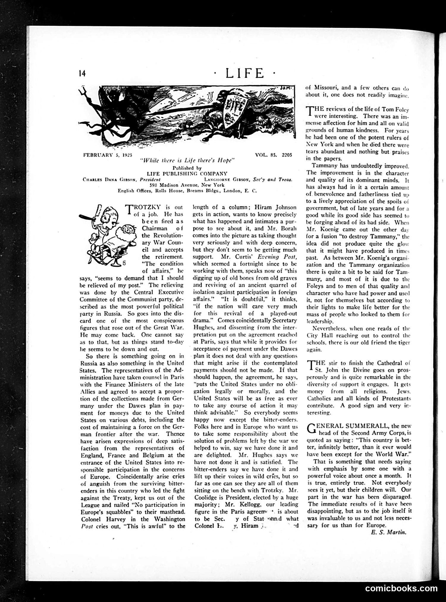
The cartoon depicts **Trotsky** as a small, disheveled figure sitting on a bench labeled "Chairman of the Revolutionary War Council." The satire comments on Trotsky's diminished political power within the Soviet Union—he's physically portrayed as insignificant despite his formerly prominent position. The text discusses how Trotsky "seems to demand that I believed in my post," referencing the Communist Party's internal power struggles. By 1925, **Stalin was consolidating control**, and Trotsky was being sidelined. The cartoon mocks Trotsky's apparent irrelevance while portraying him as clinging to his revolutionary credentials. The overall point: once-powerful revolutionary figures can become politically powerless when factional struggles shift within authoritarian regimes.
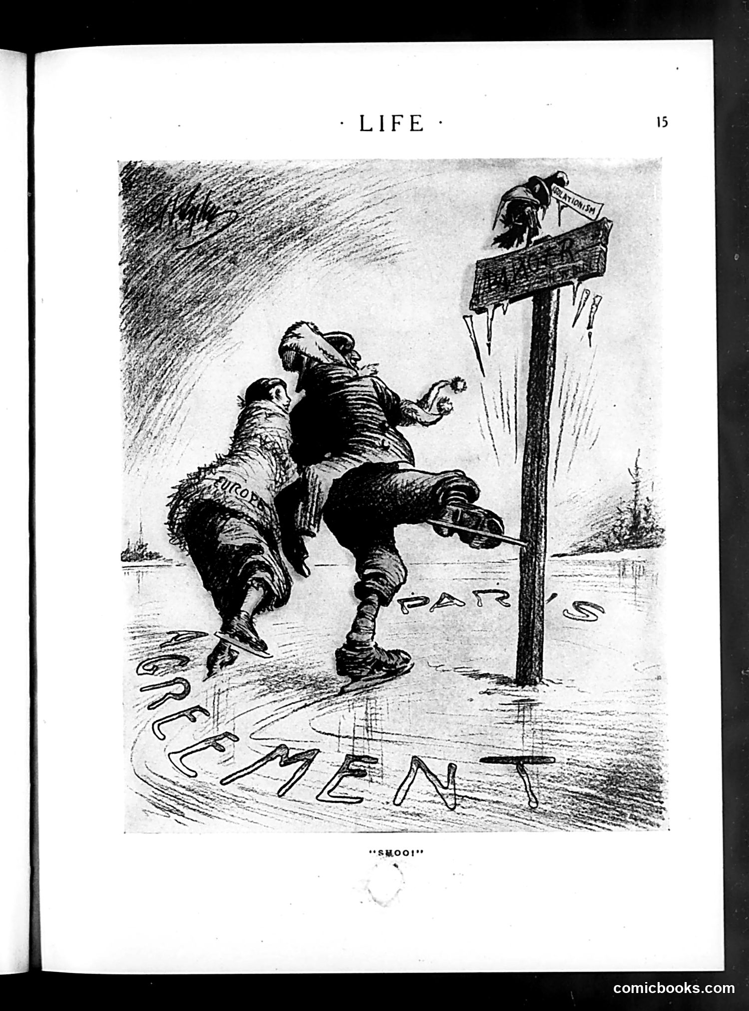
This cartoon depicts a figure at a signpost labeled "CIVILIZATION" being chased away or repelled, with the word "SHOO!" as caption. The figure appears to be a caricatured person being driven back from the sign, suggesting rejection from or exclusion from civilized society. The water and barren landscape suggest isolation or exile. The signpost pointing toward "CIVILIZATION" emphasizes the cartoon's central message: that someone or some group is being forcibly kept away from or denied access to civilization itself. Without clearer context or visible dates, I cannot definitively identify which historical figure or group this targets, though the style suggests early-to-mid 20th century satirical commentary on exclusion or social rejection based on presumed unfitness for civilized society.
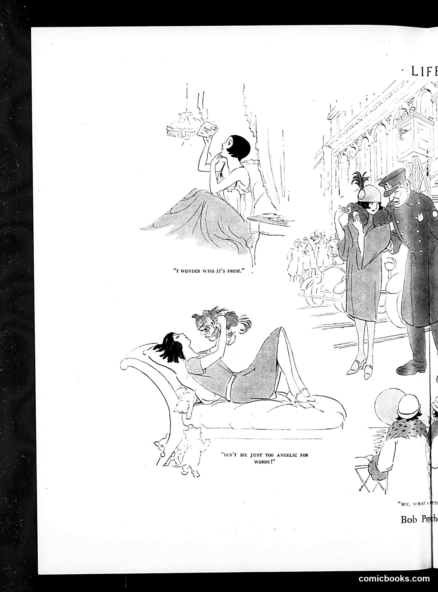
This page contains two related satirical cartoons by Bob Psth (artist signature visible). The top panel shows a woman admiring a small cherub or infant, with the caption "I WONDER WHO IT'S FROM" — suggesting an illegitimate child or unexpected baby. The bottom panel depicts the same woman reclining with the child, while fashionable society figures observe outside. The caption reads "ISN'T HE JUST TOO ANGELIC FOR WORDS!" The satire targets upper-class hypocrisy: a woman brazenly displays an out-of-wedlock child to her social circle, who pretend innocence and admiration rather than scandal. The "angelic" language masks social impropriety. This reflects early 20th-century Life magazine's frequent mockery of wealthy society's double standards regarding morality and respectability.
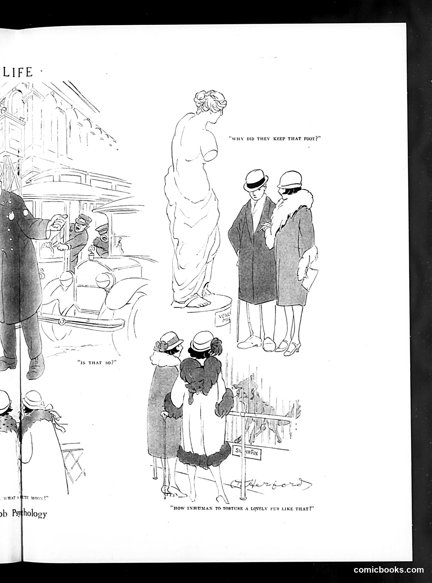
This page from *Life* magazine contains a satirical cartoon about the fur trade. The comic depicts several scenes: wealthy patrons admiring a classical nude statue, and below them, two women examining a fur coat with visible feet still attached to it. The satire's point is clear from the caption: "How inhuman to torture a lovely fur like that!" The humor relies on ironic reversal—the viewers express concern for the animal's suffering while wearing its pelt as a status symbol. By juxtaposing the classical nude figure (representing aesthetic appreciation of the human form) with the fur-clad women, the cartoon critiques the hypocrisy of people who claim to value beauty and humanity while participating in animal exploitation for fashion. This reflects early 20th-century emerging concerns about animal welfare and consumerism among the wealthy.
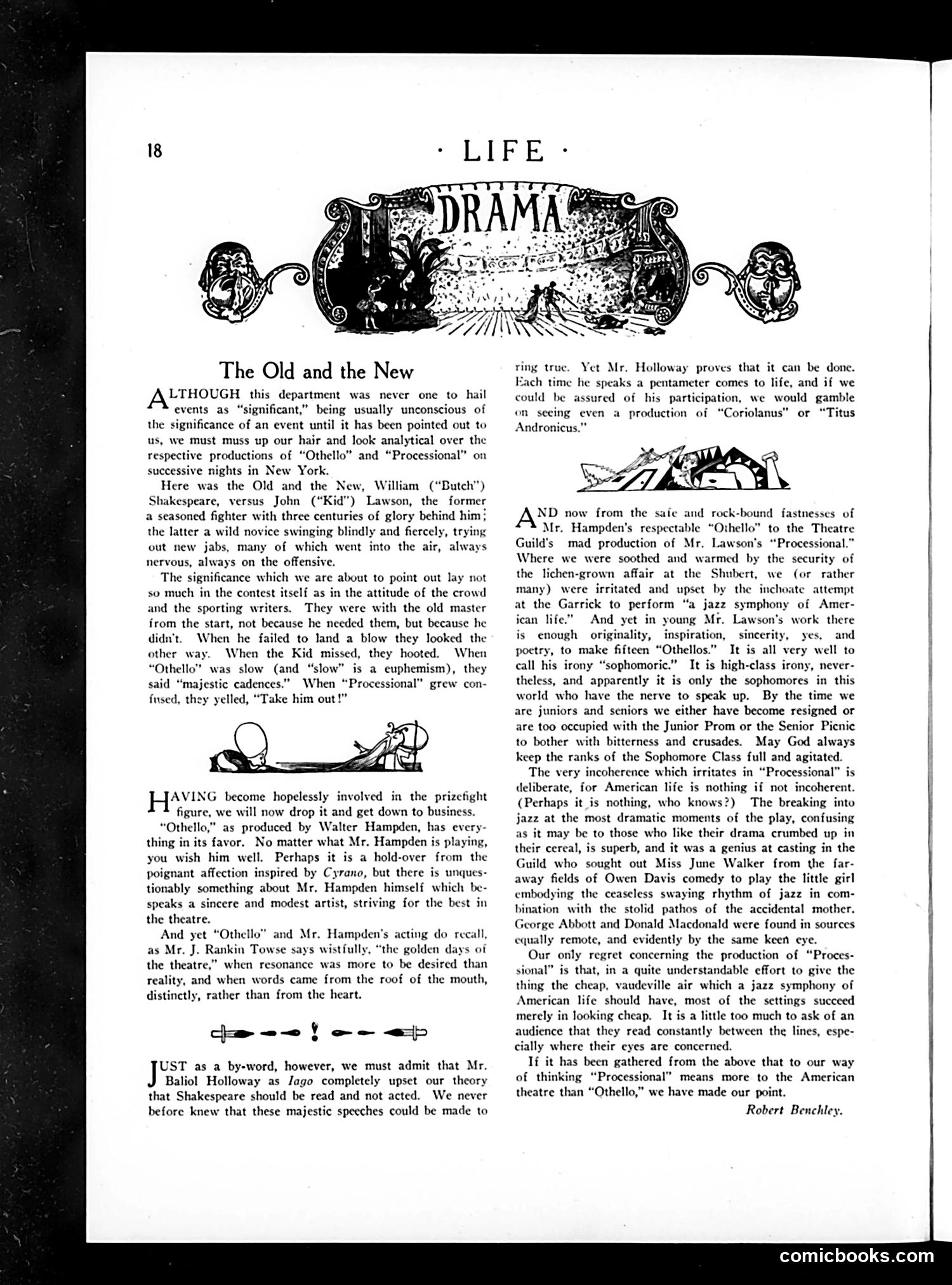
This *Life* magazine article compares two Broadway productions: Walter Hampden's classical *Othello* and John ("Kid") Lawson's avant-garde play *Processional*. The satire targets audience bias and critical double standards. The author uses a prizefight metaphor: the established Shakespearean production receives protective, forgiving treatment ("majestic cadences" excuses slowness), while the experimental new play faces harsh judgment ("Take him out!") for similar flaws. The piece praises Baliol Holloway's performance as Iago for proving Shakespeare's language can feel authentic rather than merely declamatory. However, it ultimately champions Lawson's chaotic, jazz-influenced work—despite (or because of) its "incoherence"—as capturing genuine American life and youthful artistic courage. The author suggests that by adulthood, people lose the nerve for such bold, bitter artistic experimentation.
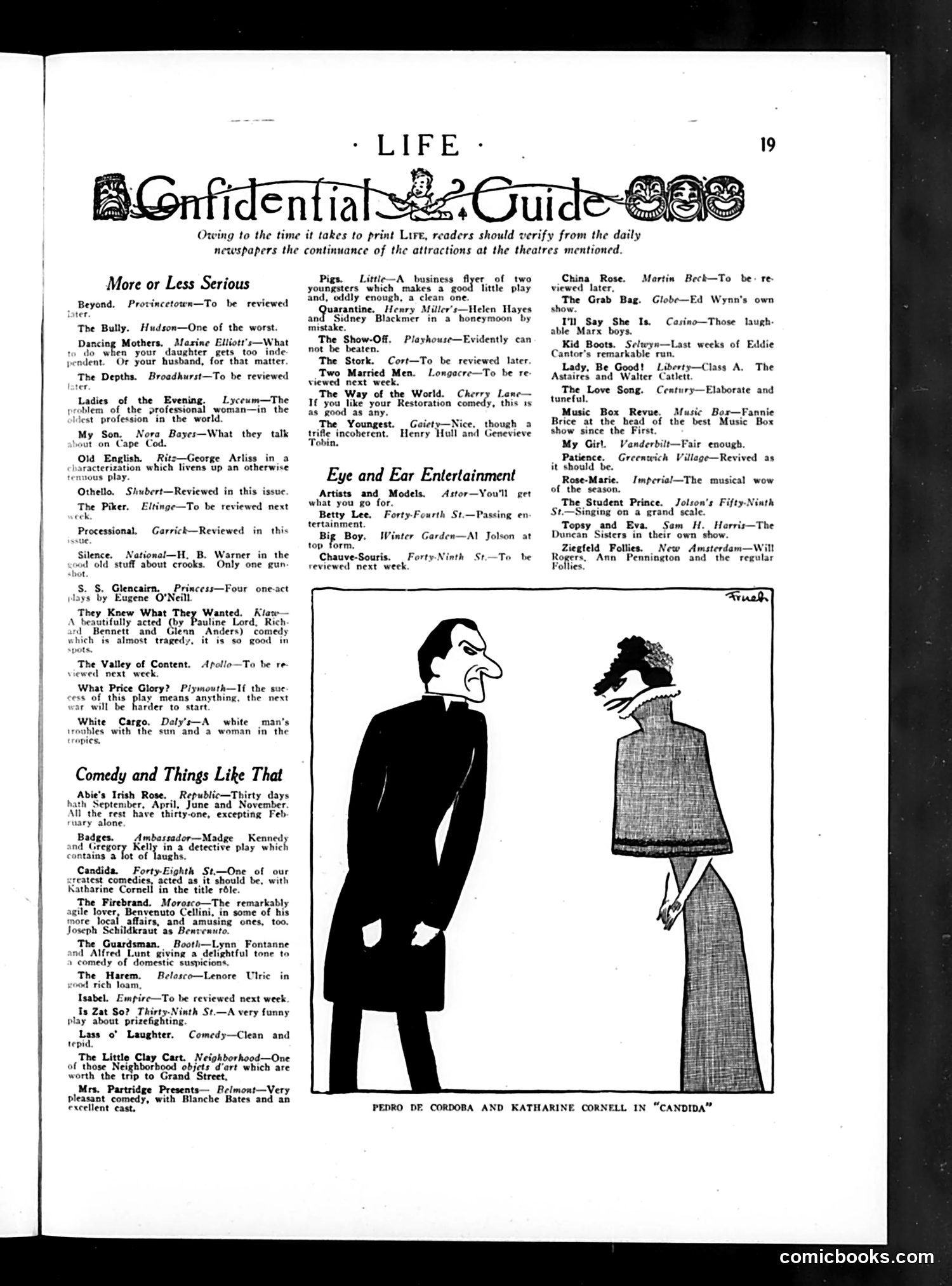
This page is primarily a **theater review guide**, not a political cartoon. The small illustration shows **Pedro de Cordoba and Katharine Cornell in "Candida"**—a Fifty-Eighth Street theatrical production by George Bernard Shaw. The image depicts two figures in period costume: a man in dark formal wear and a woman in a long gown, illustrating a scene from the play about domestic relationships and moral choices. The surrounding text is a **"Confidential Guide"** to New York City theaters—brief, often sardonic reviews of current Broadway and off-Broadway shows. The tone is gossipy and irreverent; reviewers mock plots ("what they talk about on Cape Cod"), criticize quality ("One of the worst"), and note production details. This reflects 1920s theatrical culture and Life magazine's role as sophisticated urban entertainment commentary for educated readers. The satire is gentle, aimed at Broadway itself rather than politics or social issues.
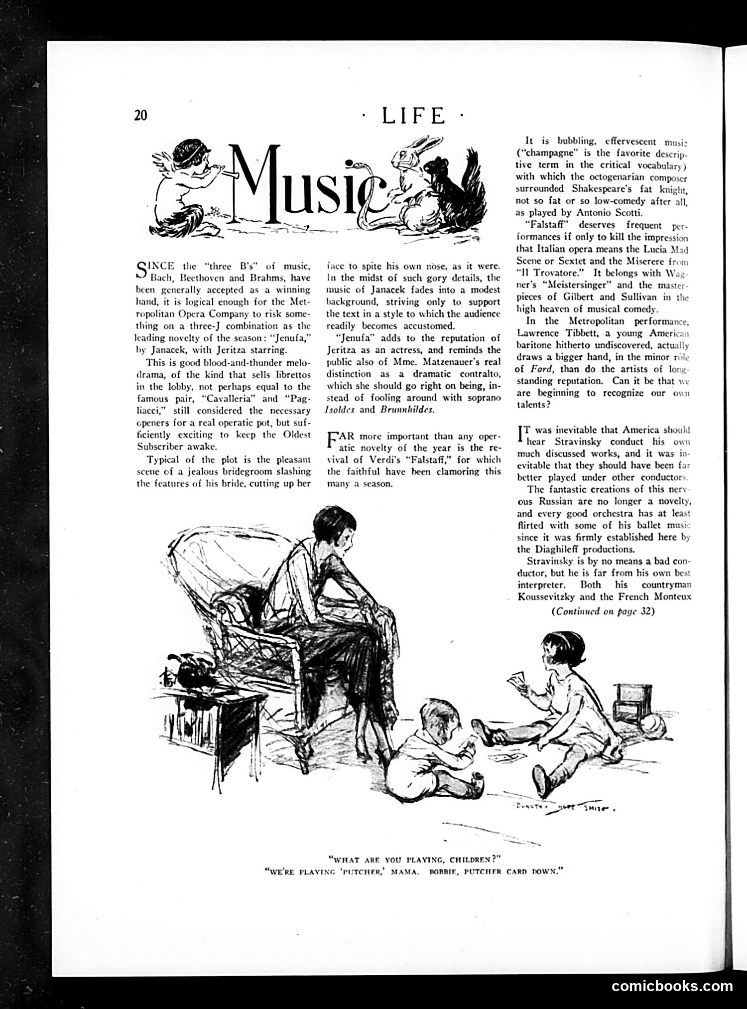
This page reviews recent Metropolitan Opera productions for a sophisticated American audience. The main text discusses three operatic novelties: Janacek's *Jenufa* (featuring soprano Jeritza), Verdi's *Falstaff* revival, and Stravinsky conducting his own works. The **cartoon at bottom** depicts a domestic scene where children are playing "Putcher" (pitcher)—a children's game involving cards. When the mother asks what they're playing, one child responds they're playing "Putcher, Mama, Bobbie, Putcher card down." The joke is subtle wordplay: the children's innocent card game mirrors the violent plot of *Jenufa* (where a jealous bridegroom slashes his bride's face). The contrast between children's innocent play and opera's melodramatic brutality creates the humor—satirizing how opera plots, despite their gory content, are entertainment for respectable audiences. The page celebrates emerging American talent (Lawrence Tibbett) while critiquing Stravinsky as an inferior conductor of his own compositions.
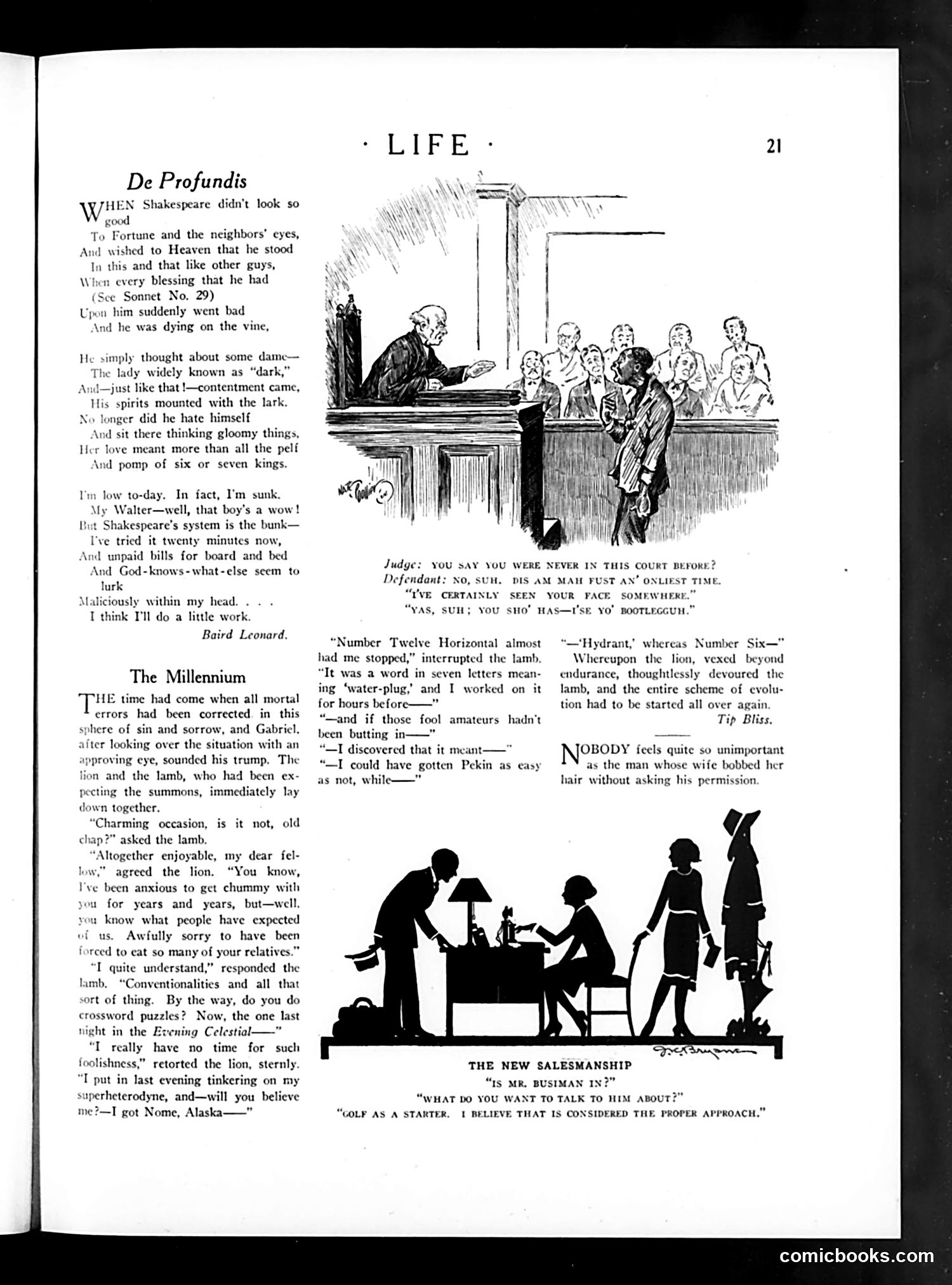
This page contains three satirical pieces typical of 1920s humor: **"De Profundis"** (Baird Leonard): A poem mocking the idea that romantic love solves financial problems. The speaker tries Shakespeare's approach of thinking about a woman to cure depression, but bills and work demands intrude—implying real-world problems can't be escaped through sentiment. **"The Millennium"**: A fable where a lion and lamb coexist peacefully in paradise, but immediately revert to nature (the lion eats the lamb) when distracted by mundane modern concerns like crossword puzzles and radio tinkering. It satirizes the notion that human nature or civilization can fundamentally change. **Three cartoon panels** on social situations: a courtroom scene with dialect humor; a domestic joke about wives making decisions without husbands' permission (reflecting 1920s gender tensions post-suffrage); and "The New Salesmanship" mocking businessmen who use golf as a social networking tool—suggesting superficial relationship-building in corporate culture. Overall, the page ridicules romantic idealism, utopian thinking, and modern social pretension.
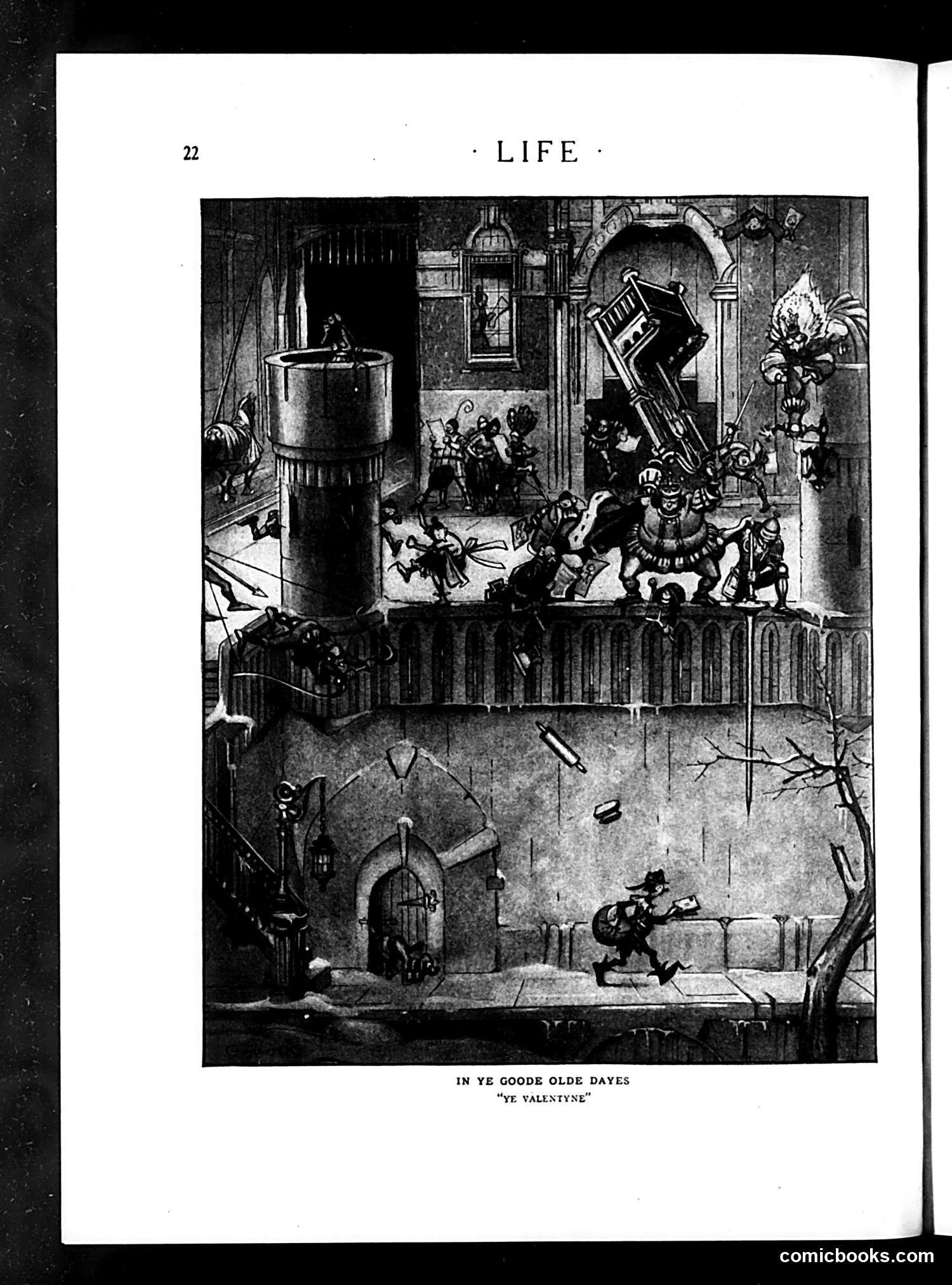
This is a two-panel satirical illustration titled "In Ye Goode Olde Dayes: 'Ye Valentyne.'" The top panel depicts an elaborate Renaissance or medieval festival scene with costumed figures, musicians, and courtly activity in an ornate setting. The bottom panel shows a lone figure with a rifle in a desolate landscape with bare trees and falling projectiles. The satire appears to contrast romantic, idealized notions of historical courtship ("ye goode olde dayes") with harsh reality. The juxtaposition suggests that Valentine's Day traditions—presented as refined and genteel in historical fantasy—contrast sharply with life's actual brutality or hardship. The armed figure and violent imagery in the lower scene likely represent a cynical commentary on modern reality intruding upon sentimental nostalgia. The overall message critiques romanticized views of the past.
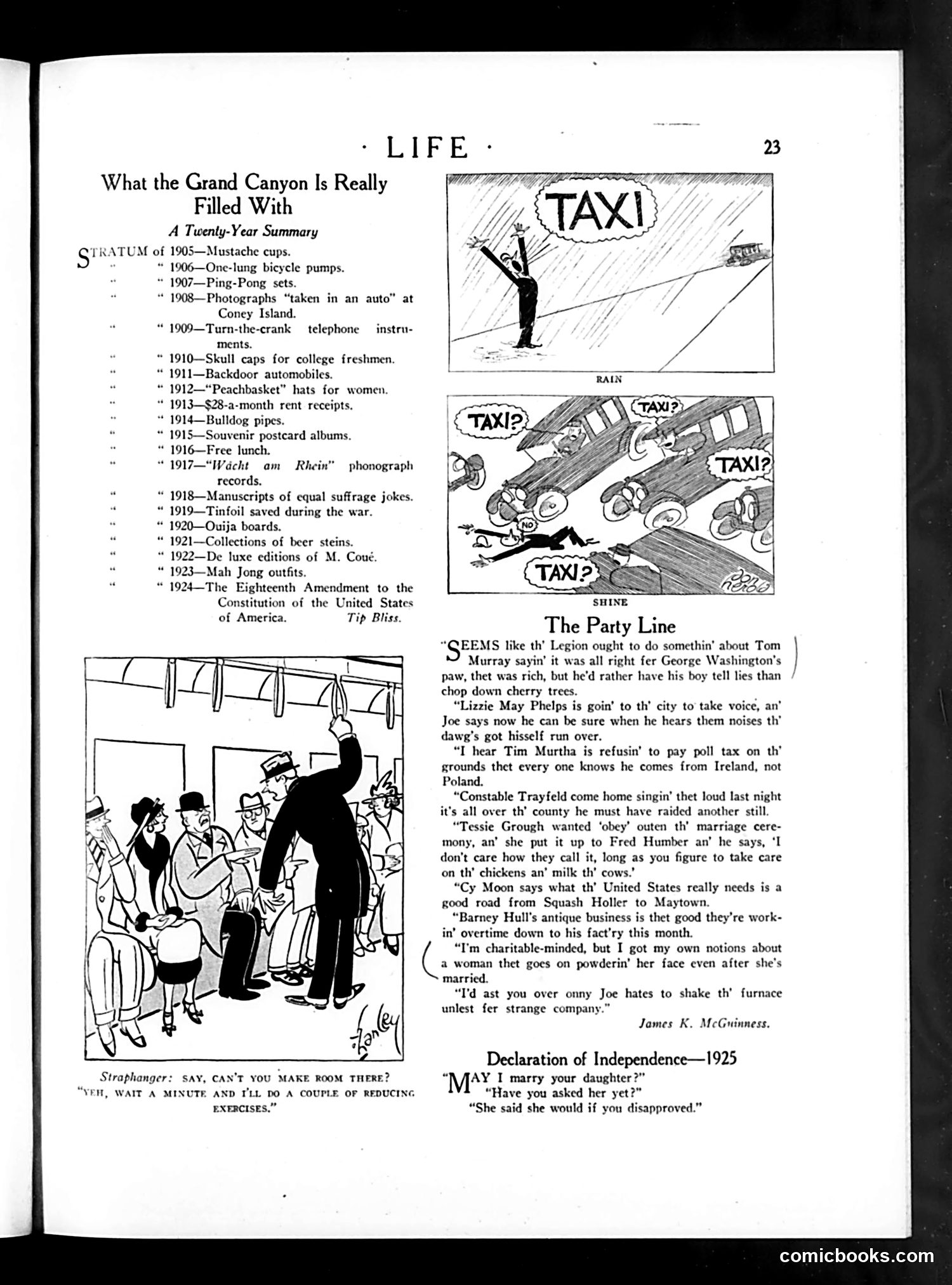
This page contains three satirical pieces from 1920s Life magazine: **"What the Grand Canyon Is Really Filled With"** mocks consumerism and fad culture. It humorously lists trivial items supposedly accumulating in the Grand Canyon from 1905-1924—from mustache cups and bicycle pumps to mah jong sets and Prohibition-era beer steins. The final entry, "The Eighteenth Amendment," suggests that America's failed Prohibition experiment (1920-1933) is as disposable and forgettable as passing fads. **The taxi cartoons** appear to satirize either taxi shortages or overcharging ("TAXI?" appearing repeatedly suggests unavailability or the service's ubiquity). **"The Party Line"** uses rural gossip to comment on contemporary social issues: women's suffrage jokes, Prohibition raids ("raided another still"), marriage customs, and Irish immigration politics. The dialect humor targets small-town life. **"Declaration of Independence—1925"** jokes about modern youth rebellion: a daughter will marry a suitor only if her father disapproves, inverting traditional parental authority.
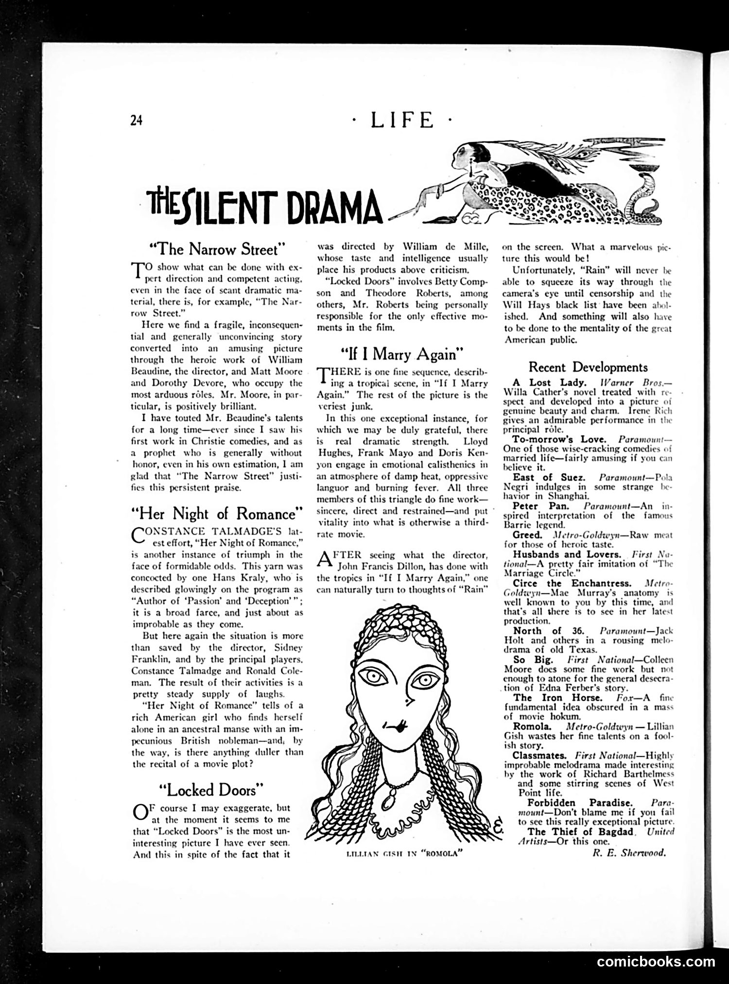
This page reviews several silent films, with a portrait illustration of actress Lillian Gish (captioned as appearing in "Romola"). The reviews are written by R.E. Sherwood, a prominent theater critic of the era. The critic praises directors William Beaudine and Sidney Franklin for elevating weak material through skilled direction and acting. He's particularly enthusiastic about Constance Talmadge's performance in "Her Night of Romance." Notably, Sherwood expresses frustration about censorship, lamenting that a film adaptation of "Rain" (likely Somerset Maugham's controversial play about a prostitute) cannot be made due to the "Will Hays black list"—referring to the newly-established Motion Picture Association's censorship code. This reflects 1920s cultural tensions between artistic freedom and moral gatekeeping. The reviews exemplify how silent-era critics evaluated films primarily through directorial skill and acting, given the medium's reliance on visual storytelling.
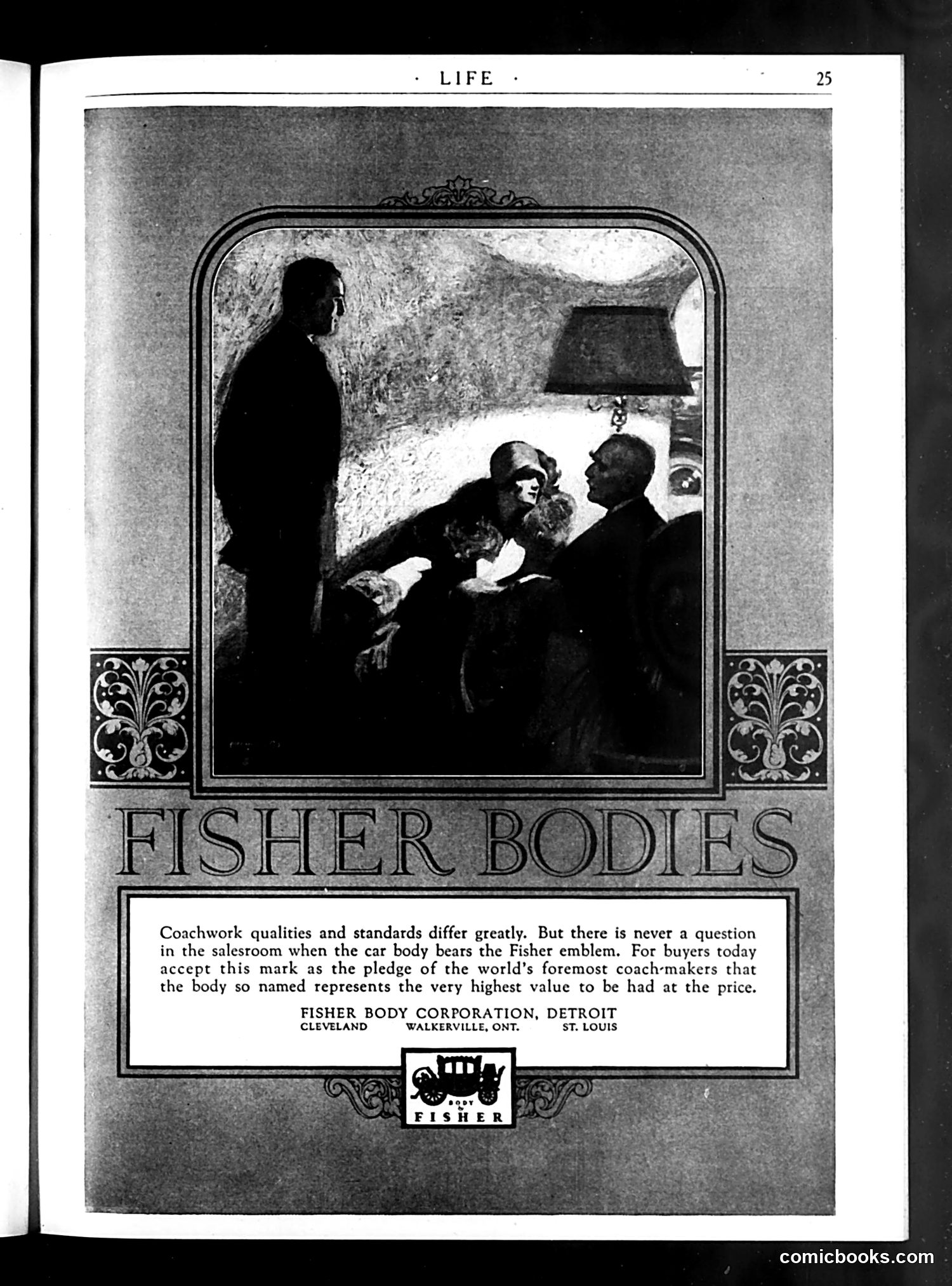
This is a **product advertisement** for Fisher Body Corporation, a major automotive coachwork manufacturer. The image shows a sales scene: a standing salesman presenting a car to seated buyers in what appears to be a showroom, with a lamp visible in the background. The text emphasizes brand prestige, claiming the "Fisher emblem" guarantees quality and value—establishing it as a trusted mark of excellence in car body construction. The advertisement positions Fisher Bodies as "the world's foremost coach-makers," appealing to buyers seeking assurance of quality. This appears to be from an era when car bodies were sold separately from chassis, before full automotive integration became standard. The focus on the salesman's pitch reflects early 20th-century consumer marketing tactics emphasizing brand reputation.
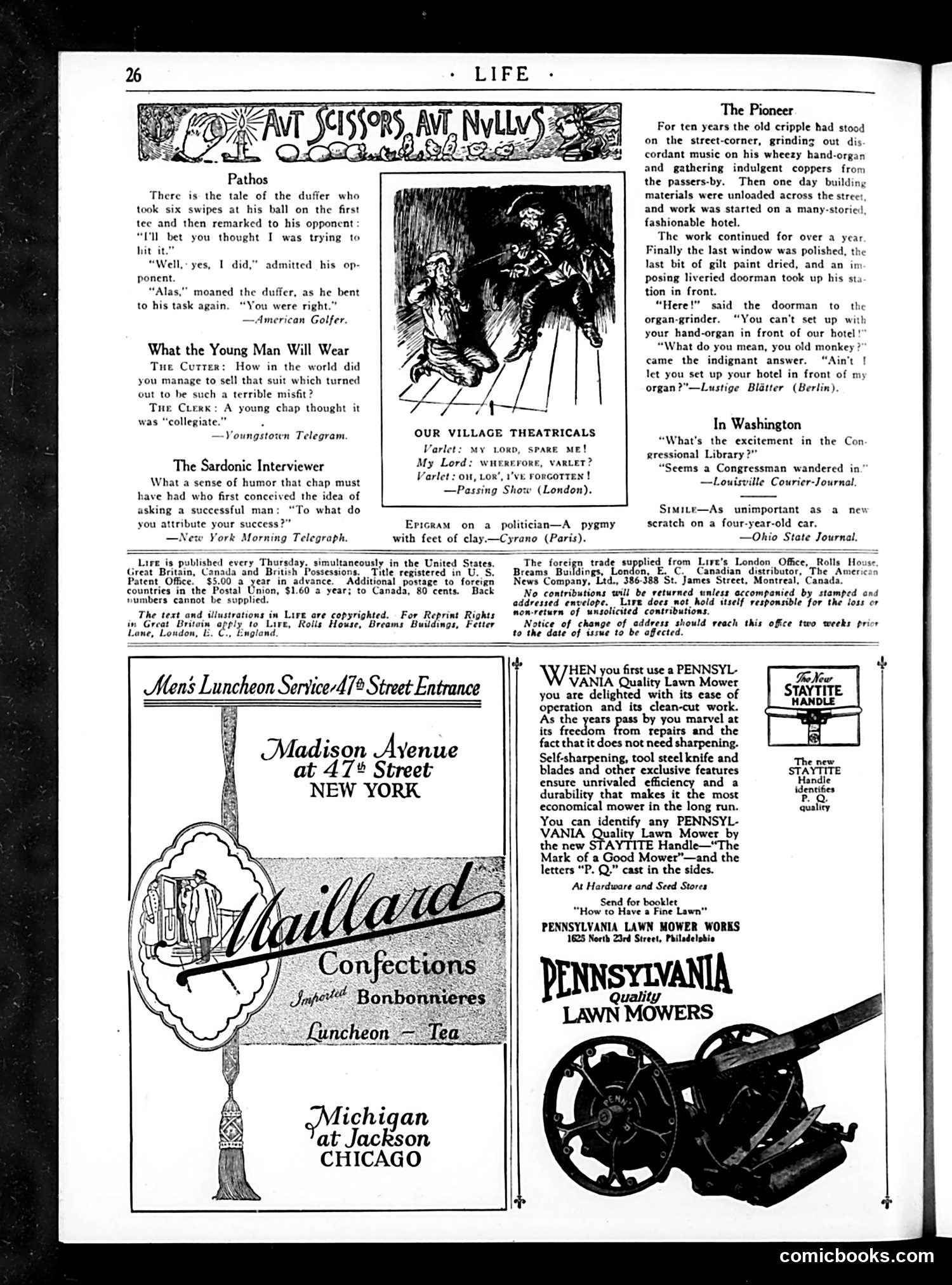
This page mixes satirical humor columns with period advertisements. The cartoons and jokes target social pretense and hypocrisy: **"The Pioneer"** depicts class conflict: a street musician with a hand-organ has occupied a corner for years; when a fancy hotel is built across the street, the new doorman demands he leave. The cripple's retort—that *he* was there first—exposes the doorman's arbitrary authority and the hotel's disregard for those already established in the space. **"The Sardonic Interviewer"** mocks the clichéd question posed to successful men about their success, implying the question itself is absurd or that successful people rarely give honest answers. **"Epigram on a politician"** (from *Cyrano*) is a derisive one-liner: politicians are dwarfs with feet of clay—powerful-seeming but fundamentally weak and artificial. The other brief jokes target golfers, clothing salesmen, and theatrical performers—common targets of genteel satire. The page is primarily advertising for confections and lawn mowers, typical of the era.
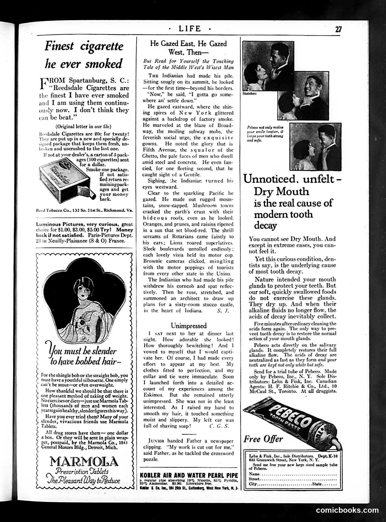
This page from *Life* magazine contains several satirical pieces and advertisements typical of the 1920s era. **"He Gazed East, He Gazed West, Then—"** is a humorous short story mocking Midwestern provincialism. A wealthy Indiana businessman contemplates moving to either cosmopolitan New York (with its Broadway glitter and Fifth Avenue sophistication) or the booming West Coast (with its tourist attractions and civic clubs like Rotarians and Lions). The punchline: he decides to build a mansion back in Indiana anyway—satirizing the Midwesterner's simultaneous attraction to and rejection of "sophisticated" coasts. **"Unimpressed"** is a brief comedic anecdote about a man's failed seduction attempt, ruined when his date notices shaving soap in his ear—deflating his carefully maintained appearance. The advertisements (Reedsdale Cigarettes, Marmola diet tablets, and others) reflect period marketing: cigarettes marketed as health products, weight-loss pills targeting women concerned with fashionable "bobbed hair" silhouettes, and other dubious remedies—all presented as common commercial offerings.
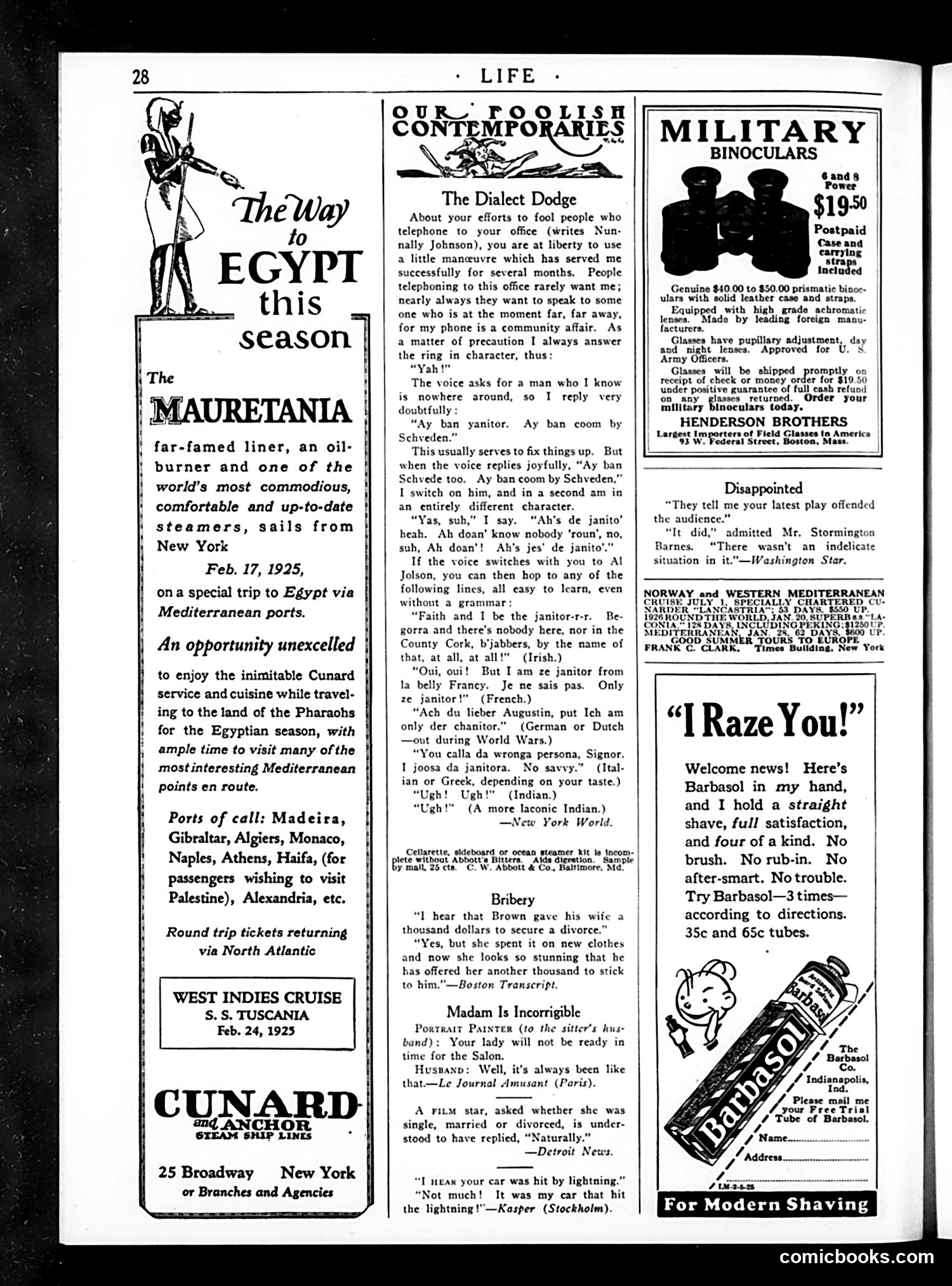
This page is primarily advertising for luxury travel (Cunard steamship lines to Egypt and the Caribbean) and military binoculars, with several humorous short pieces interspersed. The main satirical content is "The Dialect Dodge," a comedic column advising office workers on how to deceive callers by pretending to be a non-English-speaking janitor, switching between exaggerated Swedish, Irish, French, German, Italian, Indian, and other accents and dialects. The humor relies on ethnic stereotyping—portraying foreign accents as comical and using them as tools for deception. The remaining pieces are brief, mild jokes about divorce, portrait painting, and car accidents. These were typical of Life magazine's light social humor in the 1920s, relying on marital discord and domestic situations as comedic subjects. The page reflects 1920s attitudes toward immigration and ethnic humor that would be considered offensive today.
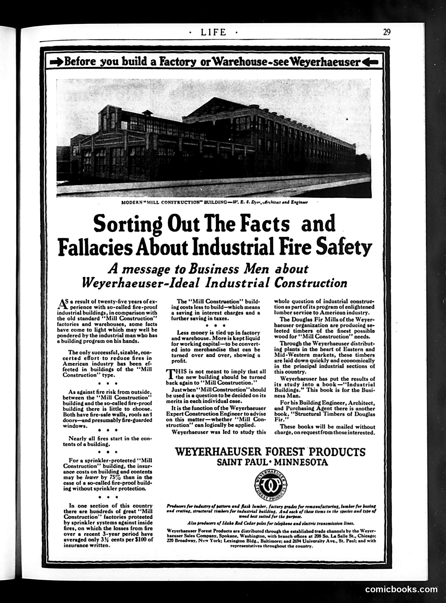
This is primarily **advertising disguised as editorial content**—a sponsored message to business owners about industrial construction, not satire or political commentary. The Weyerhaeuser Forest Products company presents itself as a neutral advisor on fire safety, claiming their "Mill Construction" method (wooden-frame factories with sprinkler systems) is cheaper and safer than conventional "fireproof" (steel/masonry) buildings. They argue fires start in *contents*, not buildings, so sprinkler protection matters more than fireproof materials. The hidden sales pitch: wooden construction uses more lumber, which Weyerhaeuser supplies profitably through their distribution network. There's no cartoon or caricature—just a photograph of a modern industrial building. The "sorting out facts and fallacies" framing suggests objectivity while actually promoting one construction method's economic advantages (lower building costs, less tied-up capital) over competitors. This represents early-20th-century corporate marketing: providing ostensibly helpful information while advancing commercial interests.
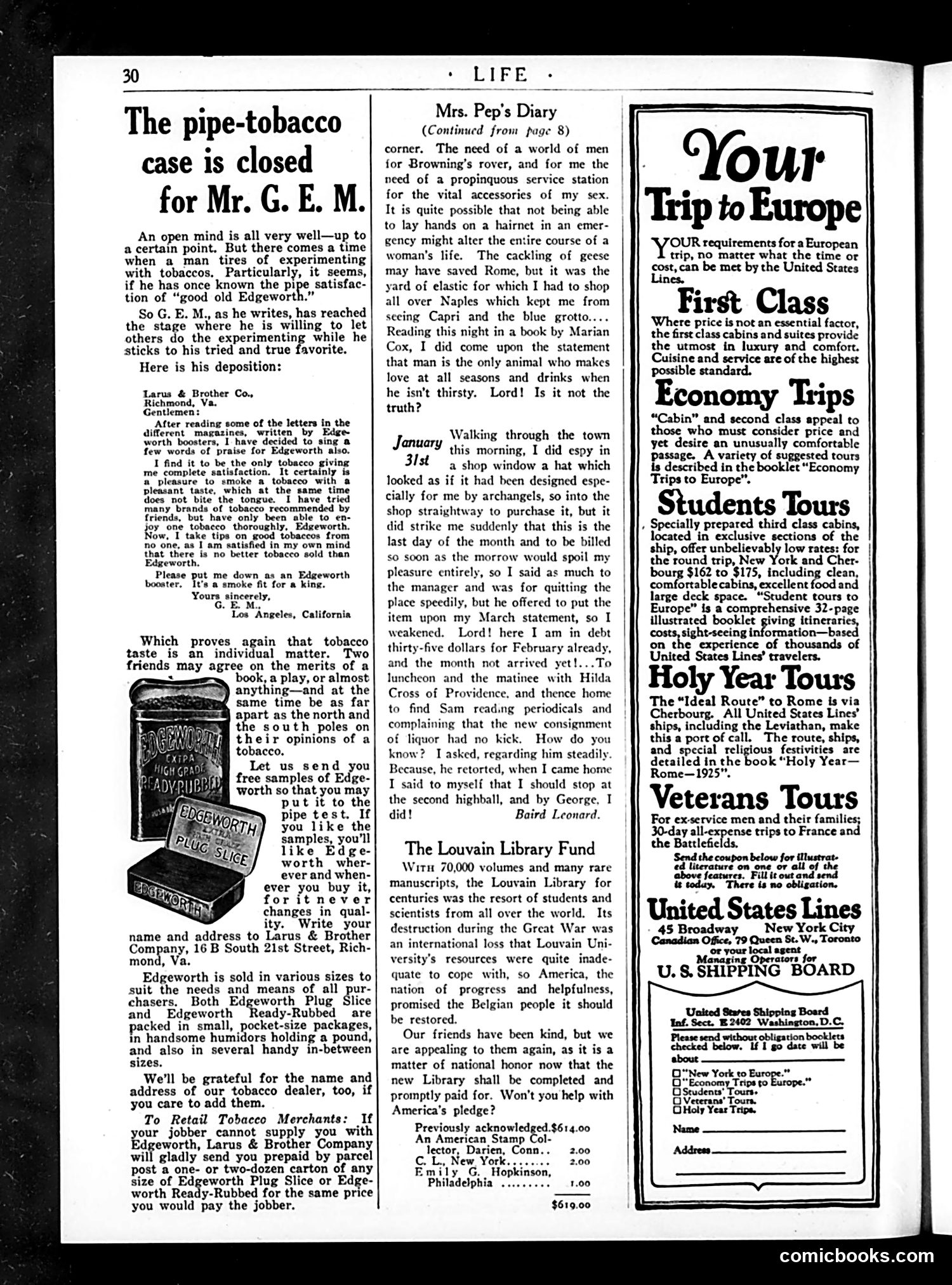
This page is primarily **advertising**, not political satire. The dominant content is a lengthy advertisement for Edgeworth pipe tobacco, presented as a customer testimonial letter from "G.E.M." in Los Angeles praising the product's consistent quality and pleasant taste. The advertisement uses a common early 20th-century marketing technique: publishing genuine (or purportedly genuine) customer letters to build credibility. The "case is closed" headline humorously suggests the writer has completed his tobacco experimentation and settled definitively on Edgeworth. The page also contains **"Mrs. Pep's Diary,"** a lighthearted column about a woman's travel experiences in Europe, touching on mundane frustrations (finding hairnets, purchasing a hat) alongside cultural observations. The right column advertises **United States Lines' European travel packages**—first-class cruises, economy tours, and student rates—reflecting the 1920s leisure travel boom for affluent Americans.
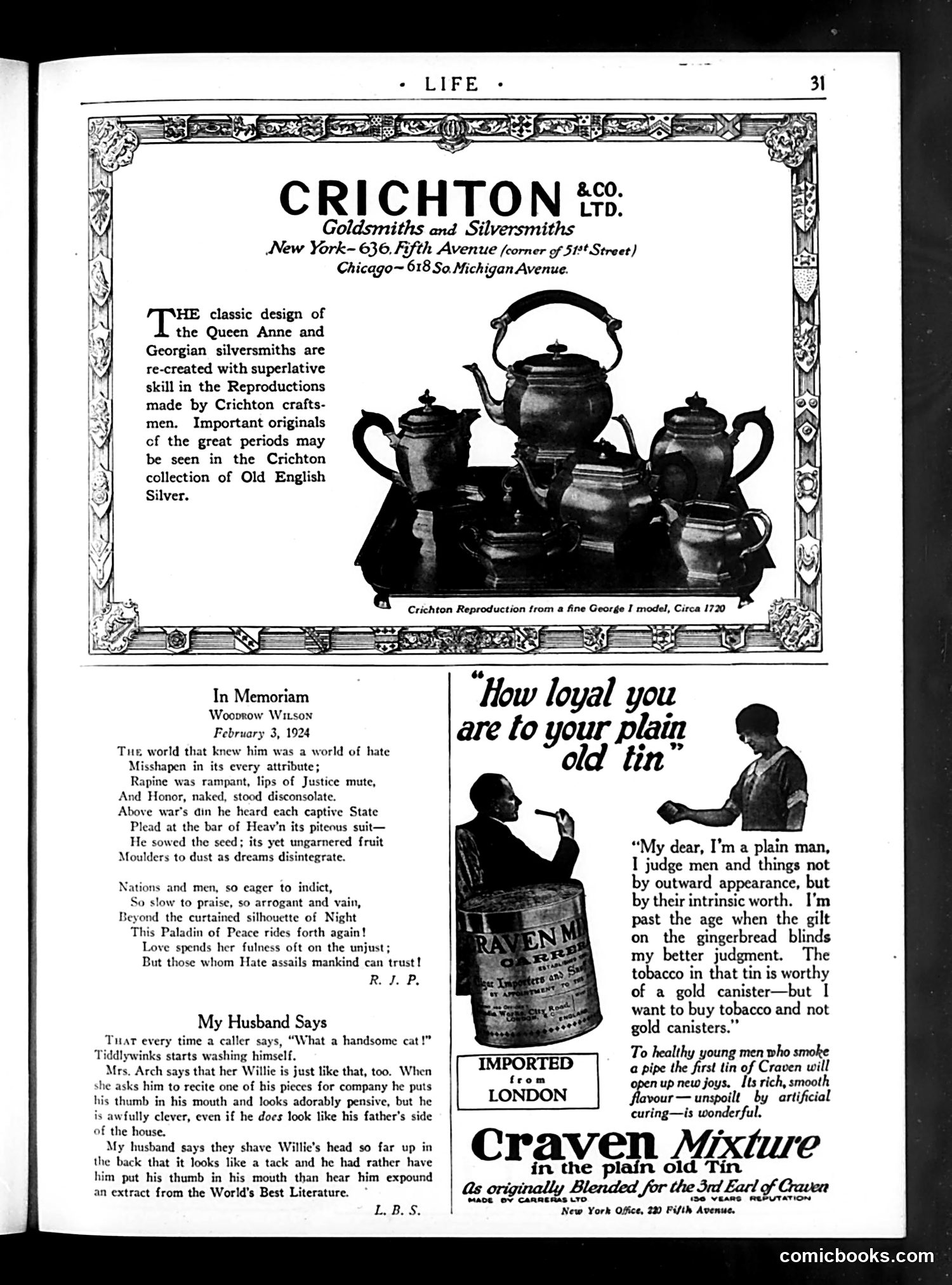
This page contains three distinct items: 1. **Crichton & Co. Advertisement** (top): A luxury silversmith company advertising reproductions of Queen Anne and Georgian period silver designs, positioned as high-end goods for wealthy consumers. 2. **In Memoriam Poem** (left): A tribute to Woodrow Wilson, who died February 3, 1924. The poem portrays Wilson as an idealistic peacemaker ("Paladin of Peace") whose post-WWI efforts were unappreciated by a cynical world. It reflects the contemporary disappointment that Wilson's League of Nations failed and his presidency ended in defeat. 3. **Humorous Vignettes** (right side): Two brief comic pieces—"My Husband Says" (a recurring feature mocking domestic behavior) and "How loyal you are to your plain old tin" (a Craven Mixture tobacco advertisement using a satirical dialogue about valuing intrinsic worth over appearances). The page mixes premium advertising, serious political remembrance, and light humor—typical of *Life* magazine's eclectic 1920s format.
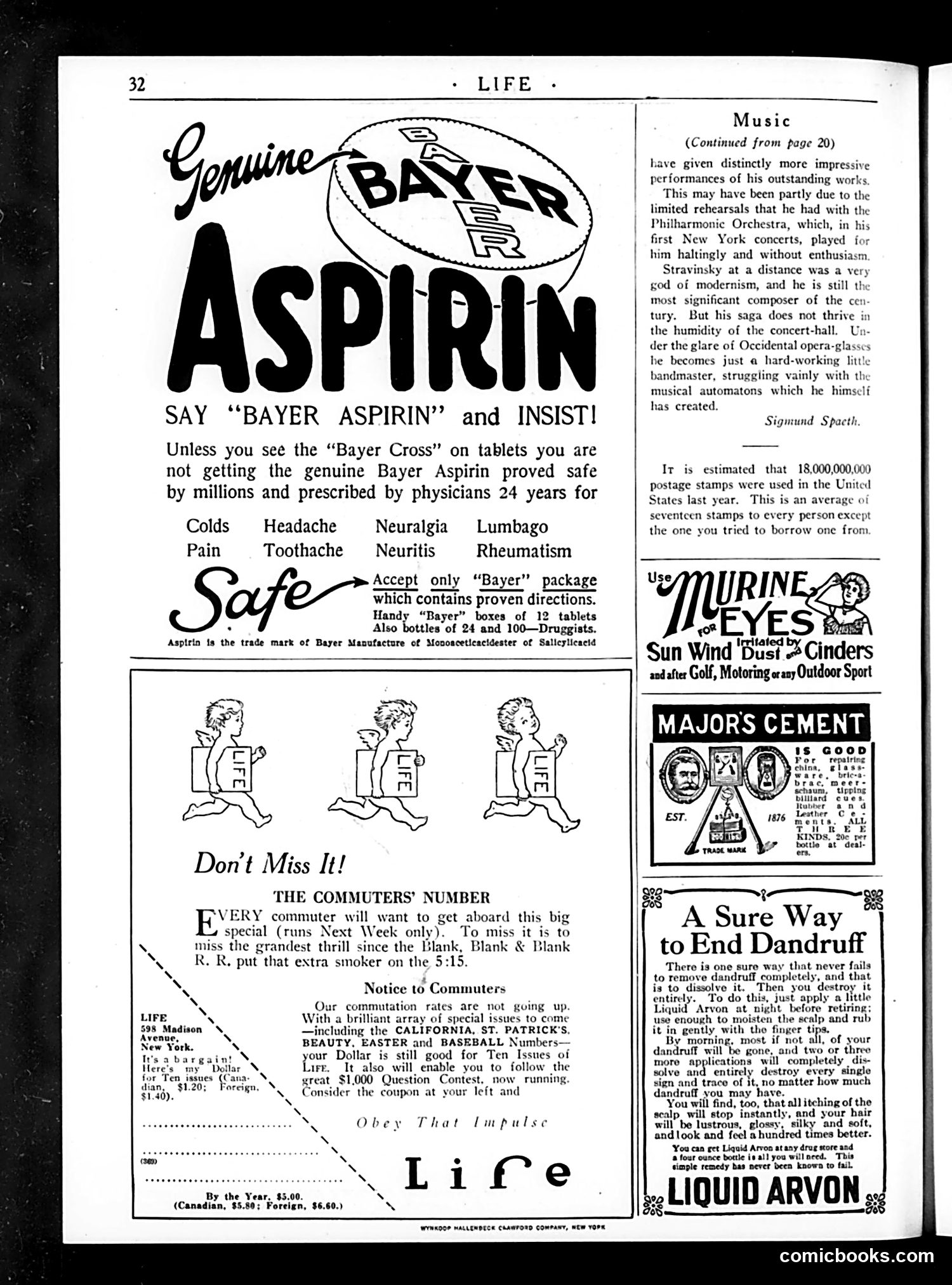
This page is primarily **advertising**, not political satire or editorial content. The main elements are commercial product advertisements typical of the 1920s era. The largest ad promotes **Bayer Aspirin**, emphasizing the importance of the "Bayer Cross" trademark to ensure genuine medication—likely responding to counterfeit products or consumer confusion about aspirin brands during this period. Secondary ads include: - **Murine for Eyes** (eyewash product for outdoor activities) - **Major's Cement** (adhesive) - **Liquid Arvon** (dandruff treatment) The only editorial content visible is a brief music column discussing composer Stravinsky's disappointing New York concert performances, suggesting his modernist compositions work better in theory than in live orchestral settings. The page also advertises Life's upcoming special issues (California, St. Patrick's, Easter, Baseball) and notes unchanged subscription rates. There is no cartoon or satire to analyze here—this is straightforward 1920s-era advertising and magazine promotion.
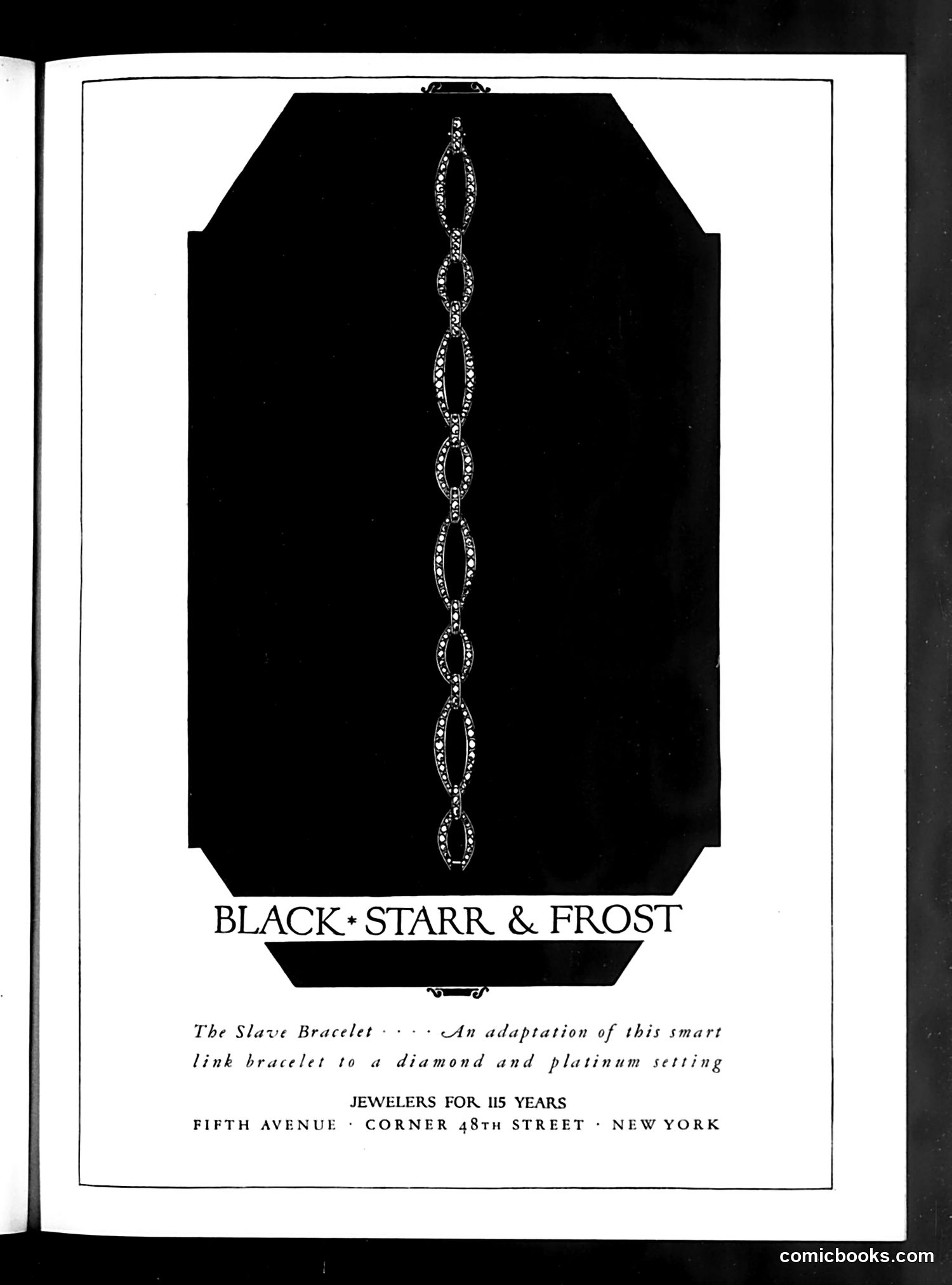
This is a **jewelry advertisement**, not a political cartoon. Black, Starr & Frost, a prestigious New York jeweler, is advertising a "Slave Bracelet"—a decorative chain-link bracelet adapted with diamonds and platinum settings. The name "Slave Bracelet" reflects early 20th-century jewelry terminology for this style of linked bracelet design, not a political statement. The ad emphasizes the jeweler's prestige ("115 Years") and Fifth Avenue location to appeal to wealthy consumers. For modern readers, the product name feels jarring due to changed cultural sensitivity around slavery terminology. However, this reflects the casual historical language of the era, when such names were purely descriptive of the bracelet's aesthetic chain-link design rather than carrying deliberate social commentary.
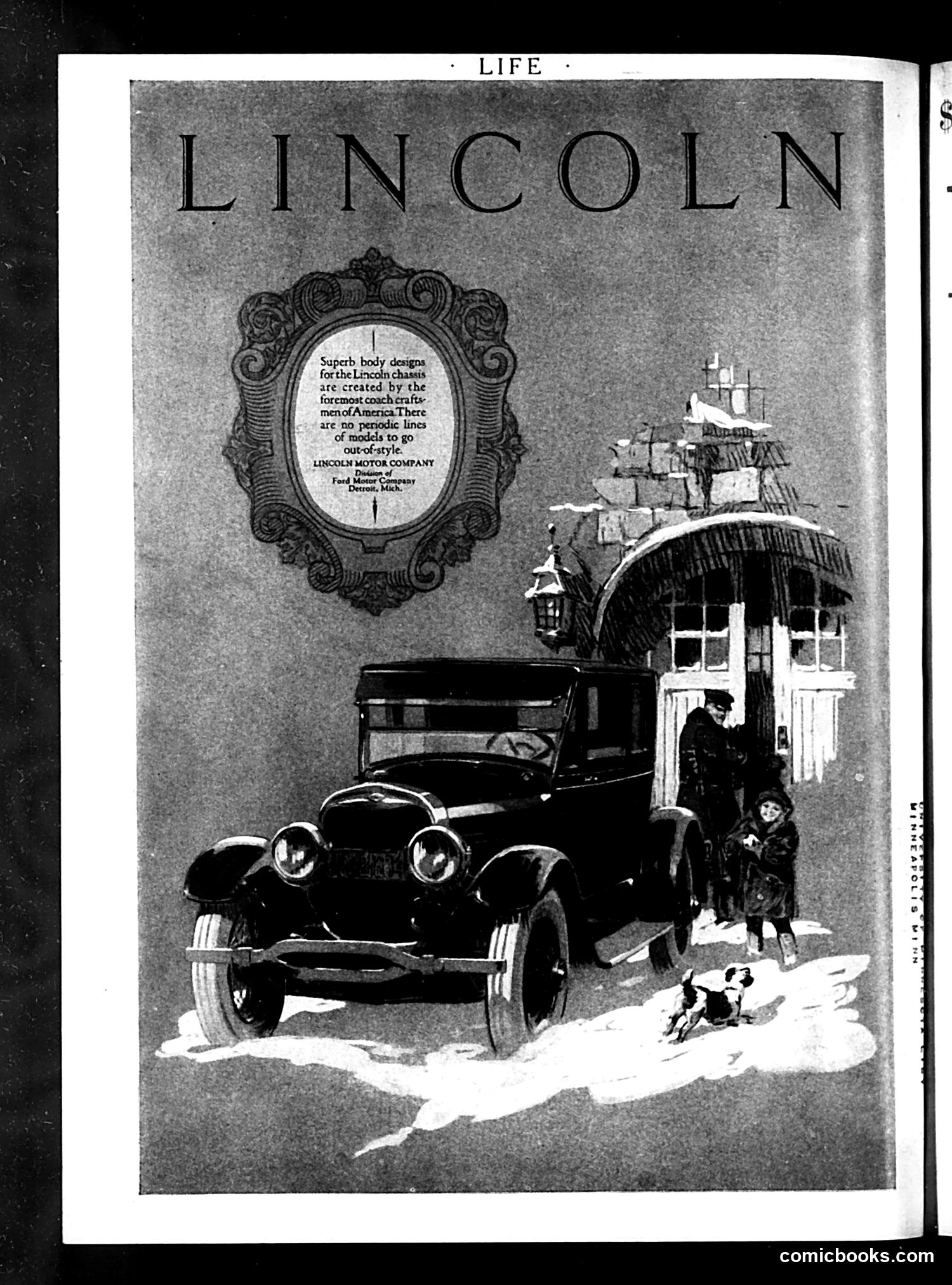
This is a **full-page advertisement** for the Lincoln automobile, not political satire. The ad appears in *Life* magazine and features an ornate decorative frame containing marketing copy claiming Lincoln chassis designs are "created by the foremost coach craftsmen of America" with "no periodic lines of models to go out-of-style." The illustration shows a Lincoln car positioned outside an elegant colonial-style mansion, with well-dressed figures and a small dog nearby—imagery designed to associate the vehicle with wealth, taste, and timeless sophistication. The ad emphasizes durability and enduring design value as selling points, contrasting with competitors' frequent model changes. This reflects 1920s luxury automotive marketing strategies targeting affluent buyers.