
A complete issue · 36 pages · 1919
Life — October 23, 1919
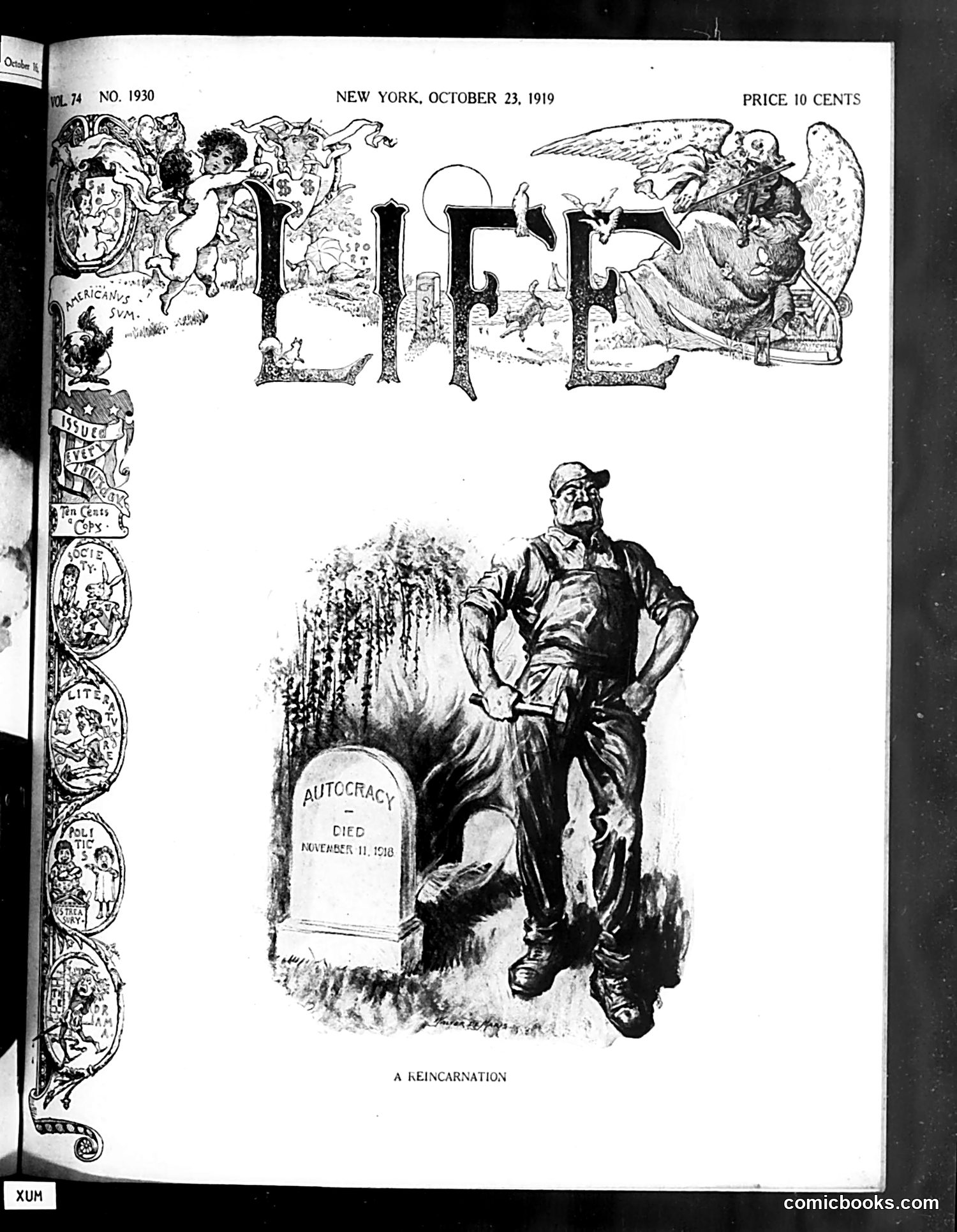
The main cartoon titled "A Reincarnation" depicts a man in work clothes standing beside a gravestone marked "AUTOCRACY / DIED / NOVEMBER 11, 1918"—referencing the armistice ending World War I and the collapse of European monarchies. The figure appears to represent either returning militarism or authoritarian leadership being resurrected in post-war society. The elaborate header illustration shows cherubs and classical figures, suggesting themes of power and governance. The satire warns that despite autocracy's apparent death, its spirit may persist or return—a commentary on anxieties about whether wartime authoritarian controls would truly end, or whether new forms of tyranny might emerge during post-war reconstruction and social upheaval in 1919.
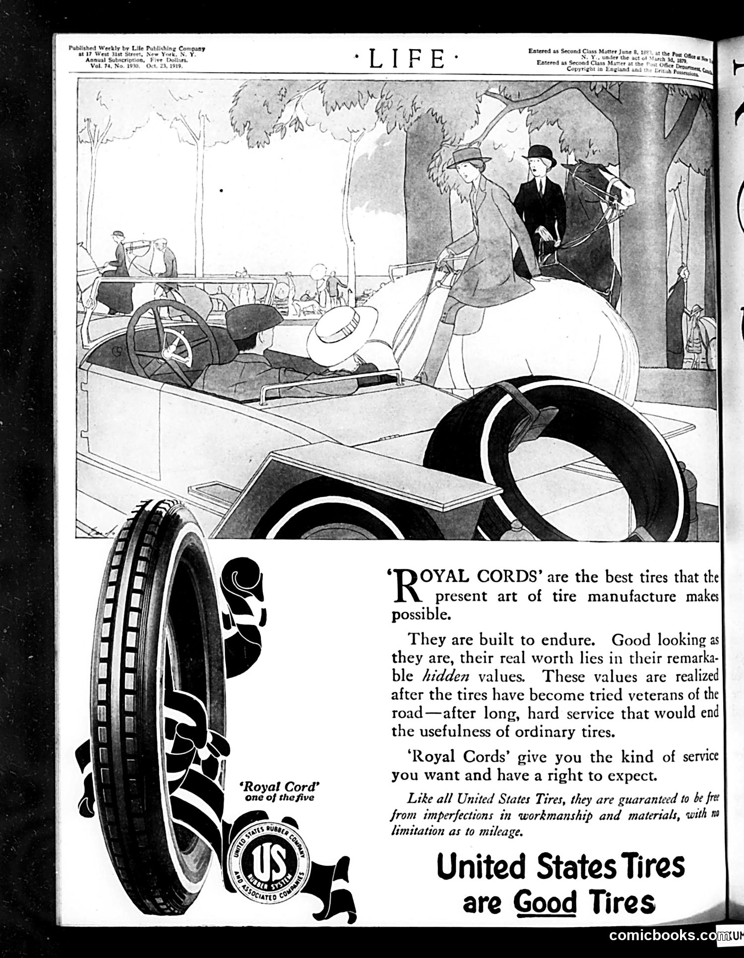
This page is **primarily a vintage automobile advertisement** for United States Tires' "Royal Cord" brand, not political satire. The illustration shows a 1919-era social scene at what appears to be a country club or park gathering, with well-dressed figures and automobiles. The cartoon depicts leisure-class life of the period—men in suits and hats, women in fashionable dress, vehicles prominently displayed. The advertisement emphasizes the tire's durability and reliability, claiming superior "hidden values" that justify the product's quality through long-term road performance. The satire, if present, is gentle and commercial rather than political—it's aspirational advertising dressed in humor, appealing to consumers' desires for status and reliability. The focus is entirely on product promotion, not social or political commentary.
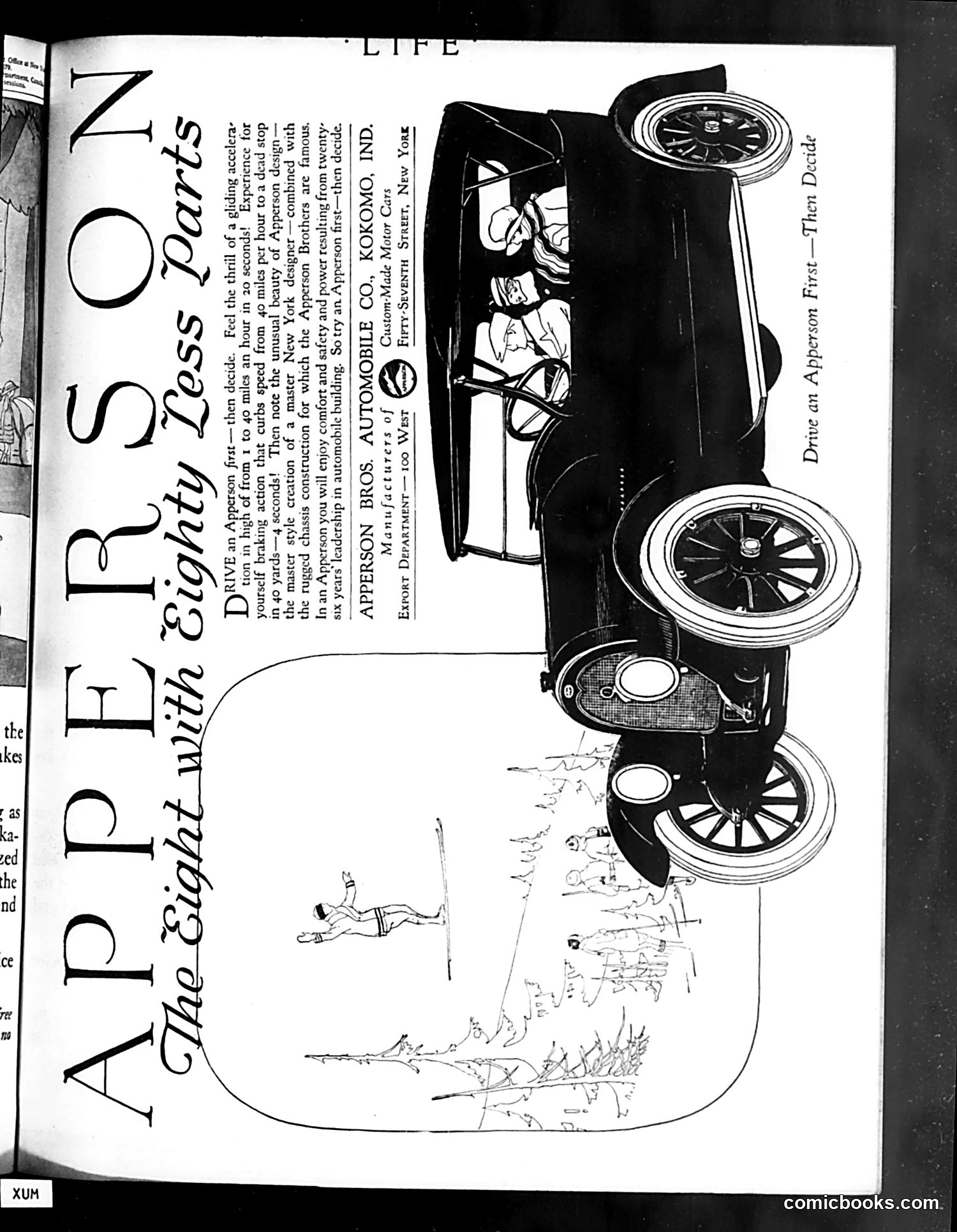
This is an advertisement for the Apperson Bros. Automobile Company's "Eight" model, titled "A PERSON with Eight Legged Ability." The satire plays on the car's name by depicting a literal eight-legged creature (appearing to be an insect or spider-like being) driving the automobile. The joke is a visual pun: the car is called an "Eight," so the advertiser humorously illustrates it being driven by something with eight legs. The ad emphasizes the car's capabilities, claiming it can handle various driving conditions and challenges. The surrounding landscape sketch shows the vehicle navigating rough terrain, supporting the message about its durability and performance. This represents early automotive advertising's use of wordplay and illustrated humor to make products memorable to readers of *Life* magazine.
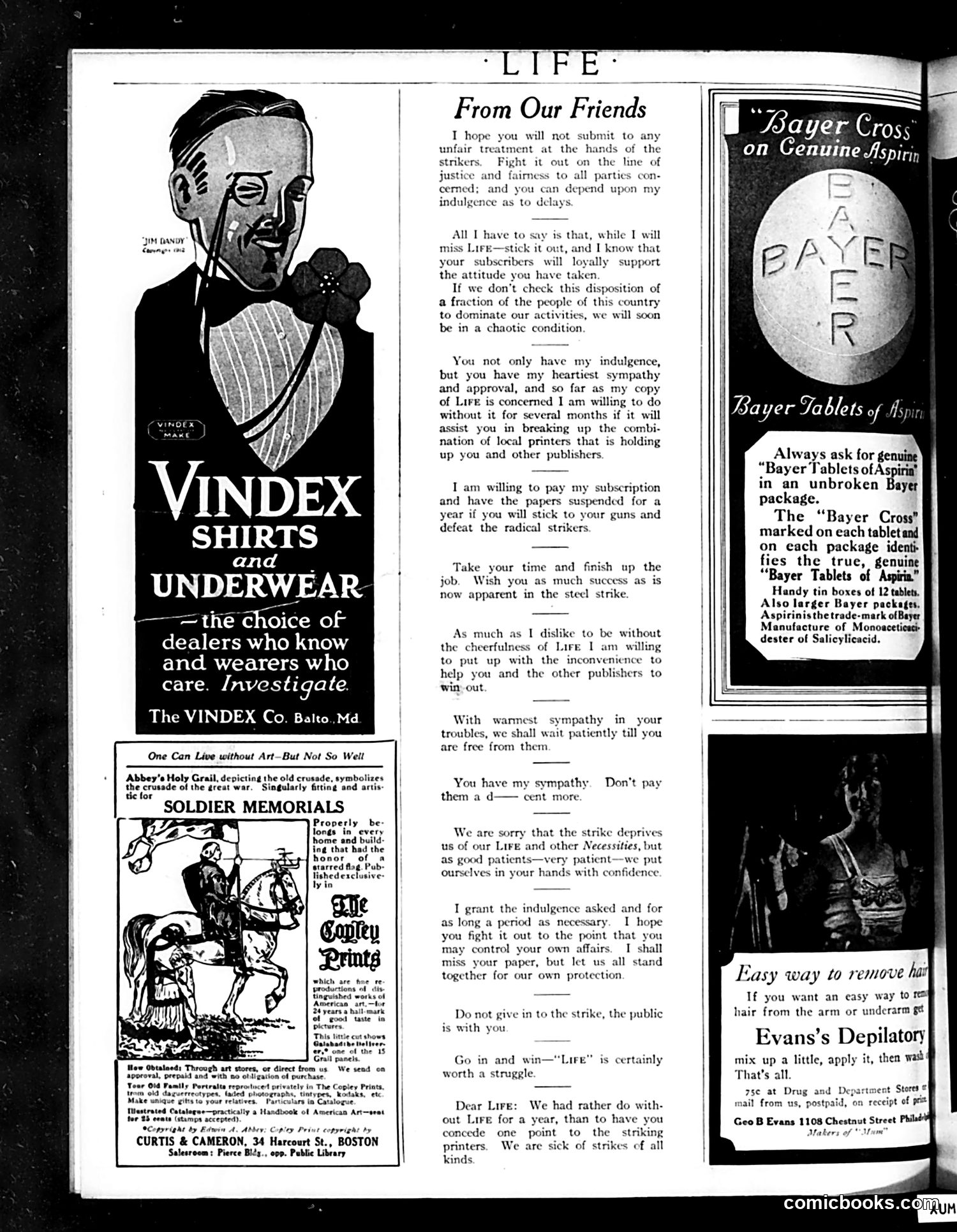
This page contains **primarily advertisements** (Vindex Shirts, Bayer Aspirin, Evans's Depilatory) interspersed with editorial content. The central element is a letter **"From Our Friends"** addressing a strike—likely the steel strike referenced in the text. The unsigned letter (possibly from Life's editor or a notable figure) expresses sympathy for striking workers while urging patience and warning against "radical" elements. The writer promises to support the strikers' cause. The left sidebar shows a **"Soldier Memorials"** advertisement depicting a military figure on horseback, emphasizing wartime sacrifice—contextualizing labor unrest in post-WWI America. The overall message appears to balance **pro-labor sentiment with caution against radical action**, a characteristic moderate position during America's volatile early-1920s labor period when fears of Bolshevism were high.
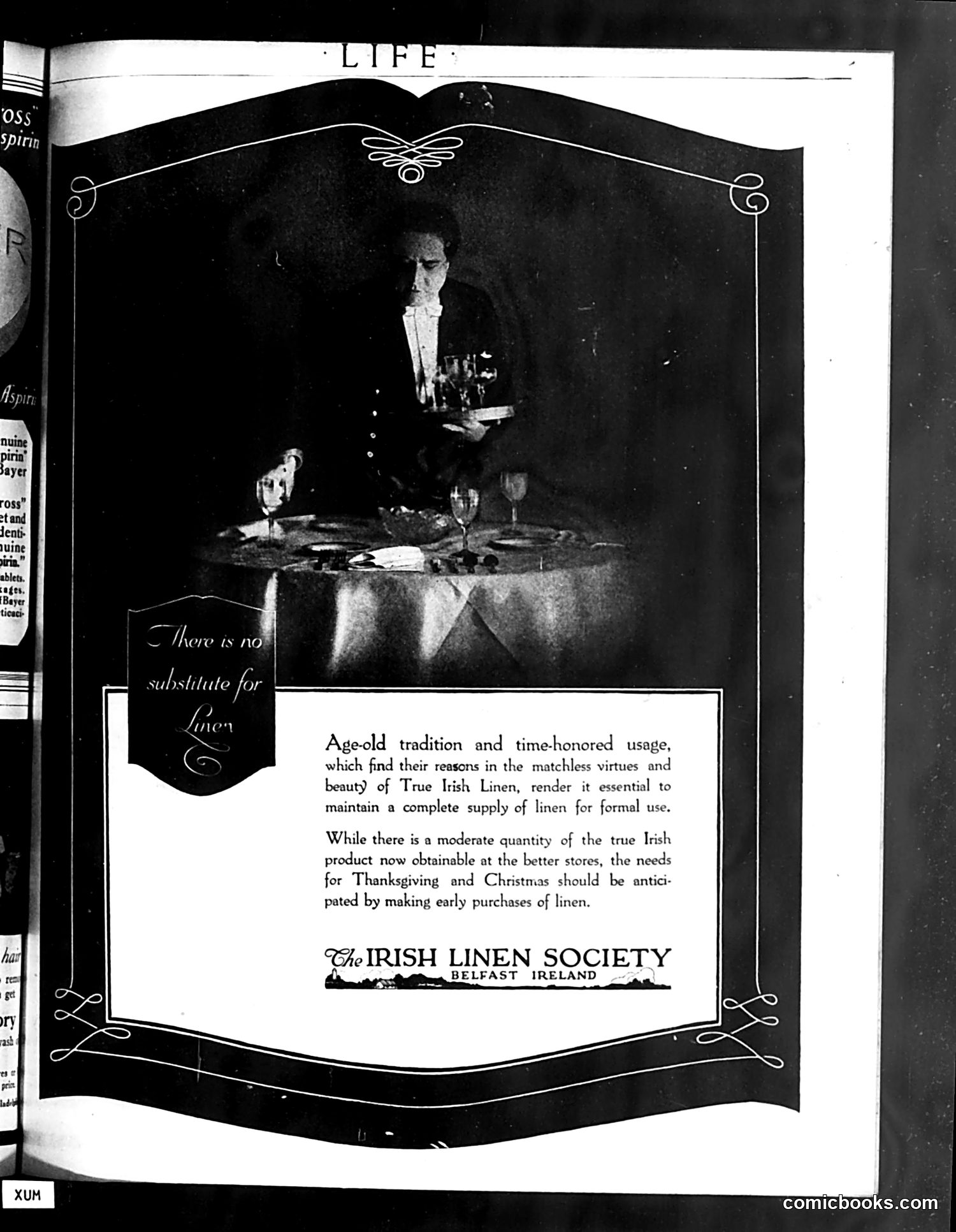
This is a **advertisement, not satire or political commentary**. It's a full-page ad from the Irish Linen Society (Belfast, Ireland) promoting linen products for formal occasions. The image shows a man in formal evening wear at an elegant dinner table, illustrating the "formal use" context mentioned in the text. The ad emphasizes that Irish linen's "age-old tradition and time-honored usage" make it essential for proper formal entertaining, particularly for holiday occasions like Thanksgiving and Christmas. The slogan "There is no substitute for Linen" appears in a decorative banner. The advertisement urges readers to purchase Irish linen early, noting supply is limited at better stores. This is straightforward product marketing, not political satire or commentary.
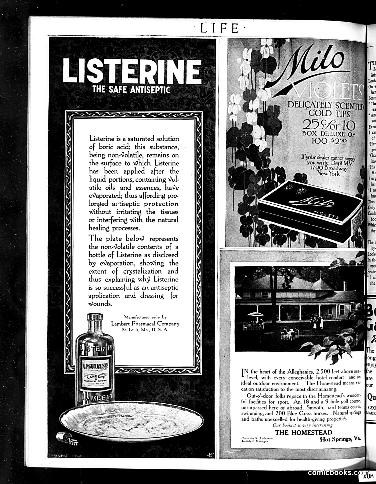
This page contains two advertisements rather than editorial cartoons or satire. The left side advertises **Listerine**, marketed as "The Safe Antiseptic" by Lambert Pharmacal Company (St. Louis). The ad explains that Listerine is a boric acid solution that remains on skin surfaces, providing antiseptic protection without irritating tissues. A plate diagram shows the non-volatile contents left after evaporation, demonstrating the product's effectiveness for wound dressing. The right side advertises **Milo Violets**—delicately scented gold-tipped cigarettes (25 or 10 box, $2.90)—and **The Homestead**, a luxury resort in Hot Springs, Virginia, featuring an 18-hole golf course, natural springs, and health facilities at 2,500 feet elevation. Both are typical early 20th-century product and tourism advertisements with no satirical content.
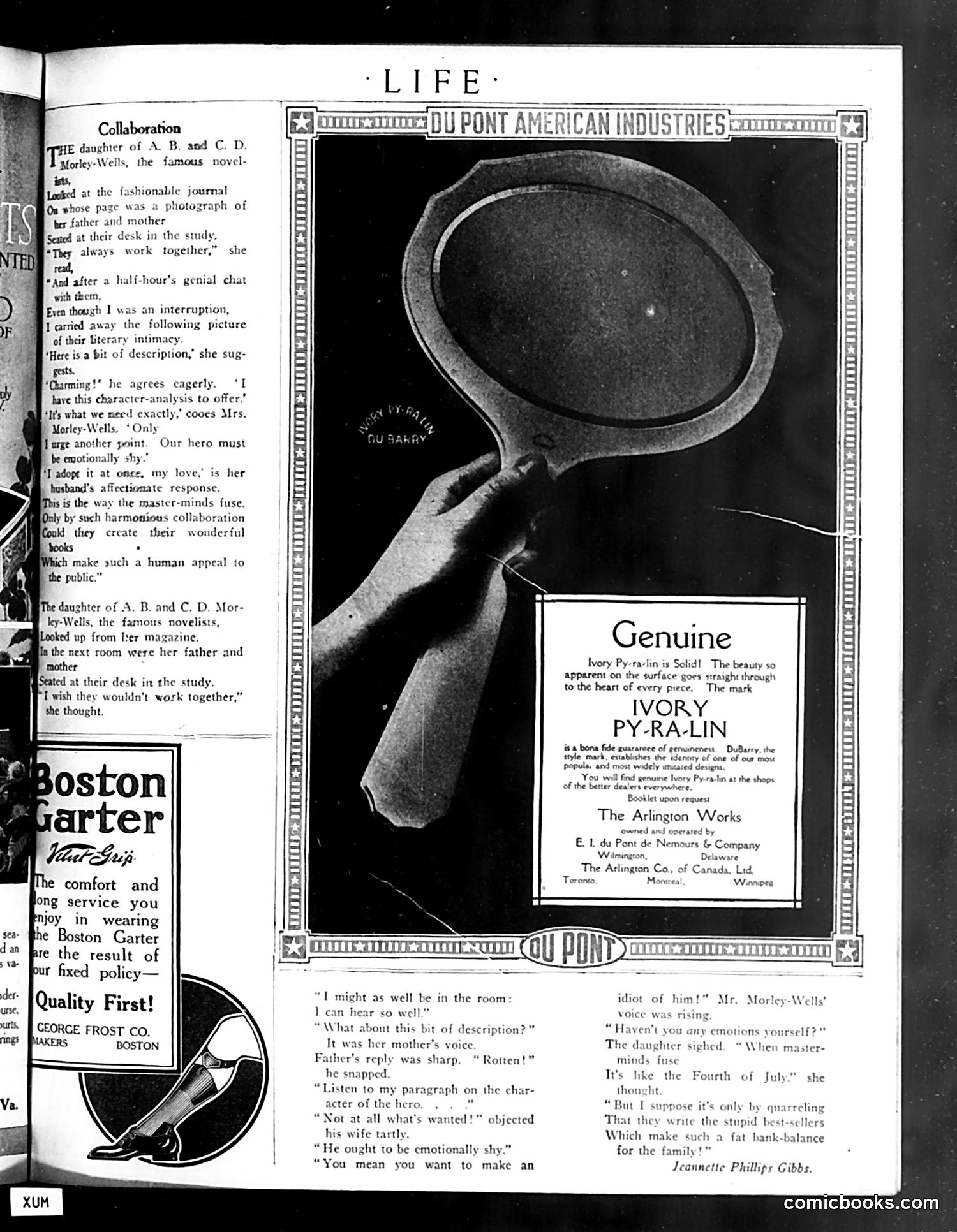
This page is primarily **advertising**, not satire or political commentary. The dominant image shows a hand holding a large pyralin (celluloid) frying pan—a DuPont product advertisement for "Genuine Ivory Py-Ra-Lin." The left column contains a fictional vignette about the daughters of "A. B. and C. D. Morley-Wells, the famous novelists," discussing their parents' collaborative writing process. This appears to be a humorous short story or sketch, likely satirizing literary couples who work together. Below is a separate advertisement for "Boston Garter" hosiery by the George Frost Company, emphasizing comfort and quality. The page primarily demonstrates how **Life magazine blended editorial content with advertising**, using celebrity references and humor to sell consumer goods to its affluent readership.
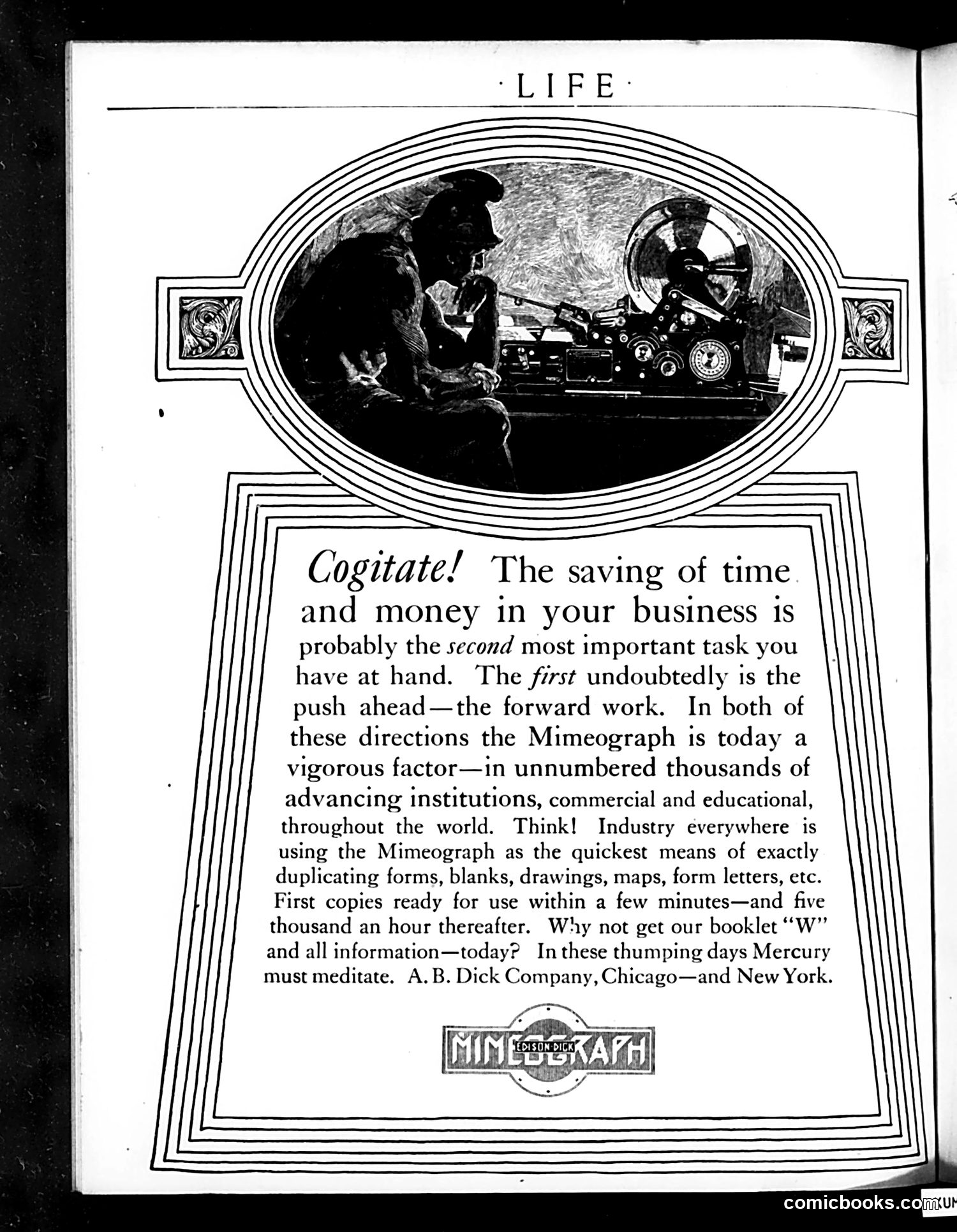
This is a **Mimeograph machine advertisement** from *Life* magazine. The image shows two men operating an early mimeograph device (a stencil-based duplicating machine). The ad's appeal to "Cogitate!" uses classical rhetoric—invoking Mercury, the Roman god of commerce and speed—to pitch the Mimeograph as essential modern business equipment. The copywriter argues that while "forward work" is primary, **time and money savings rank second**, and the Mimeograph delivers both by rapidly duplicating forms, drawings, and documents (5,000 copies per hour claimed). The ad targets commercial and educational institutions, positioning the device as a competitive necessity. A.B. Dick Company (Chicago and New York) published a promotional booklet available on request. This reflects early-20th-century industrial marketing: selling efficiency tools to businesses by appealing to competitive advantage and speed.
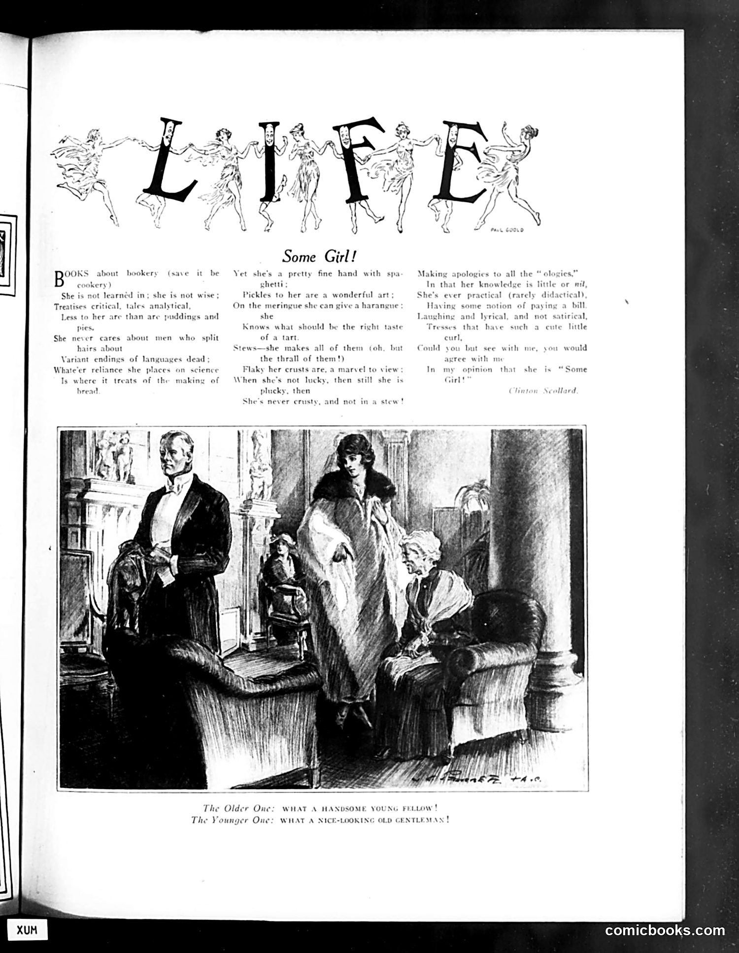
This page satirizes the modern educated woman of the early 20th century. The decorative "LIFE" header features dancing women in classical poses, setting a lighthearted tone. The poem by Clinton Scollard describes a woman who is intellectually accomplished but impractical: she reads about cooking rather than actually cooking, knows languages and science, but lacks common sense. She's "crusty" and argumentative yet somehow charming. The illustration depicts a social scene where two women visit an older gentleman. The caption contrasts reactions: "What a handsome young fellow!" versus "What a nice-looking old gentleman!"—likely mocking how women judge men's appearance differently based on wealth or status. The overall satire targets the "New Woman"—educated, opinionated, but still bound by social conventions and superficiality.
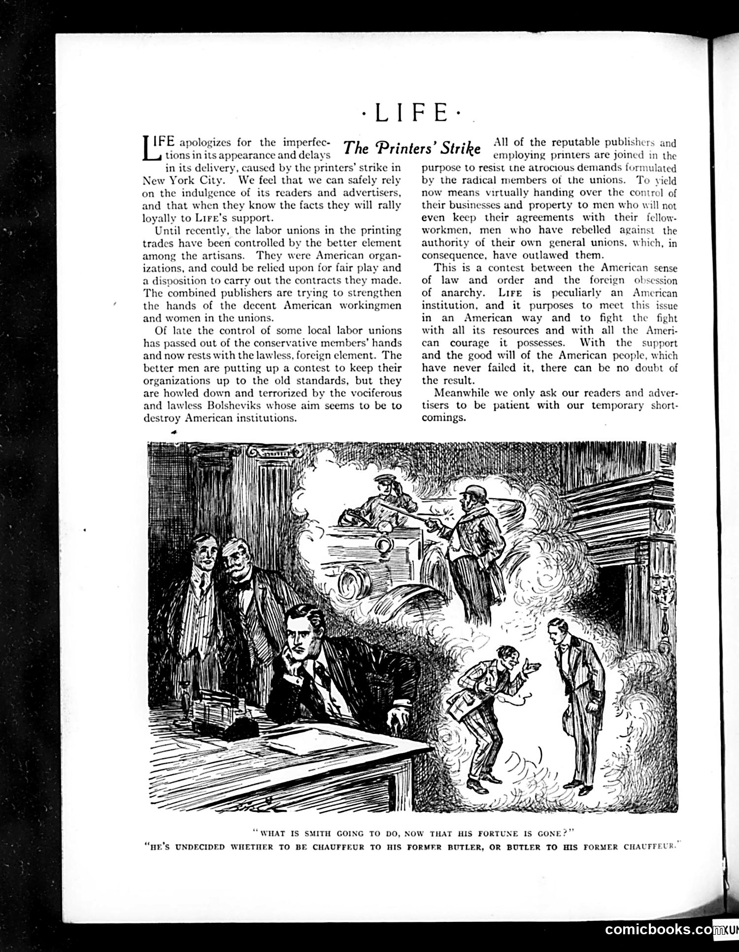
This page addresses a printers' strike in New York City. The editorial defends publishers and "decent American workmen" against what it calls "radical members of unions" and "lawless, foreign" elements seeking to destroy American institutions through anarchism. The cartoon below depicts this conflict: businessmen on the left appear calm and controlled, while on the right, figures amid flames and chaos represent the strike's violence and disruption. The caption—about "Smith" losing his fortune and uncertainty over who serves whom—satirizes the social upheaval and role reversals the strike threatens. Life presents the strike as fundamentally un-American, positioning itself with established order against labor radicalism portrayed as foreign-influenced anarchism.
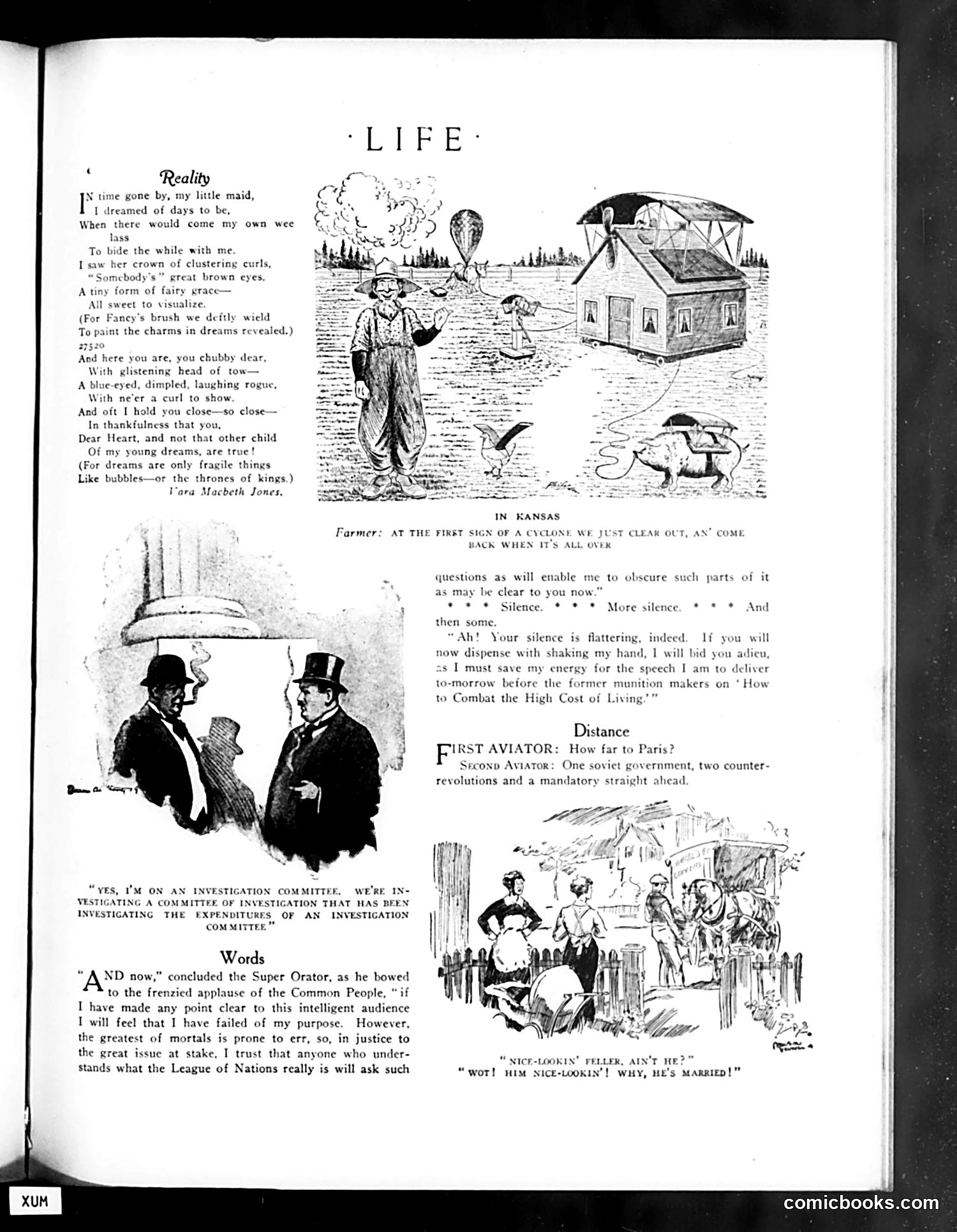
This page from *Life* magazine contains several satirical pieces: **"Reality" (top):** A poem contrasting childhood dreams with adult reality, illustrated with a Kansas farm scene—suggesting the disappointment of prairie life versus romantic expectations. **"Distance" (middle):** A brief joke where aviators discuss travel to Paris. The "Second Aviator's" response—mentioning "one soviet government, two counter-revolutions and a mandatory straight ahead"—satirizes post-WWI European political instability and the difficulty of travel through war-torn regions. **"Words" (bottom):** A cartoon showing men in top hats (likely politicians or committee members) discussing investigations, mocking bureaucratic committees investigating other committees—reflecting cynicism about government inefficiency. **Lower cartoon:** A social joke about a man's appearance and marriage, typical of *Life's* humor about domestic life and courtship.
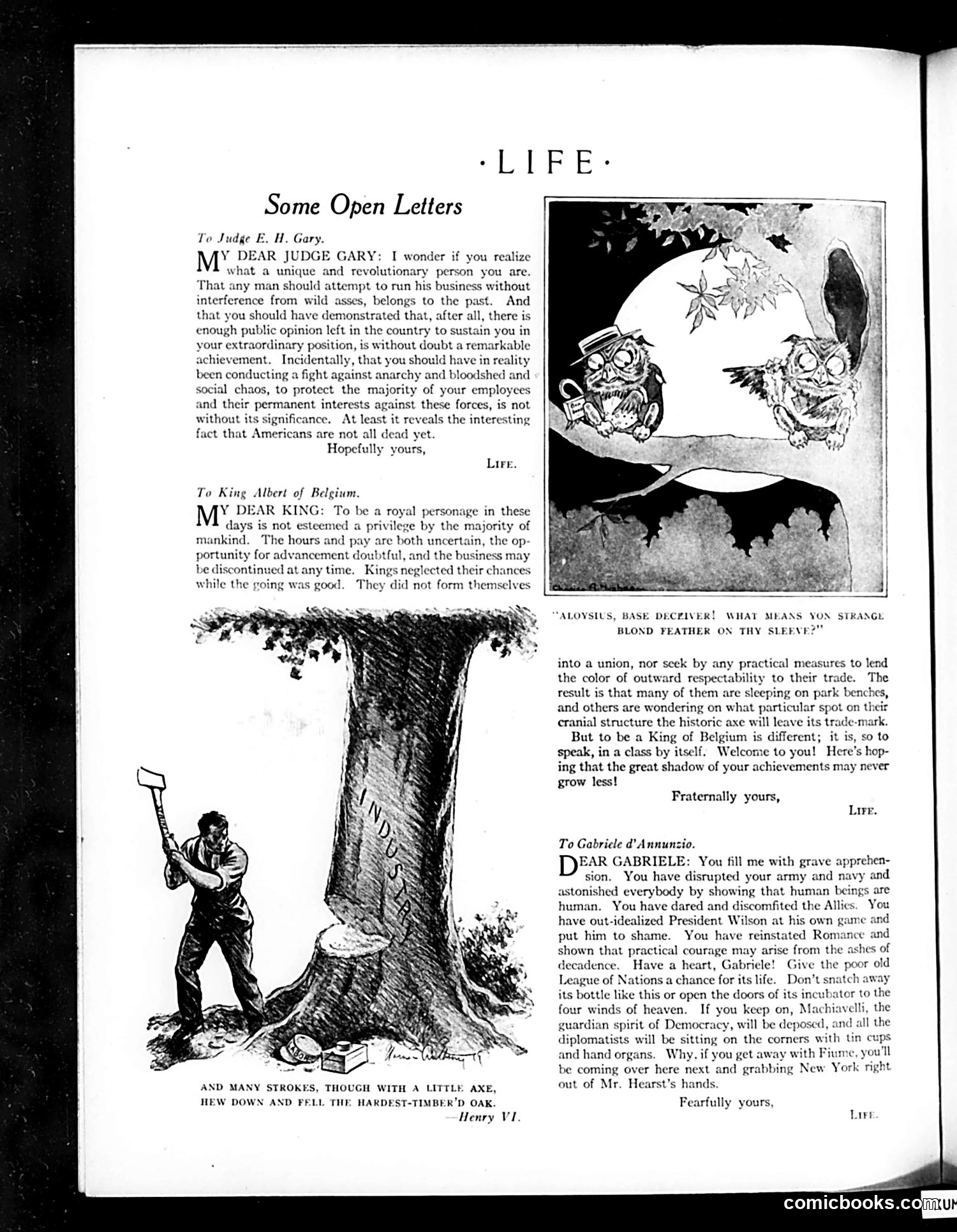
This page features three satirical open letters addressed to public figures: 1. **To Judge E. H. Gary**: Praises him for running his business without "wild asses" (labor unions) interfering, calling his anti-union stance a "remarkable achievement" against "anarchy and bloodshed." 2. **To King Albert of Belgium**: Congratulates him on being a king during uncertain times, noting monarchs face elimination—a dark joke about royal obsolescence. 3. **To Gabriele d'Annunzio**: Sarcastically criticizes the Italian military adventurer for disrupting armies and "discomfiting the Allies," mockingly warning that Fanny will "grab New York" from Hearst. The accompanying illustration shows a man felling a massive oak tree, quoting Henry VI—likely symbolizing destruction of established order. The cartoons employ heavy irony to critique labor suppression, militarism, and political adventurism.
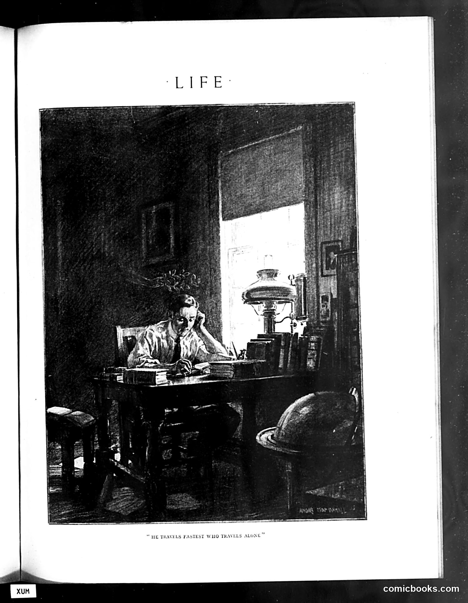
The page shows a black and white illustration titled "He Travels Fastest Who Travels Alone," depicting a solitary man hunched over a desk in a sparse, dimly-lit room. He appears to be working or studying late, with a lamp providing light and a globe visible in the background. The caption is a play on the proverb "He travels fastest who travels alone," suggesting commentary on solitary ambition or independent work. The illustration appears to satirize either intellectual labor, scholarly pursuit, or perhaps the isolation of professional dedication. Without additional context about the magazine's date or surrounding articles, the specific target of satire remains unclear, though it likely critiques attitudes toward work, success, or social isolation prevalent in the period.
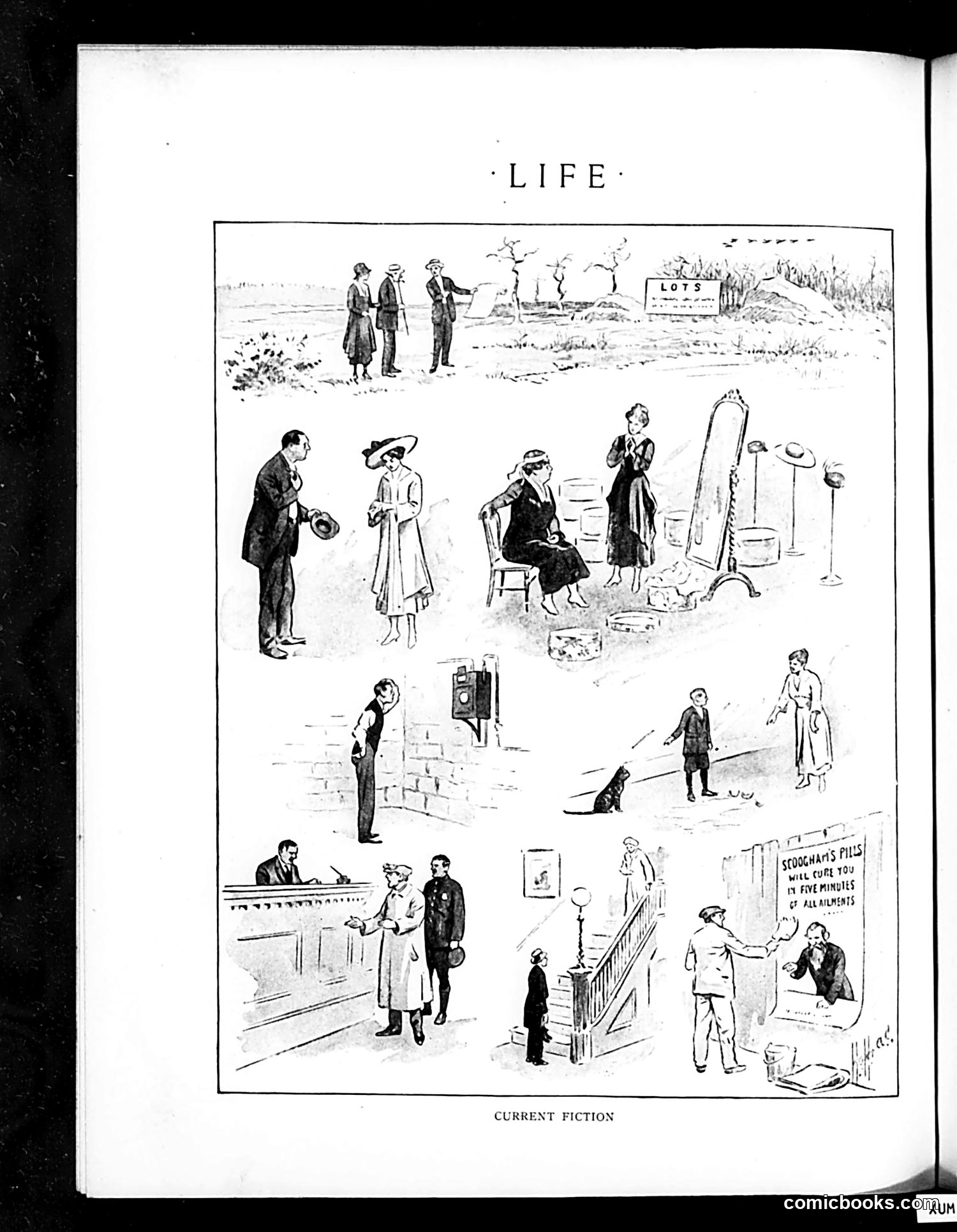
This page is titled "LIFE" and labeled "CURRENT FICTION" at the bottom. It's a single-panel cartoon depicting various scenes of everyday life arranged in vignettes across a vacant lot or undeveloped land marked "LOTS." The scenes show ordinary people in mundane situations: a man at a counter, people examining real estate, children playing, someone posting a sign, domestic activities indoors. In the upper portion, three figures observe the land marked for development. The cartoon appears to be satirizing **real estate speculation and suburban development** — a common Life magazine subject in the early 20th century. The "Current Fiction" label suggests the cartoon is mocking contemporary narratives about progress and urban expansion, showing how raw land gets populated with the messy reality of human life rather than idealized development. The vacant lot becomes a stage for ordinary, unglamorous existence.
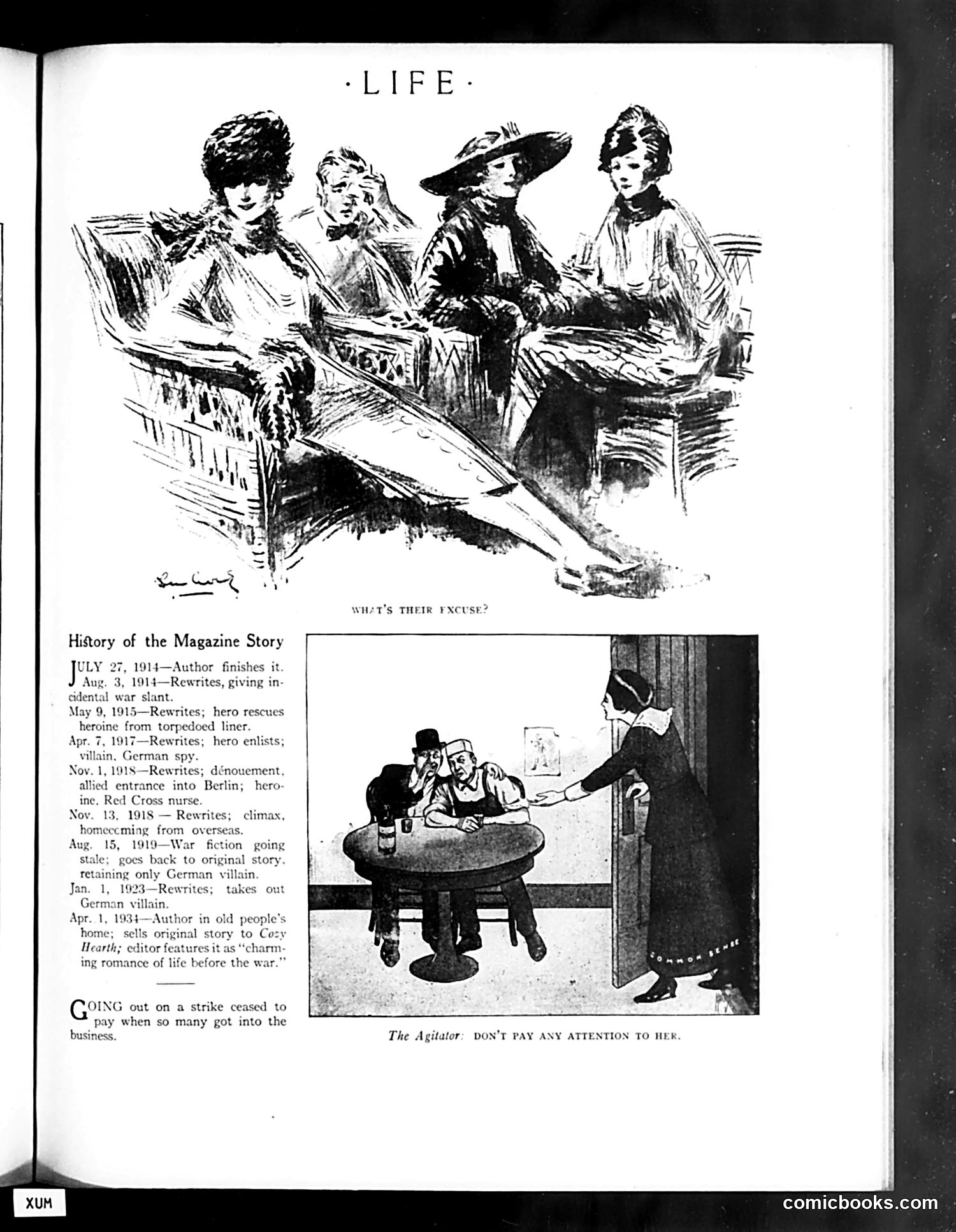
This page from Life magazine documents a serialized story's publication history from 1914-1923. The top illustration shows four well-dressed women in an early 20th-century social setting, captioned "Who's Their Excuse?" The lower cartoon, titled "The Agitator: Don't Pay Any Attention to Her," depicts two men at a table ignoring a woman at a doorway. This appears to satirize labor activism—specifically, the caption suggests dismissing female labor organizers or strikers as unworthy of attention. The accompanying text notes that "going out on a strike ceased to pay when so many got into the business," mocking the proliferation of strikes during this era. The satire targets both labor movements and women's activism simultaneously, suggesting both were becoming troublesome nuisances to be ignored by respectable society.
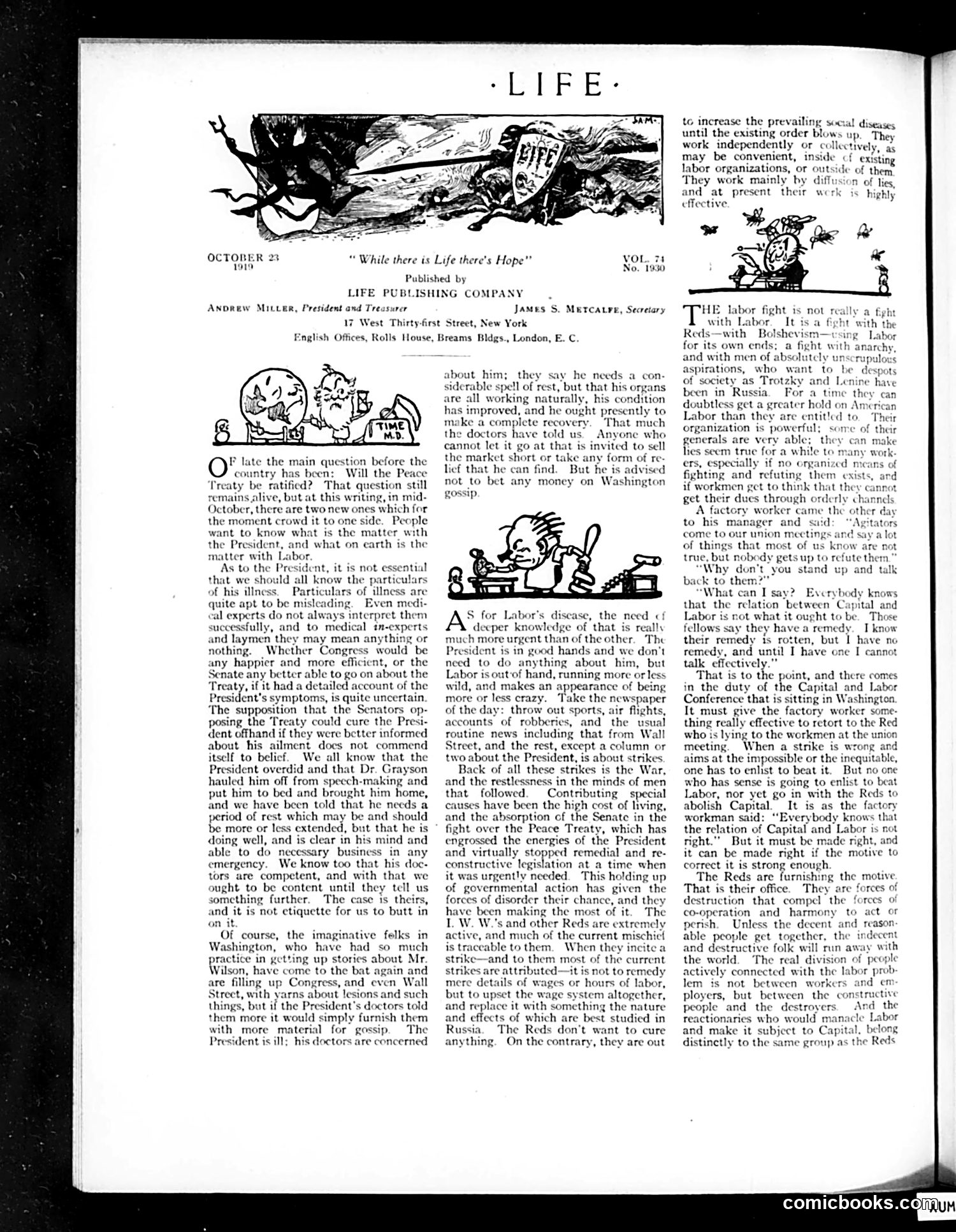
This page addresses two major crises facing America in October 1919: President Wilson's health collapse (he suffered a massive stroke while touring for the League of Nations) and nationwide labor strikes. **On Wilson:** The editor defends the President's privacy, dismissing Washington gossip about his condition. He acknowledges Wilson is ill but argues the public needs no medical details—doctors are competent, recovery is expected. **On Labor:** The article argues labor unrest stems from post-WWI instability, high living costs, and governmental neglect while Congress focused on the Peace Treaty. The cartoons (showing a distressed worker and chaotic scenes) illustrate labor "running wild" and appearing "crazy." The writer criticizes both radical "Reds" seeking to abolish capitalism and capital's failure to address workers' legitimate grievances fairly. The piece warns against dismissing either crisis, calling for serious attention to labor's real problems rather than attributing strikes to Bolshevik conspiracy alone.
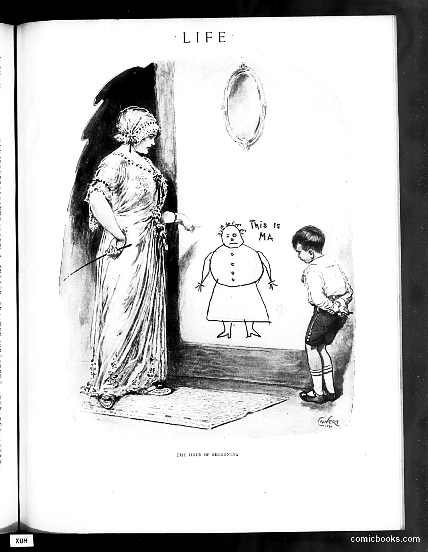
This cartoon depicts a moment of maternal accountability. A fashionably dressed woman (representing a mother) stands before a mirror, while a small child points at a crude drawing labeled "This is MA" — a simple, unflattering stick-figure sketch. The satire appears to target vanity and self-image. The mother's elaborate clothing, decorative headpiece, and refined appearance contrast sharply with the child's honest, unsophisticated portrayal of her. The title "The Hour of Reckoning" suggests a moment of truth: the child's innocent artistic rendering reveals how a mother actually appears to her children, stripping away pretense and finery. This likely comments on the gap between how adults present themselves versus how they're perceived by those close to them, or perhaps critiques maternal vanity during this period.
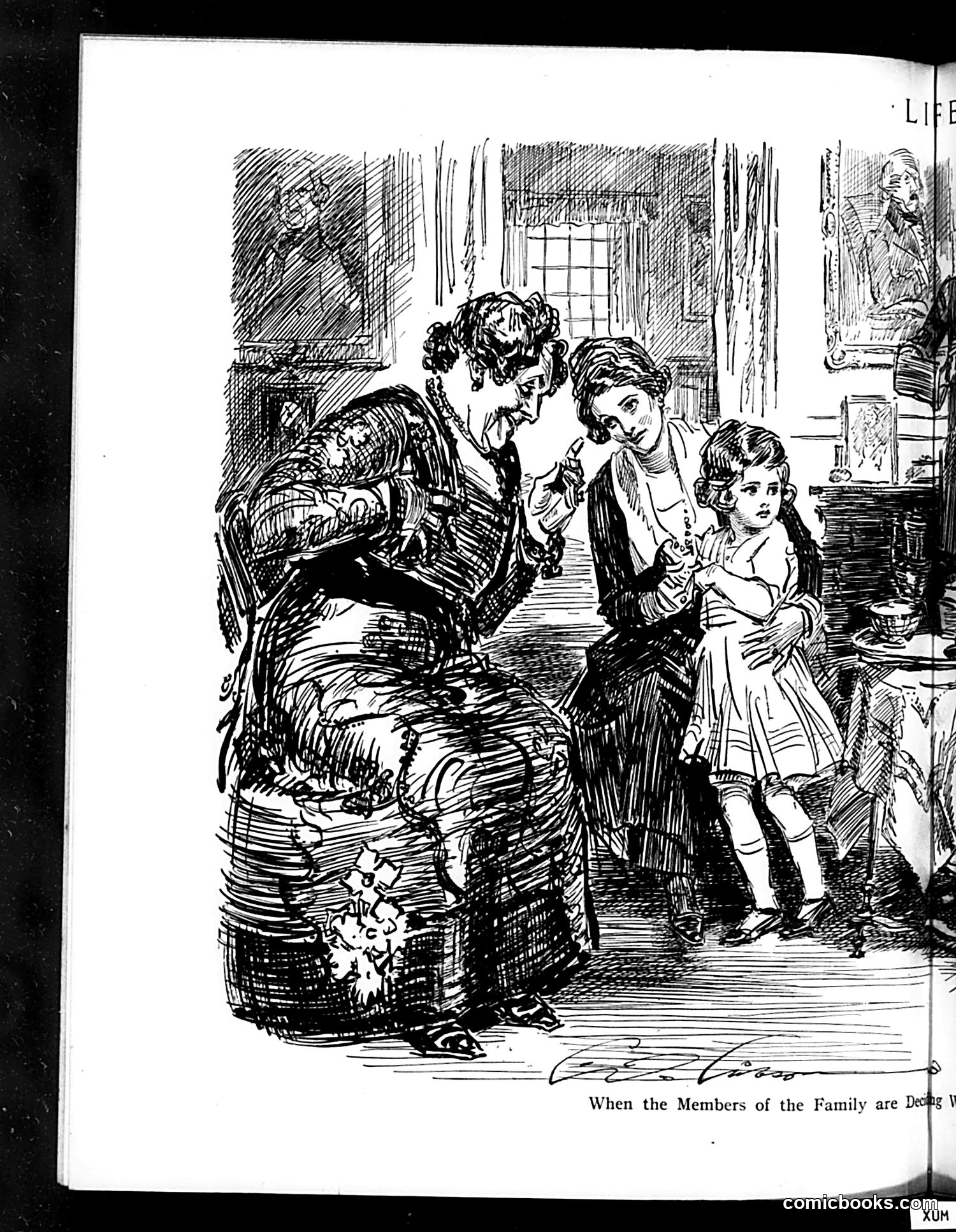
This is a satirical illustration from *Life* magazine depicting a domestic scene. The caption begins "When the Members of the Family are Do[ing]..." (text cut off), suggesting commentary on household behavior. The sketch shows an elaborately dressed woman (likely representing a wealthy or pretentious society figure based on her ornate clothing and hairstyle) with two children in what appears to be a Victorian-era parlor. The style and clothing suggest late 19th or early 20th-century subject matter. Without the complete caption, the specific satirical point is unclear, but the exaggerated rendering of the woman's dress and posture suggests the cartoon mocks either affected gentility, parenting styles, or family dynamics of the upper classes. The detailed cross-hatching technique is characteristic of period magazine illustration. The exact social or political critique remains uncertain without the full text.
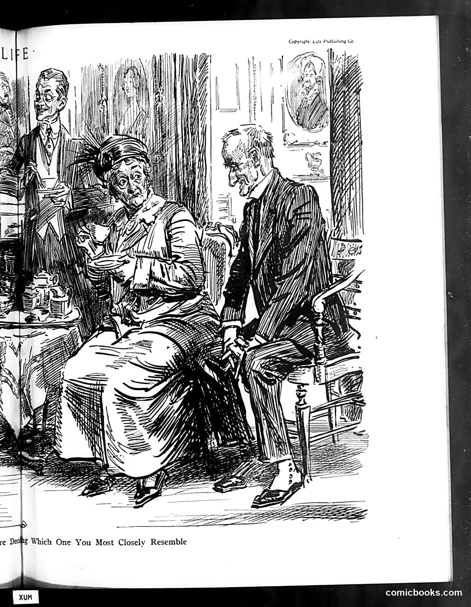
This is a Life magazine cartoon showing what appears to be a social or formal scene. The visible caption reads "...e Dees Which One You Most Closely Resemble," suggesting this is part of a "which one do you resemble" comparison feature—a common satirical format in Life magazine. The drawing depicts several figures in an interior setting: a seated woman in the foreground conversing with a standing man, while other figures appear in the background. The distinctive caricature style emphasizes facial features for comedic effect. However, the OCR text is heavily corrupted, making the full caption illegible. Without the complete caption or clearer context about who these figures represent, I cannot definitively identify the specific political or social references this cartoon satirizes. The format suggests social commentary on recognizable contemporary types or public figures, but stating specifics would require speculation.
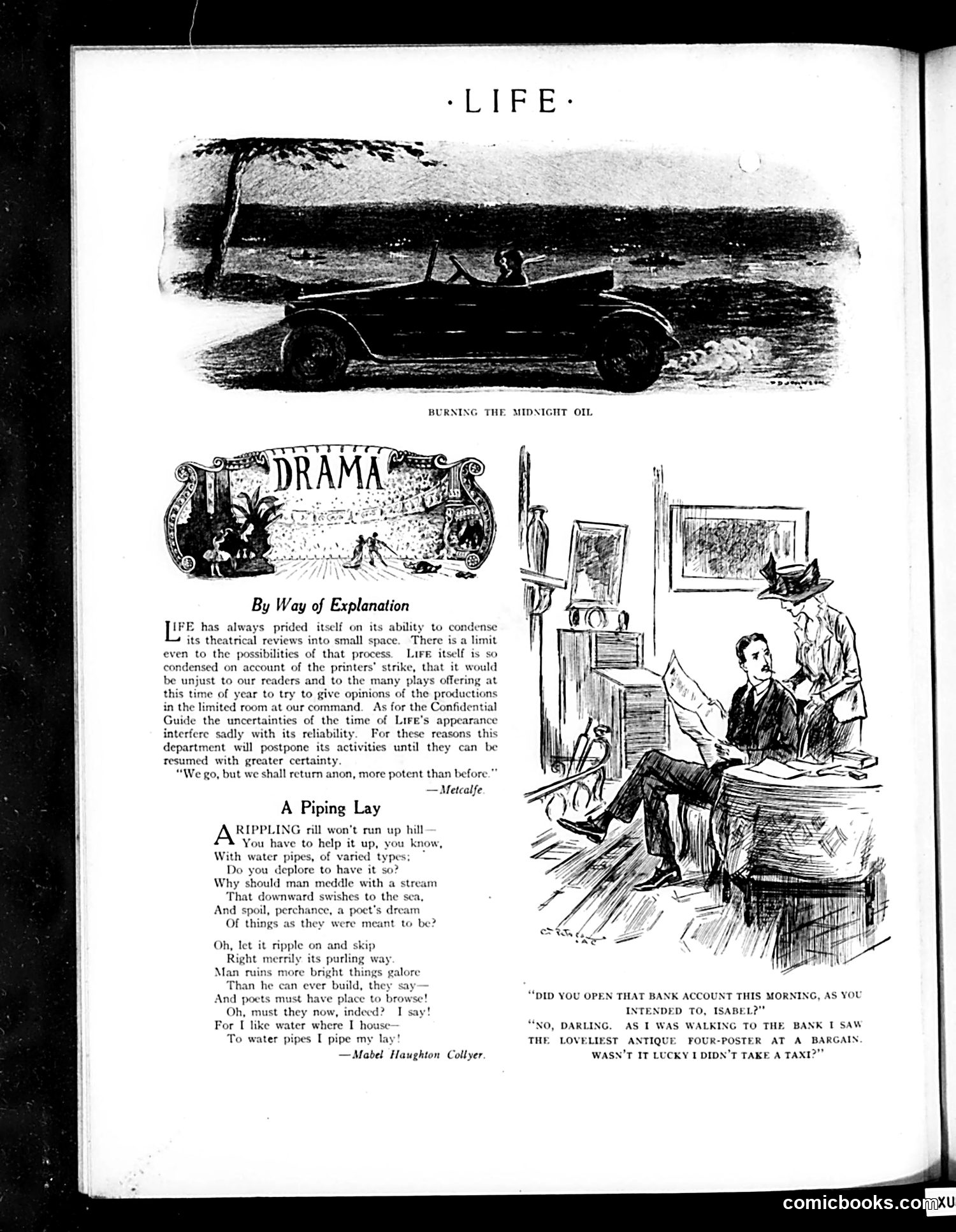
This page addresses a **printer's strike** disrupting the publication. The editor explains why the Drama section is postponed—the strike has so compressed available space that adequate theater reviews are impossible. The quote "We go, but we shall return anon, more potent than before" signals temporary suspension of coverage. The illustration depicts an office scene with the caption about opening a bank account. It satirizes **frivolous spending and poor financial priorities**: a woman abandons her banking errand to purchase an antique four-poster bed, then congratulates herself for saving taxi fare—a humorous contradiction highlighting wasteful decision-making disguised as thriftiness. "A Piping Lay" is a separate poem by Mabel Haughton Collyer about water infrastructure, likely unrelated to the strike notice. The page's title image shows a car at night (likely illustrating "burning the midnight oil"—working late).
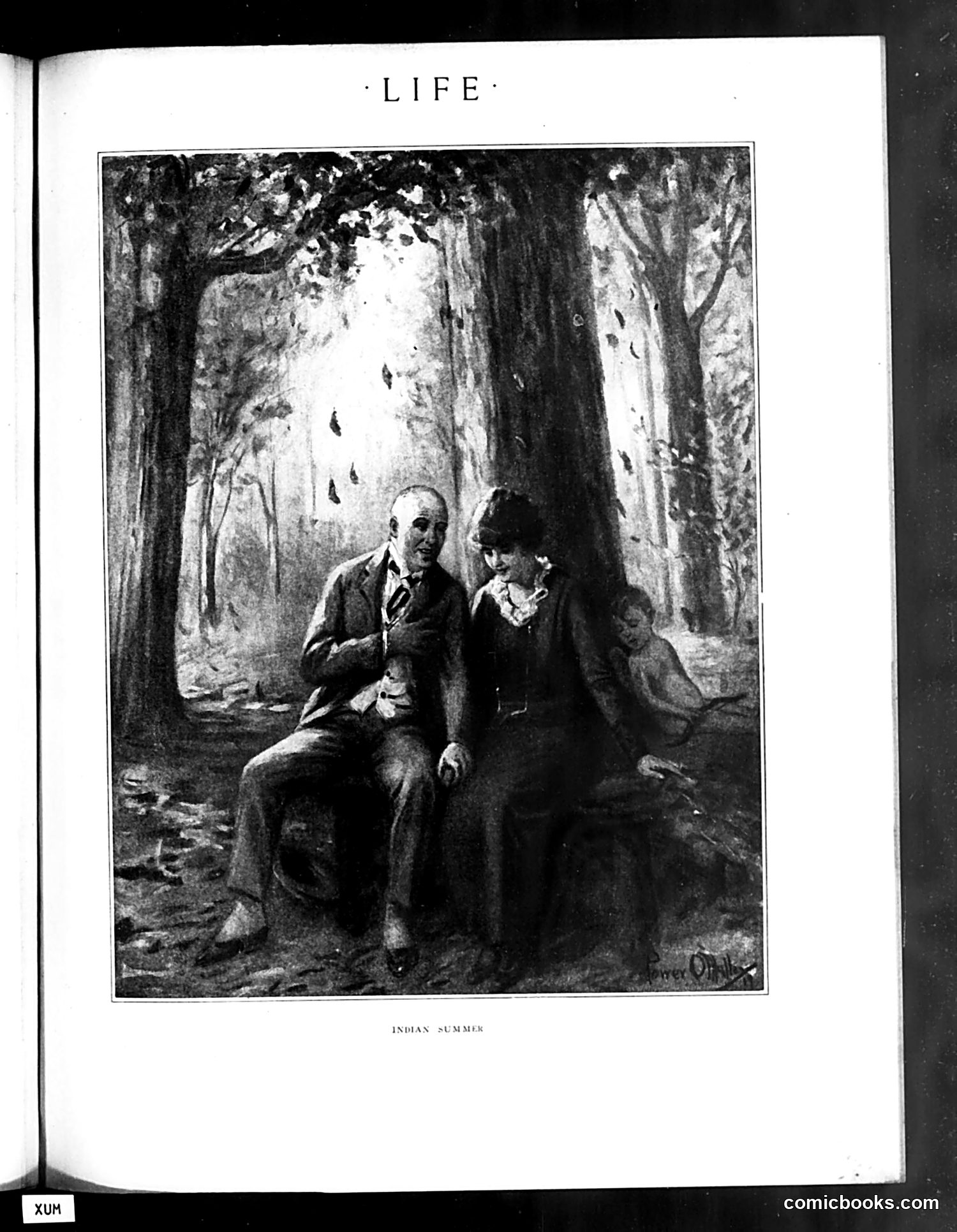
This illustration depicts two figures in a forested setting during pleasant autumn weather. The title "Indian Summer" refers to the meteorological phenomenon of warm days occurring in late autumn—a term with origins in American colonial experience. The image appears to be a sentimental or romantic scene rather than overtly satirical. Two people sit together under tall trees with dappled sunlight, suggesting leisure and intimacy in nature. Without additional context from the magazine issue, the specific satirical point remains unclear. The illustration may comment on social customs, courtship, class differences, or simply serve as a sentimental piece. The quality and style suggest this is from Life magazine's early period, known for both humor and artistic illustration.
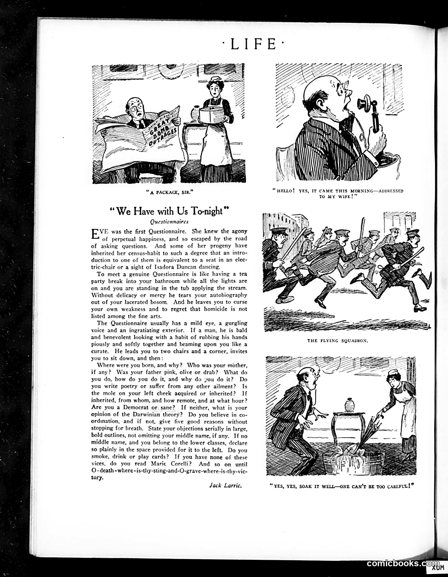
This satirical piece mocks the early 20th-century craze for questionnaires and surveys—likely referring to census-taking, psychological questionnaires, or opinion polls becoming fashionable. Jack Larric's text humorously describes the "Questionnaire" as an invasive, relentless person who interrogates others about every detail of their lives: ancestry, occupation, politics, appearance, morality, and habits. The comparison to being trapped in an electric chair or forced bathing reflects the violation of privacy people felt. The accompanying cartoons illustrate consequences of this questionnaire obsession: a man receives a mysterious package addressed to his wife, and another shows a couple frantically soaking/decontaminating it—suggesting questionnaires arrive unsolicited like dangerous parcels requiring cautious handling. The satire targets both the questionnaire-givers' nosiness and the public's anxiety about having their personal information collected and scrutinized by anonymous institutions—a surprisingly modern concern for this era.
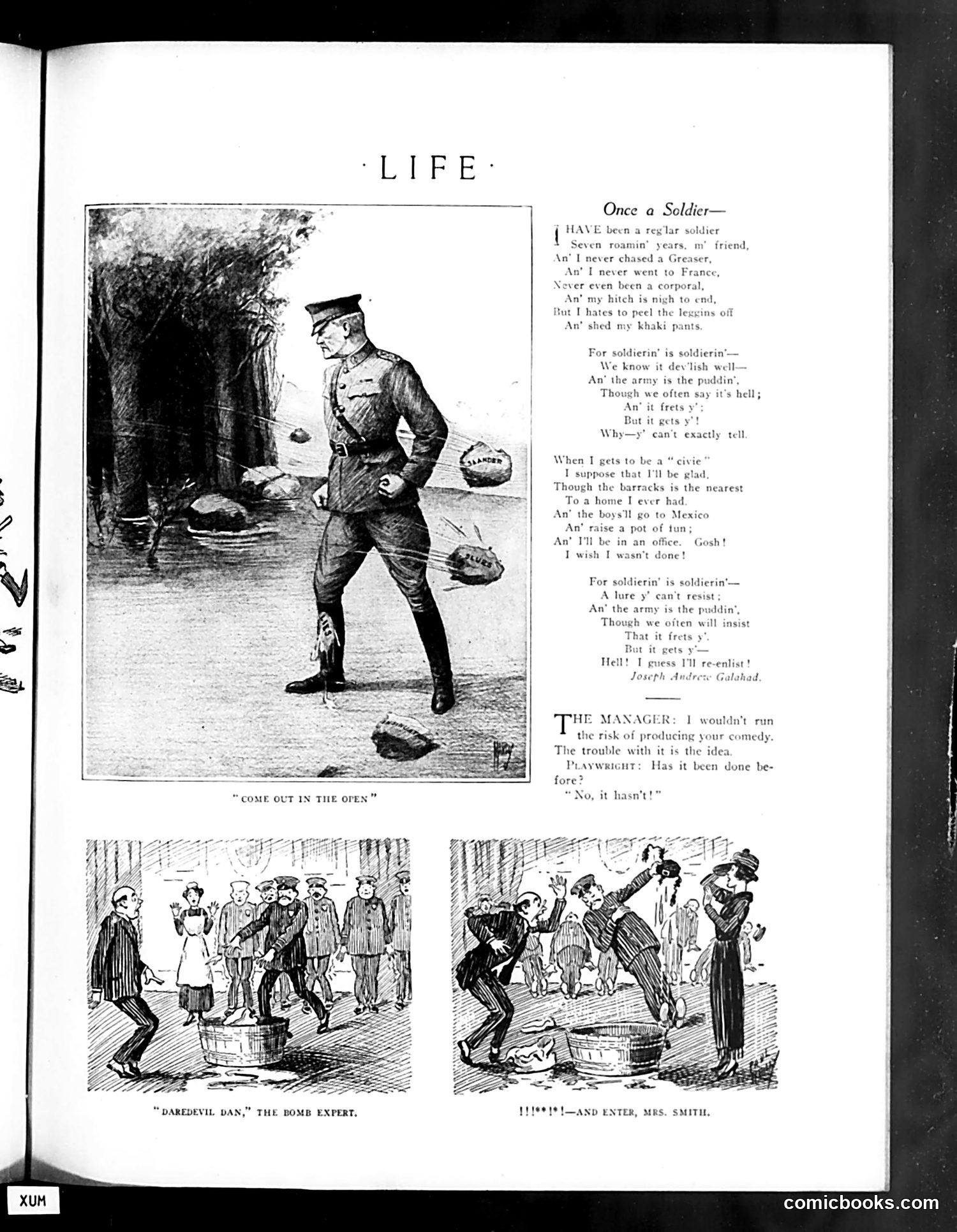
This page from Life magazine (likely WWI-era based on military references) satirizes military life and the soldier's experience. The main poem "Once a Soldier—" presents a regular soldier reflecting on seven years of service, expressing the paradox of military life: he complains about the hardships and longs to leave, yet simultaneously cannot imagine civilian life. The refrain "For soldierin' is soldierin'" suggests the appeal and addiction of military service despite its difficulties. The bottom section features a playwright-manager dialogue mocking theatrical conventions—the manager worries about producing an original comedy while the playwright dismisses concerns about novelty, suggesting the predictability of stage humor. The three illustrations depict soldier life and domestic comedy, likely supporting these themes about routine, predictability, and the soldier's struggle between military and civilian identities. The overall message critiques both military culture and entertainment formulas as repetitive and inescapable.
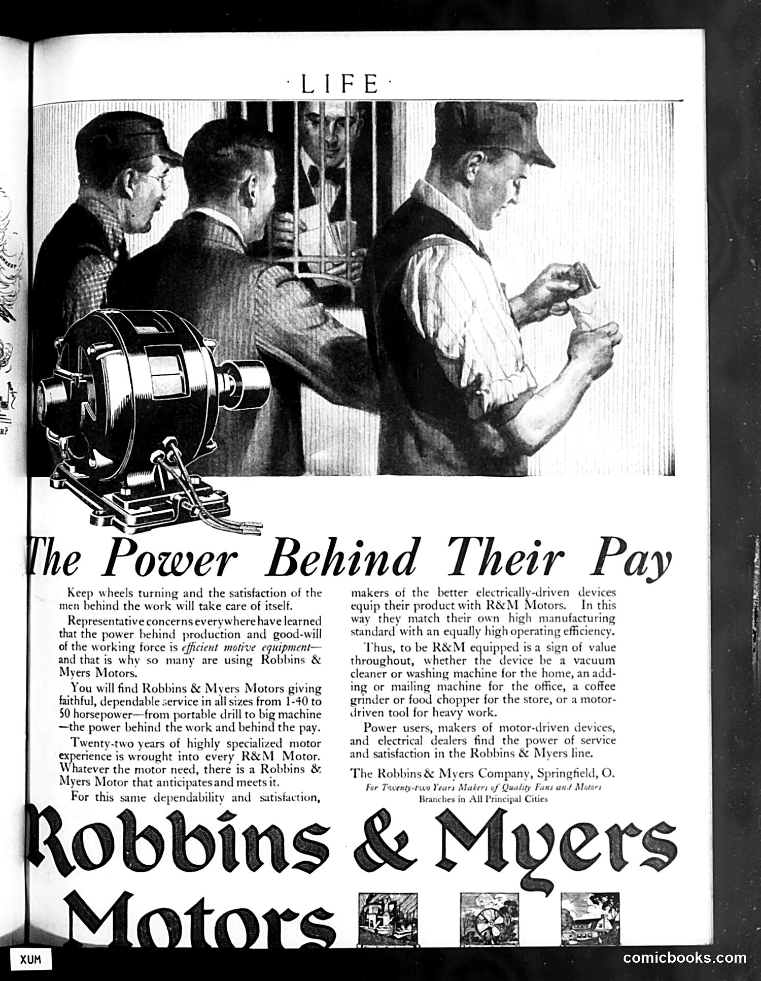
This is **not satire or a political cartoon**—it's a straightforward **advertisement** for Robbins & Myers Motors, appearing in *Life* magazine. The image shows three working-class men in a factory or workshop setting, with one examining or handling something, illustrating industrial labor. The headline "The Power Behind Their Pay" uses a double meaning: literally, efficient motors power industrial production; figuratively, good equipment sustains worker satisfaction and wages. The ad argues that manufacturers who equip their products with R&M Motors ensure quality and reliability, which in turn protects worker employment and compensation. It's a sales pitch positioning the company's motors as essential to both productivity and worker welfare—a pitch likely aimed at factory owners and equipment manufacturers. The three small images at the bottom appear to show various applications of R&M Motors in different industries, though details are unclear.
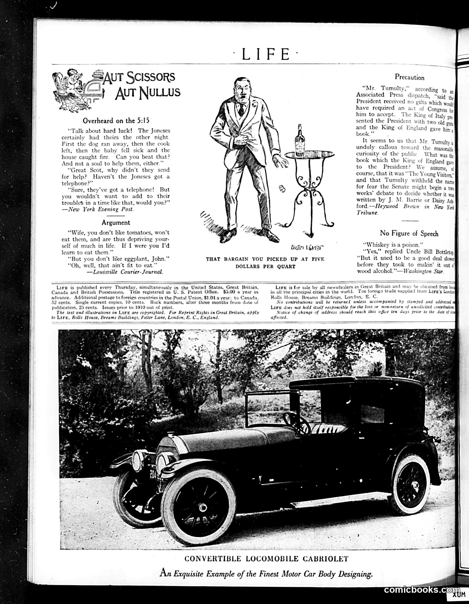
This page from *Life* magazine contains several satirical pieces targeting early 20th-century American concerns: **"Aut Scissors Aut Nullus"** jokes mock everyday misfortunes and poor judgment—the Joneses' string of disasters worsened by not calling for help, and a wife's illogical insistence her husband eat foods he dislikes. **"Precaution"** references President Woodrow Wilson's aide Joseph Tumulty receiving a controversial book (likely about presidential matters). The satire ridicules the public's morbid curiosity and Tumulty's apparent nervousness about its contents. **"No Figure of Speech"** presents ironic dialogue about whiskey as poison and alcohol prohibition concerns—likely contemporary to Prohibition-era debates. The page also advertises a luxury automobile, reflecting the magazine's typical mix of humor, social commentary, and upscale advertising targeting wealthy readers.
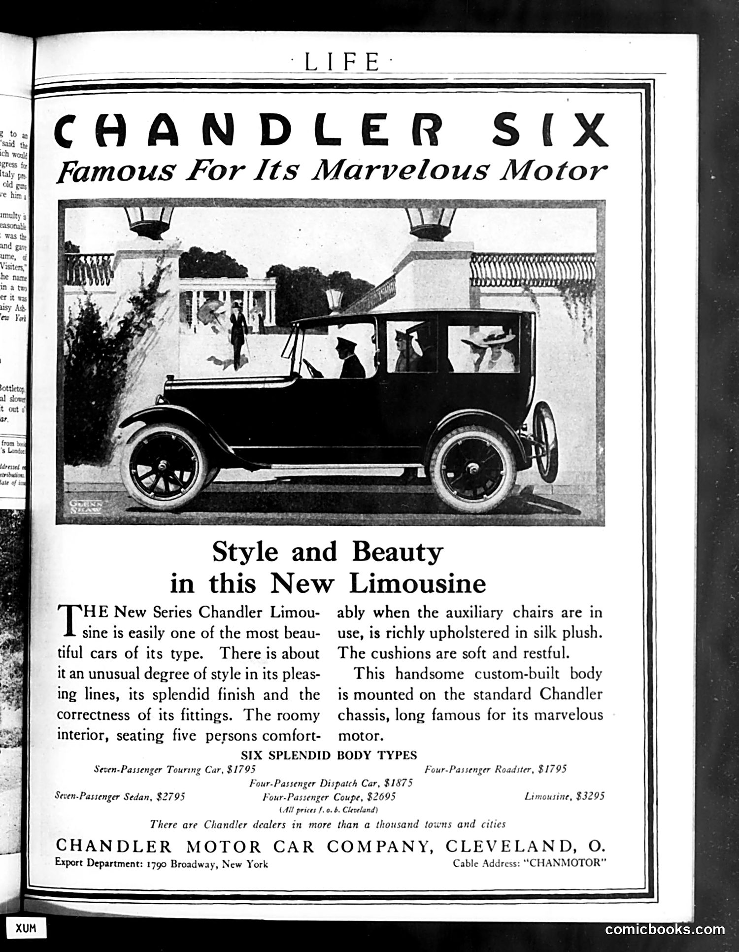
This is **not a cartoon or satire**—it is a straightforward automobile advertisement from *Life* magazine. The page advertises the Chandler Six, a luxury car manufactured by the Chandler Motor Car Company of Cleveland, Ohio. The image shows a limousine model with passengers visible through its windows, parked in front of an elegant residential building. The ad emphasizes the vehicle's style, comfort, and engineering (particularly its motor). It lists six body types with prices ranging from $1,795 to $3,295, noting that Chandler dealers existed in over a thousand towns. This represents typical early-20th-century automobile advertising in *Life*—a magazine that mixed satirical editorial content with premium advertising targeting affluent readers who could afford luxury vehicles.
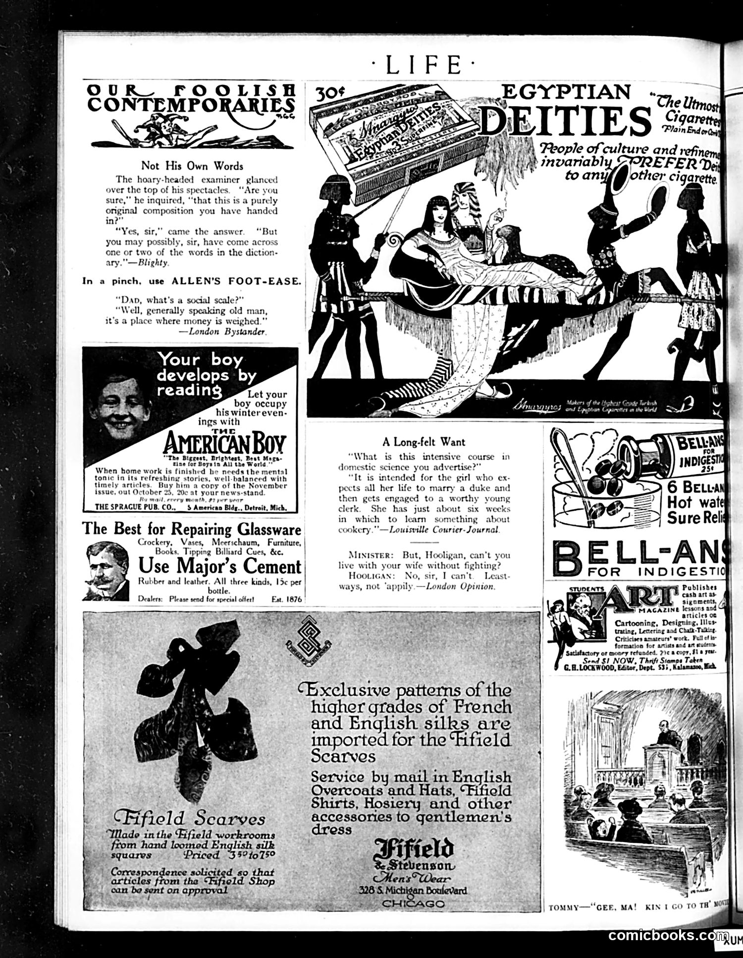
This page mixes satirical commentary with period advertisements (circa 1910s-1920s). **The Satire:** The "Not His Own Words" cartoon mocks academic dishonesty—an examiner suspects a student's essay isn't original, and the student admits he lifted phrases from a dictionary. The humor targets both student laziness and the examiner's weariness with such cheating. **Other Jokes:** - "Social Scale": A pun—a wealthy father explains that a "social scale" is literally where "money is weighed" - "A Long-felt Want": Satirizes class anxiety; a domestic science course supposedly trains girls to marry dukes but settle for clerks instead - The minister and "Hooligan": Commentary on working-class domestic violence as normal and inevitable **Context for Modern Readers:** These reflect Edwardian attitudes: academic integrity concerns, class mobility anxieties, and resigned acceptance of spousal fighting as humorous rather than serious. The advertisements for remedies (foot powder, cement, indigestion pills) were standard magazine filler. The page is primarily **satirical social commentary through short comic scenarios**, using humor to critique education, class pretensions, and domestic norms.
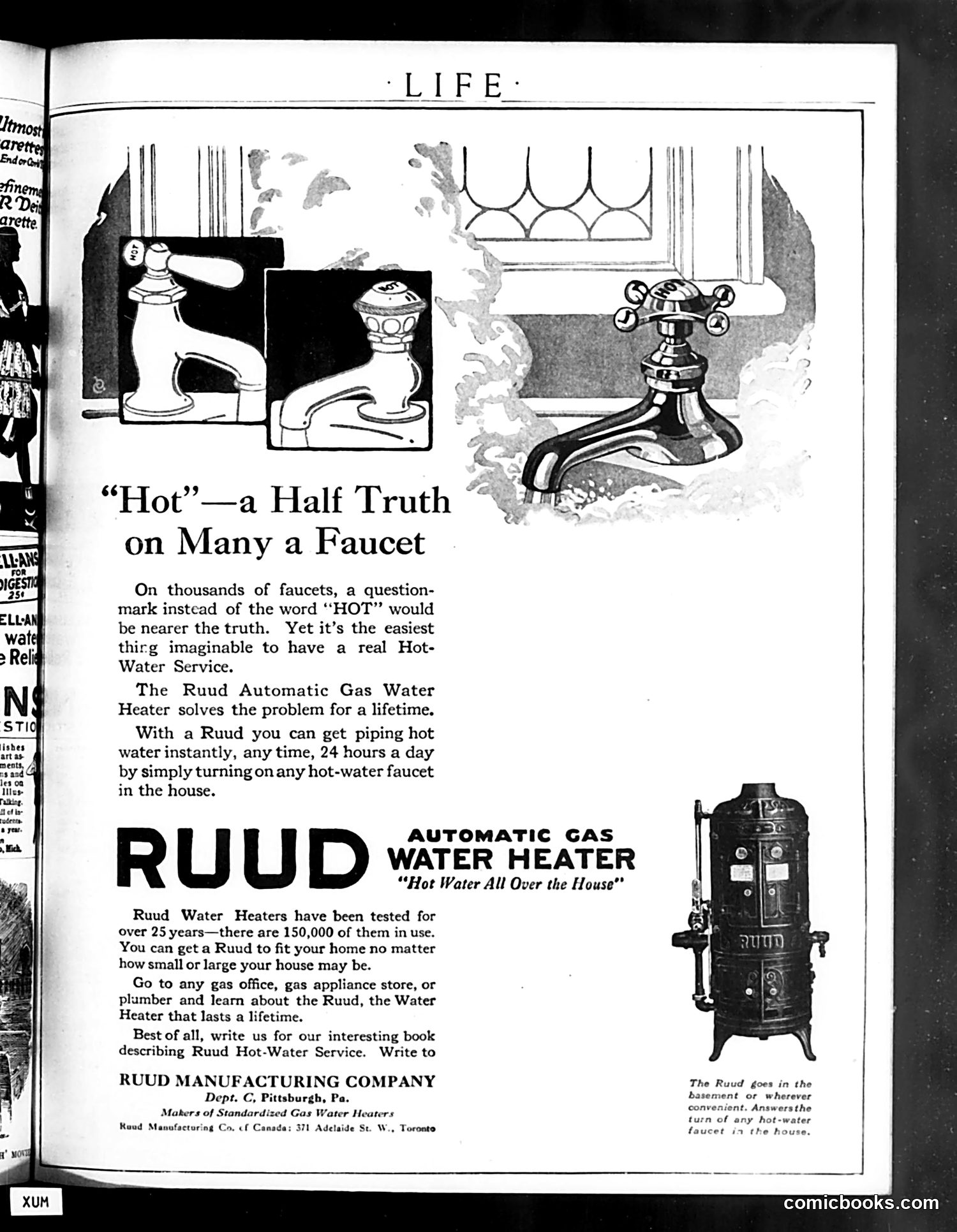
This is **primarily an advertisement**, not satire or political commentary. The page promotes the Ruud Automatic Gas Water Heater. The small cartoon at top left functions as the ad's hook: it shows three faucets labeled "Hot," with the caption suggesting that a question mark would be more honest—implying many homes lack reliable hot water. This is a humorous complaint about a genuine consumer problem of the era: inconsistent or absent hot water service. The advertisement then pivots to selling the solution: Ruud heaters, which allegedly provide "hot water all over the house" 24/7. The copy emphasizes reliability (150,000 units in use, 25+ years tested), convenience, and lifetime durability. The imagery—faucets and the large water heater unit—directly illustrates the product and its benefit. There is no political or social satire here; it's straightforward early-20th-century marketing using light humor to identify a relatable household frustration, then offering a product remedy.
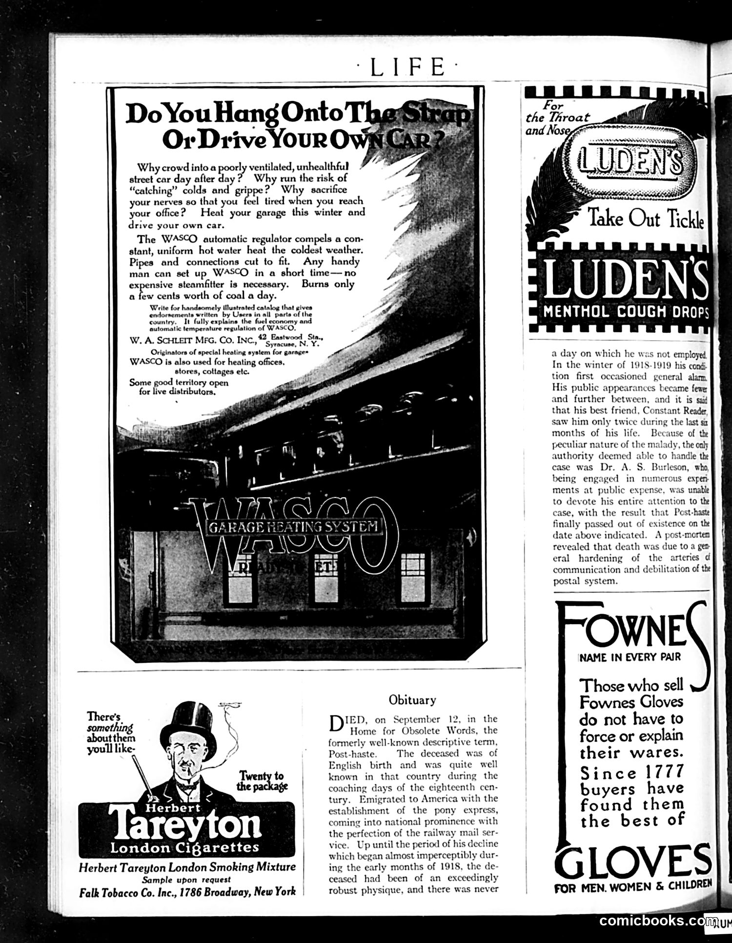
This page contains three distinct advertisements and an obituary, primarily serving as a commercial vehicle rather than satirical content. **Main Advertisement (WASCO):** Promotes an automatic heating system for home garages, arguing that driving your own car is preferable to crowded, unhealthy streetcars. This reflects post-WWI American automobile culture and class anxieties about public transit. **Obituary (Satirical):** A humorous piece announcing the death of "Post-haste"—a now-obsolete descriptive term. The joke satirizes how modern life (particularly postal service inefficiencies mentioned) has made the concept of speed meaningless. This likely references wartime disruptions to mail delivery (1918-1919 referenced). **Minor Advertisements:** Herbert Tareyton London Cigarettes, Luden's Menthol Cough Drops, and Fownes Gloves fill remaining space. The page reflects 1920s consumer culture: automobiles as status symbols, health consciousness regarding public spaces, and nostalgic humor about changing language and customs.
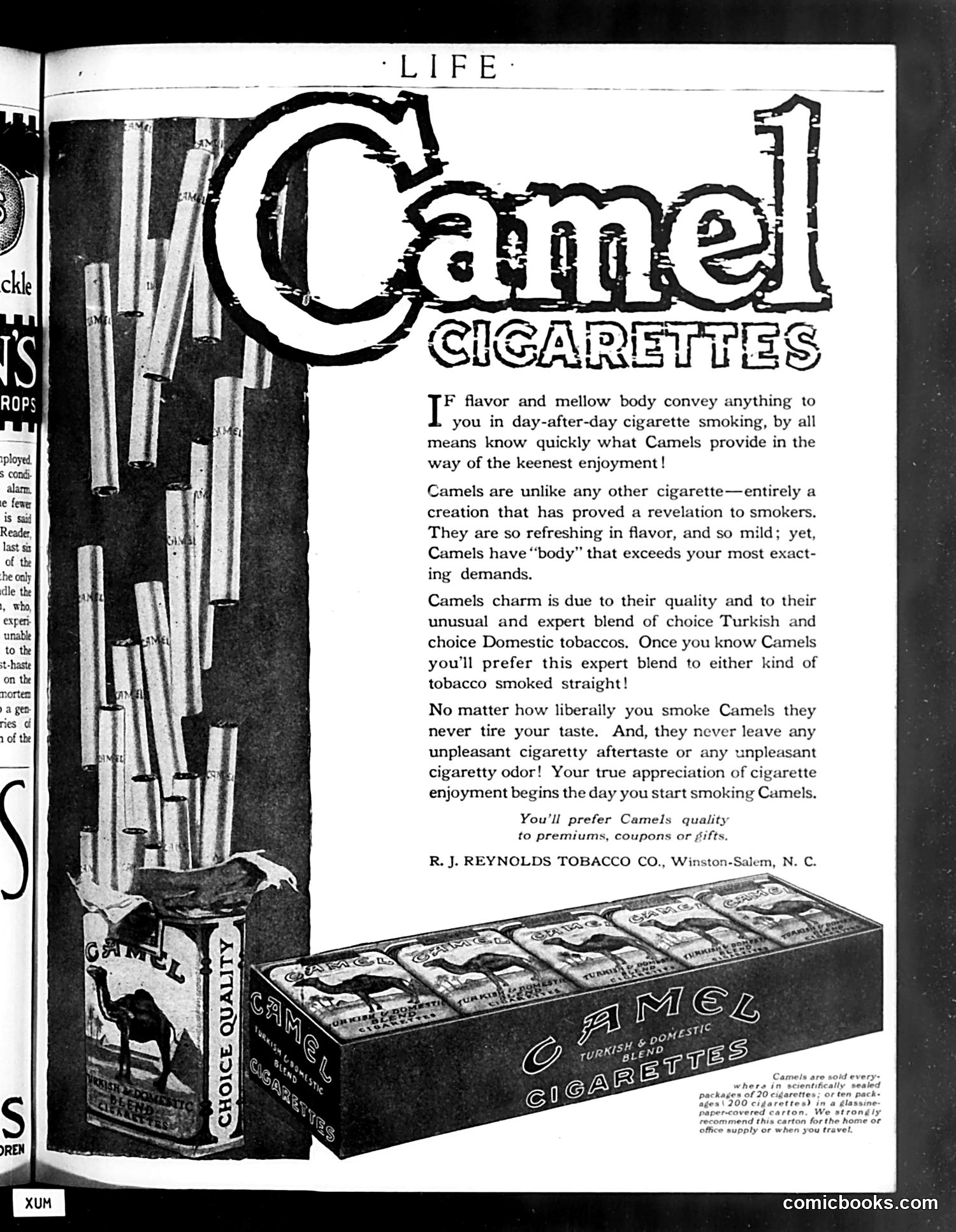
The ad promotes Camel cigarettes from R.J. Reynolds Tobacco Company, emphasizing the product's "flavor and mellow body" and claiming superiority over competitors through its "blend of choice Turkish and choice Domestic tobaccos." The imagery shows cigarette packs and an open carton display. The tagline "You'll prefer Camels quality to premiums, coupons or gifts" suggests the company positioned itself as premium quality, contrasting with competitors offering promotional giveaways. **For modern readers**: This represents an era when cigarette advertising appeared openly in mainstream magazines without health warnings. The rhetorical claims (never tires your taste, no unpleasant aftertaste) would be legally prohibited today. The ad reflects early-20th-century marketing strategy emphasizing product quality and sophistication rather than the health concerns now central to tobacco discourse.
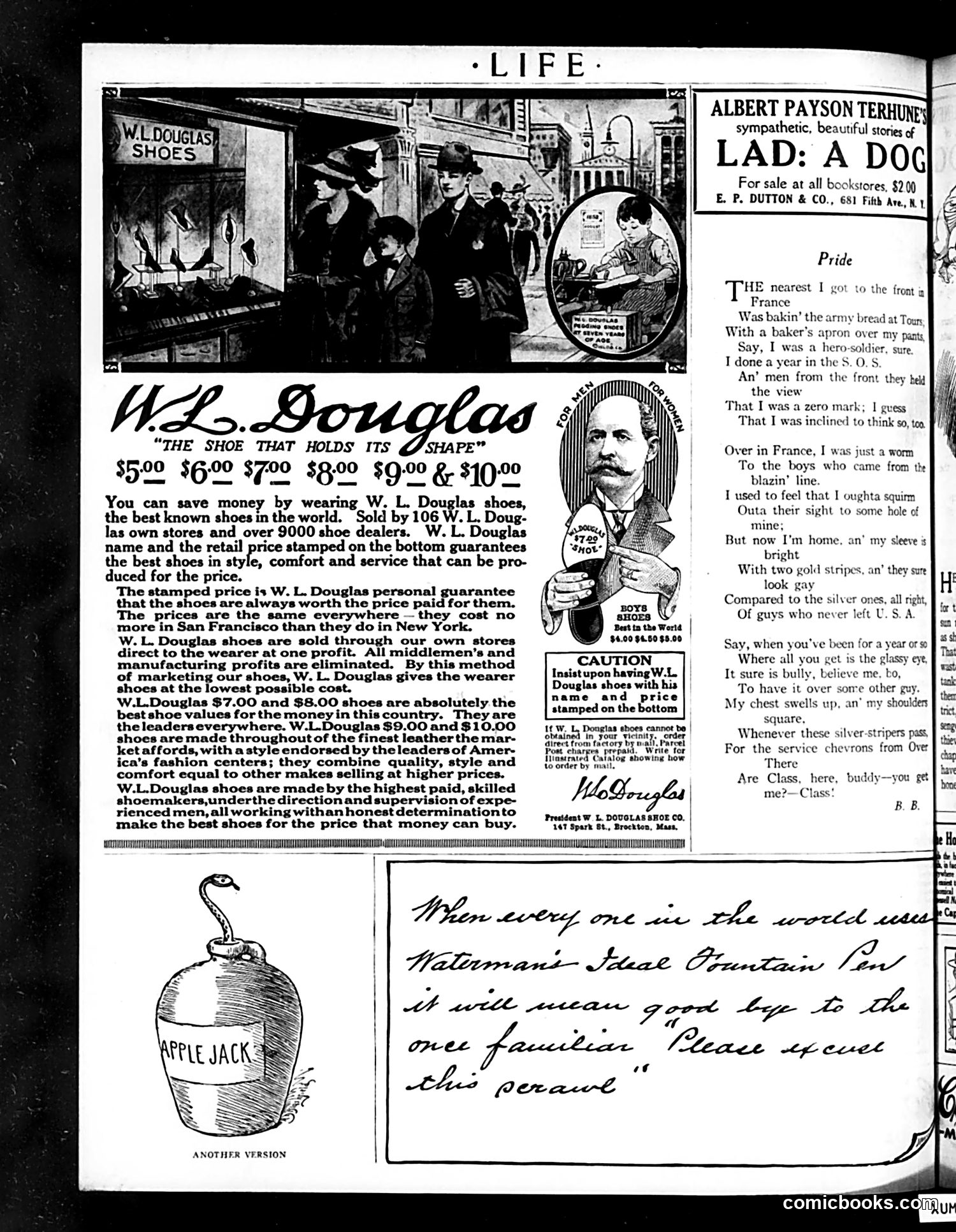
This page is primarily **advertising**, not political satire. The dominant content is a **W.L. Douglas shoe advertisement** emphasizing direct-to-consumer sales, eliminating middlemen's profits, and price standardization across regions. The ad includes a street scene photograph showing people examining shoes in a shop window. The secondary content features: 1. **"LAD: A DOG"** — a book advertisement by Albert Payson Terhune, a popular author of dog stories. 2. **"Pride"** — a poem by B.B. about a World War I veteran who served in non-combat roles (baking bread) but now wears service chevrons (gold stripes indicating overseas service). The poem captures the complex emotions of support-staff soldiers: initial shame at not being in frontline combat, then relief and pride upon returning home with visible insignia of service. The page reflects post-WWI American culture: commercial optimism, consumer marketing strategies, and veterans' experiences processing their war service.
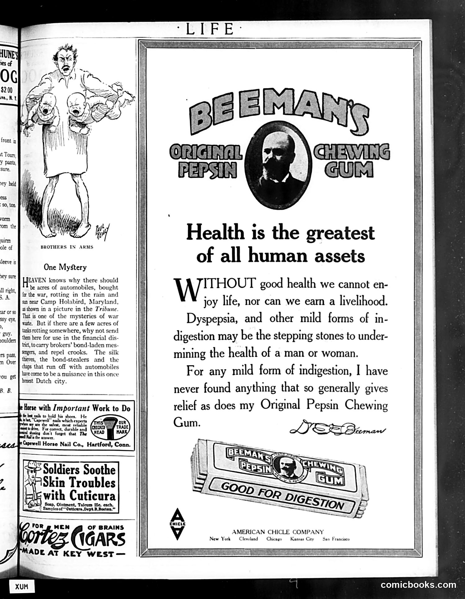
The page contains two distinct elements: **Left side**: A cartoon titled "Brothers in Arms" depicting a woman holding multiple babies/infants. The accompanying text satirizes wartime waste—specifically questioning why military vehicles rot unused at Camp Holabird, Maryland, while such resources could address crime in what appears to be New York City (the "honest Dutch city"). The joke plays on the absurdity of military inefficiency during wartime. **Right side**: A full-page advertisement for Beeman's Original Pepsin Chewing Gum, featuring a testimonial attributed to "Dr. Beeman." The ad claims the gum aids digestion and promotes health—typical early-20th-century patent medicine marketing that made broad health claims. The juxtaposition is purely coincidental; this is primarily an **advertising page** with one satirical cartoon. The "Brothers in Arms" cartoon's satire targets military bureaucratic waste rather than any specific political figure.
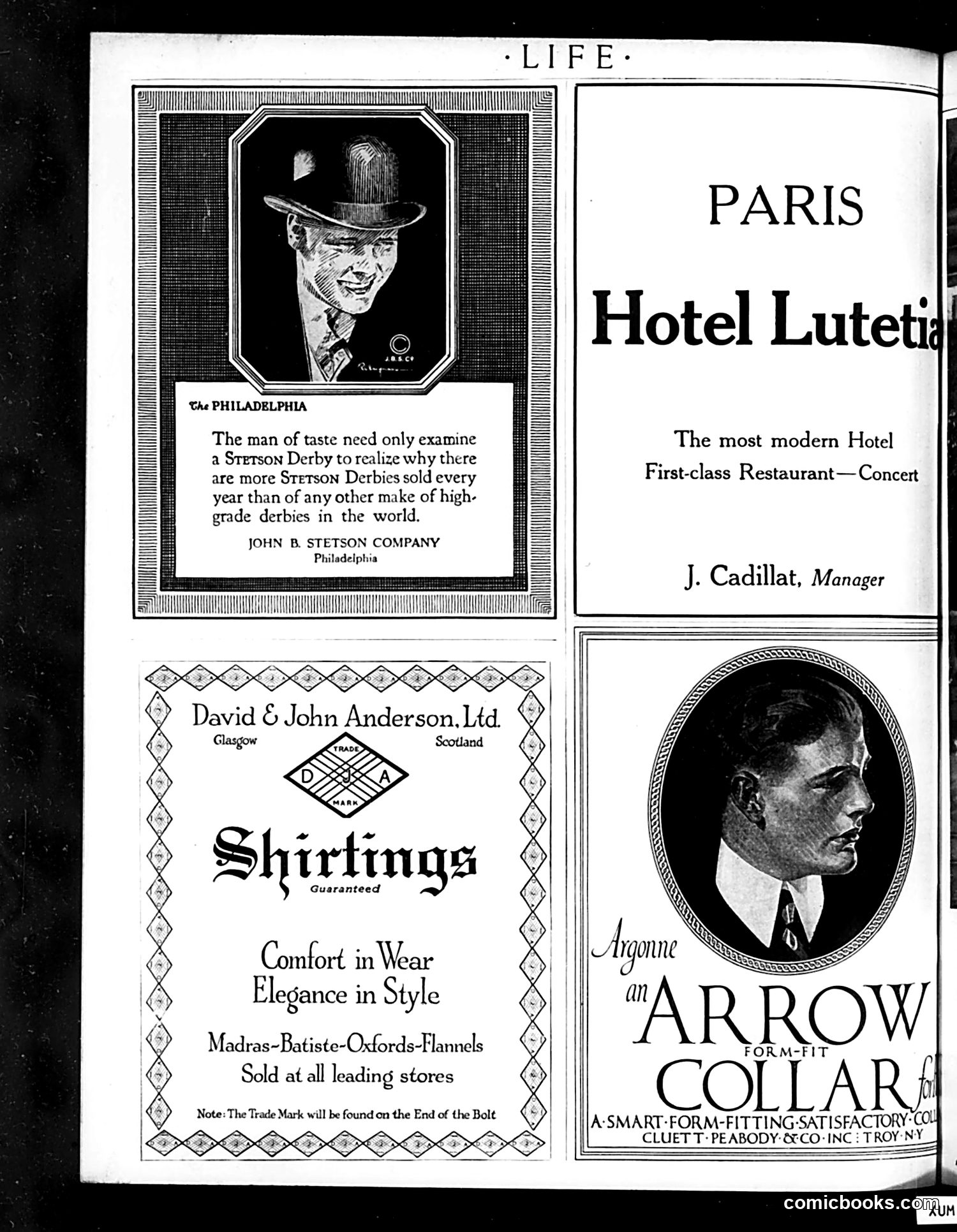
This page is primarily **advertising**, not political satire. It contains four commercial advertisements from the early 20th century: 1. **Stetson Derby hats** (Philadelphia): Appeals to "men of taste" by emphasizing superior sales volume 2. **David & John Anderson shirtings** (Scotland): Promotes fabric quality with slogans about "comfort" and "elegance" 3. **Hotel Lutetia** (Paris): Advertises luxury accommodations with a manager's name 4. **Arrow Collar** (Troy, NY): Features a well-dressed man in profile, marketing form-fitting collars as aspirational menswear The illustrated portrait in the Stetson ad and the Arrow Collar photograph represent the ideal gentleman consumer of that era—sophisticated, well-groomed, wearing quality accessories. There is no evident political commentary or satire on this page. It simply showcases products targeting affluent male consumers through appeals to taste and social status.
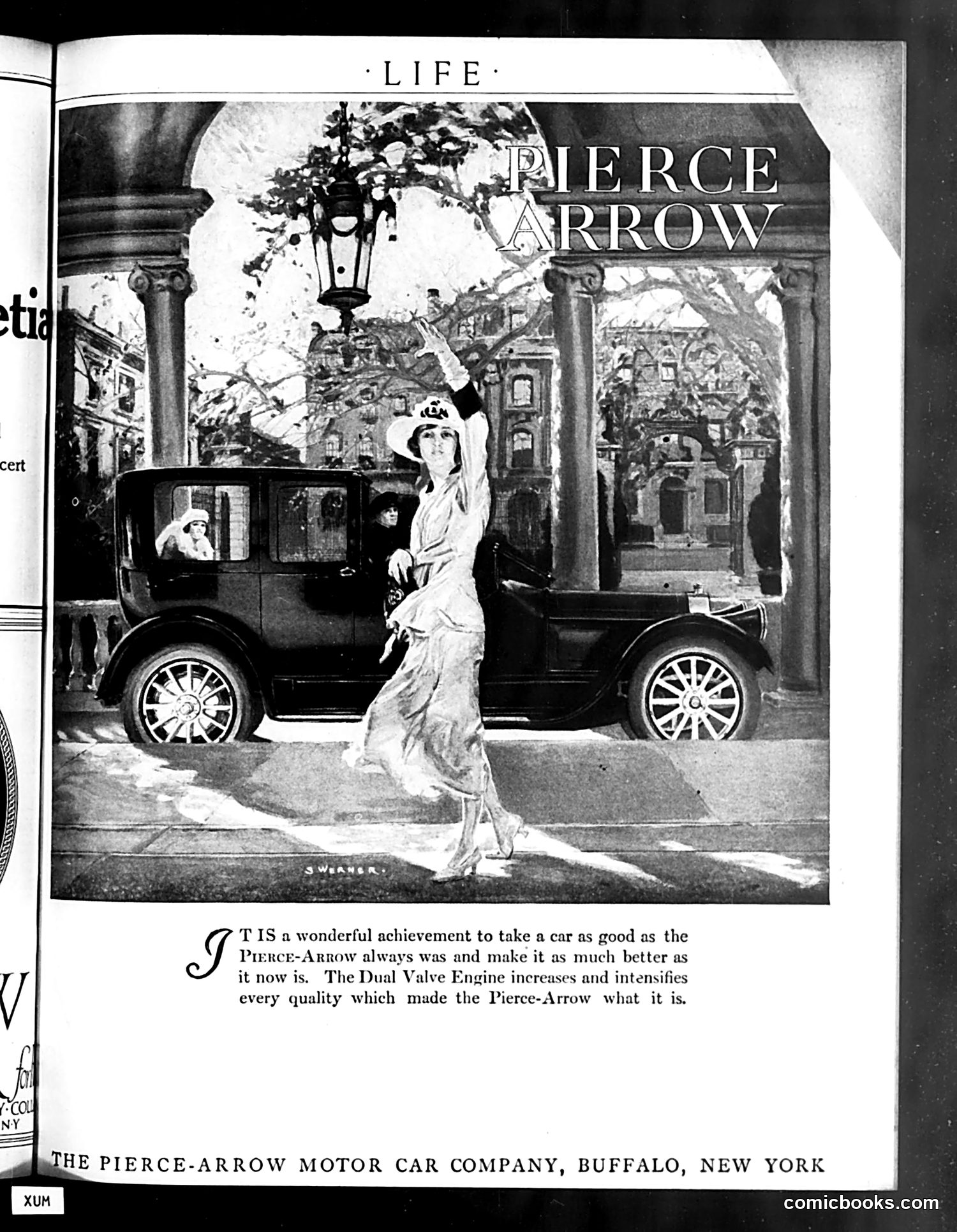
This is primarily an **advertisement for Pierce-Arrow automobiles**, not satire or political commentary. The page features a glamorous woman in 1920s attire reaching toward a hanging lantern outside an elegant columned courtyard, with a Pierce-Arrow sedan visible behind her. The ad copy celebrates the car's "Dual Valve Engine" and claims it improves upon the already excellent Pierce-Arrow. The imagery associates the luxury vehicle with sophistication, wealth, and refinement—typical advertising strategy of the era. There is no cartoon, political message, or satire present. This represents how Life magazine, while known for satirical content, also carried paid advertisements to support publication. The Pierce-Arrow Motor Car Company was based in Buffalo, New York.
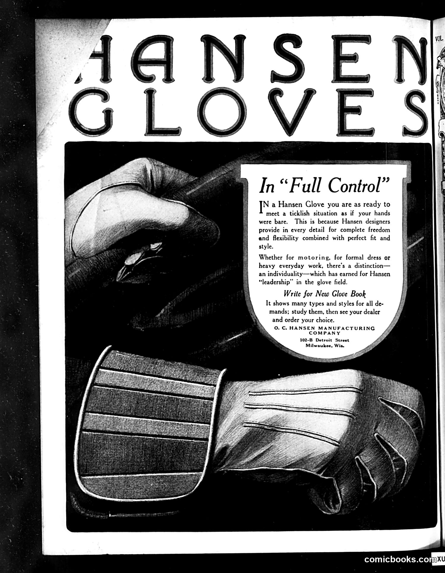
This is a straightforward **product advertisement**, not political satire or a cartoon. It promotes Hansen Manufacturing Company's gloves, headquartered in Milwaukee, Wisconsin. The ad emphasizes that Hansen gloves provide "complete freedom and flexibility" while maintaining "perfect fit and style"—a paradoxical selling point (gloves that feel like bare hands). The imagery shows three detailed illustrations of gloved hands demonstrating the gloves' dexterity and range of motion. The advertisement targets multiple markets: motorists, formal-wear users, and laborers. It encourages readers to request a "New Glove Book" catalog showcasing different styles for various demands, then purchase through local dealers. This represents typical early-twentieth-century trade advertising emphasizing both functionality and fashion—common content in *Life* magazine during its period as a general-interest publication.