
A complete issue · 26 pages · 1905
Life — September 21, 1905
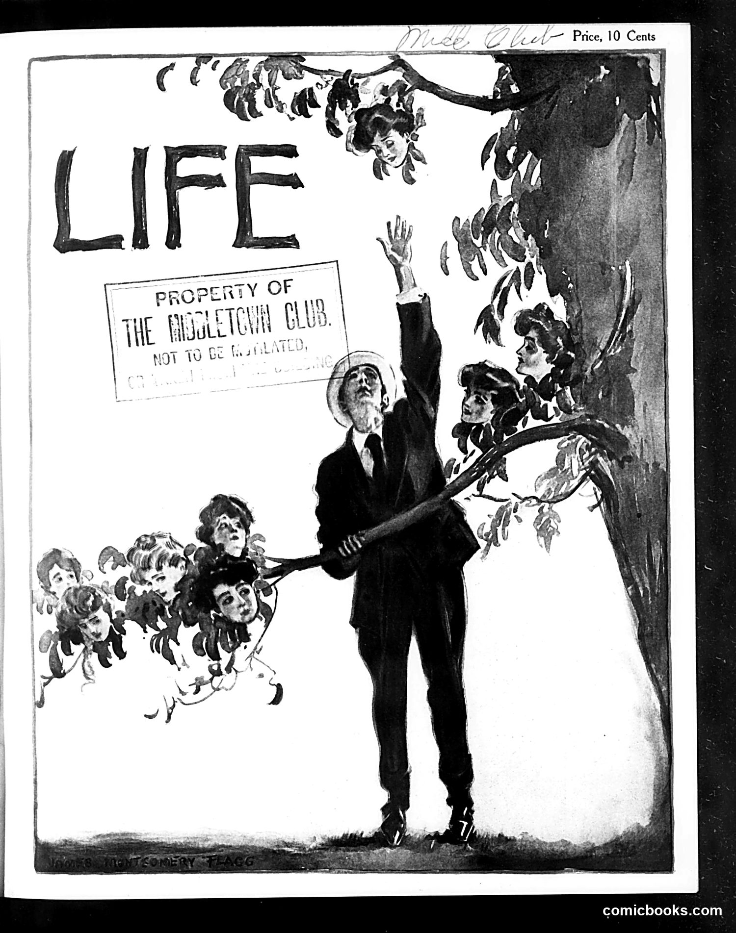
This is a cover from *Life* magazine (priced at 10 cents), marked as property of "The Oogletchi Club." The cartoon depicts an elderly man in formal dress wielding a long pole or stick to pluck children like fruit from a tree. The children appear distressed, clustered together on the left side. The imagery suggests **child labor exploitation** — specifically, the predatory harvesting of children for work, likely in agriculture or factories. The satire targets the practice of **child labor**, which was prevalent and controversial in early-20th-century America. The "harvesting" metaphor emphasizes how adults cynically exploited children as commodities rather than protecting them as human beings. This reflects progressive-era concerns about child welfare and labor reform.
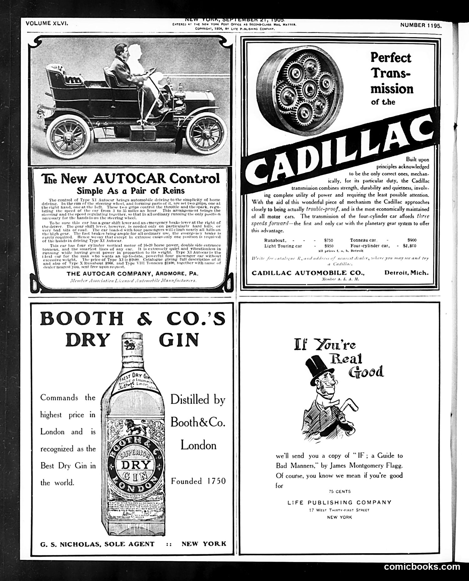
This page contains **four advertisements**, not political cartoons or satire. The content is purely commercial: 1. **Autocar Control** (top left): Promotes an early automobile steering mechanism, emphasizing simplicity ("Simple As a Pair of Reins"). This reflects early 1900s automotive technology still mimicking horse-carriage controls. 2. **Cadillac Transmission** (top right): Advertises Cadillac's transmission system with technical specifications and pricing ($950-$2,800), targeting affluent buyers. 3. **Booth & Co.'s Dry Gin** (bottom left): A London gin distillery advertisement established 1750, claiming it's "the Best Dry Gin in the world." 4. **"If You're Real Good"** (bottom right): A humorous advertisement for James Montgomery Flagg's guide to bad manners, offered for 75 cents by Life Publishing Company. No political content or satire is present on this page.
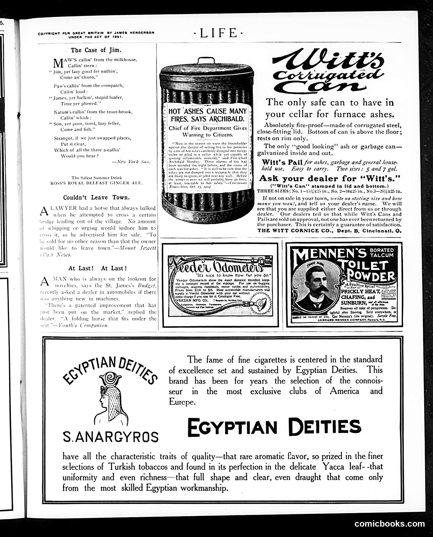
This page is primarily **advertising**, not political satire. The dominant content consists of product advertisements from the early 1900s: - **Witt's Corrugated Can**: fireproof ash receptacles for cellars - **Veder Odometer**: measuring devices for carriages and automobiles - **Mennen's Borated Talcum Powder**: toiletry product - **Egyptian Deities Cigarettes**: luxury cigarettes marketed to exclusive clubs The only satirical content appears in the short poem "The Case of Jim" (top left) and brief humorous anecdotes like "Couldn't Leave Town" and "At Last! At Last!"—gentle, non-political humor about everyday situations. The page reflects turn-of-the-century consumer culture and advertising practices rather than political commentary.
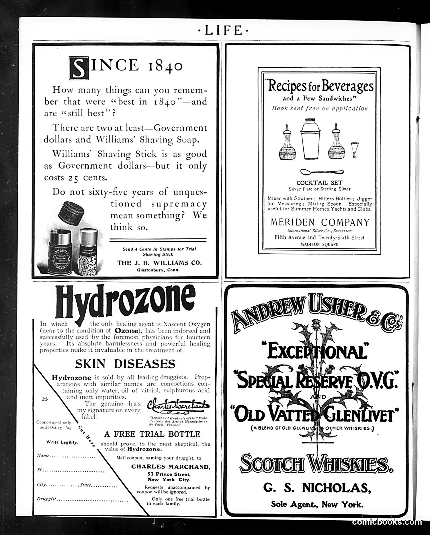
This page is **primarily advertising**, not satirical content. It contains four distinct ads: 1. **J.B. Williams Co.** (top left): Advertises shaving soap, claiming it's been "best in 1840" and remains superior—essentially arguing that longevity proves quality. 2. **Meriden Company** (top right): Promotes a cocktail set in silver plate, marketed toward wealthy households and yacht clubs. 3. **Hydrozone** (bottom left): A patent medicine claiming to treat skin diseases using "Nascent Oxygen," with a coupon for a free trial bottle—typical of early 20th-century medical advertising making dubious health claims. 4. **Andrew Usher & Co.** (bottom right): Scotch whisky advertisement. The page reflects *Life* magazine's revenue model: satirical editorial content subsidized by luxury goods and patent medicine ads targeting affluent readers.
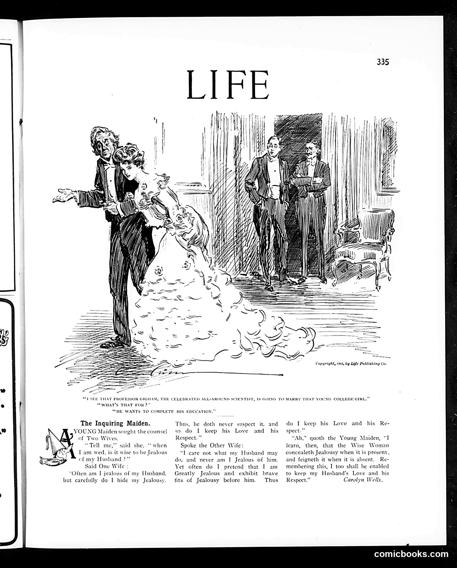
This satirical piece depicts a social situation about marriage and jealousy. The cartoon shows a young woman in an elaborate dress asking an older man (identified as "Professor Osgam, the celebrated all-around scientist") about marrying a college girl, with onlookers observing. The accompanying story presents a dialogue between wives about managing husbands' jealousy. One wife counsels that a wise woman should conceal her jealousy and maintain her husband's love and respect through discretion and absence of suspicion. The humor appears to target Victorian-era gender dynamics and marital advice—specifically, the expectation that women should suppress their own feelings to maintain domestic harmony. The "Professor" reference suggests the satirization of pseudo-scientific justifications for such advice.
This page critiques Japan's post-war conduct and American foreign policy naïveté. The text discusses the Tokio (Tokyo) mob burning churches and whether Americans should blame Japan's government or hold President Roosevelt responsible for trusting Japanese peace intentions. The small cartoon illustrations (children and birds) appear decorative rather than substantive commentary. The main argument satirizes American optimism about Japan's reliability as a peaceful ally. The author suggests Roosevelt was too credulous in accepting Japanese assurances, and that Japan will inevitably pursue expansionist policies in Asia regardless of treaties. The piece implies Japan's current peaceful posturing masks deeper imperial ambitions—a prescient concern given Japan's later militarism in the 1930s-40s.
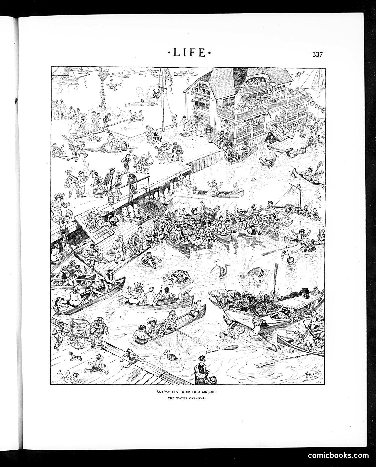
This is a detailed satirical illustration titled "Snapshots from Our Airship: The Water Carnival," depicting a bustling beach or seaside resort scene viewed from above. The image shows hundreds of people enjoying various water activities—swimming, boating, wading—around docks and beached vessels, with a large multi-story building (likely a bathhouse or resort hotel) on the right. The satire appears to target the crowding and chaos of popular leisure destinations, particularly beach resorts, during what was likely the early 20th century. The "airship" perspective—a novelty at the time—allows the artist to capture the comical disorder of masses of people packed together in summer recreation. The humor lies in depicting the overwhelming abundance and disorganization of modern public entertainment.
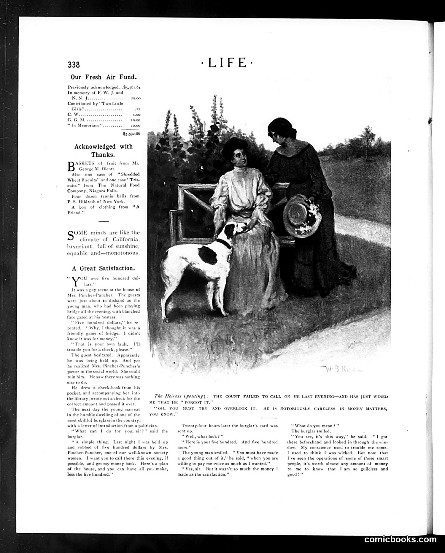
This page from *Life* magazine contains a short story titled "A Great Satisfaction" rather than a political cartoon. The narrative concerns a young man who lost $500 playing bridge at a society event hosted by Mrs. Pincher-Pancher. When confronted about the debt, he claims poverty, yet Mrs. Pincher-Pancher notices he's well-dressed and socially connected. The accompanying illustration shows women and a dog outdoors, though its connection to the text is unclear from the visible image alone. The story satirizes **social hypocrisy among the wealthy**: a young man loses substantial money gambling but claims he cannot pay, while maintaining an appearance of respectability. The satire targets both careless wealth management and the social pretense that allows such behavior to persist unpunished in elite circles.
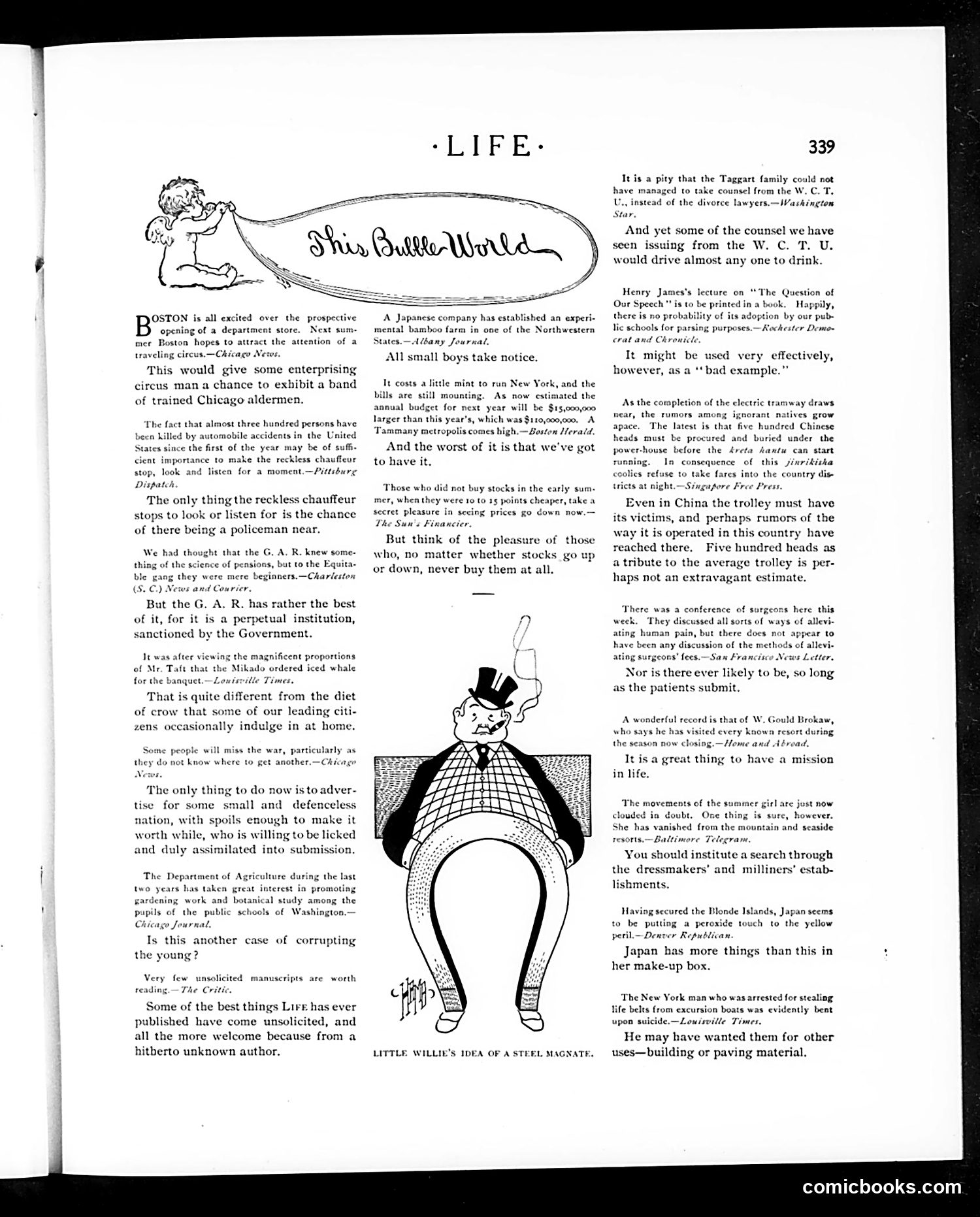
This page contains the cartoon "Little Willie's Idea of a Steel Magnate," depicting a figure in formal dress (top hat and monocle) whose body is constructed entirely of steel or metal plating—literal interpretation of the term "steel magnate" (a wealthy industrialist). The surrounding text discusses various social and economic topics of the era: Boston property values, New York electric tramway costs, Chinese labor concerns, and agricultural education. Multiple brief satirical commentary pieces critique business practices, stock speculation, and social trends. The cartoon's humor relies on visual pun: taking the figurative language of industrial capitalism literally. "Willie" (likely a young observer's naive perspective) imagines what a "steel magnate" physically looks like, creating absurdist comedy that subtly mocks the materialism and dehumanization of industrial-age business culture.
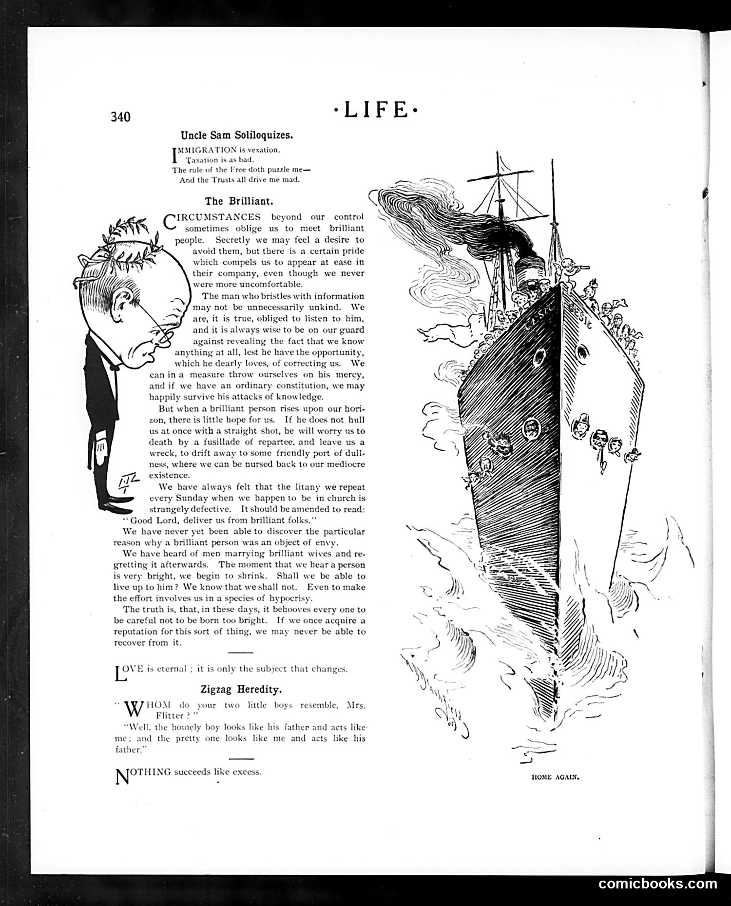
This page features a satirical essay titled "The Brilliant" with an accompanying caricature of a thin, sharp-featured man. The text warns against the social danger posed by exceptionally intelligent people who use their knowledge to embarrass or dominate others in conversation. The essay argues that while ordinary ignorant people are manageable, a "brilliant" person who "rises upon our horizon" becomes genuinely threatening—they attack relentlessly with facts and can destroy one's reputation through superior wit. The author suggests that brilliance, when weaponized socially, is worse than mere stupidity. The caricature's exaggerated features (particularly the sharp profile) visually emphasize intellectual arrogance. The satire mocks both brilliant people's condescension and society's fear of intellectual superiority in casual social settings.
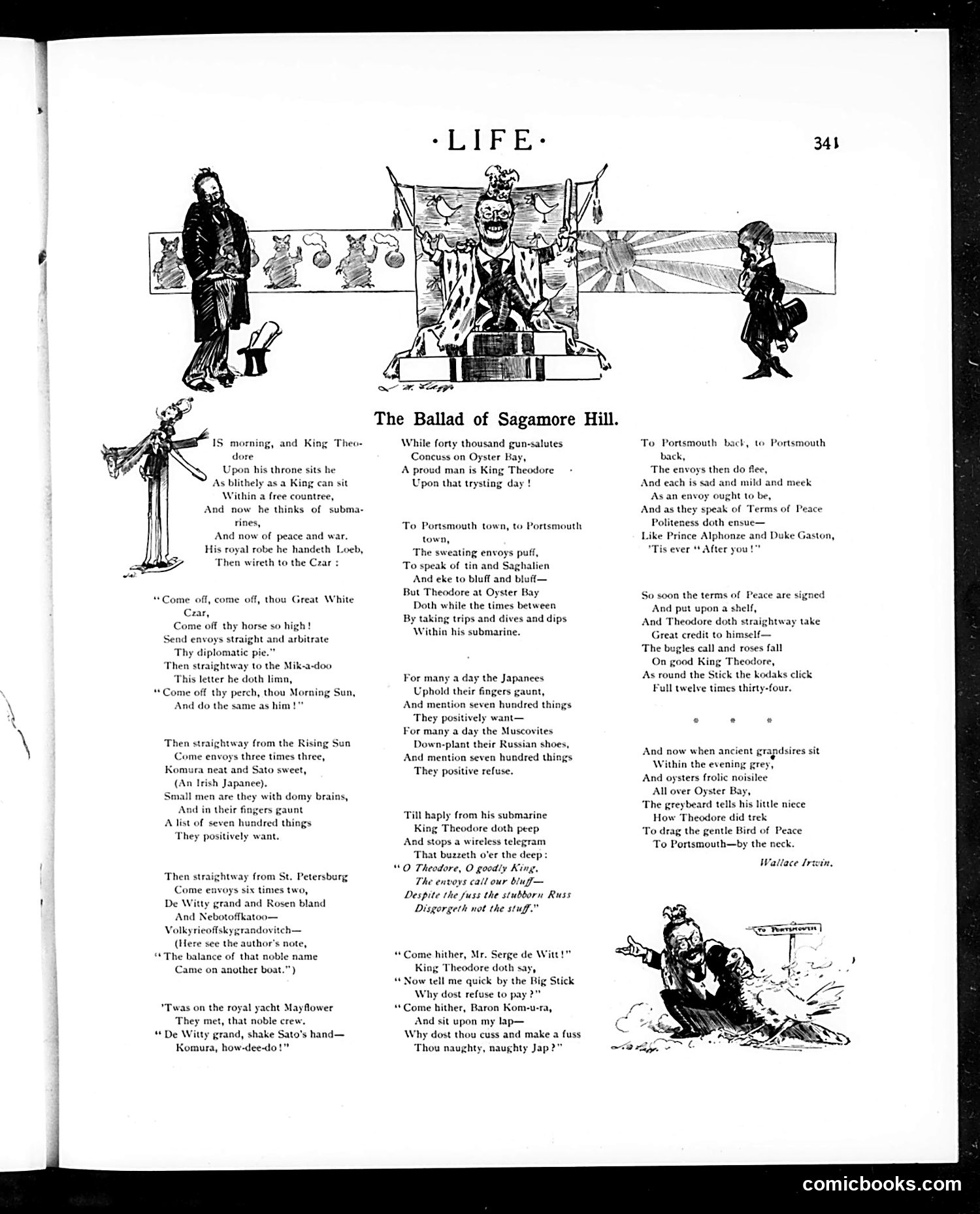
This satirical poem mocks President Theodore Roosevelt's peace negotiations ending the Russo-Japanese War (1904-1905). "Sagamore Hill" was Roosevelt's home, establishing him as the target. The ballad ridicules Roosevelt's diplomatic efforts by portraying him as boastfully orchestrating peace while various parties—Japanese, Russians, and others—resist or mock the process. References to "King Theodore" and his submarines, envoys, and grand pronouncements suggest Roosevelt was grandstanding about his role. The caricatures depict Roosevelt as an inflated, self-important figure manipulating international affairs. The satire suggests his peace brokerage was more about personal glory than genuine diplomacy, with other nations humoring or ignoring him ("'Tis ever 'After you!'").
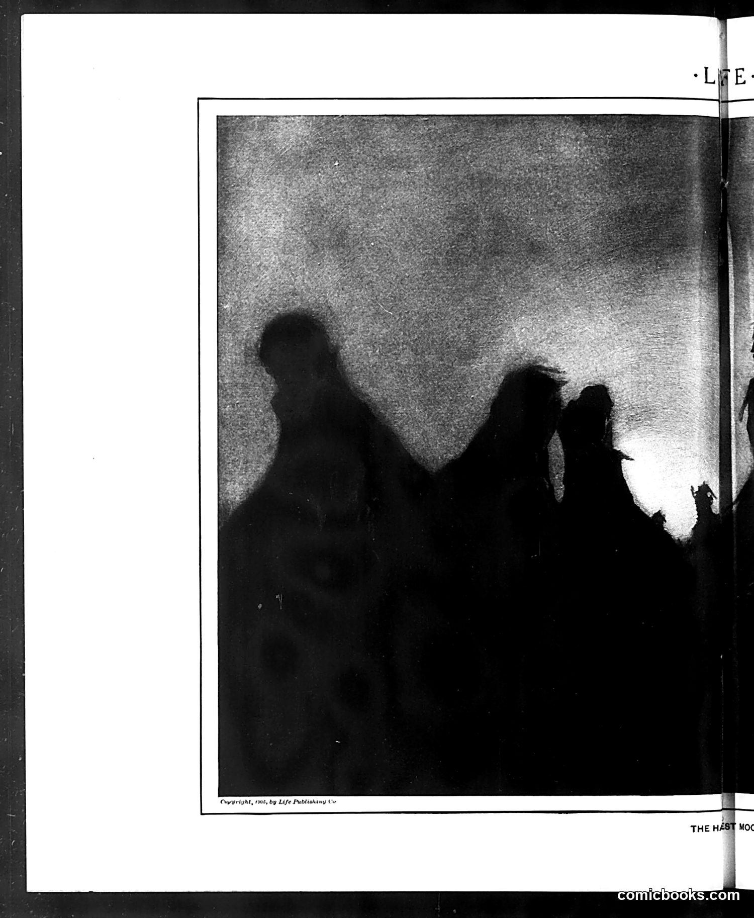
This image shows silhouettes of what appear to be three figures against a textured background. The silhouettes are dark and somewhat indistinct, making specific identification difficult from the image alone. The copyright notice reads "Copyright, 1902, by Life Publishing Co," indicating this is from Life magazine's 1902 publication. The partial text visible at the bottom appears to read "THE REST MOO[.]" (likely "THE REST MOOS" or similar), suggesting this may be a political cartoon with animal references, possibly satirizing political figures of that era. However, without clearer visibility of the figures' distinctive features and without more complete caption text, I cannot definitively identify who these silhouettes represent or what specific political/social commentary this cartoon intended. The context necessary for modern readers to understand the satire is not sufficiently clear from what's visible here.
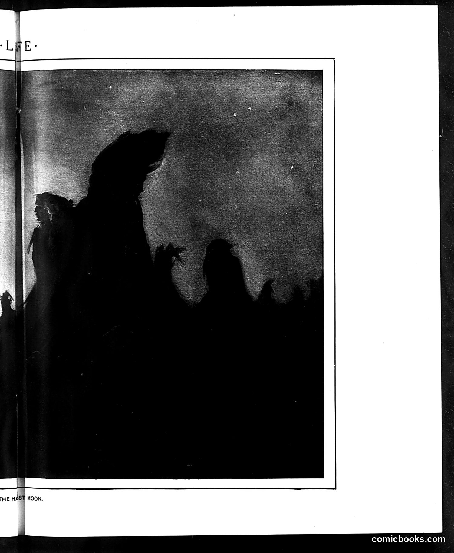
This page from *Life* magazine shows a silhouette illustration captioned "THE HAST MOON" (likely "THE LAST MOON"). The image depicts shadowy figures gazing upward at what appears to be a celestial body against a textured sky. Without additional context or visible text on the page itself, the specific satirical meaning is unclear. The caption suggests either: 1. A commentary on astronomical observation or lunar phenomena 2. Possible apocalyptic or dystopian satire about humanity's final days 3. A reference to a contemporary event or cultural moment involving the moon The silhouette style and somber tone suggest social or political commentary, but identifying the precise figures, intended audience reaction, or historical reference requires more contextual information than the image and partial OCR provide.
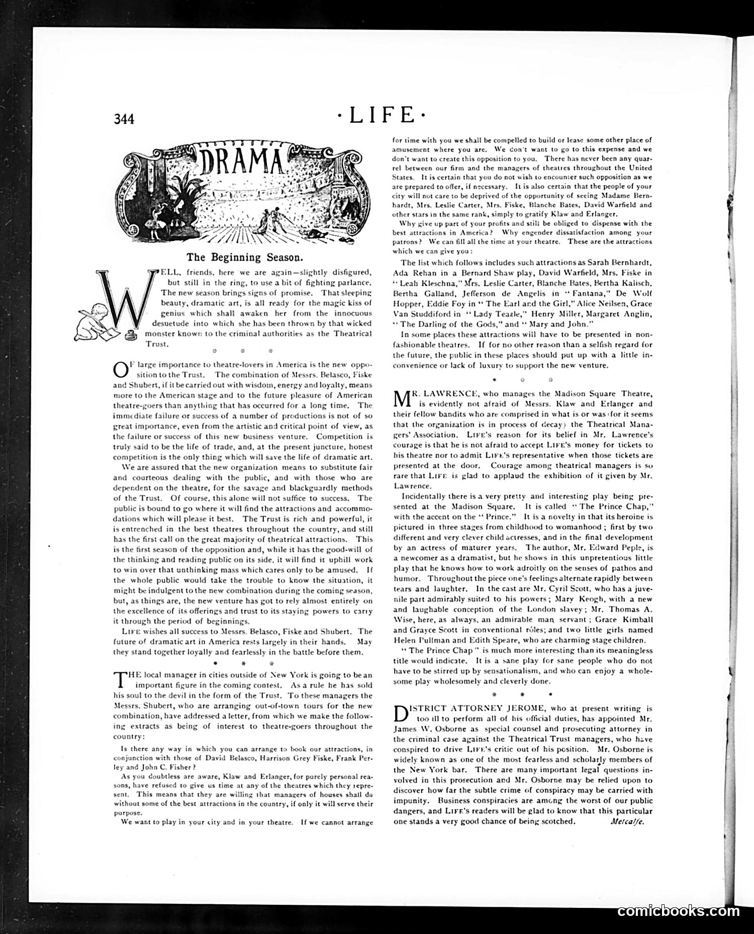
This 1900s *Life* editorial addresses the **Theatrical Trust**, a monopoly controlling American theater distribution. The "wicked monster" referenced is the Trust's stranglehold on venues and productions. **The Opposition**: Belasco, Fiske, and Shubert (prominent theater producers) are forming a competing organization to break the Trust's power. *Life* frames this as a crucial moment for American theater's future. **The Satire**: The editorial mocks the Trust's ruthless tactics—particularly their refusal to give stage time to rival producers' shows, forcing competitors to build their own theaters. The letter excerpt shows how the new combination pressures local managers: support us or we'll construct competing venues in your city. **Key Point**: This represents an early **antitrust battle**. *Life* champions competition as essential to dramatic art's health, opposing the monopoly's "savage and blackguardly methods" that prioritize profit over public access to quality entertainment. The piece advocates for artistic merit over corporate control—a Progressive Era concern about big business consolidation.
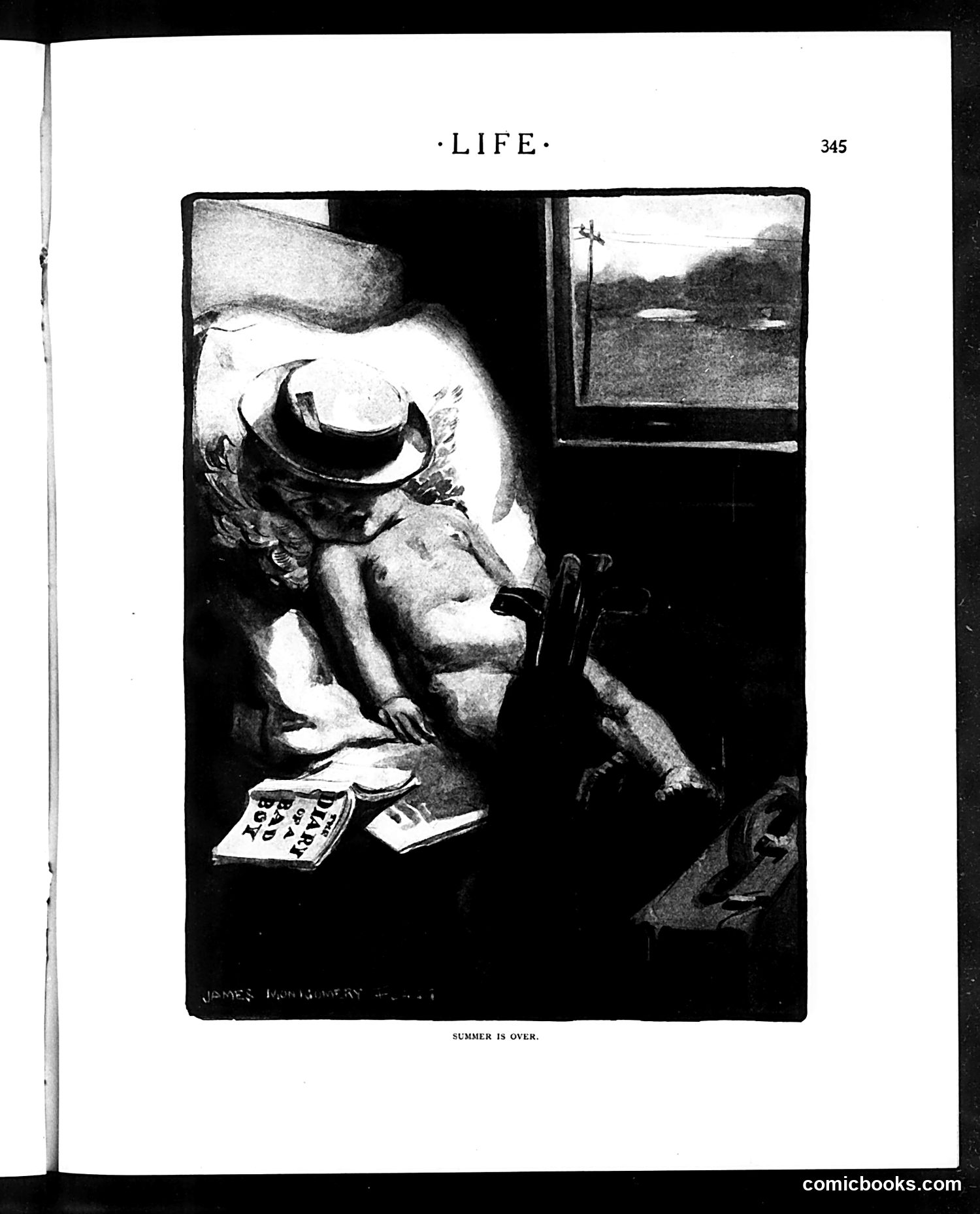
This illustration depicts a scene of domestic discontent. A woman wearing a hat sits indoors with what appears to be playing cards or similar leisure materials scattered before her. Through the window behind her, a sunny landscape is visible. The caption "Summer is Over" suggests satire about the end of vacation season and return to routine life. The woman's posture and expression convey boredom or resignation rather than joy. The contrast between the outdoor summer scene visible through the window and her confined indoor setting emphasizes the melancholy transition from leisure to obligation. This appears to be social commentary on how summer's freedom ends and domesticity reasserts itself—likely mocking both the monotony of housewife life and the disappointment when leisure time concludes.
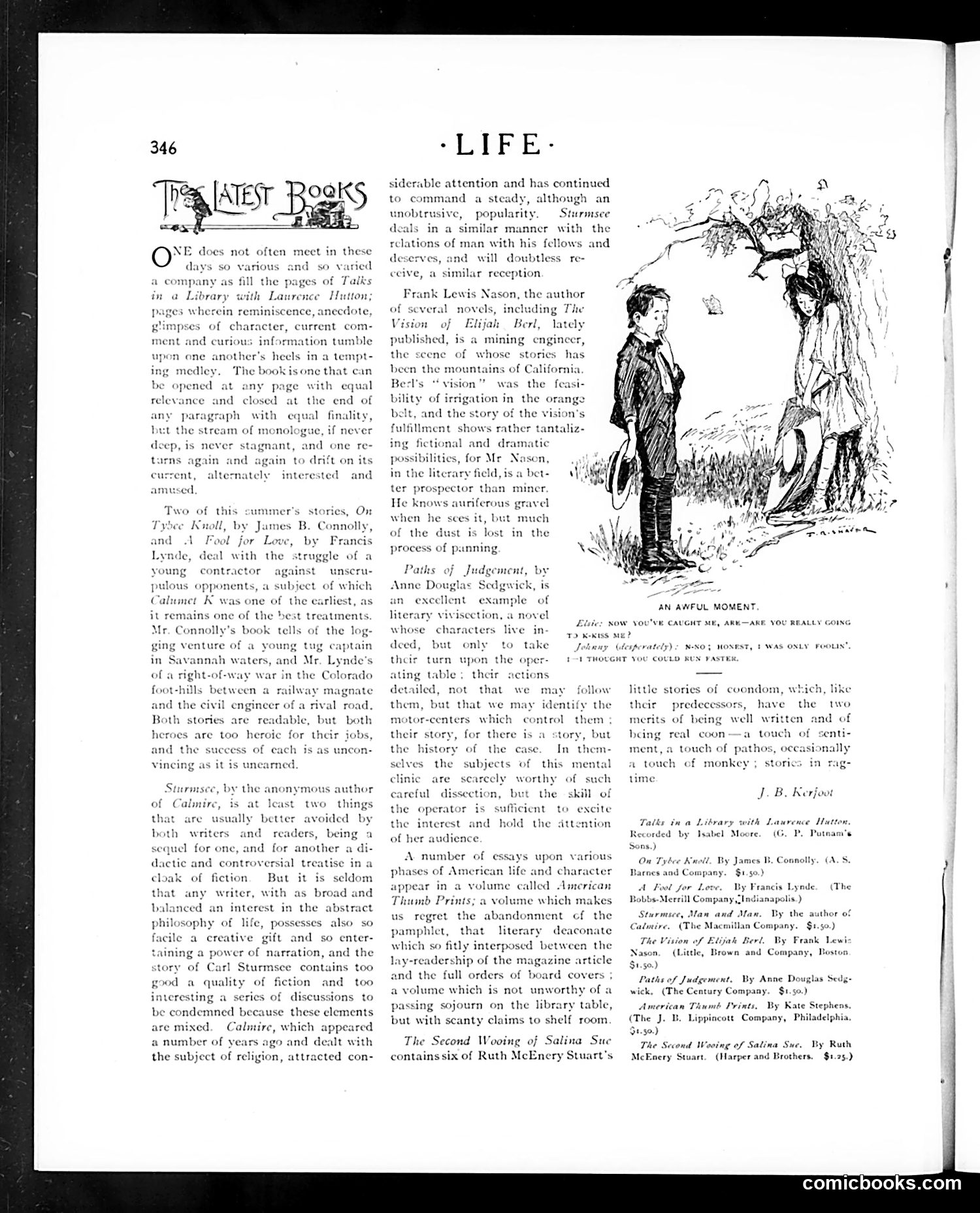
This page is primarily a book review section discussing recent literary works, not a political cartoon. The only illustration is titled "An Awful Moment" and depicts a domestic scene where a woman (Elsie) confronts a man about infidelity. The caption shows her demanding honesty, with his defensive response: "Honest, I was only foolin'. I thought you could run faster." The humor is a crude domestic joke playing on the man's fabricated excuse—he claims he was merely "testing" her running ability, an obviously absurd justification for suspicious behavior. This reflects early-20th-century attitudes toward marital drama and male infidelity treated as comedic material. The page otherwise reviews novels by contemporary authors including Frank Lewis Nason and Anne Douglas Sedgwick, discussing their literary merits and subject matter ranging from California irrigation stories to character psychology. There is no political satire present.
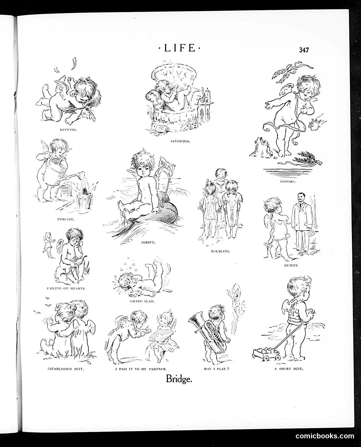
This page presents a series of cherub illustrations labeled with Bridge card game terminology. Each drawing depicts a baby or cupid in situations that pun on Bridge vocabulary: - "Established Suit" shows cherubs in formal wear - "I Pass It to My Partner" depicts one cherub handing something to another - "Satisfied" shows a cherub relaxed in a chair - "Adrift," "Doubling," "Honors," "Dummy," and "A Short Suit" feature cherubs in corresponding scenarios The satire mocks Bridge, an enormously popular card game among American society in the early 20th century. By applying serious Bridge terminology to whimsical cherub scenarios, Life magazine gently satirizes the game's complexity and the social pretension surrounding it. The humor relies on incongruity: babies enacting sophisticated card-game concepts.
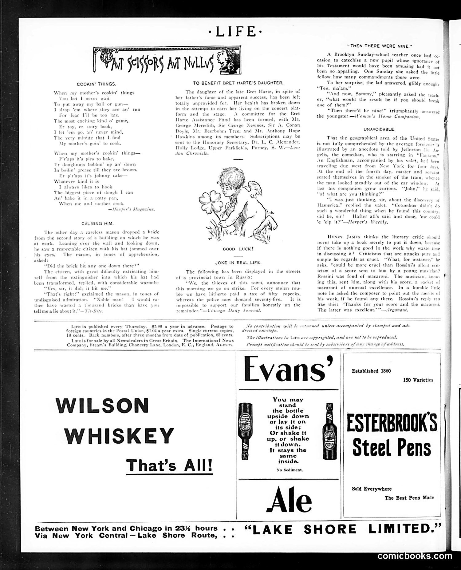
This page contains three distinct sections: **Main Content:** Two humorous pieces—"Cookin' Things" (a poem about a mother's cooking) and "Calming Him" (a brief anecdote about a mason hit by a brick). A third piece, "Then There Were Nine," depicts a Sunday-school teacher's conversation with an ignorant pupil about biblical commandments, played for comedy at the child's expense. Another anecdote, "Joke in Real Life," mocks literary critics' pretentiousness, including a (likely apocryphal) story about composer Rossini dismissing a critic's praise. **Illustrations:** A simple drawing of a cherub or angel holds flowers, captioned "Good Luck!" **Advertisements:** The page is dominated by period ads—Wilson Whiskey, Evans' Ale (emphasizing sediment-free quality), Esterbrook's Steel Pens, and Lake Shore Limited railroad service between New York and Chicago. **Context for Modern Readers:** This represents early 1900s American humor: genteel, focused on domestic life, class pretension, and gentle mockery rather than sharp satire. The advertisements reflect contemporary consumer goods and travel.
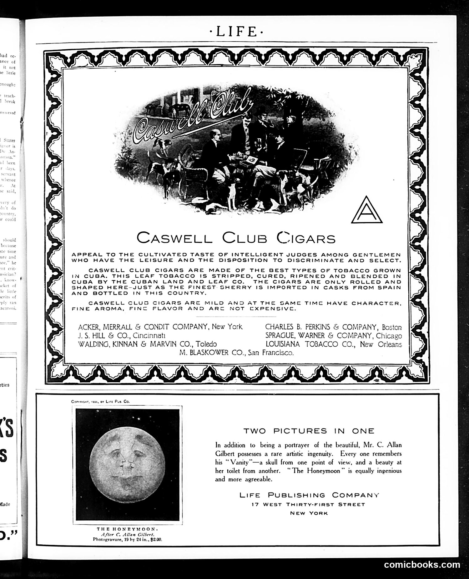
This page is primarily **advertising**, not satire. The upper two-thirds features a Caswell Club Cigars advertisement targeting wealthy gentlemen, emphasizing Cuban tobacco quality and refined taste. The ad lists multiple distributors across major American cities. The lower section promotes "The Honeymoon," an artwork by C. Allan Gilbert—a artist known for optical illusions. The text references his famous earlier work "Vanity," which depicts a skull that transforms into a woman at her vanity mirror depending on viewing angle. "The Honeymoon" apparently employs similar double-image technique, though the small reproduction here makes the second image unclear. This represents early 20th-century Life magazine content: **advertising luxury goods to affluent readers alongside art promotion**—not political commentary or satirical cartooning.
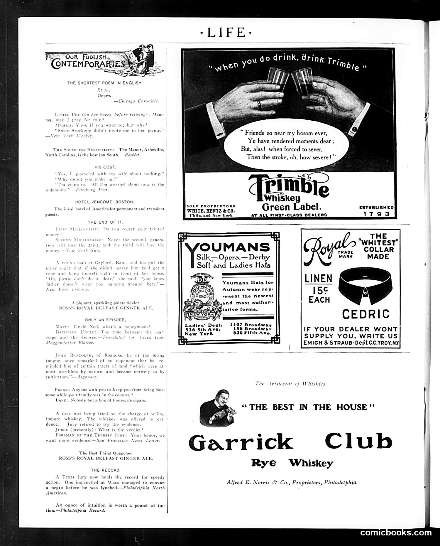
This page is primarily **advertising**, not political commentary. The main content features multiple liquor and consumer product ads from the early 20th century. The central advertisement is for **Trimble Whiskey** (Green Label, established 1793), which uses an illustration of two men toasting with glasses and a sentimental poem about friendship and parting—typical advertising rhetoric of the era appealing to emotional bonds. Surrounding ads promote **Garrick Club Rye Whiskey** ("The Best in the House"), **Youmans Hats**, **Royal Collar** (cedric brand linen collars at 15¢), and **Ross's Royal Belfast Ginger Ale**. The left column contains brief humorous anecdotes and quotes, including pieces titled "Our Foolish Contemporaries" and "Hotel Vendome, Boston"—Life magazine's standard satirical commentary on contemporary society and human nature. No specific political figures or events are referenced; this represents typical early-1900s magazine content mixing humor with commercial advertising.
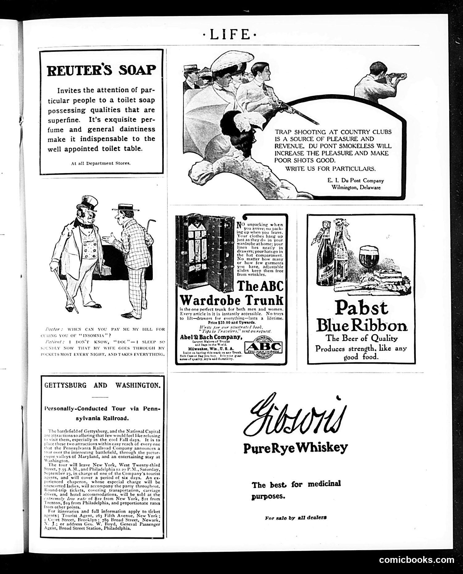
This page is primarily **advertisements** interspersed with one small cartoon joke. The cartoon at bottom left depicts a domestic humor scenario: a man complains to a doctor that he can't sleep because his wife now goes through his pockets every night and takes everything. The joke satirizes marital dynamics and women's access to household finances—suggesting the wife's aggressive money-management (or theft) prevents the husband's rest. This reflects early 20th-century tensions about women's economic control within marriages. The rest of the page consists of period product ads: Reuter's Soap (luxury toiletries), Du Pont smokeless ammunition for hunting, ABC Wardrobe Trunk (travel luggage), Pabst Blue Ribbon beer, and Gibson's Pure Rye Whiskey (marketed for "medicinal purposes"—a common claim during Prohibition era, though the date isn't specified here). The ads reflect consumer culture targeting affluent readers interested in leisure activities like trap shooting and travel.
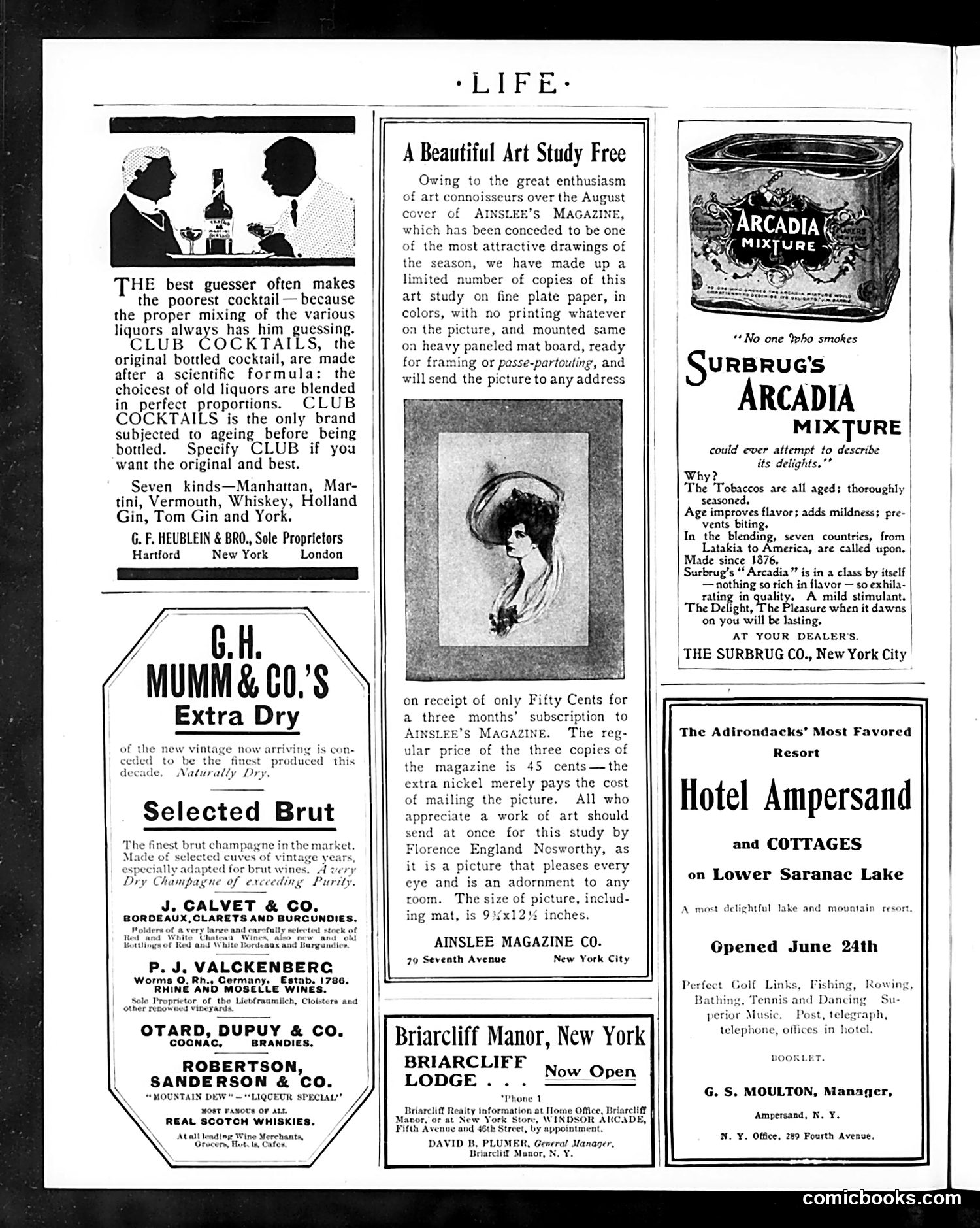
This page is primarily **advertising**, not satire or political commentary. The small cartoon at top left depicts two silhouetted figures—a man and woman—at what appears to be a bar or social setting, illustrating the accompanying text about cocktail mixing. The joke is straightforward: poor bartenders who guess at cocktail proportions make inferior drinks, so consumers should specify "Club Cocktails," which are scientifically formulated. The rest of the page advertises liquor brands (champagne, cognac, whiskey), tobacco (Surbrugg's Arcadia mixture), and Adirondack resort hotels—typical early 20th-century luxury goods marketing. The central feature promotes a free art print offer from Ainslee's Magazine, encouraging subscription with a fifty-cent incentive. There is no political satire or hidden meaning—this is straightforward commercial promotion typical of Life magazine's revenue model during this period.
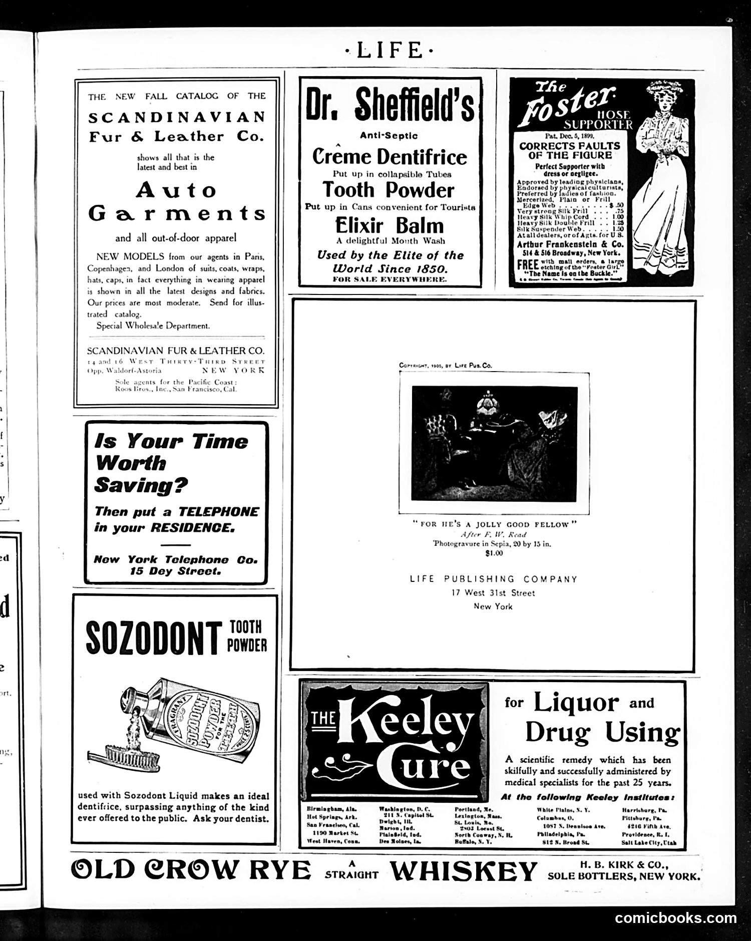
This page is primarily **advertising**, not editorial content or satire. It contains multiple product advertisements typical of early 20th-century magazines. The ads reflect period concerns: dental hygiene products (Sheffield's, Sozodont), fashion (Scandinavian furs and auto garments), and notably, **the Keeley Institute advertisement for "Liquor and Drug Using" treatment**—indicating widespread contemporary anxiety about addiction. One editorial element appears: a photogravure titled "For He's a Jolly Good Fellow" by Life Publishing Company, showing what appears to be a social scene, though details are unclear. The bottom advertises **Old Crow Rye whiskey**—ironic placement given the adjacent addiction-treatment ad, reflecting the era's contradictory attitudes toward alcohol (sold freely while simultaneously treating its abuse as a medical problem). The page documents consumer culture and social anxieties of the period rather than delivering satire.
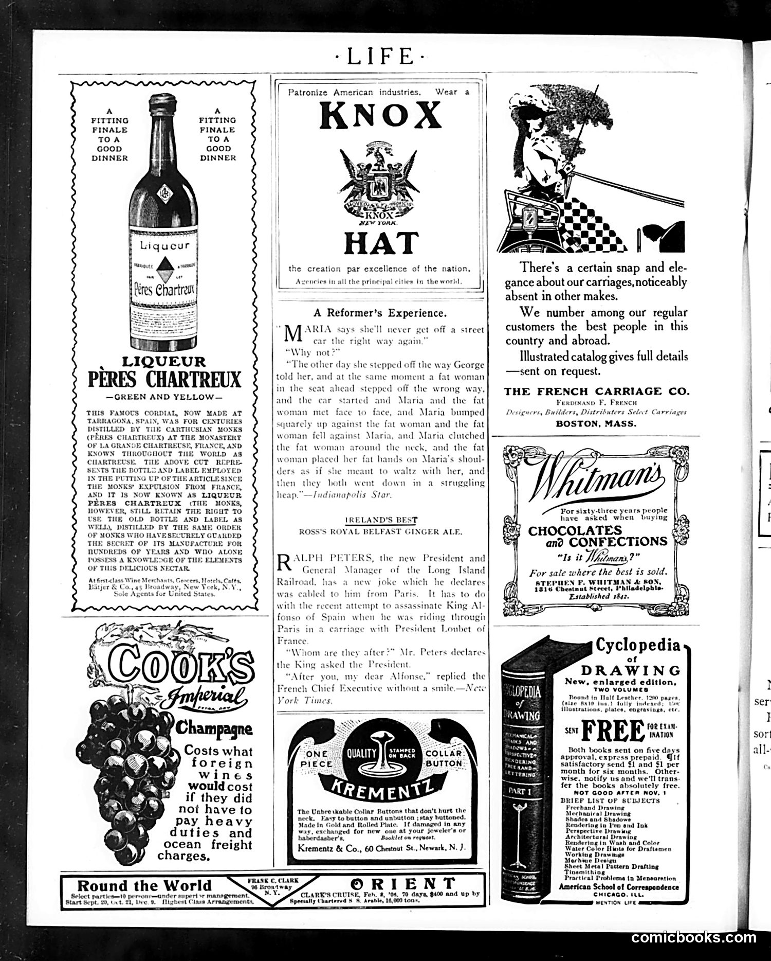
This humorous anecdote satirizes well-intentioned but naive social reformers. Maria, apparently an activist trying to improve street safety, instructs a woman on the "right way" to cross. However, when the woman follows her advice, both she and Maria collide with a fat woman crossing incorrectly—resulting in all three tumbling together in a "struggling heap." The joke mocks the reformer's presumption: her instruction backfires immediately, suggesting that real-world chaos resists simple moral lessons. The repeated emphasis on "the fat woman" adds physical comedy while implying that some obstacles (literal or figurative) cannot be resolved by well-meaning advice alone. The satire targets Progressive Era reformers who believed social problems could be solved through education and correct behavior—a common target of Life magazine's humor during this period.
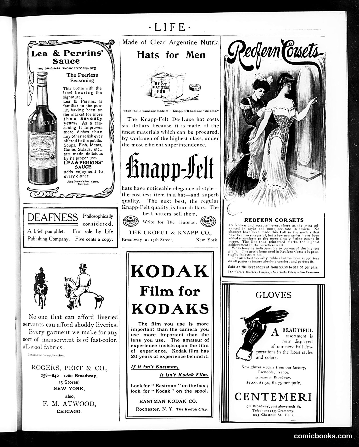
This is predominantly an **advertising page** with no political cartoons or satirical content. It displays vintage product advertisements from the early 20th century. Notable ads include: - **Lea & Perrins' Sauce**: promoting their 70-year-old Worcestershire sauce brand - **Knapp-Felt Hats**: luxury men's hats priced at $4-6 - **Rogers, Peet & Co.**: advertising high-quality servant liveries, revealing class hierarchies of the era - **Kodak Film**: emphasizing film quality over camera quality - **Redfern Corsets** and **Centemeri Gloves**: women's fashion items - **A deafness pamphlet**: offering a brief publication for five cents The page reflects early 1900s consumer culture, with emphasis on imported luxury goods (Argentine nutria, French gloves), brand reputation, and class-conscious marketing. The servant livery ad particularly illustrates period attitudes about domestic service hierarchies.
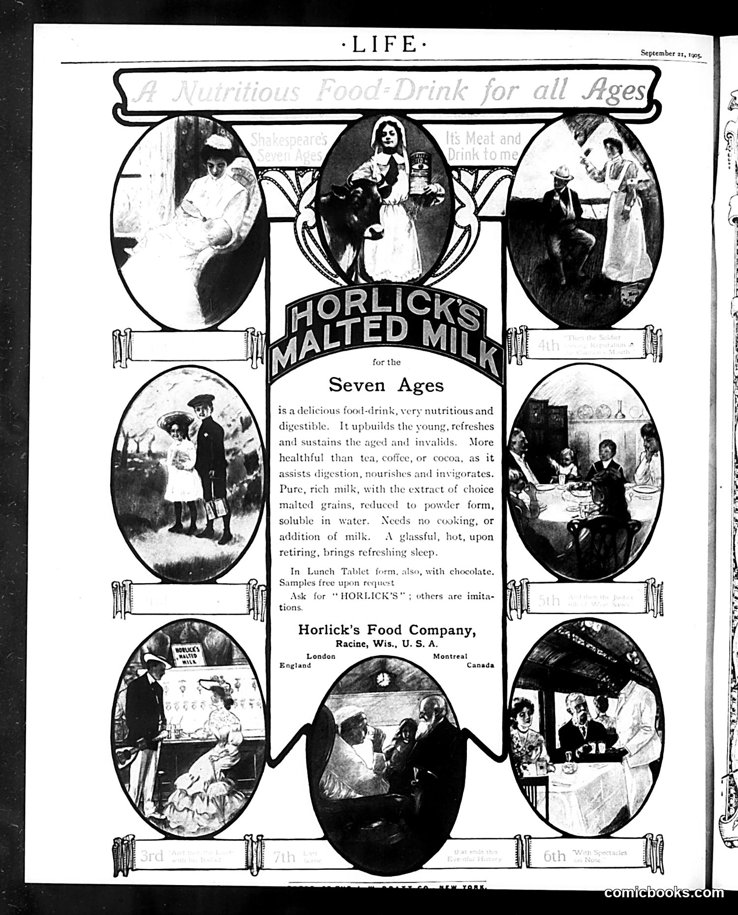
This is primarily a **product advertisement**, not political satire. It promotes Horlick's Malted Milk, a commercial food drink. The page uses the concept of "Seven Ages" (likely referencing Shakespeare's "seven ages of man") to market the product across different life stages. Seven oval photographs arranged around a central logo show various people—infants, children, adults, and elderly individuals—in domestic scenes consuming or being offered the beverage. The text claims Horlick's is "nutritious and digestible," benefits young and old alike, aids digestion better than tea or coffee, requires no cooking, and promotes sleep. It emphasizes the product's purity and convenience. The company operated from Racine, Wisconsin, with offices in London and Montreal, indicating international reach. The advertisement's use of life-stage imagery was typical early-20th-century marketing strategy, appealing to family health consciousness and the period's faith in commercial nutritional products.