
Life, 1929-03-01 · page 2 of 36
Life — March 1, 1929 — page 2: what you’re looking at
What you’re looking at
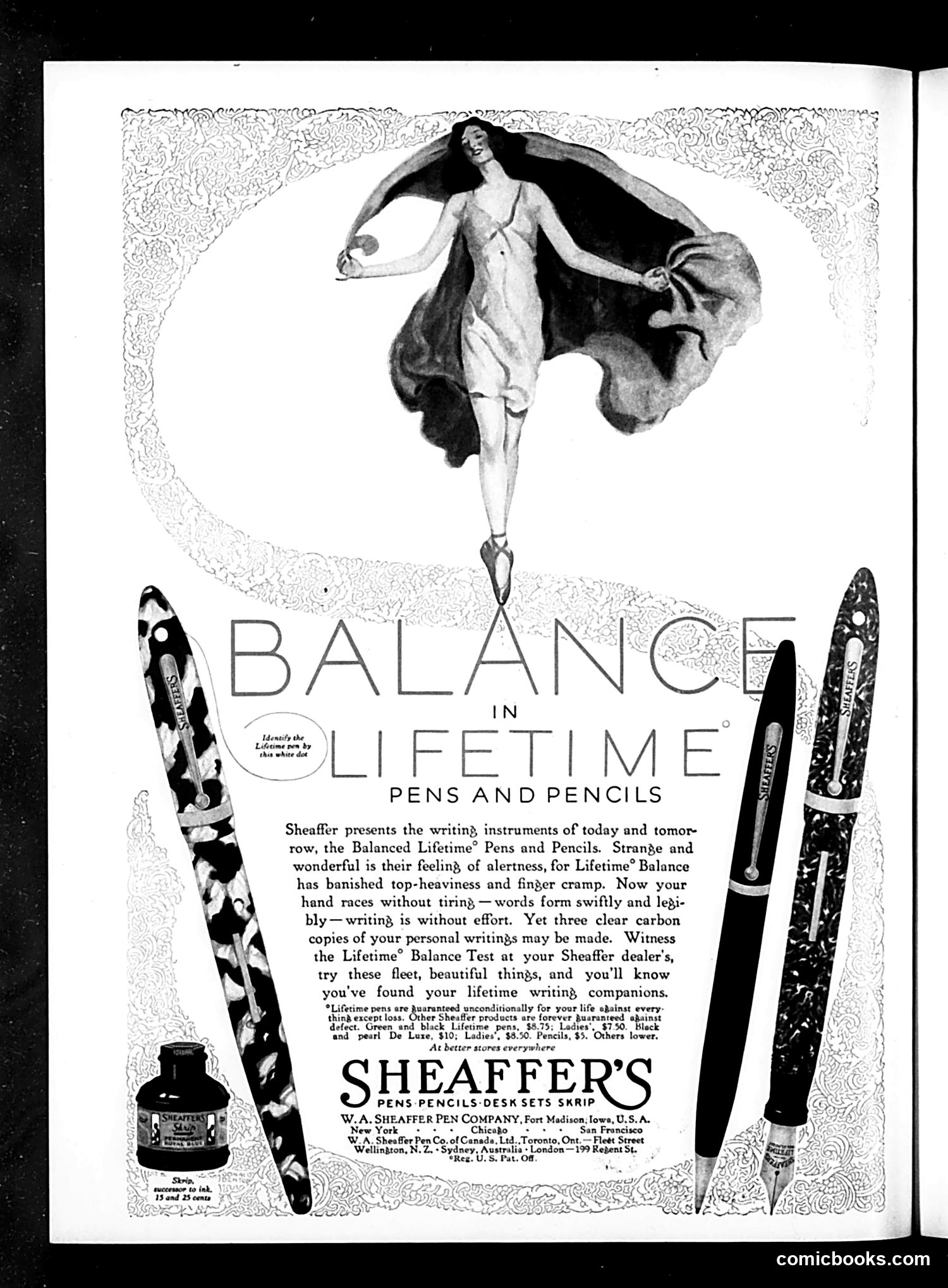
This page is primarily **advertising, not political satire**. It's a Sheaffer pens and pencils advertisement from an era when Life magazine included substantial commercial content. The central image shows a stylized female figure in classical ballet pose, depicted as balanced on the tip of a pen nib. This visual metaphor illustrates the product's core marketing claim: "Balance in Lifetime"—that Sheaffer's writing instruments are so well-balanced they eliminate hand fatigue and cramping. The decorative border and art deco styling are typical of 1920s-30s advertising design. The multiple pen styles displayed (with ornamental patterns) emphasize product variety. The text promises that writing with these pens requires minimal effort and that users can produce three carbon copies while writing. This is straightforward product marketing using an artistic metaphor, not editorial commentary.
📄 Transcribed text from this page (OCR, searchable)
Machine-transcribed from the original scan — historical spelling and the odd misread are preserved.
IN =| FET ppemerdp nd PENS AND PENCILS Sheaffer presents the writin}, instruments of today and tomor row, the Balanced Lifetime® Pens and Pencils. Strange and wonderful is their feeling, of alertness, for Lifetime® Balance has banished top-heaviness and finger cramp. Now your hand races without tirin — words form swiftly and lepi- bly — writing, is without effort. Yet three clear carbon copies of your personal writings may be made. Witness the Lifetime® Balance Test at your Sheaffer dealer's, try these fleet, beautiful things, and you'll know you've found your lifetime writing, companions. “Hinbexcepe loss: Orher Sheaser product aze forever bustomeeed again 75; Ladies’, $7.50. Black thing except loss. defect. Green and black Lifetime pens, i ‘and pearl De Luze, $10; Ladies’, $3.50. Pencils, $5, Others lower, At better stores everywhere SHEAFFE PENS-PENCILS-DESK SETS SKRIP W.A, SHEAFFER PEN COMPANY, Fort Madison; Iowa, U.S. A. New York + + + Chicafo + + + San Francisco W.A. Sheaffer Pen Co. of Canade. Ltd., Toronto, Ont. — Fleet Street + London—199 Regent St. Wellington, N. Z, + Sydney, Australi Reg. U.S. Pat. OF. comicbooks.com