
Life, 1923-03-15 · page 2 of 36
Life — March 15, 1923 — page 2: what you’re looking at
What you’re looking at
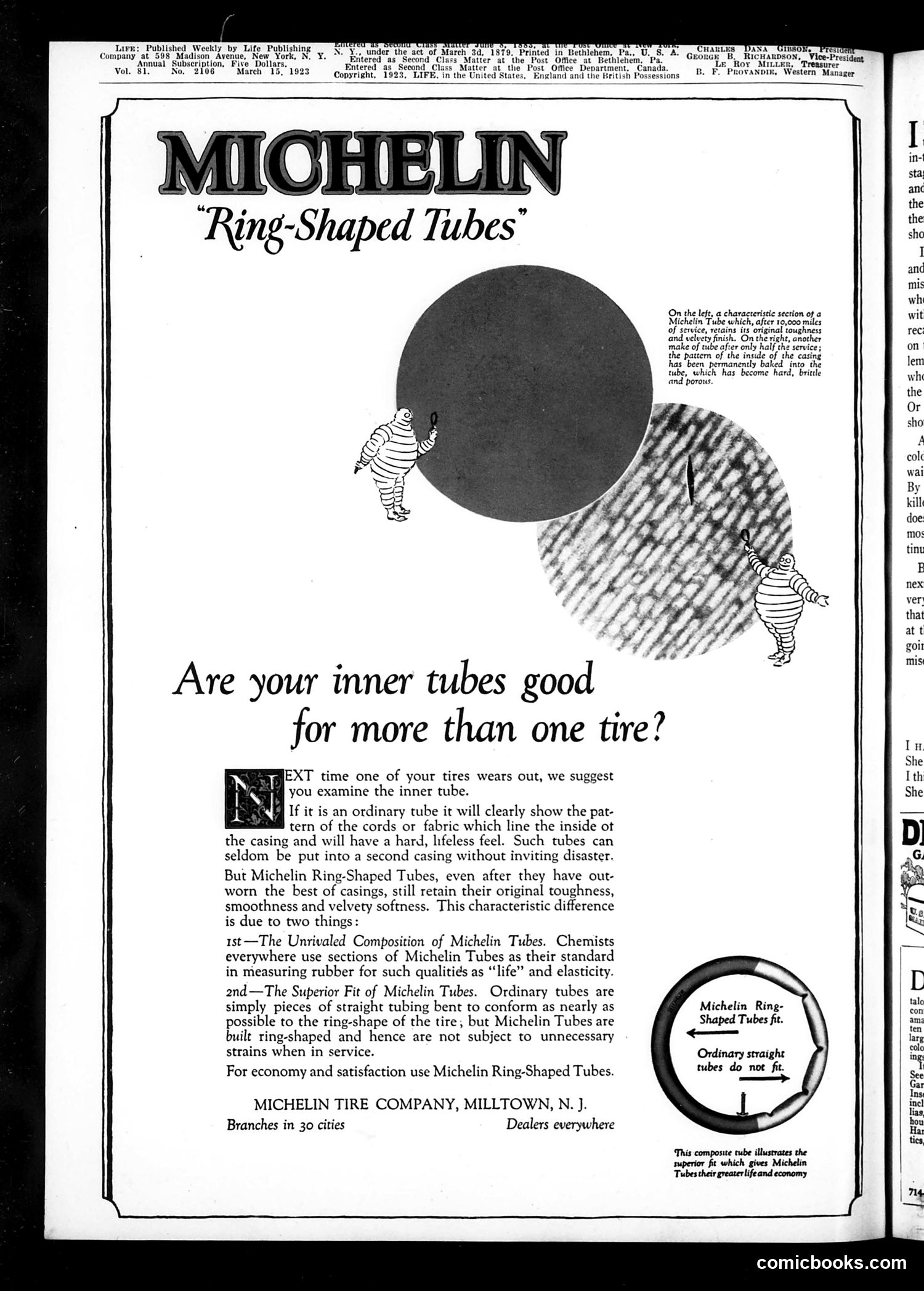
This page is **not satire or political commentary**—it's a straightforward product advertisement for Michelin Ring-Shaped Tubes, published in *Life* magazine around 1923. The ad features two cartoon figures (appearing to be Michelin's mascot, Bibendum, the rotund "Michelin Man") demonstrating the superiority of Michelin's ring-shaped inner tubes over competitors' straight tubes. The visual metaphor shows how ring-shaped tubes conform better to tire geometry, maintaining elasticity and durability longer than ordinary tubes. The text emphasizes two technical advantages: the "Unrivaled Composition" and "Superior Fit" of Michelin tubes. A circular diagram compares the ring-shaped versus straight tube design. This is commercial advertising integrated into the magazine's editorial space, typical of early 20th-century publication practices.
📄 Transcribed text from this page (OCR, searchable)
Machine-transcribed from the original scan — historical spelling and the odd misread are preserved.
Lire: Published Weekly by Life Publishing funder ithe! a Company at, 598 Madison, Avenue,” New York, N. Y. Hee Vice-Presi nna . Five LER u Vol. 81. No. 2106-" March 15.1923 qgnieted # Western Martager On the left, a characteristic section of a Michelin Tube which, after 10,000 miles of service, retains its original toughness and velvety finish. On the right, another make of tube after only half the ice; the pattern of the inside of the casing been permanently baked into the tube, which has become hard, brittle and porous. Are your inner tubes good for more than one tire? EXT time one of your tires wears out, we suggest | / J you examine the inner tube. si If it is an ordinary tube it will clearly show the pat- tern of the cords or fabric which line the inside ot the casing and will have a hard, lifeless feel. Such tubes can seldom be put into a second casing without inviting disaster. But Michelin Ring-Shaped Tubes, even after they have out- worn the best of casings, still retain their original toughness, smoothness and velvety softness. This characteristic difference is due to two things: 1st—The Unrivaled Composition of Michelin Tubes. Chemists everywhere use sections of Michelin Tubes as their standard in measuring rubber for such qualities as “life” and elasticity. 2nd—The Superior Fit of Michelin Tubes. Ordinary tubes are simply pieces of straight tubing bent to conform as nearly as Michelin Ring- possible to the ring-shape of the tire; but Michelin Tubes are Shaped Tubes fit. built ring-shaped and hence are not subject to unnecessary c- strains when in service. Ordinary straight ‘ 5 ‘ A ‘ tubes do not fit. For economy and satisfaction use Michelin Ring-Shaped Tubes. ; MICHELIN TIRE COMPANY, MILLTOWN, N. J. Branches in 30 cities Dealers everywhere ‘This composite tube illustrates the fit which gives Michelin Tubes their greaterlifeand economy comicbooks.com