
Life, 1923-01-18 · page 2 of 36
Life — January 18, 1923 — page 2: what you’re looking at
What you’re looking at
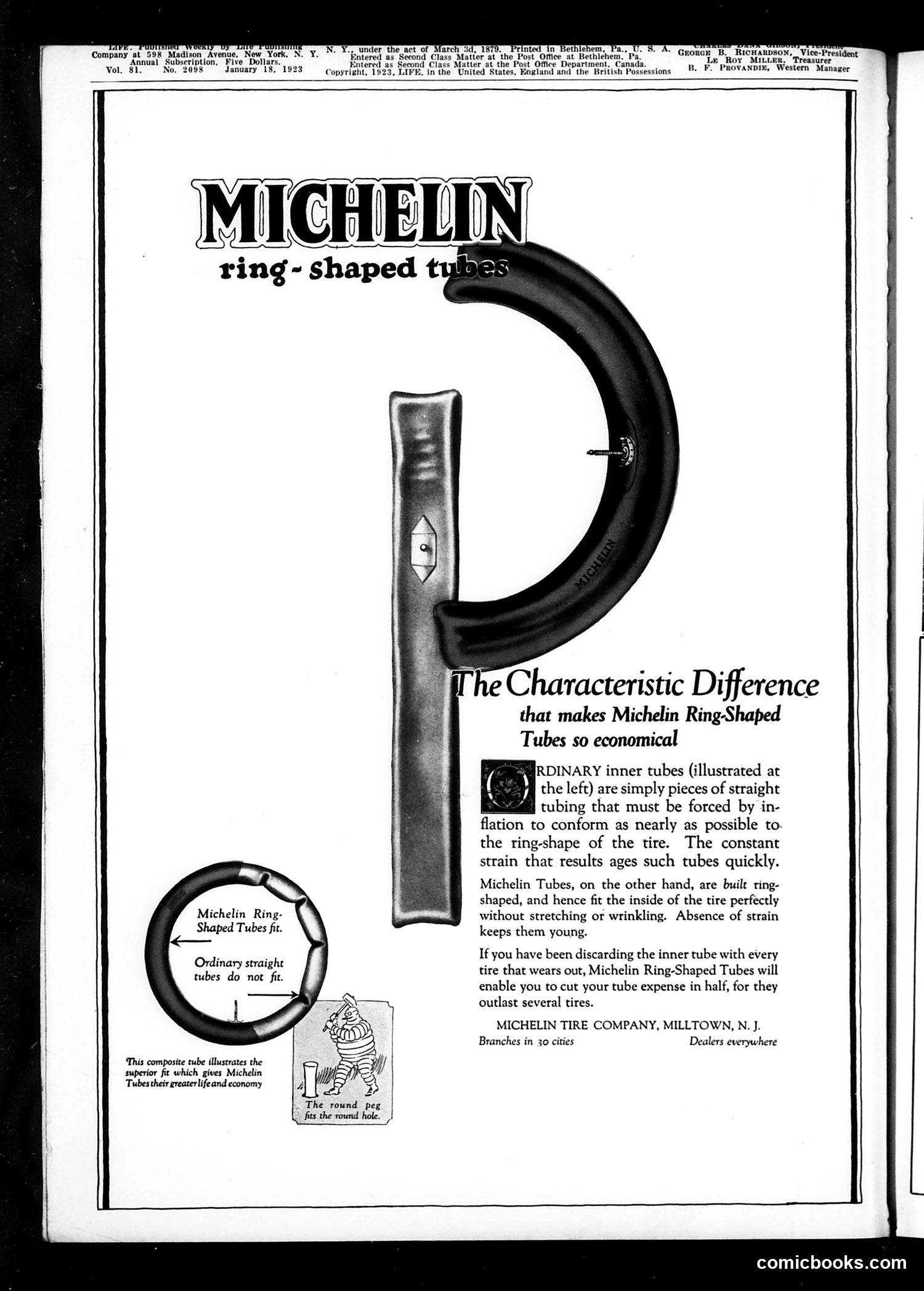
This page is **primarily a Michelin tire advertisement**, not political satire or commentary. The ad promotes Michelin's "ring-shaped tubes" for tires. The central visual compares two inner tube designs: ordinary straight tubes (shown on the left) that must be forced to fit a tire's curved shape, causing strain and aging; versus Michelin's ring-shaped tubes (illustrated prominently) that naturally conform to the tire's interior without stretching or wrinkling. The Bibendum character (the rotund "Michelin Man" mascot, visible at bottom) reinforces the brand identity. The advertisement's "characteristic difference" is framed as an economic advantage—claiming Michelin tubes last longer, reducing replacement costs. This is a straightforward product-differentiation marketing pitch aimed at cost-conscious consumers, circa 1923.
📄 Transcribed text from this page (OCR, searchable)
Machine-transcribed from the original scan — historical spelling and the odd misread are preserved.
eats 5 1879. Printed eu Company ‘at 988 Madison Avenue, : clas rat the Post Office at Bethiche tion, 4 id Cla at the Post Office Department a. ‘923, LIFE, in the United States, England and the British Possessions he Characteristic Difference that makes Michelin Ring-Shaped Tubes so economical IRDINARY inner tubes (illustrated at the left) are simply pieces of straight v tubing that must be forced by in- flation to conform as nearly as possible to. the ring-shape of the tire. The constant strain that results ages such tubes quickly. Michelin Tubes, on the other hand, are built ring- shaped, and hence fit the inside of the tire perfectly Michelin Ring- without stretching or wrinkling. Absence of strain Shaped Tubes fit. keeps them young. Ondthary araighe If you have been discarding the inner tube with every babes ts Woe fe tire that wears out, Michelin Ring-Shaped Tubes will i enable you to cut your tube expense in half, for they outlast several tires. MICHELIN TIRE COMPANY, MILLTOWN, N. J. Branches in 30 cities Dealers everywhere ‘This composite tube illustrates the superior fit which gives Michelin Tubes their greaterlifeand economy The round peg fits the round hole. comicbooks.com